Chapter 2
- 2.1 Raw scores are the original data, to which nothing has been done.
- 2.3 A frequency table is a visual depiction of data that shows how often each value occurred; that is, it shows how many scores are at each value. Values are listed in one column, and the numbers of individuals with scores at that value are listed in the second column. A grouped frequency table is a visual depiction of data that reports the frequency within each given interval, rather than the frequency for each specific value.
C-
3 - 2.5 Bar graphs typically provide scores for nominal data, whereas histograms typically provide frequencies for scale data. Also, the categories in bar graphs do not need to be arranged in a particular order and the bars should not touch, whereas the intervals in histograms are arranged in a meaningful order (lowest to highest) and the bars should touch each other.
- 2.7 A histogram looks like a bar graph but is usually used to depict scale data, with the values (or midpoints of intervals) of the variable on the x-axis and the frequencies on the y-axis. A frequency polygon is a line graph, with the x-axis representing values (or midpoints of intervals) and the y-axis representing frequencies; a dot is placed at the frequency for each value (or midpoint), and the points are connected.
- 2.9 In everyday conversation, you might use the word distribution in a number of different contexts, from the distribution of food to a marketing distribution. A statistician would use distribution only to describe the way that a set of scores, such as a set of grades, is distributed. A statistician is looking at the overall pattern of the data—
what the shape is, where the data tend to cluster, and how they trail off. - 2.11 With positively skewed data, the distribution’s tail extends to the right, in a positive direction, and with negatively skewed data, the distribution’s tail extends to the left, in a negative direction.
- 2.13 A ceiling effect occurs when there are no scores above a certain value; a ceiling effect leads to a negatively skewed distribution because the upper part of the distribution is constrained.
- 2.15 A stem-
and- leaf plot is much like a histogram in that it conveys how often different values in a data set occur. Also, when a stem- and- leaf plot is turned on its side, it has the same shape as a histogram of the same data set. - 2.17 17.95% and 40.67%
- 2.19 0.10% and 96.77%
- 2.21 0.04, 198.22, and 17.89
- 2.23 The full range of data is 68 minus 2, plus 1, or 67. The range (67) divided by the desired seven intervals gives us an interval size of 9.57, or 10 when rounded. The seven intervals are: 0–
9, 10– 19, 20– 29, 30– 39, 40– 49, 50– 59, and 60– 69. - 2.25 26 shows
- 2.27 Serial killers would create positive skew, adding high numbers of murders to the data that are clustered around 1.
- 2.29
- a. For the college population, the range of ages extends farther to the right (with a larger number of years) than to the left, creating positive skew.
- b. The fact that youthful prodigies have limited access to college creates a sort of floor effect that makes low scores less possible.
- 2.31
- a. The stem-
and- leaf plot is depicted below: 3 55568888 3 0013334444 2 5778889 2 00344 1 688 1 03 0 5 0 1 - b. This stem-
and- leaf plot depicts a negatively skewed distribution.
- a. The stem-
- 2.33
- a.
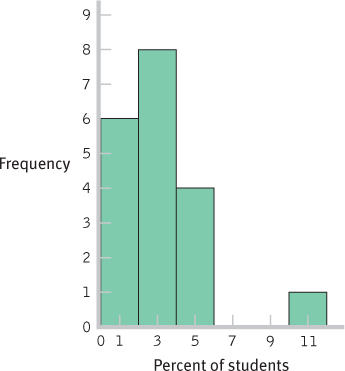
PERCENTAGE FREQUENCY PERCENTAGE 10 1 5.26 9 0 0.00 8 0 0.00 7 0 0.00 6 0 0.00 5 2 10.53 4 2 10.53 3 4 21.05 2 4 21.05 1 5 26.32 0 1 5.26 - b. In 10.53% of these schools, exactly 4% of the students reported that they wrote between 5 and 10 twenty-
page papers that year. - c. This is not a random sample. It includes schools that chose to participate in this survey and opted to have their results made public.
- d.
- e. One
- f. The data are clustered around 1% to 4%, with a high outlier, 10%.
- a.
- 2.35
- a.
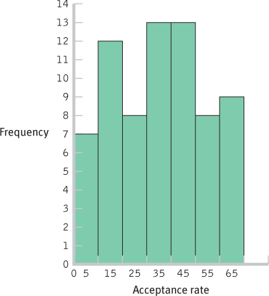
INTERVAL FREQUENCY 60- 69 9 50- 59 8 40- 49 13 30- 39 13 20- 29 8 10- 19 12 0- 9 7 C-
4 - b. There are many possible answers to this question. For example, we might ask whether the prestige of the university or the region of the country is a factor in acceptance rate.
- c.
- d.
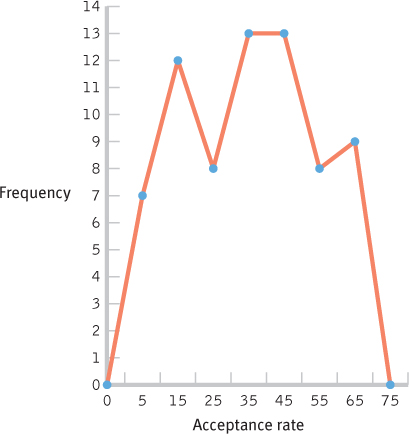
- e. There are no unusual scores, as the distribution is fairly uniform with frequencies between 6 and 13. The center of the distribution seems to be in the 20–
49 range.
- a.
- 2.37
- a. Extroversion scores are most likely to have a normal distribution. Most people would fall toward the middle, with some people having higher levels and some having lower levels.
- b. The distribution of finishing times for a marathon is likely to be positively skewed. The floor is the fastest possible time, a little over 2 hours; however, some runners take as long as 6 hours or more. Unfortunately for the very, very slow
- c. The distribution of numbers of meals eaten in a dining hall in a semester on a three-
meal- a- day plan is likely to be negatively skewed. The ceiling is three times per day, multiplied by the number of days; most people who choose to pay for the full plan would eat many of these meals. A few would hardly ever eat in the dining hall, pulling the tail in a negative direction.
- 2.39
INTERVAL FREQUENCY 18– 20 2 15– 17 6 12– 14 2 9– 11 3 6– 8 7 3– 5 8 - 2.41 The stem-
and- leaf plot is depicted below: 6 0 5 01367 4 002234489 3 13779 2 33567999 1 89 - 2.43
- a.
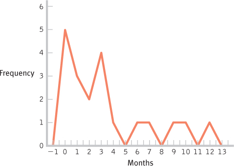
MONTHS FREQUENCY PERCENTAGE 12 1 5 11 0 0 10 1 5 9 1 5 8 0 0 7 1 5 6 1 5 5 0 0 4 1 5 3 4 20 2 2 10 1 3 15 0 5 25 - b.
- c.
- d.
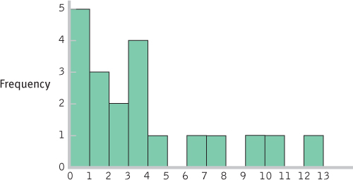
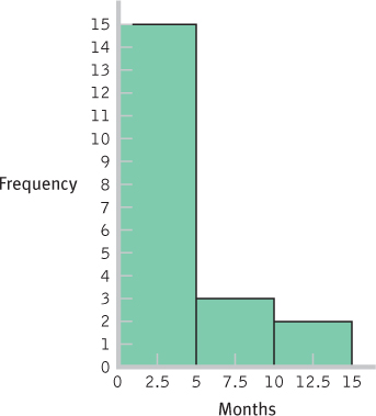
INTERVAL FREQUENCY 10– 14 months 2 5– 9 months 3 0– 4 months 15 - e.
- f.
- g. These data are centered around the 3-
month period, with positive skew extending the data out to the 12- month period. - h. The bulk of the data would need to be shifted from the 3-
month period to approximately 12 months, so the women who have breast- fed for 3 months so far might be the focus of attention. Perhaps early contact at the hospital and at follow- up visits after birth would help encourage mothers to breast- feed, and to breast- feed longer. One could also consider studying the women who create the positive skew to learn what unique characteristics or knowledge they have that influenced their behavior.
C-
5 - a.
- 2.45
- a.
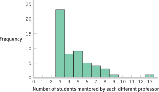
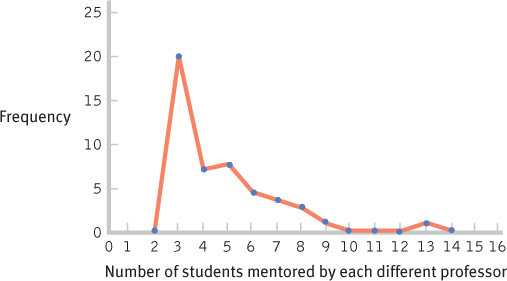
FORMER STUDENTS NOW IN TOP JOBS FREQUENCY PERCENTAGE 13 1 1.85 12 0 0.00 11 0 0.00 10 0 0.00 9 1 1.85 8 3 5.56 7 4 7.41 6 5 9.26 5 9 16.67 4 8 14.81 3 23 42.59 - b.
- c.
C-
6 - d. This distribution is positively skewed.
- e. The researchers operationalized the variable of mentoring success as numbers of students placed into top professorial positions. There are many other ways this variable could have been operationalized. For example, the researchers might have counted numbers of student publications while in graduate school or might have asked graduates to rate their satisfaction with their graduate mentoring experiences.
- f. The students might have attained their positions as professors because of the prestige of their advisor, not because of his mentoring.
- g. There are many possible answers to this question. For example, the attainment of a top professor position might be predicted by the prestige of the institution, the number of publications while in graduate school, or the graduate student’s academic ability.
- a.