3.1 The purpose of a graph is to reveal and clarify relations between variables.
3.2 Five miles per gallon change (from 22 to 27) and
change
3.3 The graph on the left is misleading. It shows a sharp decline in annual traffic deaths in Connecticut from 1955 to 1956, but we cannot draw valid conclusions from just two data points. The graph on the right is a more accurate and complete depiction of the data. It includes nine, rather than two, data points and suggests that the sharp 1-year decline was the beginning of a clear downward trend in traffic fatalities that extended through 1959. It also shows that there had been previous 1-year declines of similar magnitude—from 1951 to 1952 and from 1953 to 1954. Also, the γ-axis does not go down to 0, which exaggerates any differences.
3.4 Scatterplots and line graphs both depict the relation between two scale variables.
3.5 We should typically avoid using pictorial graphs and pie charts because the data can almost always be presented more clearly in a table or in a bar graph.
3.6 The line graph known as a time plot or time series plot allows us to calculate or evaluate how a variable changes over time.
3.7
a. A scatterplot is the best graph choice to depict the relation between two scale variables such as depression and stress.
b. A time plot, or time series plot, is the best graph choice to depict the change in a scale variable, such as the rise or decline in the number of facilities over time.
c. For one scale variable, such as number of siblings, the best graph choice would be either a frequency histogram or frequency polygon.
d. In this case, there is a nominal variable (region of the United States) and a scale variable (years of education). The best choice would be a bar graph, with one bar depicting the mean years of education for each region. In a Pareto chart, the bars would be arranged from highest to lowest, allowing for easier comparisons.
e. Calories and hours are both scale variables, and the question is about prediction rather than relation. In this case, we would calculate and graph a line of best fit.
3.8 Chartjunk is any unnecessary information or feature in a graph that detracts from the viewer’s understanding.
3.9
a. Scatterplot or line graph
b. Bar graph
c. Scatterplot or line graph
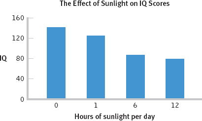
3.10
The accompanying graph improves on the chartjunk graph in several ways. First, it has a clear, specific title. Second, all axes are labeled left to right. Third, there are no abbreviations. The units of measurement, IQ and hours of sunlight per day, are included. The γ-axis has 0 as its minimum, the colors are simple and muted, and all chartjunk has been eliminated. This graph wasn’t as much fun to create, but it offers a far clearer presentation of the data! (Note: We are treating hours as an ordinal variable.)
 change