15.1 The Meaning of Correlation
A correlation is exactly what its name suggests: a co-
MASTERING THE CONCEPT
15.1: A correlation coefficient always falls between −1.00 and 1.00. The size of the coefficient, not its sign, indicates how large it is.
The Characteristics of Correlation
A correlation coefficient is a statistic that quantifies a relation between two variables.
A correlation coefficient is a statistic that quantifies a relation between two variables. In this chapter, we learn how to quantify a relation—
- The correlation coefficient can be either positive or negative.
- The correlation coefficient always falls between −1.00 and 1.00.
- It is the strength (also called the magnitude) of the coefficient, not its sign, that indicates how large it is.
393
A positive correlation is an association between two variables such that participants with high scores on one variable tend to have high scores on the other variable as well, and those with low scores on one variable tend to have low scores on the other variable.
The first important characteristic of the correlation coefficient is that it can be either positive or negative. A positive correlation has a positive sign (e.g., 0.32), and a negative correlation has a negative sign (e.g., −0.32). A positive correlation is an association between two variables such that participants with high scores on one variable tend to have high scores on the other variable as well, and those with low scores on one variable tend to have low scores on the other variable.
Contrary to what some people think, when participants with low scores on one variable tend to have low scores on the other, it is not a negative correlation. A positive correlation describes a situation in which participants tend to have similar scores, with respect to the mean and spread, on both variables—
EXAMPLE 15.1
The scatterplot in Figure 15-1 shows a positive correlation between Scholastic Aptitude Test (SAT) score and college grade point average (GPA). For example, the second dot from the left is for a person with a 980 on the SAT and a 2.2 GPA; this person is lower than average on both scores. The upper-
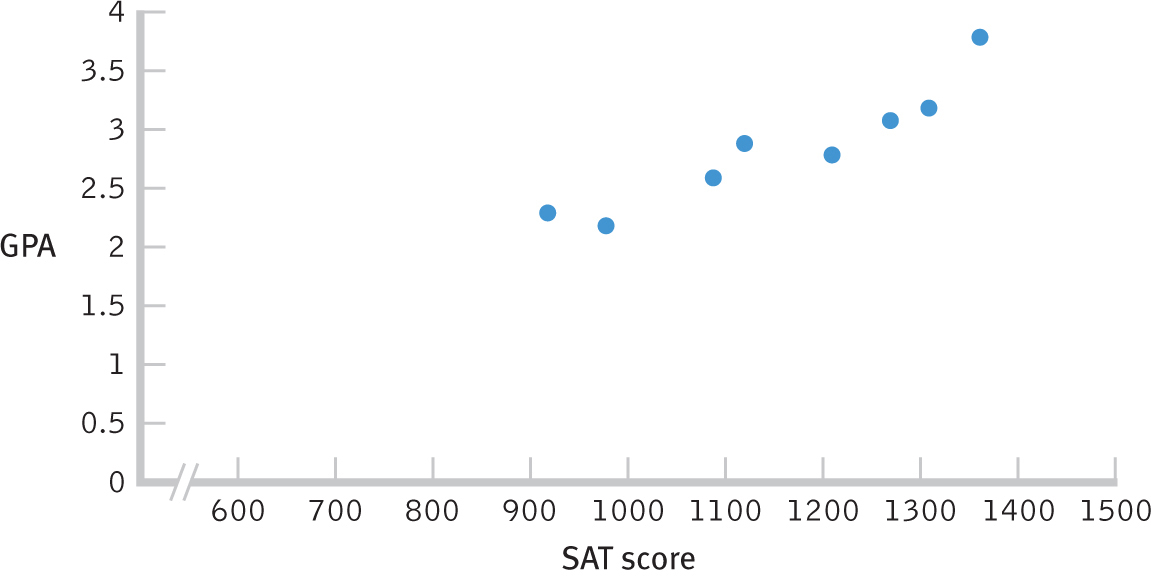
Figure 15-
EXAMPLE 15.2
A negative correlation is an association between two variables in which participants with high scores on one variable tend to have low scores on the other variable.
A negative correlation is an association between two variables in which participants with high scores on one variable tend to have low scores on the other variable. The line that summarizes a scatterplot with a negative correlation slopes downward and to the right.
The scatterplot in Figure 15-2 shows the negative correlation of −0.43 between cheating and final exam grade for the MIT study. Each dot represents one person’s values on both variables. The proportion of homework copied during the semester is on the horizontal x-axis, and the final exam grade (converted to standardized z scores) is on the vertical y-axis. For example, the dot in the green diamond indicates a student who copied less than 0.2, or 20%, of the homework, and scored almost 2 standard deviations above the mean on the final exam. The dot in the red diamond indicates a student who copied almost 80% of the homework and scored more than 3 standard deviations below the mean on the final exam. Notice that most dots do not fit the pattern of the two students we just described. However, the overall trend is for students who copied more to perform more poorly on the final—
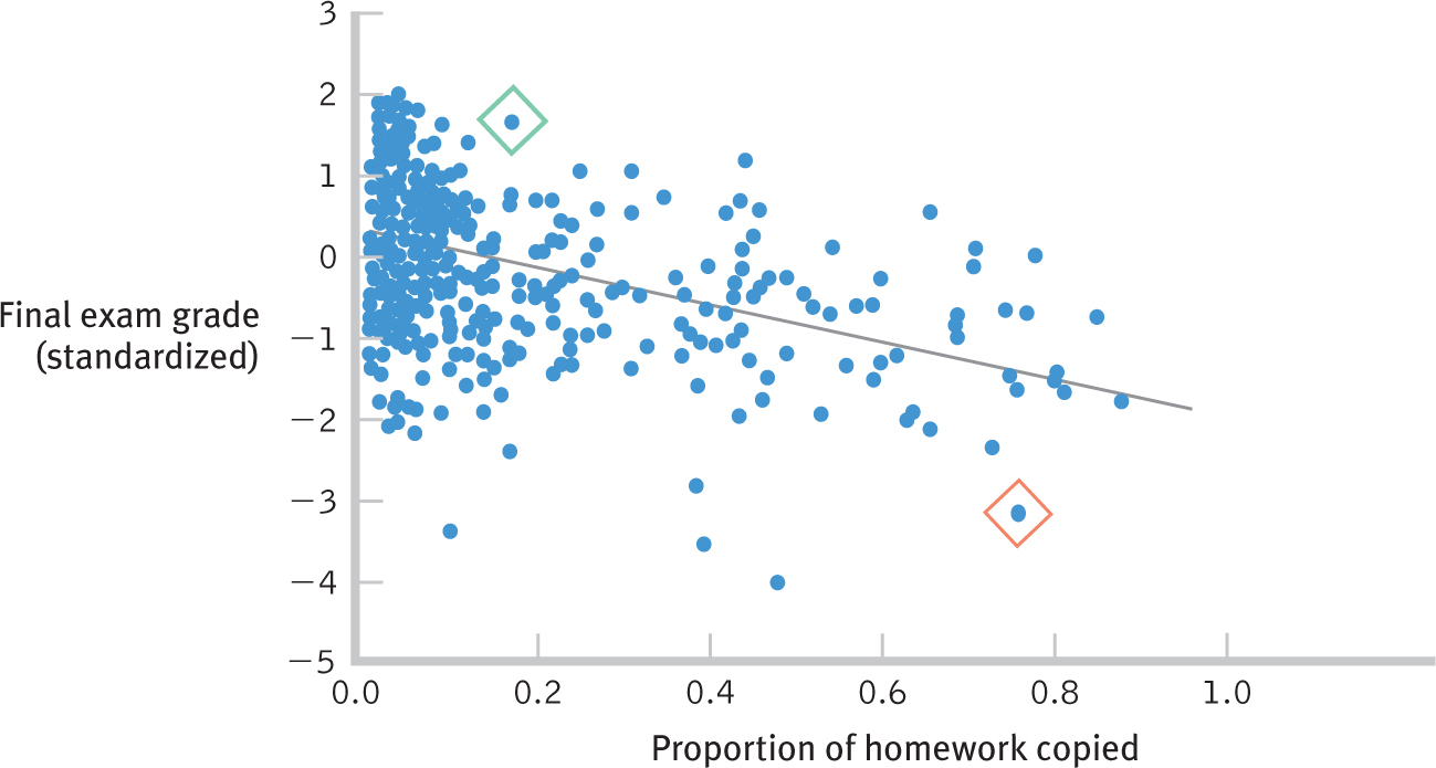
Figure 15-
MASTERING THE CONCEPT
15.2: The sign indicates the direction of the correlation, positive or negative. A positive correlation occurs when people who are high on one variable tend to be high on the other as well, and people who are low on one variable tend to be low on the other. A negative correlation occurs when people who are high on one variable tend to be low on the other.
394
A second important characteristic of the correlation coefficient is that it always falls between −1.00 and 1.00. Both −1.00 and 1.00 are perfect correlations. If we calculate a coefficient that is outside this range, we have made a mistake in the calculations. A correlation coefficient of 1.00 indicates a perfect positive correlation; every point on the scatterplot falls on one line, as seen in the imaginary relation between absences and exam grades depicted in Figure 15-3. Higher scores on one variable are associated with higher scores on the other, and lower scores on one variable are associated with lower scores on the other. When a correlation coefficient is either −1.00 or 1.00, knowing somebody’s score on one variable tells you exactly what that person’s score is on the other variable. They are perfectly related.
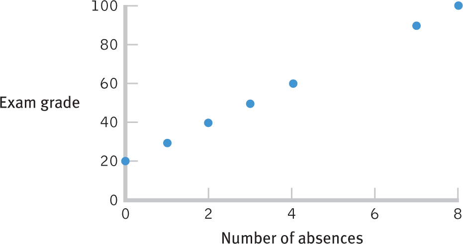
Figure 15-
A correlation coefficient of −1.00 indicates a perfect negative correlation. Every point on the scatterplot falls on one line, as seen in the imaginary relation between absences and exam grades depicted in Figure 15-4, but now higher scores on one variable go with lower scores on the other variable. As with a perfect positive correlation, knowing somebody’s score on one variable tells you that person’s exact score on the other variable. A correlation of 0.00 falls right in the middle of the two extremes and indicates no correlation—
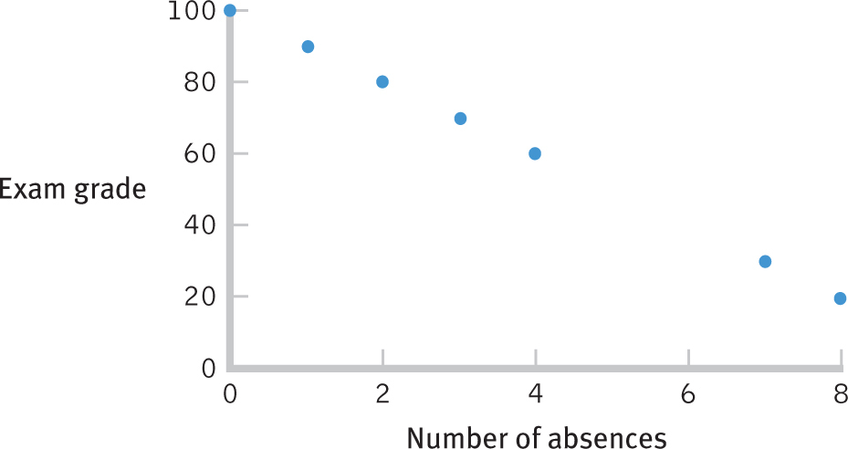
Figure 15-
The third useful characteristic of the correlation coefficient is that its sign—
The strength of the correlation is determined by how close to “perfect” the data points are. The closer the data points are to the imaginary line that one could draw through them, the closer the correlation is to being perfect (either −1.00 or 1.00), and the stronger the relation between the two variables. The farther the points are from this imaginary line, the farther the correlation is from being perfect (so, closer to 0.00), and the weaker the relation between the two variables.
395

The scores in a positive correlation move up and down together, the same way the mercury rises or falls in a thermometer as the temperature goes up or down. The scores in a negative correlation move up and down in opposition to each other, as though on a teeter-
How big does a correlation coefficient have to be to be considered important? As he did for effect sizes, Jacob Cohen (1988) published standards, shown in Table 15-1, to help us interpret the correlation coefficient. Very few findings in the behavioral sciences have correlation coefficients of 0.50 or larger because a correlation is influenced by many variables. A student’s exam grade, for example, is influenced by absences from class, attention level, hours of studying, interest in the subject matter, IQ, and many other variables. So, the correlation of −0.43 between cheating and exam grades found among MIT students is a large correlation for the behavioral sciences.
| Size of the Correlation | Correlation Coefficient |
|---|---|
| Small | 0.10 |
| Medium | 0.30 |
| Large | 0.50 |
Correlation Is Not Causation
You need to understand what correlations do not reveal about the relation between variables. Correlations only provide clues to causality; they do not demonstrate or test for causality; they only quantify the strength and direction of the relation between variables. Your appreciation for what correlations do not reveal suggests that you are thinking scientifically. For example, we know that there was a strong negative correlation in the MIT study between cheating and final exam grade, and it is not unreasonable to think that cheating causes bad grades. However, there are three possible reasons for this observed correlation.
First, variable A (cheating) could cause variable B (poor grades). Second, variable B (poor grades) could cause variable A (cheating). Third, variable C (some other influence) could be causing the correlation between variable A (cheating) and variable B (poor grades). You can think of these three possibilities as the A-
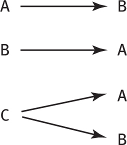
Figure 15-
396
MASTERING THE CONCEPT
15.3: Just because two variables are related doesn’t mean one causes the other. It could be that the first causes the second, the second causes the first, or a third variable causes both. Correlation does not indicate causation.
Knowing that correlation does not imply causation coaxes our brains into thinking of alternate explanations. The researchers found that physics and math ability did not correlate with cheating; so that’s an unlikely answer. But we also mentioned working, anxiety, and other time commitments. You can probably think of even more possibilities. Never confuse correlation with causation.
CHECK YOUR LEARNING
Reviewing the Concepts
- A correlation coefficient is a statistic that quantifies a relation between two variables.
- The correlation coefficient always falls between −1.00 and 1.00.
- When two variables are related such that people with high scores on one tend to have high scores on the other and people with low scores on one tend to have low scores on the other, we describe the variables as positively correlated.
- When two variables are related such that people with high scores on one tend to have low scores on the other, we describe the variables as negatively correlated.
- When two variables are not related, there is no correlation and they have a correlation coefficient close to 0.
- The strength of a correlation, captured by the number value of the coefficient, is independent of its sign. Cohen established standards for evaluating the strength of association.
- Correlation is not equivalent to causation. In fact, a correlation does not help us decide the merits of different causal explanations.
- When two variables are correlated, this association might occur because the first variable, (A), causes the second, (B); or because the second variable, (B), causes the first, (A). Alternately, a third variable, (C), could cause both of the correlated variables, (A) and (B).
Clarifying the Concepts
- 15-
1 There are three main characteristics of the correlation coefficient. What are they? - 15-
2 Why doesn’t correlation indicate causation?
Calculating the Statistics
- 15-
3 Use Cohen’s guidelines to describe the strength of the following coefficients:- −0.60
- 0.35
- 0.04
- 15-
4 Draw a hypothetical scatterplot to depict the following correlation coefficients:- −0.60
- 0.35
- 0.04
Applying the Concepts
- 15-
5 A writer for Runner’s World magazine debated the merits of running while listening to music (Seymour, 2006). The writer, an avid iPod user, interviewed a clinical psychologist, whose response to the debate about whether to listen to music while running was: “I like to do what the great ones do and try to emulate that. What are the Kenyans doing?”
Let’s say a researcher conducted a study in which he determined the correlation between the percentage of a country’s marathon runners who train while using a portable music device and the average marathon finishing time for that country’s runners. (Note that in this case the participants are countries, not people.) Let’s say the researcher finds a strong positive correlation. That is, the more of a country’s runners who train with music, the longer the average marathon finishing time. Remember, in a marathon, a longer time is bad. So this fictional finding is that training with music is associated with slower marathon finishing times; the United States, for example, would have a higher percentage of music use and higher (slower) finishing times than Kenya.
Using the A-B- C model, provide three possible explanations for this finding.
Solutions to these Check Your Learning questions can be found in Appendix D.