Chapter 2 How it Works
2.1 CREATING A FREQUENCY TABLE
Imagine that we ask everyone in a class of 20 first-

How can we use these data to create a frequency table? First, we reorder the “nights socializing” data into a table with two columns, one for the range of possible responses (the values) and one for the frequencies of each of the responses (the scores). The frequency table for these data follows.
| Nights | Frequency |
|---|---|
| 7 | 1 |
| 6 | 2 |
| 5 | 2 |
| 4 | 5 |
| 3 | 3 |
| 2 | 4 |
| 1 | 2 |
| 0 | 1 |
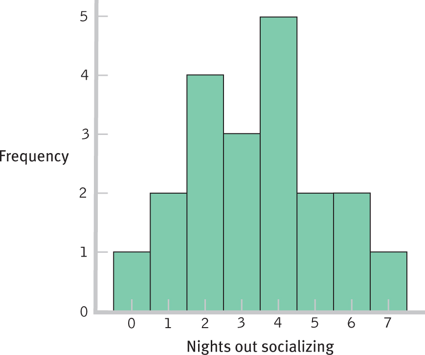
2.2 CREATING A HISTOGRAM
How can we use these same data to create a histogram? First, we put the number of nights socializing on the x-axis and the frequency for each number on the y-axis. The bar for each frequency is centered at the appropriate number of nights out. The figure below shows the histogram for these data.
41
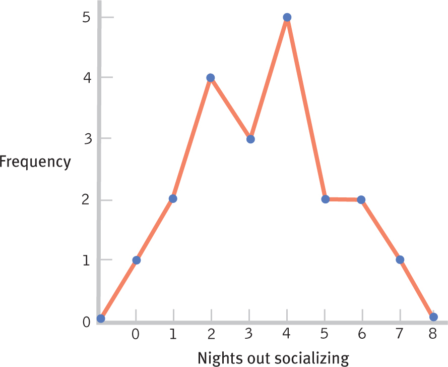
2.3 CREATING A FREQUENCY POLYGON
How can we use these same data to create a frequency polygon? As with the histogram, we put the number of nights socializing on the x-axis and the frequency for each number on the y-axis. Instead of bars, we now place a dot for each frequency above the appropriate number of nights out. We add additional values at the next whole numbers below and above this range, −1 and 8, and put dots indicating a frequency of 0 at each of these values. The figure below shows the frequency polygon for these data.