Chapter 2 Exercises
Clarifying the Concepts
Question 2.1
What are raw scores?
Question 2.2
What are the steps to create a frequency table?
Question 2.3
What is the difference between a frequency table and a grouped frequency table?
Question 2.4
Describe two ways that statisticians might use the word interval.
Question 2.5
What is the difference between a histogram and a bar graph?
Question 2.6
What are the typical labels for the x-axis and the y-axis in a histogram?
Question 2.7
What are the differences between a histogram and a frequency polygon?
Question 2.8
What is the benefit of creating a visual distribution of data rather than simply looking at a list of the data?
Question 2.9
In your own words, define the word distribution, first as you would use it in everyday conversation and then as a statistician would use it.
Question 2.10
What is a normal distribution?
42
Question 2.11
How do positively skewed distributions and negatively skewed distributions deviate from a normal distribution?
Question 2.12
What is a floor effect and how does it affect a distribution?
Question 2.13
What is a ceiling effect and how does it affect a distribution?
Question 2.14
What are potential benefits of using a stem-
Question 2.15
In what way are stem-
Calculating the Statistics
Question 2.16
Convert the following to percentages: 63 out of 1264; 2 out of 88.
Question 2.17
Convert the following to percentages: 7 out of 39; 122 out of 300.
Question 2.18
Counts are often converted to percentages. Convert 817 out of 22,140 into a percentage. Now convert 4009 out of 22,140 into a percentage. What type of variable (nominal, ordinal, or scale) are these data as counts? What kind of variable are they as percentages?
Question 2.19
Convert 2 out of 2000 into a percentage. Now convert 60 out of 62 into a percentage.
Question 2.20
Throughout this book, final answers are reported to two decimal places. Report the following numbers this way: 1,888.999, 2.6454, and 0.0833.
Question 2.21
Report the following numbers to two decimal places: 0.0391, 198.2219, and 17.886.
Question 2.22
On a test of marital satisfaction, scores could range from 0 to 27.
What is the full range of data, according to the calculation procedure described in this chapter?
What would the interval size be if we wanted six intervals?
List the six intervals.
Question 2.23
If you have data that range from 2 to 68 and you want seven intervals in a grouped frequency table, what would the intervals be?
Question 2.24
A grouped frequency table has the following intervals: 30–
Question 2.25
Referring to the grouped frequency table in Table 2-
Question 2.26
Referring to the histogram in Figure 2-
Question 2.27
If the average person convicted of murder killed only one person, serial killers would create what kind of skew?
Question 2.28
Would the data for number of murders by those convicted of the crime be an example of a floor effect or ceiling effect?
Question 2.29
A researcher collects data on the ages of college students. As you have probably observed, the distribution of age clusters around 19 to 22 years, but there are extremes on both the low end (high school prodigies) and the high end (nontraditional students returning to school).
What type of skew might you expect for such data?
Do the skewed data represent a floor effect or a ceiling effect?
Question 2.30
If you have a Facebook account, you are allowed to have up to 5000 friends. At that point, Facebook cuts you off, and you have to “defriend” people to add more. Imagine you collected data from Facebook users at your university about the number of friends each has.
What type of skew might you expect for such data?
Do the skewed data represent a floor effect or ceiling effect?
Question 2.31
Using the following set of data, construct a single stem-
and- leaf plot: 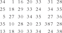
Refer to the stem-
and- leaf plot you created for part (a). Does it depict a symmetric or a skewed distribution?
Question 2.32
Using the following set of data, construct a single stem-
and- leaf plot: 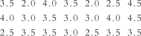
Refer to the stem-
and- leaf plot you created for part (a). Does it depict a symmetric or a skewed distribution?
Applying the Concepts
Question 2.33
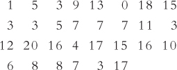
Frequency tables, histograms, and the National Survey of Student Engagement: The National Survey of Student Engagement (NSSE) surveys freshmen and seniors about their level of engagement in campus and classroom activities that enhance learning. Hundreds of thousands of students at almost 1000 schools have completed surveys since 1999, when the NSSE was first administered. Among the many questions, students were asked how often they were assigned a paper of 20 pages or more during the academic year. For a sample of 19 institutions classified as national universities that made their data publicly available through the U.S. News & World Report Web site, here are the percentages of students who said they were assigned between 5 and 10 twenty-
43
Create a frequency table for these data. Include a third column for percentages.
For what percentage of these schools did exactly 4% of the students report that they wrote between 5 and 10 twenty-
page papers that year? Is this a random sample? Explain your answer.
Create a histogram of grouped data, using six intervals.
In how many schools did 6% or more of the students report that they wrote between 5 and 10 twenty-
page papers that year? How are the data distributed?
Question 2.34
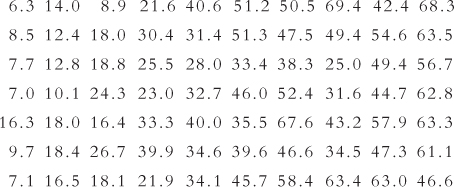
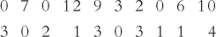
Frequency tables, histograms, and the Survey of Earned Doctorates: The Survey of Earned Doctorates regularly assesses the numbers and types of doctorates awarded at U.S. universities. It also provides data on the length of time in years that it takes to complete a doctorate. Below is a modified list of this completion-
Create a frequency table for these data.
How many schools have an average completion time of 8 years or less?
Is a grouped frequency table necessary? Why or why not?
Describe how these data are distributed.
Create a histogram for these data.
At how many universities did students take, on average, 10 or more years to complete their doctorates?
Question 2.35
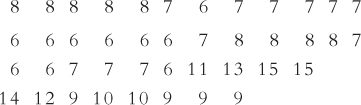
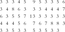
Frequency tables, histograms, polygons, and university acceptance rates: U.S. News and World Report publishes acceptance rates for U.S. universities. Following are the acceptance rates for the top 70 U.S. universities in 2011.
Create a grouped frequency table for these data.
The data have quite a range, with the highest acceptance rates among the top 70 belonging to Yeshiva University in New York, and the lowest belonging to Harvard University. What research hypotheses come to mind when you examine these data? State at least one research question that these data suggest to you.
Create a grouped histogram for these data. Be careful when determining the midpoints of your intervals!
Create a frequency polygon for these data.
Examine these graphs and give a brief description of the distribution. Are there unusual scores? Are the data skewed, and if so, in which direction?
Question 2.36
Frequency tables, histograms, and the basketball wins: Here are the number of wins for the 30 U.S. National Basketball Association teams for the 2012–
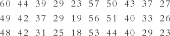
Create a grouped frequency table for these data.
Create a histogram based on the grouped frequency table.
Write a summary describing the distribution of these data with respect to shape and direction of any skew.
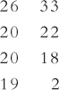
Here are the numbers of wins for the 8 teams in the National Basketball League (NBL) of Canada. Explain why we would not necessarily need a grouped frequency table for these data.
Question 2.37
Types of distributions: Consider these three variables: finishing times in a marathon, number of university dining hall meals eaten in a semester on a three-
Which of these variables is most likely to have a normal distribution? Explain your answer.
Which of these variables is most likely to have a positively skewed distribution? Explain your answer, stating the possible contribution of a floor effect.
Which of these variables is most likely to have a negatively skewed distribution? Explain your answer, stating the possible contribution of a ceiling effect.
Question 2.38
Type of frequency distribution and type of graph: For each of the types of data described below, first state how you would present individual data values or grouped data when creating a frequency distribution. Then, state which visual display(s) of data would be most appropriate to use. Explain your answers clearly.
Eye color observed for 87 people
Minutes used on a cell phone by 240 teenagers
Time to complete the London Marathon for the more than 35,000 runners who participate
Number of siblings for 64 college students
Question 2.39
Number of televisions and a grouped frequency distribution: The Canadian Radio-
Question 2.40
Use the NBL data in Exercise 2.36(d) to create a stem-
Question 2.41
Use the NBA data from Exercise 2.36 to create a stem-
Putting It All Together
Question 2.42
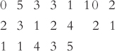
Frequencies, distributions, and numbers of friends: A college student is interested in how many friends the average person has. She decides to count the number of people who appear in photographs on display in dorm rooms and offices across campus. She collects data on 84 students and 33 faculty members. The data are presented below.
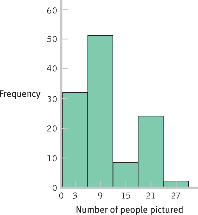
What kind of visual display is this?
Estimate how many people have fewer than 6 people pictured.
Estimate how many people have more than 18 people pictured.
Can you think of additional questions you might ask after reviewing the data displayed here?
Below is a subset of the data described here. Create a grouped frequency table for these data, using seven groupings.
Create a histogram of the grouped data from (e).
Describe how the data depicted in the original graph and the histogram you created in part (f) are distributed.
Use the data in part (e) to create a stem-
and- leaf plot. Refer to the stem-
and- leaf plot you created in (h). Do these data reflect a floor effect or a ceiling effect? Explain your answer.
Question 2.43
Frequencies, distributions, and breast-
Create a frequency table for these data. Include a third column for percentages.
Create a histogram of these data.
Create a frequency polygon of these data.
Create a grouped frequency table for these data with three groups (create groupings around the mid-
points of 2.5 months, 7.5 months, and 12.5 months). Create a histogram of the grouped data.
Create a frequency polygon of the grouped data.
Write a summary describing the distribution of these data with respect to shape and direction of any skew.
If you wanted the data to be normally distributed around 12 months, how would the data have to shift to fit that goal? How could you use knowledge about the current distribution to target certain women?
45
Question 2.44
Developing research ideas from frequency distributions: Below are frequency distributions for two sets of the friends data described in Exercise 2.42, one for the students and one for the faculty members studied.
| Interval | Faculty Frequency | Student Frequency |
|
0– |
21 | 0 |
|
4– |
11 | 26 |
|
8– |
1 | 24 |
| 12– |
0 | 2 |
| 16– |
0 | 27 |
| 20– |
0 | 37 |
| 24– |
0 | 2 |
How would you describe the distribution for faculty members?
How would you describe the distribution for students?
If you were to conduct a study comparing the numbers of friends that faculty members and students have, what would the independent variable be and what would be the levels of the independent variable?
In the study described in (c), what would the dependent variable be?
What is a confounding variable that might be present in the study described in (c)?
Suggest at least two additional ways to operationalize the dependent variable. Would either of these ways reduce the impact of the confounding variable described in (e)?
Question 2.45
Frequencies, distributions, and graduate advising: In a study of mentoring in chemistry fields, a team of chemists and social scientists identified the most successful U.S. mentors—
Construct a frequency table for these data. Include a third column for percentages.
Construct a histogram for these data.
Construct a frequency polygon for these data.
Describe the shape of this distribution.
How did the researchers operationalize the variable of mentoring success? Suggest at least two other ways in which they might have operationalized mentoring success.
Imagine that researchers hypothesized that an independent variable—
the number of publications coauthored by the advisor— predicts the dependent variable of mentoring success. One professor, Dr. Yuan T. Lee, from the University of California at Berkeley, trained 13 future top faculty members. Dr. Lee won a Nobel Prize. Explain how such a prestigious and public accomplishment might present a confounding variable to the hypothesis described above. Dr. Lee had many students who went on to top professorships before he won his Nobel Prize. Several other chemistry Nobel Prize winners in the United States serve as graduate advisors but have not had Dr. Lee’s level of success as mentors. What are other possible variables that might predict the dependent variable of attaining a top professor position?