6.1 The Normal Curve
EXAMPLE 6.1
In this section, we learn more about the normal curve through a real-
52 77 63 64 64
Figure 6-2 shows a histogram of those heights, with a normal curve superimposed on the histogram. With so few scores, we can only begin to guess at the emerging shape of a normal distribution. Notice that three of the observations (63 inches, 64 inches, and 64 inches) are represented by the middle bar. This is why it is three times higher than the bars that represent a single observation of 52 inches and another observation of 77 inches.
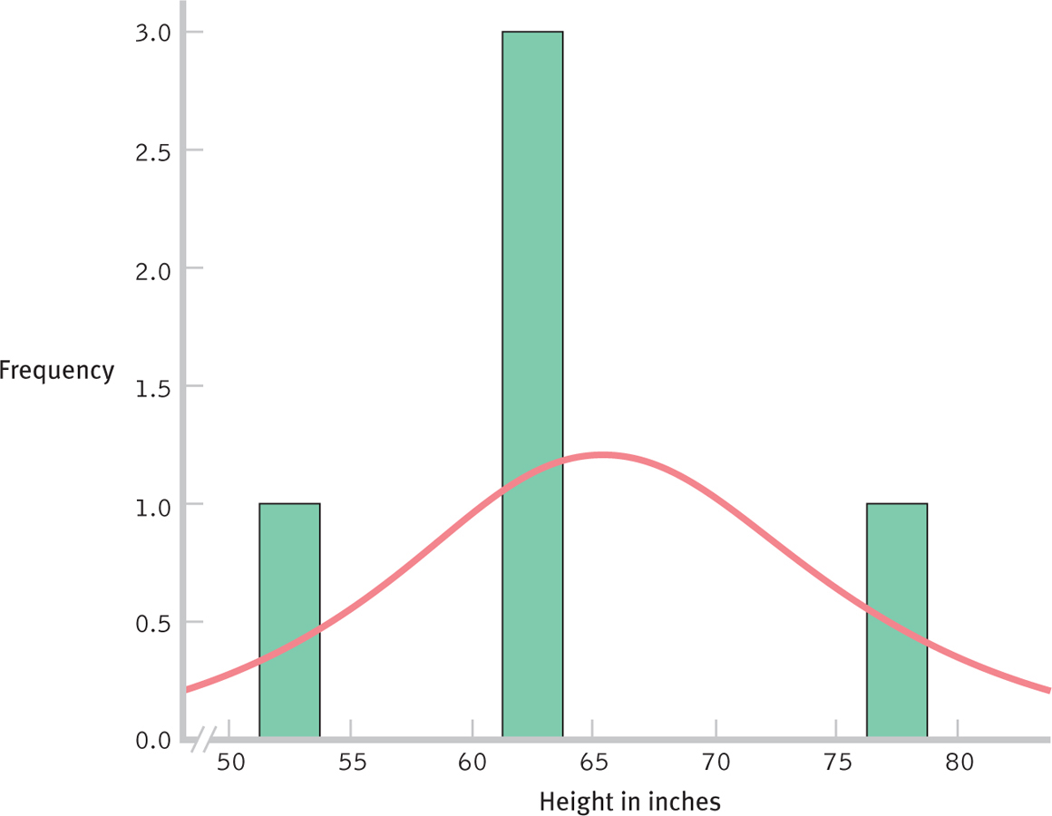
Figure 6-
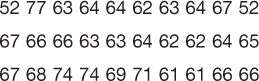
Now, here are the heights in inches from a sample of 30 students:
131
Figure 6-3 shows the histogram for these data. Notice that the heights of 30 students resemble a normal curve more so than do the heights of just 5 students, although certainly they don’t match it perfectly.
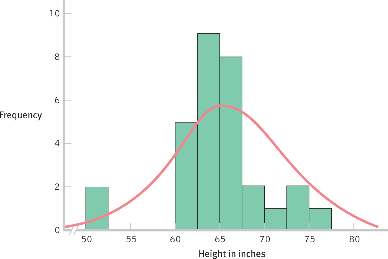
Figure 6-
MASTERING THE CONCEPT
6.1: The distributions of many variables approximate a normal curve, a mathematically defined, bell-
Table 6-1 gives the heights in inches from a random sample of 140 students. Figure 6-4 shows the histogram for these data.
| 52 | 77 | 63 | 64 | 64 | 62 | 63 | 64 | 67 | 52 |
| 67 | 66 | 66 | 63 | 63 | 64 | 62 | 62 | 64 | 65 |
| 67 | 68 | 74 | 74 | 69 | 71 | 61 | 61 | 66 | 66 |
| 68 | 63 | 63 | 62 | 62 | 63 | 65 | 67 | 73 | 62 |
| 63 | 63 | 64 | 60 | 69 | 67 | 67 | 63 | 66 | 61 |
| 65 | 70 | 67 | 57 | 61 | 62 | 63 | 63 | 63 | 64 |
| 64 | 68 | 63 | 70 | 64 | 60 | 63 | 64 | 66 | 67 |
| 68 | 68 | 68 | 72 | 73 | 65 | 61 | 72 | 71 | 65 |
| 60 | 64 | 64 | 66 | 56 | 62 | 65 | 66 | 72 | 69 |
| 60 | 66 | 73 | 59 | 60 | 60 | 61 | 63 | 63 | 65 |
| 66 | 69 | 72 | 65 | 62 | 62 | 62 | 66 | 64 | 63 |
| 65 | 67 | 58 | 60 | 60 | 67 | 68 | 68 | 69 | 63 |
| 63 | 73 | 60 | 67 | 64 | 67 | 64 | 66 | 64 | 72 |
| 65 | 67 | 60 | 70 | 60 | 67 | 65 | 67 | 62 | 66 |
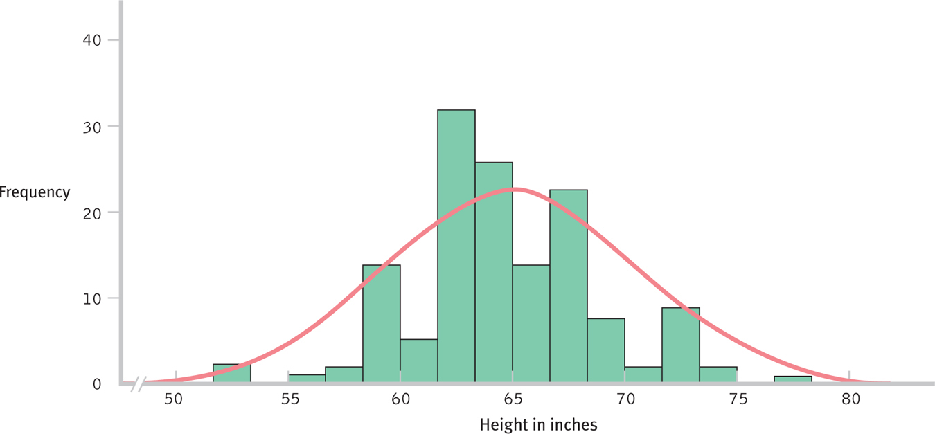
Figure 6-
These three images demonstrate why sample size is so important in relation to the normal curve. As the sample size increases, the distribution more and more closely resembles a normal curve (as long as the underlying population distribution is normal). Imagine even larger samples—
132
133
CHECK YOUR LEARNING
Reviewing the Concepts
- The normal curve is a specific, mathematically defined curve that is bell-
shaped and symmetric. - The normal curve describes the distributions of many variables.
- As the size of a sample approaches the size of the population, the distribution resembles a normal curve (as long as the population is normally distributed).
Clarifying the Concepts
- 6-
1 What does it mean to say that the normal curve is unimodal and symmetric?
Calculating the Statistics
- 6-
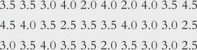
2 A sample of 225 students completed the Consideration of Future Consequences (CFC) scale. The scores are means of responses to 12 items. Overall CFC scores range from 1 to 5.- Here are CFC scores for 5 students, rounded to the nearest whole or half number: 3.5, 3.5, 3.0, 4.0, and 2.0. Create a histogram for these data, either by hand or by using software.
- Now create a histogram for these scores of 30 students:
Applying the Concepts
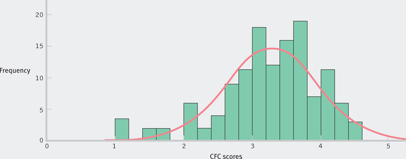
- 6-
3 The histogram below uses the actual (not rounded) CFC scores for all 225 students described in 6-2. What do you notice about the shape of this distribution of scores as the size of the sample increases?
Solutions to these Check Your Learning questions can be found in Appendix D.