Chapter 1. APPENDIX C Chemistry, Math, and Statistics
1. Measurement Units
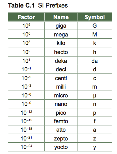
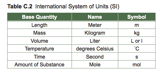
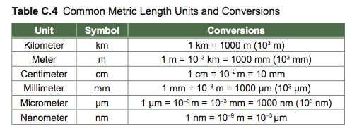
Accurate measurement helps us describe natural objects and phenomena. Measurements used in biology are based on the International System of Units (SI Units): length and weight are measured as multiples or decimal fractions of meters and kilograms, respectively. Know the metric scale and be able to convert between different units.

Basic Math Skills
Significant digits
The number of digits in a measurement indicates the accuracy of the measurement.
How many significant digits do the numbers 3.02, 780, 500, 4.30, .0821, and 16.7 have? If all the values to the left of the decimal place are important, then they all have 3 significant digits. The number 0.0821 only has 3 significant digits because the 0 serves as a placeholder. In scientific notation, 0.0821 is 8.21 × 10⁻².
Whole numbers written without a decimal point may or may not represent accurate significant figures. A trip 500 miles long may be precisely 500 miles long—which makes this a measurement of 3 significant digits, or it may only be accurate to one or two significant digits.
If you multiply or divide numbers, how many digits are significant enough for your answer? For example, you calculate a ratio in Excel by dividing 3.45 g by 12.4 g, and Excel returns the value 0.278226. The greatest number of significant digits that you used for your calculation was 3, so your number should have 3 significant digits and be written as 0.278. If you were adding or subtracting two numbers then your final number may have as many significant digits as any of your input numbers, depending on the accuracy of the values. For example, if you measured 10.44 and you subtracted from it 8.3, then your value is 2.14, not 2.1.
Logarithms
The log base 10 of a number (represented by log10x or log x) is the number to which you raise 10 that will give you that number (x). You can represent it as follows:

Example: if x = 100, then the log 100 is 2 because 10 raised to the power of 2 is 100. In other words, y = log10 100 = 2, because 102 = 100.
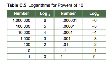
You can guess where the log of a number should fall based on the table of logarithms. If you have a number between 10,000 and 100,000, then you know that the log is greater than 4, but less than 5. If you have a number between .00001 and .0001, then you know that the log of that number is greater than –5, but less than –4.
Introduction to Graphs
Data from tables are often represented as a graph that summarizes and depicts relationships between experimental results. To make graphs clear, accurate, and easy to read, you must label the title and axes, and plot data points carefully; if you are plotting data by hand, use graph paper. Graphs commonly used in biology include scatter graphs, line graphs, and histograms.
A. Scatter and Line Graphs
Graphs are used to compare two or more variables. We will only use graphs that compare two variables (bi-variate graphs) in our introductory labs, but you should be aware that much more complicated graphs are used widely in science. Scatter graphs are generally used to show the relationship between two variables, e.g., height vs. weight. Typical graphs relate one parameter, called the dependent variable, to a second independent variable. The dependent variable is hypothesized to vary as a function of the independent variable.
The independent variable is usually chosen by the person who records the data and creates the graph. In Figure C.1, seedling size changes with time, so size is dependent upon time. The person measuring the growth of the organism may choose to make measurements every day or every week. The time intervals chosen are independent of the growth process itself: time is not affected by the measurements. By convention, the independent variable is plotted on the x-axis (horizontal), and the dependent variable on the y-axis (vertical).
Below, identify the dependent variable and the independent variable.
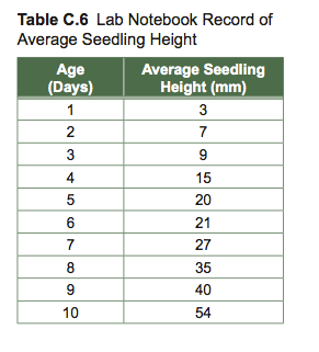
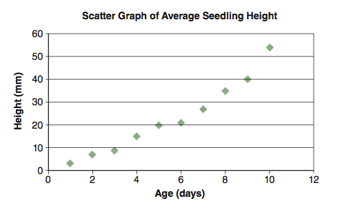
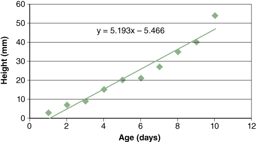
Sometimes it is useful to obtain a linear expression of the relationship between independent and dependent variables. The method most commonly used to obtain this relationship is called regression. Regression is a statistical technique that expresses the relationship between the independent and dependent variable for a collection of data points. Figure C.2 for example, shows the relationship between average seedling height and age.
The equation for a regression line is: y = mx + b, where “m” is the slope of the regression line (5.1939) and “b” is the y-intercept (5.4667). You can learn more about regression line calculations in textbooks on intro- ductory statistics. Excel will insert a trendline (regression line) in scatter graphs for you. Plot a graph using Excel and click on the graph twice to select it. Then click on the data series for which you would like to insert a trendline. Once the data points are highlighted, click on “Insert” on the Menu Bar and scroll to “Trendline.” To display the equation for the line, click on “Options” and check “Display Equation.” Click OK.
Self-Test
- Why are graphs widely used to display scientific data?
- Why do we make a distinction between dependent and independent variables?
- Why do you think regression statistics are widely used in science?
- Is there an advantage to using linear regression over “eyeballing” a line through a scatterplot?
- How are a, b, x, and y identified and used in the equation for a straight line?
- How are x and y defined in the regression equation?
B. Histograms
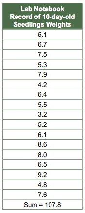
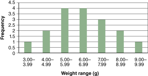
Histograms are a type of bar graph that compares numbers of items, or frequency, with categories. Fre- quency is plotted on the y-axis and the categories in which the data fall are on the x-axis. Figure C.3 is a histogram of seedling weights based on the raw data below.
In Excel, you will need to create a column of “bin” ranges for grouping your data for frequency distributions.
Means and Standard Deviations
Biologists often wish to compare groups, for instance, groups of animals surviving at different resource levels. Imagine we are studying two populations of pocket gophers, rodents that burrow around in the ground eating roots and bulbs. Population 1 is living at a site with lots of wild onions. Population 2 is living in a meadow of grasses without wild onions. We catch 10 adult gophers in each site and weigh them:
Population 1: 40 g, 37, 42, 44, 39, 39, 36, 41, 42, 41.
Population 2: 36 g, 31, 40, 27, 32, 39, 35, 35, 30, 28.
A good statistic for comparing the weight of gophers in the two groups is the mean. The mean is a particular kind of average, one kind among many. It is a useful one when the numbers have a bell-shaped (normal) distribution. The mean is calculated by summing all the numbers in a data set, then dividing this sum by the number of data points entering into the sum. This may be written as x = (∑x)/n, where x is the mean, ∑x is the sum of all the individual numbers, and n is the sample size. Now we can calculate the means for the two populations:
Population 1: Σx=401, n=10, x=40.1.
Population 2: Σx=333, n=10, x=33.3.
Population 2 has gophers that are about 17% lighter, which is consistent with the interpretation that eating onions makes for healthy gophers, while eating grass makes for scrawny gophers.
We are also interested in how variable the gophers are from the two sites. The standard deviation, s, is the statistic used to describe variation in numbers that have a normal distribution. It is calculated by considering the amount each weight differs from the mean weight, and then doing some tedious arithmetic to add up these differences. In the computer age, everyone calculates s on calculators. All “scientific calculators” have a standard deviation button (usually labeled s, or sometimes σ–1):
Population 1: s=2.42.
Population 2: s=4.42.
It appears that the population with the scrawnier gophers also has more variation in gopher weight—perhaps because when resources are scarce some gophers dominate others, and the fat get fatter while the thin get even thinner.
Experiments and Standard Errors
When comparing groups, especially when sample sizes are low, it is crucial that one consider the amount of uncertainty in one’s comparison. Imagine that we want to determine whether the number of flies fed to a Venus flytrap (a carnivorous plant) affects its growth. To find out, we take a number of Venus flytrap seedlings and randomly assign each one to a group being fed no flies, a few flies, or lots of flies. Then we weigh all the plants six months later. Our data are a bunch of numbers representing the weight of each plant:
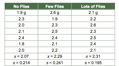
The means are ordered as we might predict: the plants seem to grow larger when they are fed more flies. However, looking only at the means can be misleading. One would not expect the means to be exactly the same even if there weren’t a fly effect. Individual Venus flytraps grow to be different sizes for innumerable reasons that have nothing to do with fly availability, so means will differ to some (small) degree by chance alone.
The most general statistic used in reporting uncertainty is the standard error, sx, which is the standard deviation (s) divided by the square root of the sample size (√n), i.e., sx = s/√n. The standard deviation is a measure of how variable the response is within a treatment group, i.e., how much Venus flytrap weight varies when fly availability is held constant. It makes sense that the less variable the response within treatments (low s), the more confident one is that apparent differences between treatments are real. It also makes sense that the more replicates one studies (larger √n), the more confident one should be of apparent differences. We can now calculate the standard error of each mean, and we can add and subtract this value from the mean:

And we can graph means ± standard errors in plant weight. It is traditional for the treatments to be plotted along the horizontal axis, and the responses to be plotted along the vertical axis.
We are now in a position to be more comfortable drawing conclusions about the effect of fly availability on Venus flytrap growth. A general rule of thumb is that if standard errors overlap, one is not convinced that the means are different, while if they do not overlap, they may be different. Notice the considerable overlap between the few-flies treatment and the lots-of-flies treatment. It appears that flies are good for growth, though perhaps a few flies are all that can be used. A more formal and precise test is possible and desirable, but will not be discussed here. Such a test would use standard errors as its starting point. The standard error is the most fundamental and versatile statistic of uncertainty. For this reason, standard errors are the most often used statistics of uncertainty on graphs comparing means.
X² Goodness-of-Fit Test
One often wishes to compare experimental results or observations in nature against some expectation, for instance a 1:1 sex ratio. If one has results in the form of frequencies (numbers of items in two or several classes), then this can be done with a χ2goodness-of-fit test. Suppose we went out and observed wasps as they emerged from their pupal cases and counted numbers of males and numbers of females, obtaining the following results:

We gave up gathering data after 62 wasps. Now we want to compare our observed counts to counts that we would expect given a 1:1 sex ratio. To calculate expected numbers for each sex, we multiply our expected proportions for each sex, 0.5 for males and 0.5 for females, by the total number of wasps (62):

It seems our observed frequencies do not match our expectations, but perhaps the observed deviation is due to chance alone.
We want to know if it is likely that this deviation from our expectations is due to chance, or if this deviation is so great that it is unlikely that it is due solely to chance. We therefore calculate χ2 by the following formula:

For each of our two classes (males and females), we find the difference between the observed counts and the expected counts, square this difference, and divide by the expected (to standardize); these numbers are added up across all classes (just two in this example). It makes sense that the bigger the differences between observed and expected, the more impressed we are by the deviation from expectation. For our wasps, χ2 = 8.258 + 8.258 = 16.516.
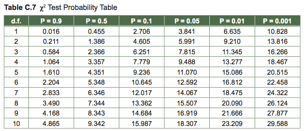
To test the statistical significance of χ2, we look up our calculated value in a table. By convention, statistical significance is taken to mean that there is less than a 0.05 probability (i.e., 5/100) that a deviation is due to chance alone. In this example, we had 1 degree of freedom (d.f.)—there were two classes, and if one sex deviated in one direction, the other sex had to deviate in the other direction. In general, degrees of freedom equals number of classes minus 1. In the table under 1 d.f., we find that 16.516 is larger than 10.828, the number tabled under P = 0.001. P represents the probability of such a result occurring by chance. Our analysis tells us there is less than one chance in a thousand that we would have observed a sex ratio this unbalanced if in fact wasp sexes were 1:1. We therefore conclude that they are not 1:1.
The goodness-of-fit test is easily generalizable to expectations of other than 0.5 and to more than two class- es. Imagine we are studying birds nesting in three types of nest box: type 1 has one nest hole, type 2 has two nest holes, and type 3 has four nest holes. Our expectation for the relative number of birds nesting in each type of nest box would be 1:2:4, or 1/7 (=0.143), 2/7 (=0.286), and 4/7 (=0.571). After counting the number of birds in many nest boxes, we could multiply the expected proportions by the total number of nesting birds to get expected counts. We could then compute (obs – exp)2/exp for each of the three classes, add these all up to get χ2, and look up this χ2 value in the table with 2 d.f. (three classes minus one) to get a P value.
Table of χ2 values: To look up a P value, find the line for your d.f., find the entry that is minimally smaller than your computed χ2 value, and read up to that column’s heading; your P value is less than the number written there. For instance, given an χ2 = 6.92 with 1 d.f., P < 0.01.
