REGION
3.1
LEARNING OBJECTIVE
Describe the regional patterns of population characteristics and how these are distributed spatially and change over time.
The principal characteristics of human populations— their densities, spatial distributions, age and gender structures, the ways they increase and decrease, and how rapidly population numbers change—vary enormously from place to place. Understanding the demographic characteristics of populations, and why and how they change over time, gives us important clues to their cultural characteristics.
POPULATION DISTRIBUTION AND DENSITY
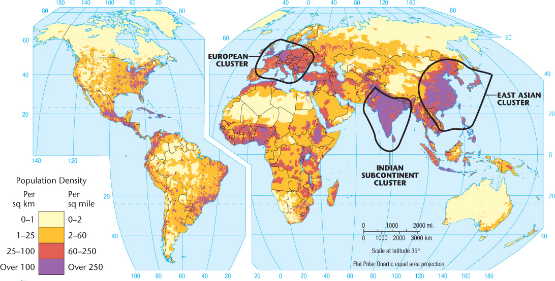
If the 7,100,000,000 inhabitants of the Earth were evenly distributed across the land area, the population density would be about 125 persons per square mile (48 per square kilometer). However, people are very unevenly distributed, creating huge disparities in density. Mongolia, for example, has 5.2 persons per square mile (2 per square kilometer), whereas Bangladesh has 2897 persons per square mile (1118 per square kilometer) (Figure 3.1).
population density
A measurement of population per unit area (e.g., per square mile).
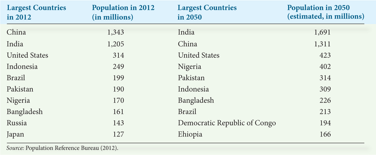
If we consider the distribution of people by continents, we find that 70.2 percent of the human race lives in Eurasia—Europe and Asia. The continent of North America is home to only 7.7 percent of all people, Africa to 15.2 percent, South America to 5.6 percent, and Australia and the Pacific islands to 0.5 percent. When we consider population distribution by country, we find that 19 percent of all humans reside in China, 17 percent in India, and only 4.4 percent in the third-largest nation in the world, the United States (Table 3.1).
For analyzing data, it is convenient to divide population density into categories. For example, in Figure 3.1, one end of the spectrum contains thickly settled areas having 250 or more persons per square mile (100 or more per square kilometer); on the other end, largely unpopulated areas have fewer than 2 persons per square mile (less than 1 per square kilometer). Moderately settled areas, with 60 to 250 persons per square mile (25 to 100 per square kilometer), and thinly settled areas, inhabited by 2 to 60 persons per square mile (1 to 25 per square kilometer), fall between these two extremes. These categories create formal demographic regions based on the single trait of population density. As Figure 3.1 shows, a fragmented crescent of densely settled areas stretches along the western, southern, and eastern edges of the huge Eurasian continent. Two-thirds of the human race is concentrated in this crescent, which contains three major population clusters: eastern Asia, the Indian subcontinent, and Europe. Outside of Eurasia, only scattered districts are so densely settled. Despite the image of a crowded world, thinly settled regions are much more extensive than thickly settled ones, and they appear on every continent. Thin settlement characterizes the northern sections of Eurasia and North America, the interior of South America, most of Australia, and a desert belt through North Africa and the Arabian Peninsula into the heart of Eurasia.
95
96
There is more we as geographers want to know about population geography than simply population density. For example, what are people’s standards of living and are they related to population density? Some of the most thickly populated areas in the world have the highest standards of living—and even suffer from labor shortages (for example, the major industrial areas of western Europe and Japan). The small principality of Monaco in southern Europe, for instance, is the most densely populated nation in the world; it also ranks among the highest incomes per capita, highest average life expectancies, and lowest unemployment rates. In other cases, thinly settled regions may actually be severely overpopulated relative to their ability to support their populations, a situation usually associated with marginal agricultural lands. Although 1000 persons per square mile (400 per square kilometer) is a “sparse” population for an industrial district, it is “dense” for a rural area. For this reason, carrying capacity—the population beyond which a given environment cannot provide support without becoming significantly damaged—provides a far more meaningful index of overpopulation than density alone. Often, however, it is difficult to determine carrying capacity until the region under study is near or over the limit.
carrying capacity
The maximum number of people that can be supported in a given area.
97
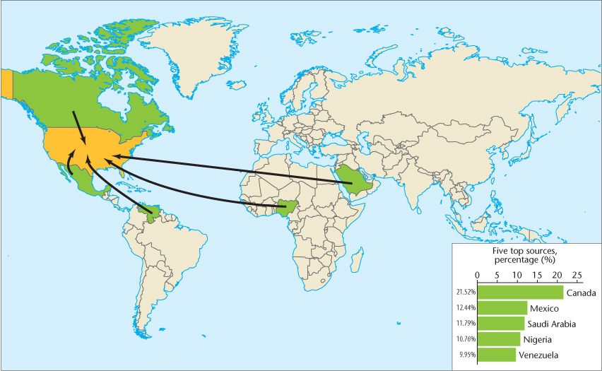
Sometimes the carrying capacity of one place can be expanded by drawing on the resources of another place. Americans, for example, consume far more food, products, and natural resources than do most other people in the world: 26 percent of the entire world’s petroleum, for instance, is consumed in the United States (Figure 3.2). The carrying capacity of the United States would be exceeded if it did not annex the resources—including the labor—of much of the rest of the world.
A critical feature of population geography is the demographic changes that occur over time. Analyzing these gives us a dynamic perspective from which we can glean insights into cultural changes occurring at local, regional, and global scales. Populations change primarily in two ways: people are born and others die in a particular place, and people move into and out of that place. The latter refers to migration, which we will consider later in this chapter. For now we discuss births and deaths, which can be thought of as additions to and subtractions from a population. They provide what demographers refer to as natural increases and natural decreases.
PATTERNS OF NATALITY
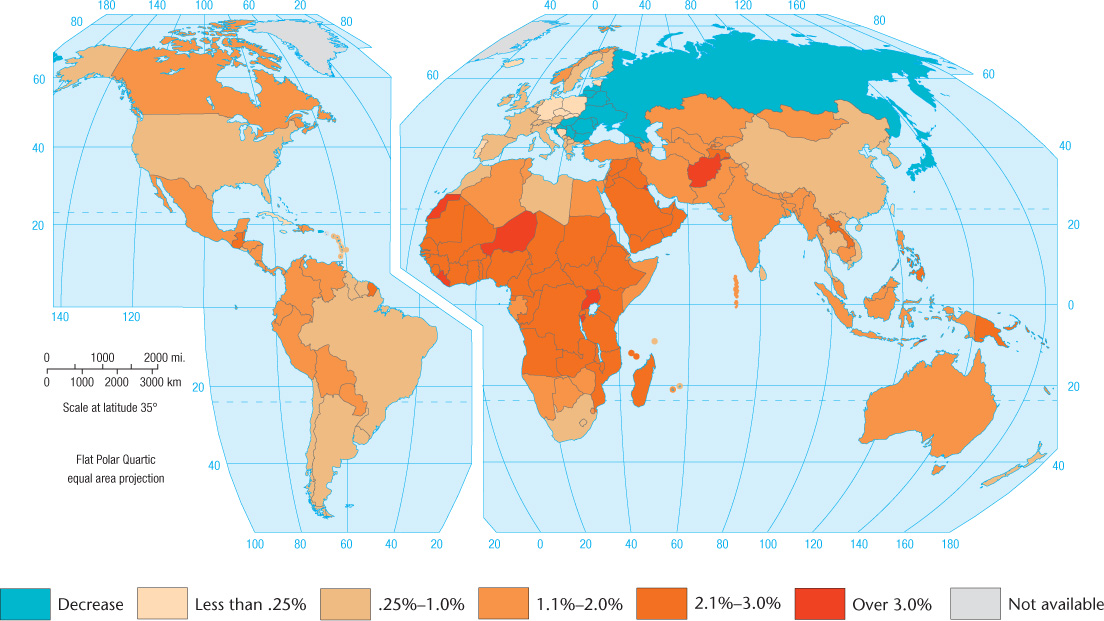
Births can be measured by several methods. The older way was simply to calculate the birth rate: the number of births per year per thousand people (Figure 3.3).
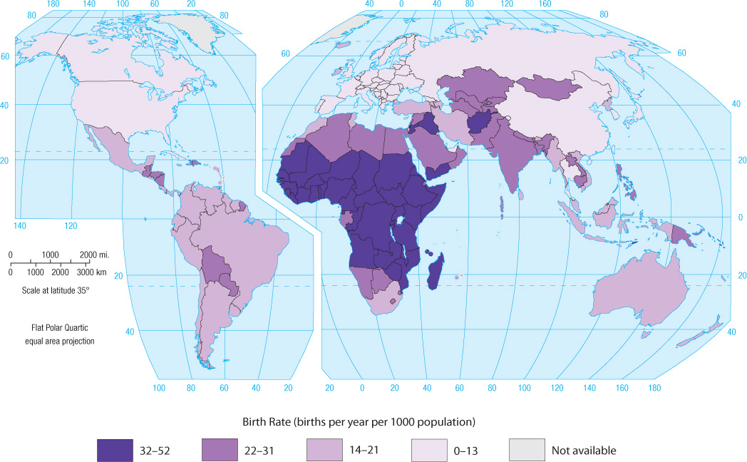
More revealing is the total fertility rate (TFR), which is measured as the average number of children born per woman during her reproductive lifetime, considered to be from 15 to 49 years of age (with some countries having a younger upper-age limit of 44 years of age). The TFR is a more useful measure than the birth rate because it focuses on the female segment of the population, reveals average family size, and gives an indication of future changes in the population structure. A TFR of 2.1 is needed to produce a stabilized population over time, one that does not increase or decrease. Once achieved, this condition is called zero population growth.
total fertility rate (TFR)
The number of children the average woman will bear during her reproductive lifetime (15–44 or 15–49 years of age). A TFR of less than 2.1, if maintained, will cause a natural decline of population.
zero population growth
A stabilized population created when an average of only two children per couple survive to adulthood. Eventually, the number of deaths equals the number of births.
98
The TFR varies markedly from one part of the world to another, revealing a vivid geographical pattern (Figure 3.4). In southern and eastern Europe, the average TFR is only 1.3. Every country with a TFR of 2.0 or lower will eventually experience population decline. Bulgaria, for example, has a TFR of 1.2 and is expected to lose 38 percent of its population by 2050. Taiwan and Latvia are tied at 1.1 for the lowest total fertility rate in the world in 2012.
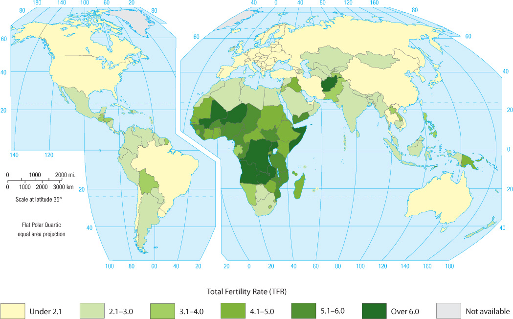
By contrast, sub-Saharan Africa has the highest TFR of any sizable part of the world, led by Niger with 7.1 as of 2014. Elsewhere in the world, only Afghanistan can rival the sub-Saharan African rates. However, according to the World Bank, during the past two decades TFRs have fallen in all sub-Saharan African nations.
THE GEOGRAPHY OF MORTALITY
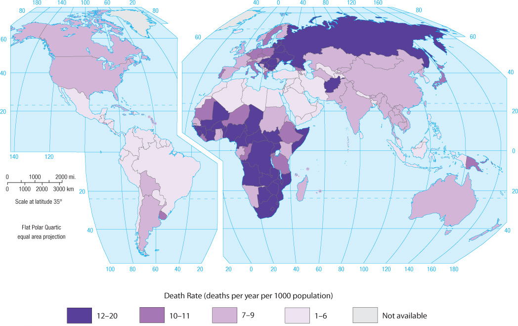
Another way to assess demographic change is to analyze death rates: the number of deaths per year per 1000 people (Figure 3.5). Of course, death is a natural part of the life cycle, and there is no way to achieve a death rate of zero. But geographically speaking, death comes in different forms. In the developed world, most people die of age-induced degenerative conditions, such as heart disease, or from maladies caused by industrial pollution of the environment. Many types of cancer fall into the latter category. By contrast, contagious diseases such as malaria, HIV/AIDS, and diarrheal diseases are a leading cause of death in poorer countries. Civil warfare, inadequate health services, and the age structure of a country’s population will also affect its death rate.
death rate
The number of deaths per year per 1000 people.
99
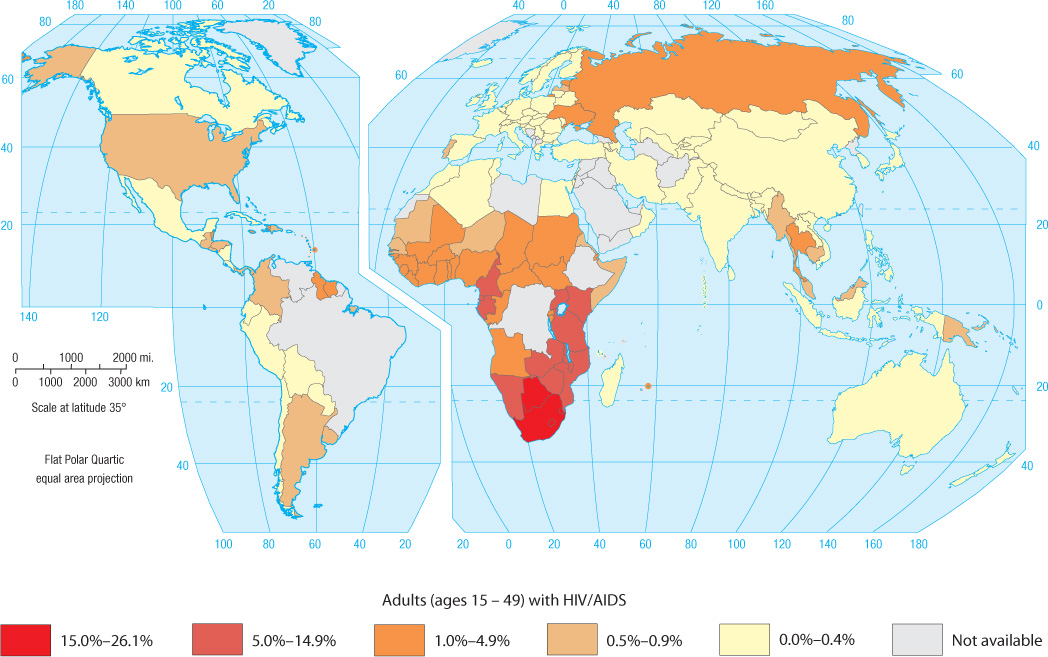
Some of the world’s highest death rates occur in sub-Saharan Africa, the poorest world region and most afflicted by life-threatening diseases and civil strife (Figure 3.6 illustrates the geography of HIV/AIDS). Ingenrral, deathratesof more than 20 per 1000 people are uncommon today. The world’s highest death rate as of 2013—just over 17 per 1000 people—was found in South Africa, and is primarily the result of a very high prevalence of HIV/AIDS. South Africa is the country with the highest HIV/AIDS prevalence in the world. High death rates are also found in eastern European nations—with Ukraine, Bulgaria, and Russia, for instance, ranked second, eighth, and tenth in the world in 2013—thanks to a collapsing public health care system in the post-Soviet era, environmental contamination and increased cancer incidence, poor health choices including smoking and alcohol consumption, and very high rates of diseases such as tuberculosis and HIV/AIDS.
By contrast, the American tropics generally have rather low death rates, as does the desert belt across North Africa, the Middle East, and central Asia. In these regions, the predominantly young population suppresses the death rate. Compared to South Africa, Paraguay’s death rate of only 4.6 per 1000 seems quite low. Because of its older population structure, the average death rate in the European Union is 10.5 per 1000. Australia, Canada, and the United States, which continue to attract young immigrants, have lower death rates than most of Europe. Canada’s death rate, for instance, is slightly less than 8 people per 1000.
100
THE DEMOGRAPHIC TRANSITION
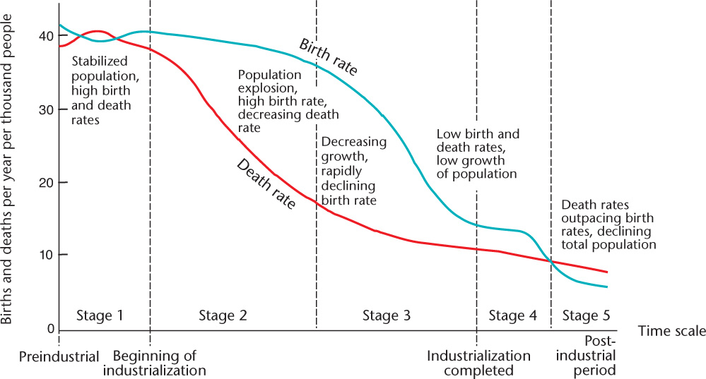
All industrialized, technologically advanced countries have low fertility ratesand stabilized or declining populations, having passed through what is called the demographic transition (Figure 3.7). In preindustrial societies, birth and death rates were both high, resulting in almost no population growth. Because these were agrarian societies that depended on family labor, many children meant larger workforces, thus the high birth rates. But low levels of public health and limited access to health care, particularly for the very young, also meant high death rates. With the coming of the industrial era, medical advances and improvements in diet set the stage for a drop in death rates. Human life expectancy in industrialized countries soared from an average of 35 years in the eighteenth century to 75 years or more at present. Yet, birth rates did not fall so quickly, leading to a population explosion as fertility outpaced mortality. In Figure 3.7, this is shown in late stage 2 and early stage 3 of the model. Eventually, a decline in the birth rate is followed the decline in the death rate, slowing population growth. An important reason leadingto lower fertility levels involves the high cost of children in industrial societies, particularly because childhood itself becomes a prolonged period of economic dependence on parents. Finally, in the postindustrial period, the demographic transition produced zero population growth or actual population decline (Figure 3.7 and Figure 3.8).
demographic transition
Describes themovementfrom highbirthanddeath ratestolowbirth and death rates.
101
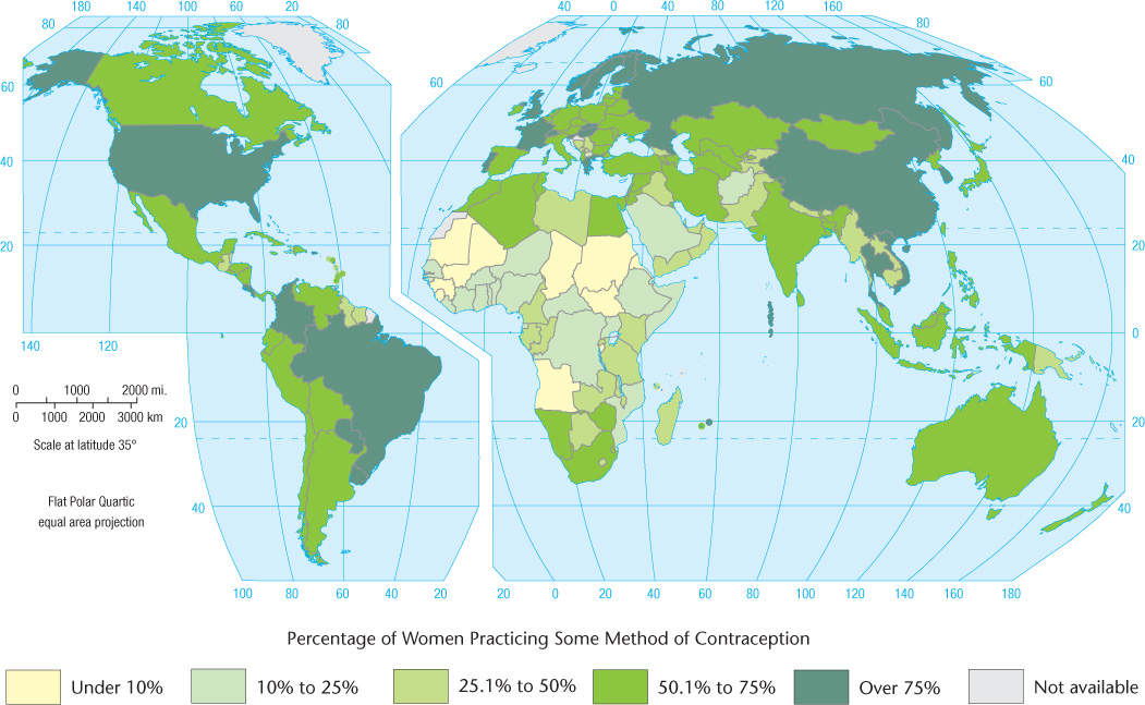
Achieving lower death rates is relatively cost effective, historically requiring little more than the provision of safe drinking water and vaccinations against common infectious diseases. Lowering death rates tends to be uncontroversial and quickly achieved, demographically speaking. Getting birth rates to fall, however, can be far more difficult, especially for a government official who wants to be reelected. Birth control, abortion, and challenging long-held beliefs about family size can prove quite controversial, and political leaders may be reluctant to legislate them. Indeed, the Chinese implementation of its one-child-per-couple policy (see Subject to Debate, page 105) probably would not have been possible in a country with a democratically elected government. In addition, because it involves changing a cultural norm, the idea of smaller families can take three or four generations to become a reality. Increased educational levels for women are closely associated with falling fertility levels, as is access to various contraceptive devices (Figure 3.9).
The demographic transition is a model that predicts trends in birth rates, death rates, and overall population levels in the abstract. Yet, like many models used by demographers, it is based on the historical experience of western Europe: it is Eurocentric. It does a good job of describing changes in population patterns over time in Europe, as well as in other wealthy regions. However, it has several shortcomings. First is the inexorable stage-by-stage progression implicit in the model. Have countries or regions ever skipped a stage or regressed? Certainly. The case of China shows how policy, in this case government-imposed restrictions on births, can fast-forward an entire nation to stage 4 (again, see the Subject to Debate feature). War, too, can cause a returnto anearlier stage in the model by increasing deathrates. For instance, Angola and Afghanistan are two countrieswithrecent histories of conflict; both had topped the world’s death rate list until recently. In other cases, wealth has not led to declining fertility. Thanks to oil exports, residents of Oman enjoy relatively high average incomes. But fertility, too, remains relatively high at nearly 3 children per woman in 2013. Indeed, the Population Reference Bureau has pointed to a “demographic divide” between countries where the demographic transition model applies well, and others—mostly poorer countries or those experiencing widespread conflict or disease—where birth and death rates do not necessarily follow the model’s predictions. Even in Europe, there are countries where fertility has dropped precipitously, while at the same time death rates have escalated. In countries such as Russia, which, according to Peter Coclanis, has “somehow managed to reverse the so-called demographic transition,” the model itself must be questioned.
Eurocentric
Using the historical experience of Europe as the benchmark for all cases.
102
103
AGE DISTRIBUTIONS
Some countries have overwhelmingly young populations. Inamajority of countries in Africa, as well as some countries in Latin America and tropical Asia, close to half the population is younger than 15 years of age (Figure 3.10). In Uganda, for example, 51 percent of the population is younger than 15 years of age. In sub-Saharan Africa, 44 percent of all people are younger than 15. Other countries, generally those that industrialized early, have a preponderance of middle-aged people in the over 15–under 65 age bracket. A growing number of affluent countries have remarkably aged populations. In Germany, for example, fully 21 percent of the people have now passed the traditional retirement age of 65. Many other European countries are not far behind. A sharp contrast emerges when Europe is compared with Africa, Latin America, or parts of Asia, where the average person never even lives to age 65. In Mauritania, Niger, Afghanistan, Guatemala, and many other countries, only 2 to 3 percent of the population have reached that age.
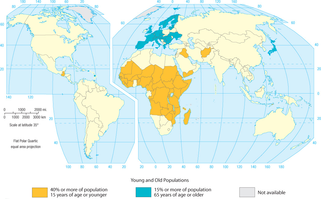
Countries with disproportionate numbers of old or young people often address these imbalances in innovative ways. Italy, for example, has one of the lowest birth rates in the world, with a TFR of only 1.4. In addition, Italy’s population is one of the oldest in the world: 20.5 percent of its population is age 65 or older. As a result of both its TFR and age distribution, Italy’s population is projected to shrink by 10 percent between 2010 and 2050. Of course, immigrants to Italy from other countries can and no doubt will counteract this trend, but that will lead to contentious political and cultural debates.
104
Given that the Italian culture does not embrace the institutionalization of the growing ranks of its elderly, and faced with the reality that more Italian women than ever work outside the home and thus few adult women are willing or able to stay at home full time to care for their elders, Italians have gotten creative. Elderly ltalians can apply for adoption by families in need of grandfathers or grandmothers. Frances D’Emilio recounts the experience of one such man, Giorgio Angelozzi, who moved in with the Rivas, a Roman family with two teenagers. Angelozzi said that Marlena Riva’s voice reminded him of his deceased wife, Lucia, and this is what convinced him to choose the Riva family. Dagmara Riva, the family’s teenage daughter, said that Mr. Angelozzi has helped her with Latin studies and that “Grandpa is a person of great experience, an affectionate person. We’re very happy we invited him to live with us.”
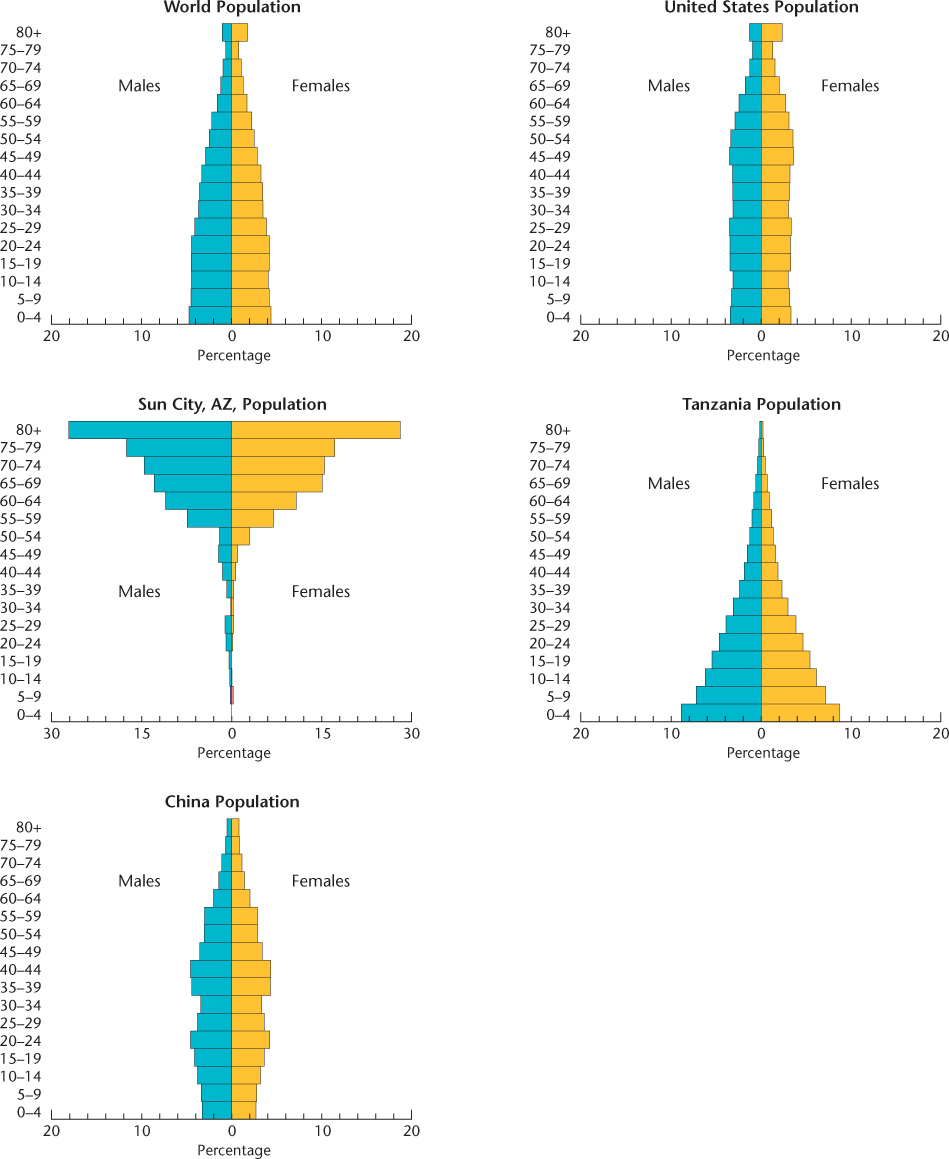
Age structure also differs spatially within individual countries. For example, rural populations in the United States and many other countries are usually older than those in urban areas. The flight of young people to the cities has left some rural counties in the midsection of the United States with populations whose median age is 45 or older. Some warm areas of the United States have become retirement havens for the elderly; parts of Arizona and Florida, for example, have populations far above the average age. Communities such as Sun City near Phoenix, Arizona, legally restrict residence to the elderly (Figure 3.11). In Great Britain, coastal districts have a much higher proportion of elderly than does the interior, suggesting that the aged often migrate to seaside locations when they retire. (Figure 3.11 with caption)

105
Subject To Debate: FEMALE: An Endangered Gender?
Subject To Debate
FEMALE: An Endangered Gender?
Does the simple fact of being female expose a person to demographic peril? In most societies, women are viewed as valuable, even powerful, particularly as mothers, nurturers, teachers, and spiritual leaders. Yet in other important ways, to be female is to be endangered. We will consider this controversial idea with an eye to how demographics and culture closely shape each other.
Many cultures demonstrate a marked preference for males. The academic term describing this is androcentrism; you may know it as patriarchy, male bias, or simply sexism. Whether a preference for males is a feature of all societies has been disputed. Some societies pass along forms of their wealth, property, and prestige from mother to daughter, rather than from father to son. This is rare, however, and it is clear that the roots of the cultural preference for males are historically far-reaching and widespread. In most societies, positions of economic, political, social, and cultural prestige and power are held largely by men. Men typically are considered to be the heads of households. Family names tend to pass from father to son, and with them, family honor and wealth. In traditional societies, when sons marry, they usually bring their wives to live in their parents’ house and are expected to assume economic responsibility for aging parents.
For all of these reasons, in many places a cultural premium is placed on producing male children. Because couples often can choose to have more children, having a girl first is usually not a problem. However, in countries that have enacted strict population control programs, couples may not be given the chance to try again for a male child. This has resulted in severe pressures on couples to have boys in some countries, particularly in China and India. In both these nations, female-specific infanticide or abortion has resulted in a growing gender imbalance. Ultrasound devices that allow gender identification of fetuses are now available even to rural peasants in China. About 100,000 such devices were in use as early as 1990 in China, and by the middle of that decade there were 121 males for every 100 females among children two years of age or younger. The sex ratio in China is radically changing, and a profound gender imbalance exists there: in 2011 there were 833 girls for every 1000 boys. The naturally occurring sex ratio is 952 girls for every 1000 boys. In India, too, there were only 914 girls per 1000 boys in 2011. In some states the imbalance is even worse: in Punjab, for instance, it is 830 to 1000.
The cultural ramifications of such male-heavy populations are potentially profound. Men of marriageable age are increasingly unable to find female partners. Social analysts speculate that this will lead to human trafficking and violence against women, and this is already the case in India where girls are kidnapped or trafficked in from neighboring Nepal and Myanmar. In China, the policy of one child per couple has resulted in the so-called four-two-one problem. This refers to the fact that the generational structure of many families now reflects four grandparents, two parents, and a single male child. This places enormous pressures on the shoulders of the male child to care for aging parents and grandparents. It also encourages parents and grandparents to lavish all their attention, wealth, and hopes on the only child. For some families, this has led to the “little emperor syndrome,” whereby the male heir becomes spoiled, unable to cope independently, and even obese.
Continuing the Debate
As noted, most societies value females and males equally. For a number of reasons, however, some societies show a clear preference for males. Keeping all this in mind, consider the following questions:
•Are Chinese families somewhat justified in emphasizing the birth of a son at all costs?
•According to a recent report, Americans using technology to select their baby’s gender, unlike the Chinese, more often choose to have a girl. Why do you think there is a difference between male and female preference in these two societies?

106
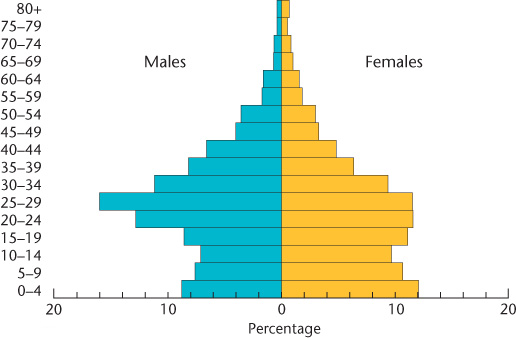
A very useful graphic device for comparing age characteristics is the population pyramid (Figure 3.12). Careful study of such pyramids not only reveals the past progress of birth control but also allows geographers to predict future population trends. Youth-weighted pyramids, those that are broad at the base, suggest the rapid growth typical of the population explosion. What’s more, broad-based population pyramids not only reflect past births but also show that future growth will rely on the momentum of all those young people growing into their reproductive years and having their own families, regardless of how small those families may be in contrast to earlier generations. Those population pyramids with more of a cylindrical shape represent countries approaching population stability or those in demographic decline. A quick look at a country’s population pyramid can tell volumes about its past as well as its future. How many dependent people—the very old and the very young—live there? Has the country suffered the demographic effects of genocide or a massive disease epidemic (Figure 3.13)? Are significantly more boys than girls being born? These questions and more can be explored at a glance using a population pyramid.
population pyramid
A graph used to show the age and sex composition of a population.
THE GEOGRAPHY OF GENDER
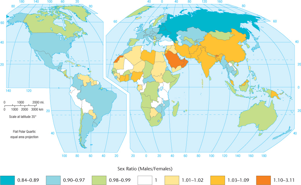
Although the human race is divided almost evenly between females and males, geographical differences do occur in the sex ratio: the ratio between men and women in a population (Figure 3.14). Slightly more boys than girls are born, but infant boys have slightly higher mortality rates than do infant girls. Recently settled areas typically have more males than females, as is evident in parts of Alaska, northern Canada, and tropical Australia. According to the U.S. Census Bureau, in 2010 there were 108 males for every 100 of Alaska’s female inhabitants. Some poverty-stricken parts of South Africa are as much as 59 percent female. Prolonged wars reduce the male population. And, in general, women tend to outlive men. The population pyramid is also useful in showing gender ratios. Note, for instance, the larger female populations in the upper bars for the United States in Figure 3.12.
sex ratio
The numerical ratio of females to males in a population.
Beyond such general patterns, gender often influences demographic traits in specific ways. Often gender roles—culturally specific notions of what it means to be a man and what it means to be a woman—are closely tied to how many children are produced by couples. In many cultures, women are considered more womanly when they produce many offspring. Butho eame token, men are seen as more manly when they father many children. Because the raising of children often falls to women, the spaces that many cultures associate with women tend to be the private family spaces of the home. Public spaces such as streets, plazas, and the workplace, by contrast, are often associated with men. Some cultures go so far as to restrict where women and men may and may not go, resulting in a distinctive geography of gender, as Figure 3.15 illustrates (take a look at Seeing Geography, page 133). Falling fertility levels that coincide with higher levels of education for women, however, have resulted in numerous challenges to these cultural ideas of male and female spaces. As more and more women enter the workplace, for instance, ideas of where women should and should not go slowly become modified. Clearly, gender is an important factor to consider in our exploration of population geography (see also Subject to Debate, page 105, and Patricia’s Notebook, page 110).

gender roles
What it means to be a man or a woman in different cultural and historical contexts.
107
108
109
STANDARD OF LIVING
Various demographic traits can be used to assess standard of living and analyze it geographically. Figure 3.16 is a simple attempt to map living standards using the infant mortality rate: a measure of how many children per 1000 live births die before reaching one year of age. Many experts believe that the infant mortality rate is the best single index of living standards because it is affected by many different factors: health, nutrition, sanitation, access to doctors, availability of clinics, education, ability to obtain medicines, and adequacy of housing. A striking geographical pattern is revealed by the infant mortality rate.
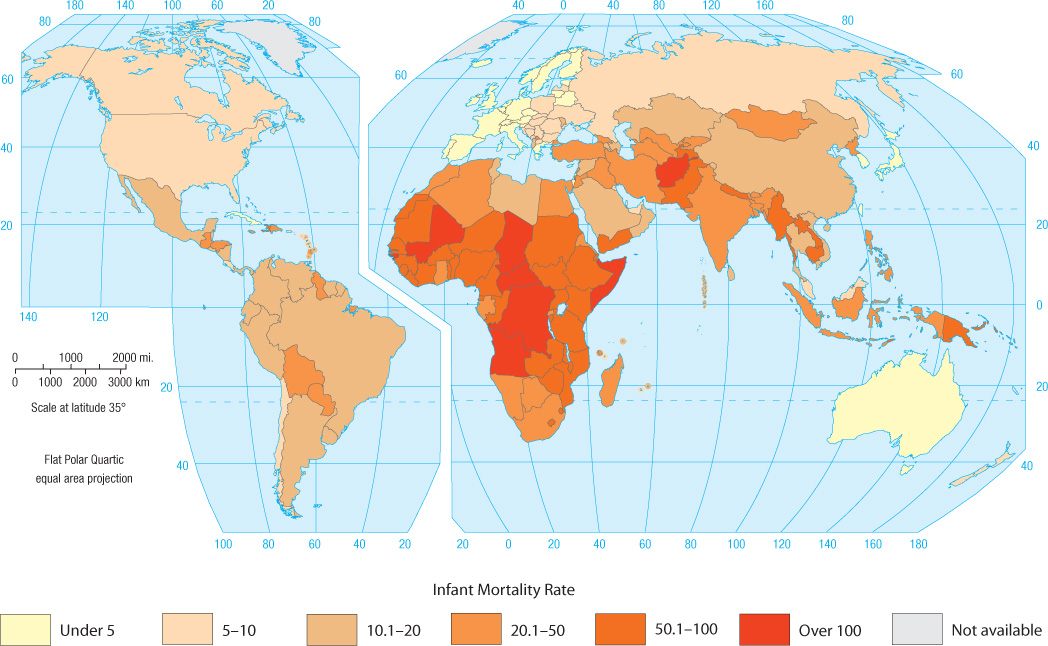
infant mortality rate
The number of infants per 1000 live births who die before reaching one year of age.
Another good measure of quality of life is the United Nations Human Development Index (HDI), which combines measures of literacy, life expectancy, education, and wealth (see Figure 1.11, pages 22–23). The highest possible score is 1.000, and the three top-ranked countries in 2012 were Norway, Australia, and the United States. Examination of the HDI reveals some surprises. If all countries spent equally on those things that improve their HDI rankings, such as education and health care, then we would expect the wealthiest countries to place first on the list. According to the International Monetary Fund, Luxembourg ranked first among 183 ranked nations in wealth as measured by the gross domestic product (GDP) per capita in 2012. Yet, it ranked 26th in the world on the HDI. Compare this to Barbados, which ranked 24th by GDP per capita but came in much higher on the HDI at 6th. Why did Barbados rank higher in living standards than its monetary wealth wouldindicate, whereas Luxembourg ranked lower? We would have to conclude that the government of Barbados places a relative priority on spending for education and health care, whereas the government of Luxembourg does not.
Great Expectations for Female Lawyers
![]() Great Expectations for Female Lawyers
Great Expectations for Female Lawyers
In this video, five women who work at the law firm Debevoise and Plimpton are interviewed. These same women were profiled in The NewYorkTimes Magazine 12 years earlier, when they started their jobs at the firm. In the interviews, they reflect on their careers and how being a woman has affected their professional success. They talk about how other aspects of their lives, such as their race, age, and motherhood, have combined in ways that have both advantaged and disadvantaged them.
Thinking Geographically:
Chapter 3 talks about a geography of gender, wherein women who work outside of the home are seen to be “out of place” What specifics do these women mention regarding feeling out of place, or not, in their jobs?
In Chapter 3 we learned that gender roles change when fertility levels fall and women become more highly educated. In what ways have these women experienced changing gender roles, and in what ways have the expectations and norms around being a woman not changed for them?
Though women make up roughly half of the human population, women are underrepresented relative to men in some professions, such as law. Women also tend to make less than men in equal positions: for the top executive positions, women are paid about $0.82 for every $1.00 that a man in the same job earns. At the end of the video, it is noted that only 4% of top U.S. law firms are led by a woman. What do you think the social as well as the individual consequences of these labor market imbalances may be?
110
Patricia’s Notebook: Demystifying the Sunday Crowds in Hong Kong
Patricia’s Notebook
Demystifying the Sunday Crowds in Hong Kong
![]()
![]()
![]()
![]()
![]()

During a trip to Hong Kong, I was struck by the dense crowds of women that can be seen on Sundays. Some of these gatherings are in public spaces, such as parks. Others are found in city spaces that are usually heavily trafficked during workdays, such as the steps outside large office buildings. The largest crowd that I observed was under the covered walkway of a subway station. Initially, I thought that these women were gathered for a political demonstration of some kind. In Latin America—the world region I’m most familiar with—large gatherings of people almost always mean that a protest march, political rally, or labor strike is about to begin. But there were no men to be seen anywhere in these Hong Kong throngs! In addition, they didn’t seem to be protesting anything. Rather, they happily chatted, ate, styled one another’s hair, and played cards.
Later, I learned that these women were in fact maids enjoying their day off. For several decades now, women from the Philippines have migrated to Hong Kong to work as domestic servants, doing chores for and looking after the children of the families who hire them. Wages in Hong Kong are much higher than back home in the Philippines: a major pull factor. However, working conditions can be far from ideal, involving hard physical labor and long hours. Reports of abuse of Filipina servants by their employers are numerous. If a servant is fired, she will be deported if she cannot find another job quickly. The stress of long separations from husbands and children back in the Philippines has led to the breakup of families. In addition, some of these women find themselves coerced into Asia’s booming sex industry. Knowing this makes me think twice about these happy-looking women. Though being a domestic servant isn’t a pleasant or highly paid job anywhere in the world, Filipina maids in Hong Kong certainly seem to face a number of pressures, ranging from labor conditions, family circumstances, and the lack of good job alternatives. While the news coverage of domestic servants in the United States seems to be mostly about their status as documented or undocumented workers, there are obviously additional factors to keep in mind. These factors complicated my picture of these women, who, at first glance, seemed happy and carefree as they enjoyed their day off.

111