A.1 Describing Data
LOQ LearningObjectiveQuestion
A-
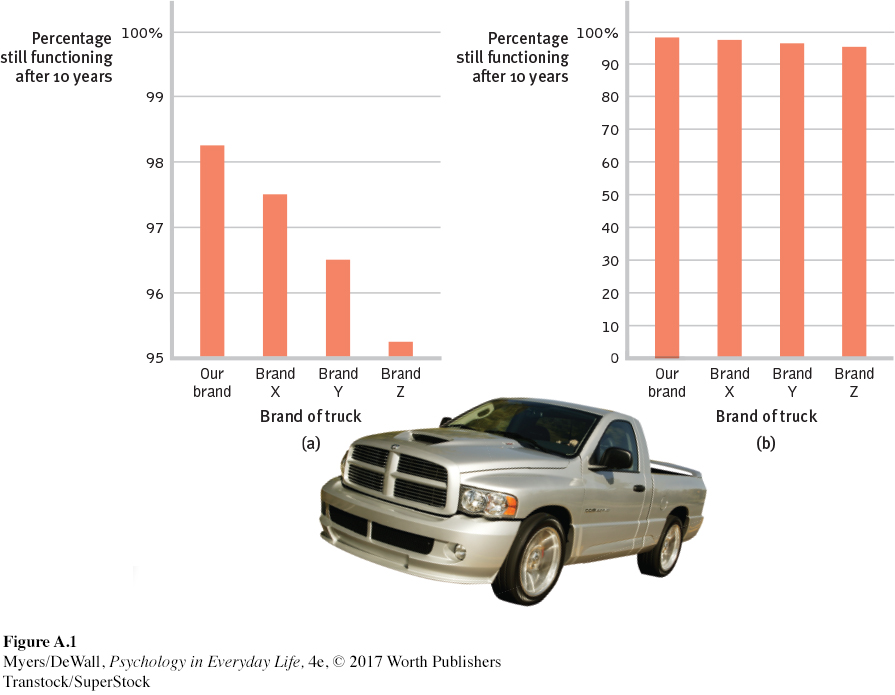
Once researchers have gathered their data, they may organize the data using descriptive statistics. One way to do this is to convert the data into a simple bar graph, as in FIGURE A.1, which displays a distribution of different brands of trucks still on the road after a decade. When reading statistical graphs such as this one, take care. It’s easy to design a graph to make a difference look big (FIGURE A.1a) or small (FIGURE A.1b). The secret lies in how you label the vertical scale (the y-
Retrieve + Remember
Question 15.1
•An American truck manufacturer offered graph (a)—with actual brand names included—
ANSWER: Note how the y-axis of each graph is labeled. The range for the y-axis label in graph (a) is only from 95 to 100. The range for graph (b) is from 0 to 100. All the trucks rank as 95% and up, so almost all are still functioning after 10 years, which graph (b) makes clear.
The point to remember: Think smart. When viewing graphs, read the scale labels and note their range.
Measures of Central Tendency
mode the most frequently occurring score(s) in a distribution.
mean the arithmetic average of a distribution, obtained by adding the scores and then dividing by the number of scores.
median the middle score in a distribution; half the scores are above it and half are below it.
The next step is to summarize the data using some measure of central tendency, a single score that represents a whole set of scores. The simplest measure is the mode, the most frequently occurring score or scores. The most familiar is the mean, or arithmetic average—
The average person has one ovary and one testicle.
Measures of central tendency neatly summarize data. But consider what happens to the mean when a distribution is lopsided, when it’s skewed by a few way-
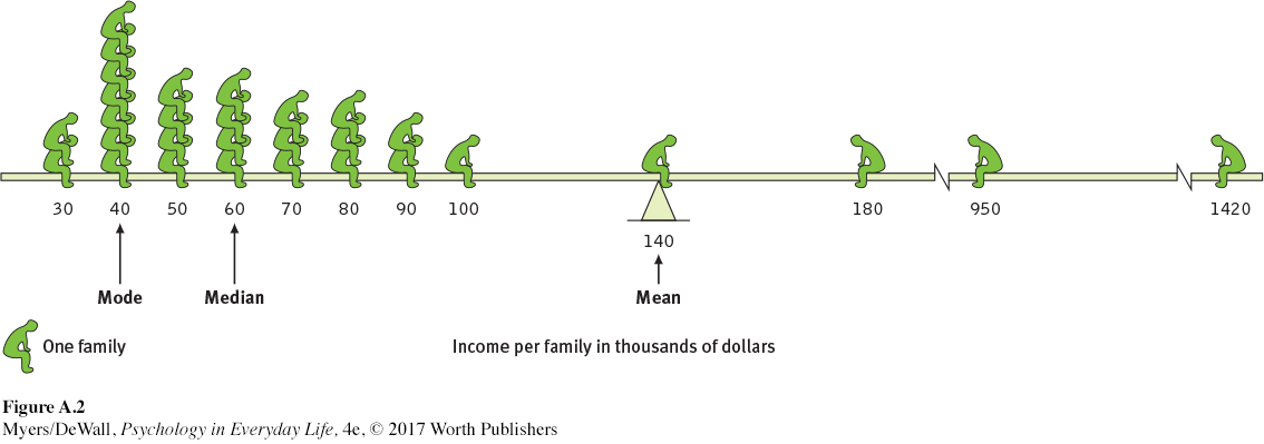
The point to remember: Always note which measure of central tendency is reported. If it is a mean, consider whether a few atypical scores could be distorting it.
Measures of Variation
Knowing the value of an appropriate measure of central tendency can tell us a great deal. But the single number omits other information. It helps to know something about the amount of variation in the data—
range the difference between the highest and lowest scores in a distribution.
The range of scores—
standard deviation a computed measure of how much scores vary around the mean score.
The more useful standard for measuring how much scores deviate from one another is the standard deviation. It better gauges whether scores are packed together or dispersed, because it uses information from each score. The computation1 assembles information about how much individual scores differ from the mean, which can be very telling. Let’s say test scores from Class A and Class B both have the same mean (75 percent), but very different standard deviations (5.0 for Class A and 15.0 for Class B). Have you ever had test experiences like that—
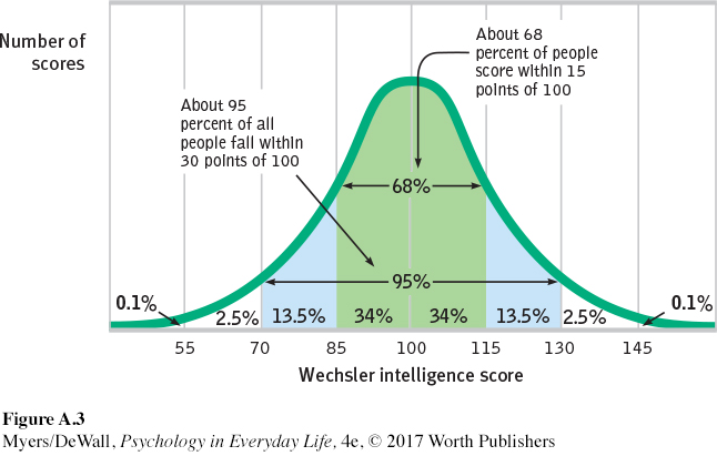
normal curve (normal distribution) a symmetrical, bell-
You can grasp the meaning of the standard deviation if you consider how scores naturally tend to be distributed. Large numbers of data—
As FIGURE A.3 shows, a useful property of the normal curve is that roughly 68 percent of the cases fall within one standard deviation on either side of the mean. About 95 percent of cases fall within two standard deviations. Thus, as Chapter 8 notes, about 68 percent of people taking an intelligence test will score within ±15 points of 100. About 95 percent will score within ±30 points.
Retrieve + Remember
Question 15.2
•The average of a distribution of scores is the ________. The score that shows up most often is the ________. The score right in the middle of a distribution (half the scores above it; half below) is the _________. We determine how much scores vary around the average in a way that includes information about the _________ of scores (difference between highest and lowest) by using the ________ _________ formula.
ANSWERS: mean; mode; median; range; standard deviation
 For an interactive tutorial on these statistical concepts, visit LaunchPad’s PsychSim 6: Descriptive Statistics.
Correlation: A Measure of Relationships
LOQ A-
Throughout this book, we often ask how strongly two things are related: For example, how closely related are the personality scores of identical twins? How well do intelligence test scores predict career achievement? How closely is stress related to disease?
correlation coefficient a statistical index of the relationship between two things (from –1.00 to +1.00).
scatterplot a graphed cluster of dots, each of which represents the values of two variables. The slope of the points suggests the direction of the relationship between the two variables. The amount of scatter suggests the strength of the correlation (little scatter indicates high correlation).
As we saw in Chapter 1, describing behavior is a first step toward predicting it. When naturalistic observation and surveys reveal that one trait or behavior accompanies another, we say the two correlate. A correlation coefficient is a statistical measure of relationship. In such cases, scatterplots can be very revealing.
Each dot in a scatterplot represents the values of two variables. The three scatterplots in FIGURE A.4 illustrate the range of possible correlations—
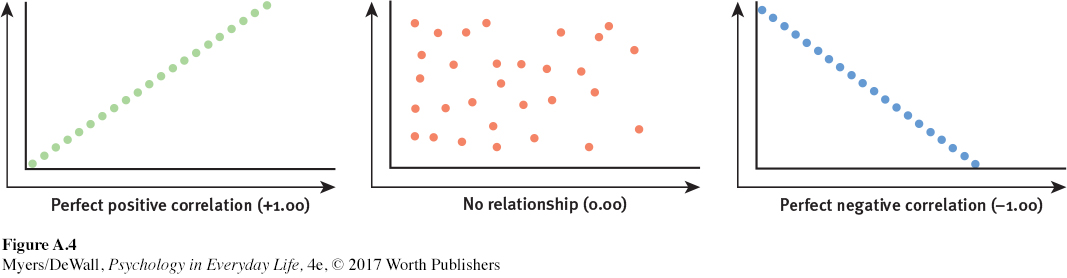
Saying that a correlation is “negative” says nothing about its strength. A correlation is negative if two sets of scores relate inversely, one set going up as the other goes down.
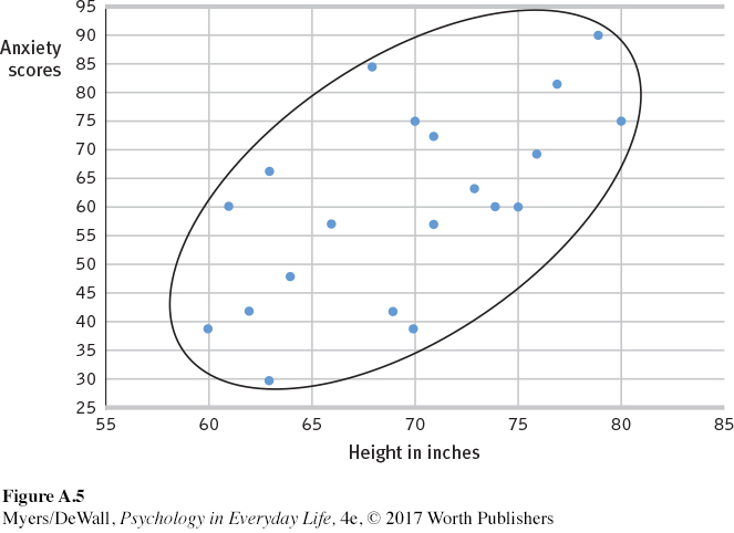
Statistics can help us see what the naked eye sometimes misses. To demonstrate this for yourself, try an imaginary project. You wonder if tall men are more or less easygoing, so you collect two sets of scores: men’s heights and their anxiety. You measure the heights of 20 men, and you have them take an anxiety test.
With all the relevant data right in front of you (TABLE A.1), can you tell whether the correlation between height and anxiety is positive, negative, or close to zero?
| Person | Height in Inches | Anxiety Score |
|---|---|---|
| 1 | 80 | 75 |
| 2 | 63 | 66 |
| 3 | 61 | 60 |
| 4 | 79 | 90 |
| 5 | 74 | 60 |
| 6 | 69 | 42 |
| 7 | 62 | 42 |
| 8 | 75 | 60 |
| 9 | 77 | 81 |
| 10 | 60 | 39 |
| 11 | 64 | 48 |
| 12 | 76 | 69 |
| 13 | 71 | 72 |
| 14 | 66 | 57 |
| 15 | 73 | 63 |
| 16 | 70 | 75 |
| 17 | 63 | 30 |
| 18 | 71 | 57 |
| 19 | 68 | 84 |
| 20 | 70 | 39 |
Comparing the columns in TABLE A.1, most people detect very little relationship between height and anxiety. In fact, the correlation in this imaginary example is positive (+0.63), as we can see if we display the data as a scatterplot (FIGURE A.5).
If we fail to see a relationship when data are presented as systematically as in TABLE A.1, how much less likely are we to notice them in everyday life? To see what is right in front of us, we sometimes need statistical illumination. We can easily see evidence of gender discrimination when given statistically summarized information about job level, seniority, performance, gender, and salary. But we often see no discrimination when the same information dribbles in, case by case (Twiss et al., 1989).
The point to remember: Correlation coefficients tell us nothing about cause and effect, but they can help us see the world more clearly by revealing the extent to which two things relate.
For an animated tutorial on correlations, see LaunchPad’s Concept Practice: Positive and Negative Correlations. See also LaunchPad’s Video: Correlational Studies for another helpful tutorial animation.
Regression Toward the Mean
LOQ A-
Correlations not only make visible the relationships we might otherwise miss, they also restrain our “seeing” nonexistent relationships. When we believe there is a relationship between two things, we are likely to notice and recall instances that confirm our belief. If we believe that dreams are forecasts of actual events, we may notice and recall confirming instances more than disconfirming instances. The result is an illusory correlation.
regression toward the mean the tendency for extreme or unusual scores or events to fall back (regress) toward the average.
Illusory correlations feed an illusion of control—
“Once you become sensitized to it, you see regression everywhere.”
Psychologist Daniel Kahneman (1985)
The point may seem obvious, yet we regularly miss it: We sometimes attribute what may be a normal regression (the expected return to normal) to something we have done. Consider two examples:
Students who score much lower or higher on an exam than they usually do are likely, when retested, to return to their average.
Unusual ESP subjects who defy chance when first tested nearly always lose their “psychic powers” when retested (a phenomenon parapsychologists have called the decline effect).
Failure to recognize regression is the source of many superstitions and of some ineffective practices as well. When day-
The point to remember: When a fluctuating behavior returns to normal, there is no need to invent fancy explanations for why it does so. Regression toward the mean is probably at work.
Retrieve + Remember
Question 15.3
•You hear the school basketball coach telling her friend that she rescued her team’s winning streak by yelling at the players after they played an unusually bad first half. What is another explanation of why the team’s performance improved?
ANSWER: The team’s poor performance was not their typical behavior. Their return to their normal—