Chapter 18. Chapter 18 Graphic Content
Introduction
Graphic Content
true
true
You must read each slide, and complete the question on the slide, before proceeding to the next one.

Instructions
Review the information provided in the graph to answer each question below.
After submitting your answer, you will be provided feedback to check if your response is correct.
(This activity contains 8 questions.)
Question 18.1
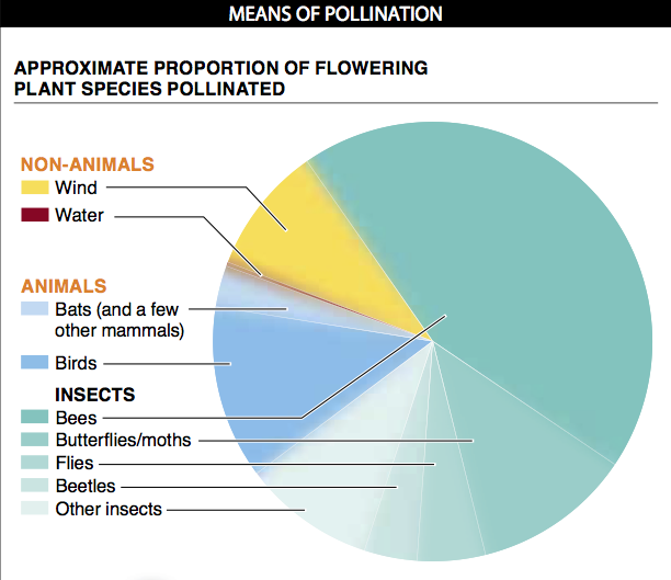
The fuzzy borders of each slice of the pie are meant to convey that the exact size of each slice is not certain.There are several other ways that uncertainty or variation can be conveyed in a graph. The pieces of the pie can have sharp borders, but within the slice (or its label) there can be a numerical indication of the size of the slice (i.e., 3–7%, 20-25%, etc.). Alternatively, instead of a pie chart, a bar graph can be used, with each slice shown as a separate bar having an error bar that reflects the uncertainty or variation around the estimate. A third way would be with a bar graph having just a single bar (representing 100% of flowering plant species), with the bar divided into regions representing each type of pollinator and the borders between regions being fuzzy, to represent uncertainty. And, perhaps, the labels associated with each region could indicate the size of that region, as a range (again, such as 3-7%, 20-25%, etc.).
Question 18.2
The different colors in this pie chart represent a broad category of plant pollinators. All of the green slices, for example, represent insect pollinators, with each shade of green representing a different group of insects. Each of the blue slices represents a group of non-insect animal pollinators.This makes it possible to make quick comparisons about the relative proportions of non-insect animal pollinators versus insect pollinators, while also enabling a comparison of the relative proportions of pollinators from each group of insects (bees versus beetles, for example).
Question 18.3
Actual percentages for each slice might make more precise comparisons of the size of each slice. In this figure, however, they may have been excluded because such precise data do not exist. The title above the pie chart suggests that this may be the reason.
Question 18.4
From the pie chart, it appears that bees are the pollinators of the largest proportion of plant species. The slice representing bees indicates that about 45% of flowering plants are pollinated by bees. The second-largest slice is for birds, indicating that they pollinate the second-largest proportion of flowering plant species.
Question 18.5
It would be useful to know which habitats (and how many of each) were surveyed to produce the data shown because it may be the case that in some habitats the majority of flowering plant species are pollinated by birds, while in other habitats the majority of flowering plant species are pollinated by bees or beetles. Or perhaps the proportions are the same across all habitats. More important, it is not possible to evaluate how much variation there is across different habitats (tropical versus arctic, for example) in the proportions of flowering plant species pollinated by each group of pollinators.
Question 18.6
You can conclude many things from this pie chart. Most flowering plant species, for example, are pollinated by animals as opposed to wind or water. And you can conclude that, among animals, insects are the most common pollinators of flowering plants. Additional conclusions you could draw include that more flowering plant species are pollinated by birds than by bats; overall, more flowering plant species are pollinated by bees than by any other group of animals; among non-animal methods of pollination, wind pollination is much more common than water pollination.
Question 18.7
An important detail to note in this figure is that the slices represent the proportion of flowering plant species rather than proportion of flowering plants. Because each species of flowering plant does not have the same number of individuals, an extremely common plant species with millions of individuals that is pollinated by flies counts as “one species, pollinated by flies” and a rare species with just a few hundred individuals that is pollinated by bats counts, similarly, as “one species, pollinated by bats.” This means that if you were to survey just one habitat and count the number of plants pollinated by insects versus non-insect animals, it may be that you rarely see any of the non-insect animals pollinating plants if the plant species that they pollinate have much smaller population sizes than those pollinated by insects. If all flowering plant species had the same population sizes, on the other hand, approximately 75% of the plants being pollinated would be pollinated by insects and approximately 20% would be pollinated by non-insect animals.
Question 18.8
Because the data here are described as “loose approximations,” it is essential to understand that we cannot have complete confidence in their accuracy. Any interpretations should be made with caution and the understanding that they are subject to change. With the collection of additional observations and, perhaps, additional habitats, it may turn out that the size of any slice is actually a bit larger or smaller than shown here. “Loose approximations” can still be valuable, however. From this pie chart, it is probably safe to assume that bees are in fact the pollinators of the largest proportion of flowering plants. Similarly, it’s probably safe to conclude that more flowering plant species are pollinated by animals than by non-animal methods. And that among animals, insects represent a more important group of pollinators than do non-insect animals. Each of these conclusions can help us to understand the general patterns of pollination in nature. Moreover, the presentation of loose approximations can help to guide future studies aimed at gaining a deeper understanding of pollination.
Activity results are being submitted...