Chapter 22. Chapter 22 Graphic Content

Introduction

Graphic Content
true
true
You must read each slide, and complete the question on the slide, before proceeding to the next one.

Instructions

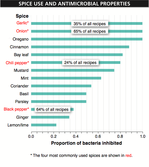
Review the information provided in the graph to answer each question below.

After submitting your answer, you will be provided feedback to check if your response is correct.

(This activity contains 8 questions.)

Question 22.1

8Lbi6kM2+YQHr8msVpkrB3LQzfRZsNT98TP/vHgFG8nVlyRvrRtHErW2iTefMMlVDRCUvKWBt5f7kvR47xZBZrpAG4EdQSLvQD+t6y0lFndH+04AbsyqzA1pd+iDFt101qISqv1cse+3rJdyOUc5j6egjQQ=
Each spice was tested to see whether it could kill or inhibit the growth of more than 30 species of common food-borne bacteria. The x-axis represents the proportion of those species killed or inhibited by the spice. The x-axis is calibrated in fractions of a whole, so the final value is 1.0. Thus, in this graph 1.0 means that all of the species of bacteria tested were killed or inhibited by the spice.

Question 22.2

l510QW6jeZvFsp3TGF4nPlQv3Sj6EZNiHDnVldCEIumyRMOz4JcBxwfcoOT1vnwMOmIYv8WqV6mO0s6MT7g5S6/Hx5GM1+EovkY6a9xpsN9JphsajKIyqw==
The spice that is the second most frequently used in recipes is black pepper (indicated in the text). The graph indicates the proportion of recipes that include garlic, onion, chili pepper, or black pepper. The other spices are used in a smaller proportion of recipes than the 24% of recipes that included chili peppers.

Question 22.3

SPyH40f1H/oTT6XqBz1jbzpFgbhy+9HiKv6lp3kypLEYpBXP2z/wcp/JRbxGvhWSb3HRTWSCxT79GcjT5oxoWv2PRKrmj5OwrMX+flJ9rASUVdBKEXGnPBg5iUOT0fSbZPpNz0fmHnXd227nYJcUeqOTGuODVnCGH5PVmNhlla0=
Garlic and onion are at the top of the chart because the spices are ordered on the basis of the proportion of bacteria species inhibited, rather than on the frequency of recipes in which they occur. Both garlic and onions inhibited 100% of the bacteria species tested.

Question 22.4

EollJelAg1NZY5TN6/9h2YQ/LyoEj51bZs9tguA0zKAAd3ykqQZ2lrOXEZnR+p7iQ5i1T50dyI4okve2UtTr/pQLe4mf+v6rPtegcIDn1cGXiQU/RcmbZw==
You can conclude that oregano is used in less than 24% of recipes. This is because the graph indicates (in red type) the four most commonly used spices and indicates how frequently they are used. Because oregano is not among the four most commonly used spices, it must be used in a smaller proportion than the fourth most commonly used spice, which is chili pepper, in 24% of recipes.

Question 22.5

HkcgZm/DJCdbRN5S+JuY9lMuk81P4RMOTluyMy652VQhS7uvWQq7628aUotVSl+R1AeaKONr4FzXipdf2e16NrCPfdgSdLBBYYMKsR19XEvuel4KJIATghu7Q5EaiRwv9HEsxl3fox3bl7F8
You cannot conclude anything about the relative frequency of use of coriander versus ginger in recipes because this information is not given in the graph.

Question 22.6

MLNXdlooRUP3Cr8zG5AuDez0X1SV45uxGA3I86AEwQ/vWJhP/h0JbaofEXhvn1qB7K49onA808AaeWDsGGCtNOpxx6Vfv9+XxMM5CxXxwf88Ayt7s5QeBMD7TOxXr3te55xTjGkJRL5sCgaMvE9lDR04y7Up00SxWFoel3FG02A2wS/R6Ic5rdGKMud0yh0EnfrbN3XdQDce3y+eZr8WRFlLTJmco7817yd8F7fWKcwi4On4jvDNdmweGD8ltshQz+9aw/xbLR0=
In a city close to the equator, you would expect fewer food poisoning cases to come from an Indian restaurant. This is because, according to the text, Indian recipes call for more spices, on average, than do recipes from countries farther from the equator. To the extent that greater spice use is associated with greater inhibition of bacterial growth, Indian food would be expected to support less bacterial growth. You cannot be very certain of this prediction, however, because numerous factors influence the incidence of food poisoning—for example, general level of cleanliness in restaurants and the number of customers served at each restaurant.

Question 22.7

CpTQB4U6tUTCP2IfGn/A/Ekk3RZsdq768lR4Y6eyuyPygMdQJakvIAgN+iEwG/llZv7Xe8BoGz44ojRY
It would be helpful to know the relationship between the amount of each spice used and the spice’s effectiveness at killing bacteria. It would also be helpful to know how quickly each spice killed bacteria and the influence of heat and cooking on the effectiveness of each spice in killing bacteria. It would also be interesting to know whether any combinations of spices were more effective at killing bacteria than would be expected from the spices’ antibacterial effectiveness on their own.

Question 22.8

E+TCErN6CK9NcdaoWK4B1lLl5FA7m41IcBr2JIVr1bV8StCLtAeTNPe4+3uEDfqEkyL8VBkCcjB7NiZk2SYWKp1ZtKSxYpjk4yQavhGl06acrbHLVYpgLnHGAx4NDAm2vOwvTgUQGdcqMFcGMXFCttFBMKFCCRVzxzCxWE9oIlS9JzWoLmNR41RcYKotCzWuOzxbPjFkDpTc2J8knAdTOh2uGxPUqP4HRuHYDOejzVKxfHM78PmdVQ==
One alternative way of plotting the data would be a scatterplot, with proportion of bacteria inhibited on the x-axis and frequency of use on the y-axis. This graph would have the advantage of revealing the extent to which a spice’s frequency of use was related to its antibacterial effectiveness. A disadvantage of a scatterplot would be the difficulty of including with each point the identity of the spice it represented. To put so many labels in the graph might obscure the information. Another way of presenting these data would be to use bar graphs, showing two bars for each spice, with one indicating the proportion of bacteria inhibited and the other (perhaps in a different color) indicating the frequency of use in recipes. Again, this would make it easier to investigate the strength of the relationship between each spice’s antibacterial effectiveness and its frequency of use. It would also make it easy to identify any spices for which the usage was significantly less than would be expected given the spices antibacterial effectiveness. That might help in identifying future research questions. A disadvantage of a bar graph would be the fact that most of the spices are used in less than 24% of all recipes. So the size of the bars reflecting spice usage might be too small, making it difficult to evaluate their relative usages. Instead, it might be helpful to rank the usage frequencies rather than using absolute numbers for the frequency of use.

Activity results are being submitted...