
Chapter 26. Chapter 26 Graphic Content
Introduction
Graphic Content
true
true
You must read each slide, and complete the question on the slide, before proceeding to the next one.
Instructions
Review the information provided in the graph to answer each question below.
After submitting your answer, you will be provided feedback to check if your response is correct.
(This activity contains 5 questions.)
1.
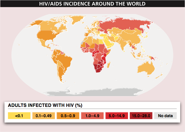
1. Based on this figure, estimate the number of adults in the United States who are infected with HIV. Explain how you arrived at that number.
According to this figure, in the United States the percent of adults infected with HIV is 0.5% to 0.9%. In order to estimate the number of adults infected with HIV, we need to estimate the number of adults in the United States. Assuming that there are about 300 million people in the United States (there were actually 313 million), we might estimate that three-quarters of people in the United States, or 225 million people, are adults. (The proportion of people in the United States who are under 18 years old is actually about 24% of the 313 million people, or 238 million.) If there are 225 million adults in the United States, and 0.5% to 0.9% are infected with HIV, that works out to 1.125 million for the low estimate and 2.025 million for the high estimate. If we had to give one number, it would probably be best to take the average of these two numbers: 1.575 million.
Activity results are being submitted...