Distributions
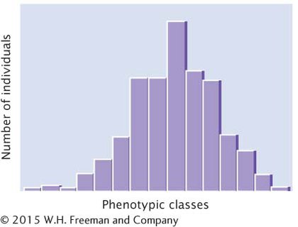
Understanding the genetic basis of any characteristic begins with a description of the numbers and kinds of phenotypes present in a group of individuals. Phenotypic variation in a group can be conveniently represented by a frequency distribution, which is a graph of the frequencies (numbers or proportions) of the different phenotypes (Figure 17.6). In a typical frequency distribution, the phenotypic classes are plotted on the horizontal (x) axis, and the numbers (or proportions) of individuals in each class are plotted on the vertical (y) axis. A frequency distribution is a concise method of summarizing all phenotypes of a quantitative characteristic.

Connecting the points of a frequency distribution with a line creates a curve that is characteristic of the distribution. Many quantitative characteristics exhibit a symmetrical (bell-
