Select an Appropriate Aid
Printed Page 156
Presentation aids include objects, models, pictures, graphs, charts, audio, video, and multimedia. Select the aid, or combination of aids, that will help audience members grasp information most effectively.
Props and Models
A prop can be any inanimate or even live object—a stone or a snake, for instance—that captures the audience’s attention and illustrates or emphasizes key points. A model is a three-dimensional, scale-size representation of an object. Presentations in engineering, architecture, medicine, and many other disciplines often make use of models. When using a prop or model:
- In most cases, keep the prop or model hidden until you are ready to use it.
- Make sure it is big enough for everyone to see (and read, if applicable).
- Practice your speech using the prop or model.
Pictures
Pictures are two-dimensional representations and include photographs, line drawings, diagrams, maps, and posters. A diagram (also called a “schematic drawing”) visually explains how something works or is made or operates. Maps help listeners visualize geographic areas and understand relationships among them; they also illustrate the proportion of one thing to something else in different areas.
Graphs and Charts
A graph represents relationships among two or more things. Four types of graphs are line graphs, bar graphs, pie graphs, and pictograms.
A line graph uses points connected by lines to demonstrate how something changes or fluctuates in value.
A bar graph uses bars of varying lengths to compare quantities or magnitudes; bars may be arranged either vertically or horizontally. When creating line and bar graphs:
- Label both axes and start the numerical axis at zero.
- Compare only like variables.
- Put no more than two lines of data on one line graph.
A pie graph depicts the division of a whole into slices. Each slice constitutes a percentage of the whole. When creating pie graphs:
- Restrict the number of pie slices to a maximum of seven.
- Identify and accurately represent the values or percentages of each pie slice.
A pictogram uses picture symbols (icons) to illustrate relationships and trends; for example, a generic-looking human figure repeated in a row can demonstrate increasing enrollment in college over time. When creating pictograms:
- Clearly indicate what the pictogram symbolizes.
- Make all pictograms the same size.
- Label the axes of the pictogram.
A chart visually organizes complex information into compact form. Several different types of charts help listeners grasp key points.
A flowchart diagrams the progression of a process, helping viewers visualize a sequence or directional flow.
A table (tabular chart) systematically groups data in column form, allowing viewers to examine and make comparisons about information quickly.
| TYPE OF GRAPH OR CHART | BEST USE |
|---|---|
Line graph 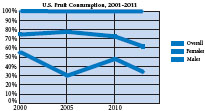
|
To represent trends or information that changes over time |
Bar graph 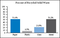
|
To compare magnitudes or volume among categories |
Pie graph 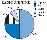
|
To show proportions of the total |
Pictogram 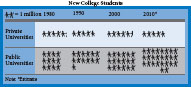
|
To show comparisons in picture form |
Flowchart 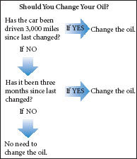
|
To diagram processes |
Table 
|
To show large amounts of information in an easily viewable form |
Audio, Video, and Multimedia
Introducing an audio clip—a short recording of sounds, music, or speech—can enliven certain presentations. Similarly, video—including movie, television, and other recording instruments—can serve to motivate attention by helping to introduce, transition into, and clarify points.3 (See Chapter 22 for guidelines on linking audio and video clips to PowerPoint slides.) Multimedia, which combines stills, sound, video, text, and data into a single production, requires more planning than other forms of presentation aids. Producing multimedia requires familiarity with presentation software programs such as Windows Live Movie Maker and Apple iMovie. When incorporating audio and video into your presentation:
- Use the audio or video clip in a manner consistent with copyright.
- Cue the audio or video clip to the appropriate segment before the presentation.
- Alert audience members to what they will be hearing or viewing before you play it back.
- Reiterate the relevance of the audio or video clip to your key points once it is over.