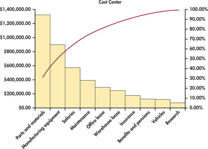
EXAMPLE 1.11 Pareto Chart for Cost Analysis
bcosts
Figure 1.5 displays the Pareto chart for the cost analysis data. Here it is easy to see that the parts and materials cost center has the highest annual cost. Research is the cost center with the lowest cost with less than 2% of the total. Notice the red curve that is superimposed on the graph. (It is actually a smoothed curve joined at the midpoints of the positions of the bars on the x axis.) This gives the cumulative percent of total cost as we move left to right in the figure.
FIGURE 1.5 Pareto chart of business cost center data, Example 1.11.

[Leave] [Close]