EXAMPLE 1.26 Compare the T-bill rates in January and July
tbilljj
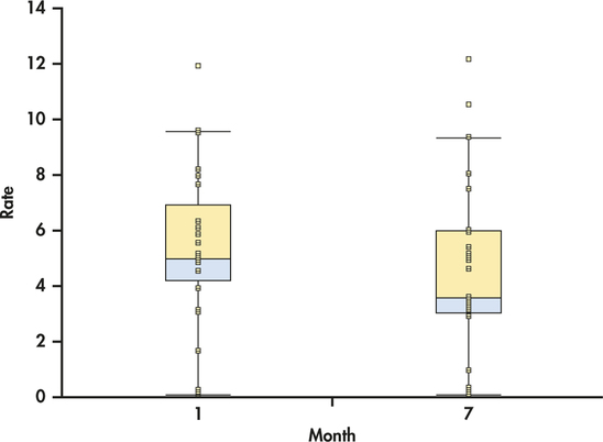
In Example 1.17 (page 17) we used a back-to-back stemplot to compare the T-bill rates for the months of January and July. Figure 1.15 gives side-by-side boxplots for the two months generated with JMP. Notice that this software plots the individual observations as dots in addition to the modified boxplots as default options.

Figure 1.15: FIGURE 1.15 Side-by-side modified boxplots with observations to compare T-bill rates in January and July from JMP, Example 1.26.