EXAMPLE 1.40 IQ Scores Are Normal
iq
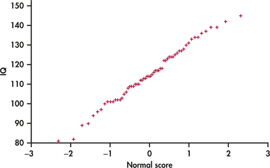
In Example 1.19 (page 18) we examined the distribution of IQ scores for a sample of 60 fifth-grade students. Figure 1.28 gives a Normal quantile plot for these data. Notice that the points have a pattern that is pretty close to a straight line. This pattern indicates that the distribution is approximately Normal. When we constructed a histogram of the data in Figure 1.11 (page 19), we noted that the distribution has a single peak, is approximately symmetric, and has tails that decrease in a smooth way. We can now add to that description by stating that the distribution is approximately Normal.

Figure 1.30: FIGURE 1.28 Normal quantile plot for the IQ data, Example 1.40. This pattern indicates that the data are approximately Normal.