EXAMPLE 1.42 Fuel Efficiency Data
canfuel
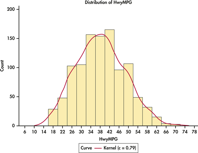
Figure 1.32 gives the histogram of the miles per gallon distribution with a density estimate produced by software. Compare this figure with Figure 1.17 (page 39). The two curves are very similar indicating that the Normal distribution gives a reasonably good fit for these data.

Figure 1.34: FIGURE 1.32 Histogram of highway fuel efficiency (MPG) for 1067 vehicles, with a density estimate, Example 1.42.