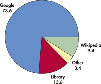
EXAMPLE 1.9 Pie Chart for the online Resource Preference Data
online
The pie chart in Figure 1.3 helps us see what part of the whole each group forms. Here it is very easy to see that Google is the favorite for about three-quarters of the students.
pie chart

Figure 1.3: FIGURE 1.3 Pie chart for the online resource preference data in Example 1.9.