EXAMPLE 10.10 Graphing the Prediction Intervals
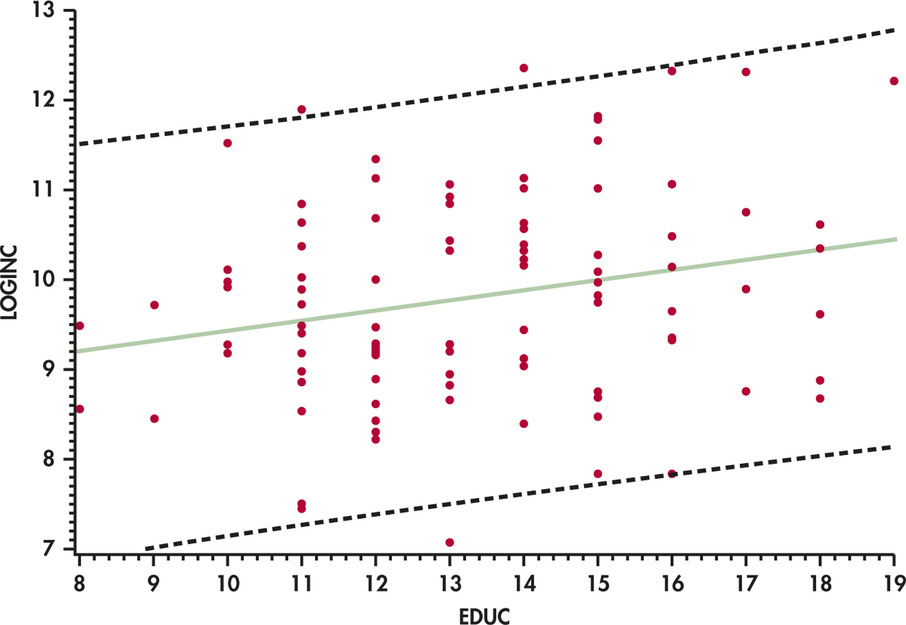
CASE 10.1 The prediction intervals for the log income data are graphed in Figure 10.15. As with the confidence intervals, we see the predicted values on the solid line and the prediction limits on the dashed curves.

Figure 10.15: FIGURE 10.15 95% prediction intervals for individual response for the annual income data.