EXAMPLE 12.2 Constructing ˉx and R Charts
lab
CASE 12.1 We begin the analysis of the turnaround times for the lab-testing process by focusing on the process variability. We use the 30 ranges shown in Table 12.2 to find the average range:
ˉR=130(32+19+⋯+21)=65930=21.967
From Table 12.1 (page 603), for subgroup size n=5, the values of D3 and D4 are 0 and 2.114, respectively. Accordingly, the center line and control limits for the R chart are
UCL=D4ˉR=2.114(21.967)=46.438CL=ˉR=21.967LCL=D3ˉR=0(21.967)=0
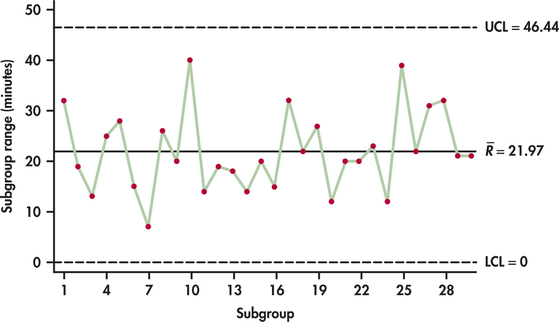
Figure 12.3 shows the R chart for the lab-testing process. The R chart shows no points outside the upper control limit. Furthermore, the ranges plotted over time show no unusual pattern. We can say that from the perspective of process variation, the process is in control.

We now construct the ˉx chart. Because the R chart exhibited in-control behavior, we can safely use the value of 21.967 computed earlier for ˉR in the computation of the ˉx chart limits. Referring to Table 12.2, we can find the grand mean:
ˉˉx=130(45.6+41.2+⋯+38.6)=1218.630=40.62
From Table 12.1 (page 603), we find A2=0.577. The center line and control limits for the ˉx chart are then as follows:
UCL=ˉˉx+A2ˉR=40.62+0.577(21.967)=53.29CL=ˉˉx=40.62LCL=ˉˉx−A2ˉR=40.62−0.577(21.967)=27.95
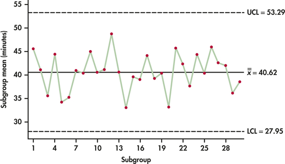
Figure 12.4 shows the ˉx chart. The subgroup means of the 30 samples do vary, but all lie within the range of variation marked out by the control limits. We are seeing the common cause variation of a stable process with no indications of special causes.
