EXAMPLE 12.3 ˉx and R Charts and out-of-Control Signals
oring
CASE 12.2 Our initial step is to study the variability of the O-ring process. Using the 25 ranges shown in Table 12.3, we find the average range to be
ˉR=125(0.0108+0.0127+⋯+0.0078)=0.238125=0.009524
From Table 12.1 (page 603), for subgroups of size n=4, the values of D3 and D4 are O and 2.282, respectively. Accordingly, the center line and control limits for the R chart are
UCL=D4ˉR=2.282(0.009524)=0.021734CL=ˉR=0.009524LCL=D3ˉR=0(0.009524)=0
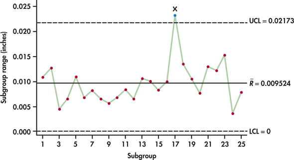
Figure 12.6 is the R chart for the O-ring process. Subgroup 17 lies outside the upper control limit. Had we constructed an ˉx chart using ˉR=0.0009524, we would have found that Subgroup 17 would not have signaled out of control. It is not unusual for the R chart to signal out of control while the ˉx chart does not, or vice versa. Each chart is looking for different departures. The R chart is looking for changes in variability, and the ˉx chart is looking for changes in the process level. It is, of course, possible for both process variation and level to go out of control together, resulting in signals on both charts.

At this stage, an explanation should be sought for the out-of-control signal. Suppose that an investigation reveals a machine problem at the time of the out-of-control signal. Because a special cause was discovered, the associated subgroup should be set aside and a new R chart constructed. By deleting Subgroup 17, the revised range estimate based on the remaining 24 subgroups is:
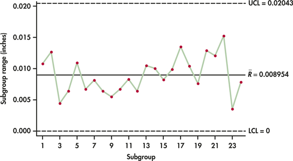
ˉR=0.214924=0.008954
Figure 12.7 shows the updated R chart applied to the 24 subgroups. Now, all the subgroup ranges are found to be in control. We can now turn our attention to the construction of the ˉx chart limits. For the 24 samples in Table 12.3, the grand mean is
ˉˉx=124(2.61085+2.60620+⋯+2.60333)=62.573624=2.60723

From Table 12.1 (page 603), we find A2=0.729. The center line and control limits for the ˉx chart are then
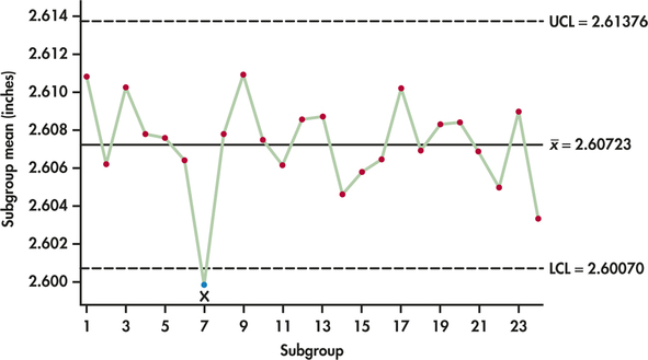
UCL=ˉˉx+A2ˉR=2.60723+0.729(0.008954)=2.61376CL=ˉˉx=2.60723LCL=ˉˉx−A2ˉR=2.60723−0.729(0.008954)=2.60070

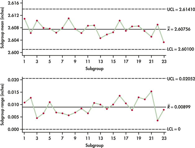
Figure 12.8 shows the ˉx chart. The ˉx chart shows an out-of-control signal at Subgroup 7. A special cause investigation reveals that the abnormally smaller diameters associated with this subgroup were caused by a problem in the postcuring stage that resulted in too much shrinkage of the rubberized material. With an explanation in hand, Subgroup 7 needs to be discarded and the R chart limits need to be recomputed. Figure 12.9 displays both the ˉx chart and the R chart based on the remaining 23 samples. The data for both charts appear well behaved. The two sets of control limits can be used for prospective control.
