EXAMPLE 13.1 Stock Price Returns

Whether it is by smartphone, laptop, or tablet, investors around the world are habitually checking the ups and downs of individual stock prices or indices (like the Dow Jones or S&P 500). Even the most casual investor knows that stock prices constantly change over time. If the changes are large enough, investors can make a fortune or suffer a great loss.
Page 646
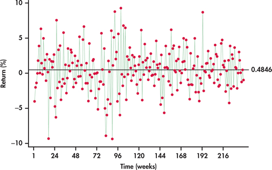
FIGURE 13.3 Time series plot of weekly returns of Disney stock (January 2010 through July 2014).

disney
Figure 13.3 plots the weekly stock price returns of Disney stock as a percent from the beginning of January 2010 through the end of July 2014.2 To add perspective, a horizontal line at the average has been superimposed on the plot. We are left with some impressions:
- The returns exhibit clear variation with lows near −10% and highs near +10%.
- The returns scatter around the average of 0.4846% with no tendency to trend away from the average over time.
- Sometimes, consecutive returns bounce from one side of the average to the other side, while at other times, they do not. Overall, there is no persistent pattern in the sequence of consecutive observations. The fact that a return is above or below the average seems to provide no insight as to whether future returns will fall above or below the average.
- The variation of the returns around the sample average appears about the same throughout the series.
[Leave] [Close]