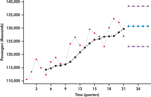
EXAMPLE 13.27 Light Rail Usage
rail
Figure 13.46 displays the quarterly number of U.S. passengers (in thousands) using light rail as a mode of transportation. The series begins with the first quarter of 2009 and ends with the first quarter of 2014.26 We can see a regularity to the series: the first quarter’s ridership tends to be lowest; then there is a progressive rise in ridership going into the second and third quarters, followed by a decline in the fourth quarter. Superimposed on the series are the moving-average forecasts based on a span of . Notice that the seasonal pattern in the time series is not present in the moving averages. The moving averages are a smoothed-out version of the original time series, reflecting only the general trending in the series, which is upward.
