EXAMPLE 14.3 A Graphical Summary of the Data
moral
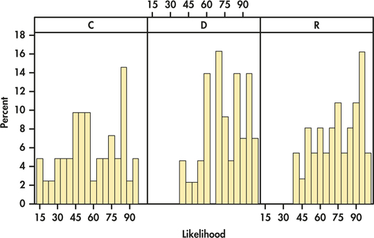
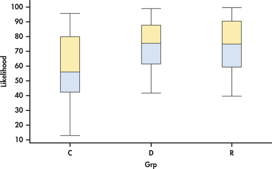
CASE 14.1 Histograms of the three groups are given in Figure 14.3. Note that the heights of the bars are percents rather than counts. This is commonly done when the group sizes vary. Figure 14.4 gives side-by-side boxplots for these data. We see that the likelihood scores cover most of the range of possible values. We also see a lot of overlap in the scores across groups. There do not appear to be any outliers, and the histograms show some, but not severe, skewness.
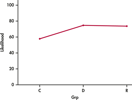
The three sample means are plotted in Figure 14.5. The control group mean appears to be lower than the other two. However, given the large amount of overlap in the data across groups, this pattern could just be the result of chance variation. We use ANOVA to make this determination.


717
