EXAMPLE 6.2 Sample Means Are Approximately Normal
delta
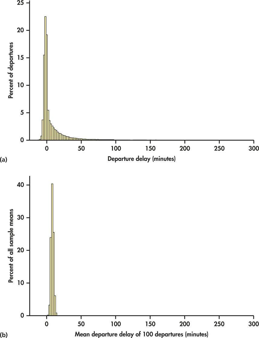
In 2013, there were more than 210,000 departures for Delta Airlines from its largest hub airport, Hartsfield-Jackson Atlanta International. Figure 6.1(a) displays the distribution of departure delay times (in minutes) for the entire year.3 ( We omitted a few extreme outliers, delays that lasted more than five hours.) A negative departure delay represents a fight that left earlier than its scheduled departure time. The distribution is clearly very different from the Normal distribution. It is extremely skewed to the right and very spread out. The right tail is actually even longer than what appears in the figure because there are too few high delay times for the histogram bars to be visible on this scale. The population mean is μ=7.92 minutes.

Suppose we take an SRS of 100 fights. The mean delay time in this sample is ˉx=5.21 minutes. That’s less than the mean of the population. Take another SRS of size 100. The mean for this sample is ˉx=10.17 minutes. That’s higher than the mean of the population. If we take more samples of size 100, we will get different values of ˉx. To find the sampling distribution of ˉx, we take many random samples of size 100 and calculate ˉx for each sample. Figure 6.1(b) is a histogram of the mean departure delay times for 1000 samples, each of size 100. The scales and choice of classes are exactly the same as in Figure 6.1(a) so that we can make a direct comparison. Notice something remarkable. Even though the distribution of the individual delay times is strongly skewed and very spread out, the distribution of the sample means is quite symmetric and much less spread out.
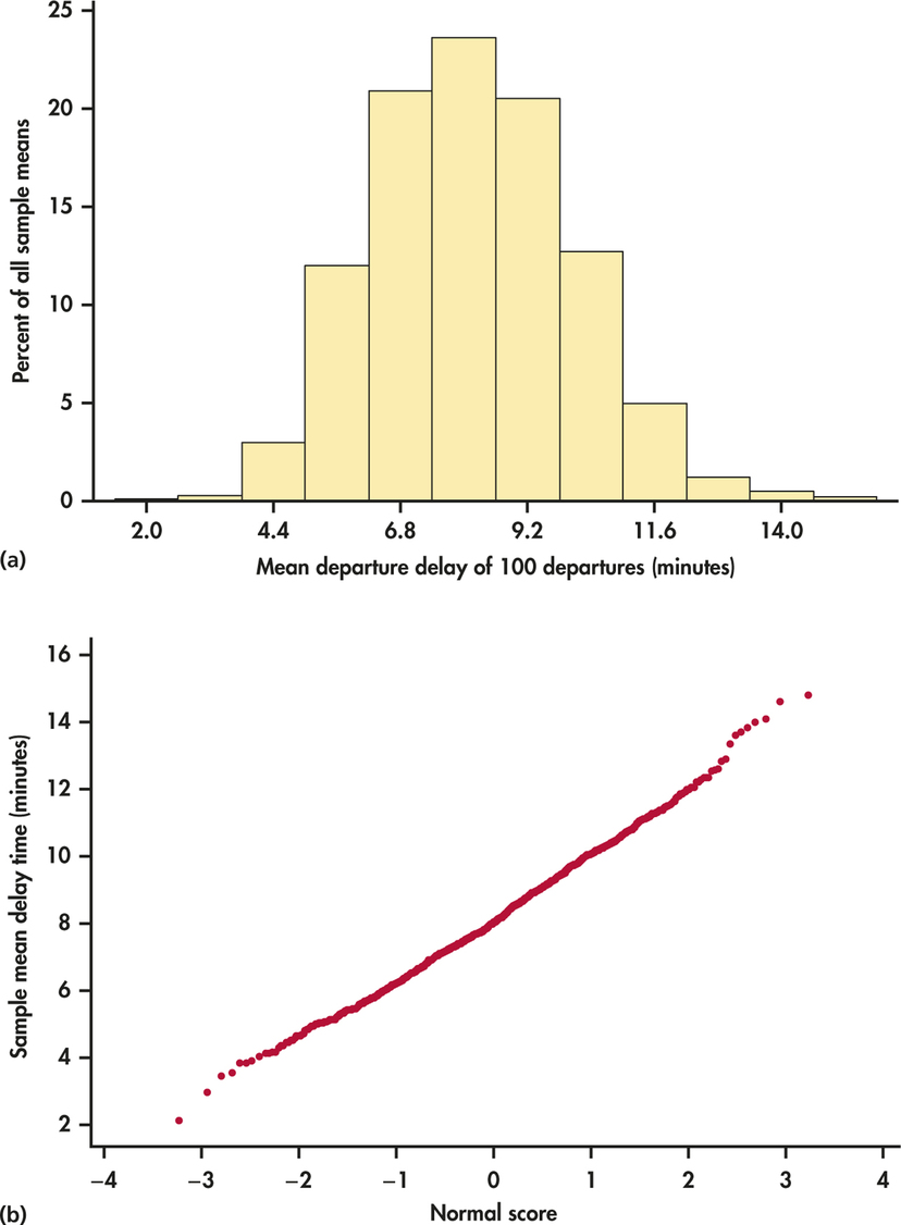
Figure 6.2(a) is the histogram of the sample means on a scale that more clearly shows its shape. We can see that the distribution of sample means is close to the Normal distribution. The Normal quantile plot of Figure 6.2(b) further confirms the compatibility of the distribution of sample means with the Normal distribution. Furthermore, the histogram in Figure 6.2(a) appears to be essentially centered on the population mean μ value. Specifically, the mean of the 1000 sample means is 8.01, which is nearly equal to the μ-value of 7.92.
