EXAMPLE 9.5 Graphical Displays
flxcom
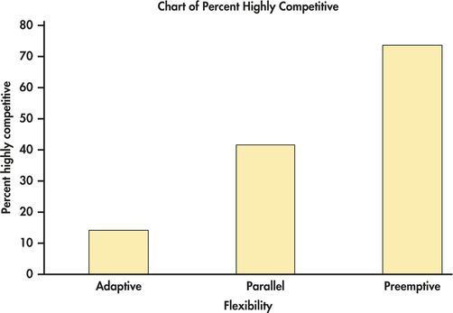
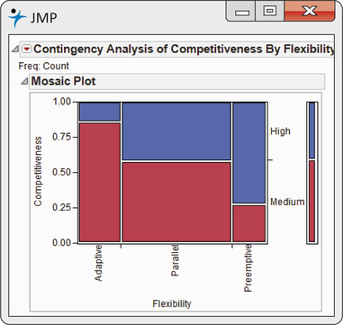
CASE 9.1 Figure 9.2 is a bar chart from Minitab that displays the percent of highly competitive companies for each level of flexibility. It shows a clear pattern: as we move from adaptive flexibility to parallel flexibility, to preemptive flexibility, the proportion of highly competitive companies increases from 14% to 42%, to 73%. The mosaic plot from JMP in Figure 9.3 displays the distribution of competitiveness for the three levels of flexibility as well as the marginal distributions. Which graphical display do you prefer for this example?
Reminder

mosaic plot, p. 109

Figure 9.2: FIGURE 9.2 Bar chart from Minitab displaying the relationship between competitiveness and flexibility, Example 9.5.

Figure 9.3: FIGURE 9.3 Mosaic plot from JMP displaying the relationship between competitiveness and flexibility, Example 9.5.