12.2 Variable Control Charts
 This page includes Video Technology Manuals
This section considers the scenario in which regular samples on measurement data are obtained to monitor process behavior. In the quality area, samples of observations are often referred to as subgroups. For each subgroup, pertinent statistics are computed and then charted over time. For example, the subgroup means can be plotted over time to control the overall mean level of the process, while process variability might be controlled by plotting subgroup standard deviations or a more simplistic statistic known as the range statistic.
subgroups
The effectiveness of a control chart depends on how the subgroups were collected. Three basic issues need to be addressed:
- Rational subgrouping. Walter Shewhart, the founder of statistical process control, conceptualized a basis for forming subgroups. He suggested that subgroups should be chosen in such a way that the individual observations within the subgroups have been measured under similar process conditions. Subgroups formed on this principle are known as rational subgroups. The idea is that if the individual observations within the subgroups are as homogeneous as possible, then any special causes disrupting the process will be reflected by greater variability between the subgroups. Thus, when special causes are present, rational subgrouping attempts to maximize the likelihood that subgroup statistics will signal that the process is out of control. In manufacturing settings, the most common way to create rational subgroups is to take individual measurements over a short period of time; often, this means measuring consecutive items produced.Page 601
- Subgroup size. Subgroup sizes are usually small. Sampling cost is one important consideration. Another is that large samples may span too much time, making it possible for the process to change while the sample is being taken. When sample sizes are large, the subgroups are at risk of not being rational subgroups. Subgroup sizes (n) for variable control charts nearly always range from 1 to 25. For various historical reasons, sample sizes of four or five are among the most common choices in practice. As we will see, control charts rely on approximate Normality of the subgroup statistics. It is fortunate that for certain statistics, like the mean, the central limit theorem effect will provide approximate Normality for sample sizes as small as four or five.
- Sampling frequency. A final subgroup design issue is the frequency of sampling, that is, the timing between subgroups. Cost factors obviously come to bear. There are not only the costs of sampling (for example, costs of testing and measuring), but also the costs associated with missing significant process changes. If sampling is done infrequently, then there is a risk that the process is out of control between subgroups, resulting in a variety of costs ranging from higher rework to customer dissatisfaction for receiving unacceptable product or service. Process stability (or the lack thereof) is another consideration. A process that is erratic needs frequent surveillance, but a process that has achieved stability can be less frequently sampled. A common strategy is to start with frequent sampling of the process and then to relax the frequency of sampling as one gains confidence about the stability of the process.
Once the sampling scheme has been designed in terms of establishing rational subgroups, sample size, and sampling frequency, data are collected to form preliminary subgroups. When first applying control charts to a process, the process behavior is not fully understood. By using a control chart to analyze a given set of initial data, we are looking back retrospectively on the performance of the process. In this phase, control charts are said to be used as a judgment.
If the process is found to be in control, then the control chart can be used pro-spectively to monitor future process performance in real time. In this phase, control charts are said to be used as an ongoing operation. If retrospective analysis shows the process to be not in control, then any numerical descriptions of the data used to construct the initial control chart will not serve as reliable guides for monitoring the process into the future. The priority is then to bring the process into control. This may mean uncovering and removing the unwanted effects of special causes. Or it may mean incorporating the favorable effects of the special causes and stabilizing the process at a more favorable position. Later, when the process has been operating in control for some time and you understand its usual behavior, control charts can be used prospectively.
ˉx and R charts
We begin with a quantitative variable x that is an important measure of quality. The variable might be the diameter of a part or the time to respond to a customer call. Given this quality characteristic is subject to variation, there is a distribution underlying the process. As discussed earlier, an in-control process is a stable process whose underlying distribution remains the same over time. Associated with this distribution is a process mean μ and a process standard deviation σ.
To make subgroup control charts, we begin by taking samples of size n from the process at regular intervals. For instance, we might measure four or five consecutive parts or time the responses to four or five consecutive customer calls. For each subgroup, we can compute the sample mean ˉx. From Chapter 6, we learned that ˉx is a random variable with mean μ and standard deviation σ/√n. Furthermore, the central limit theorem tells us that the sampling distribution of the sample mean is approximately Normal.
The 99.7 part of the 68-95-99.7 rule for Normal distributions says that as long as the process remains in control, 99.7% of the values of ˉx are expected to fall between:
UCL=μ+3σ√nLCL=μ−3σ√n
where UCL and LCL stand for "upper control limit" and "lower control limit," respectively. These limits are called three-sigma control limits and serve as the basis for most control charts. Along with the control limits, it is standard practice to draw a center line (CL) at the mean.
three-sigma control limits
With three-sigma limits, if the process remains in control and the process mean and standard deviation do not change, we will rarely observe an ˉx outside the control limits: only about three out of every 1000 sample means, given the assumption of Normality. From that perspective, if we do observe an ˉx outside the control limits, it serves as a strong signal that the underlying conditions of the process may have changed.
In practice, μ and σ are typically not known and must be estimated. One obvious estimate for the mean is the average of all the individual observations taken from all the preliminary subgroups. If the sample sizes are all equal, then the average of all the individual observations can be computed as the average of the subgroup means. In particular, if we are basing the construction of the control chart on k subgroups, then the overall average (referred to as the grand mean) is computed as
ˉˉx=1k(ˉx1+ˉx2+⋯+ˉxk)
grand mean
range statistic R
We now need an estimate of σ. One possibility is to use the subgroup sample standard deviations. However, in practice, it is more common to use a more simplistic estimate of variation based on the range statistic R. The range statistic is simply the sample range, which is the difference between the largest and the smallest observations in a sample. With k preliminary subgroups, the average range ˉR can be computed as
ˉR=1k(R1+R2+⋯+Rk)
Based on statistical theory, it can shown that if ˉR is multiplied by a constant (A2) that is a function of the subgroup size n, we then have a reasonable estimate for 3σ/√n. Table 12.1 provides values for A2 for various subgroup sizes.
ˉx chart
The control chart for the mean, called an ˉx chart, is dedicated to detecting changes in the process level. With the mean and variability estimates, the estimated center line and control limits for the mean are given by
UCL=ˉˉx+A2ˉRCL=ˉˉxLCL=ˉˉx+A2ˉR
| Sample size n | D3 | D4 | B3 | B4 | A2 | A3 | d2 |
| 2 | 0.000 | 3.267 | 0.000 | 3.267 | 1.881 | 2.659 | 1.128 |
| 3 | 0.000 | 2.574 | 0.000 | 2.568 | 1.023 | 1.954 | 1.693 |
| 4 | 0.000 | 2.282 | 0.000 | 2.266 | 0.729 | 1.628 | 2.059 |
| 5 | 0.000 | 2.114 | 0.000 | 2.089 | 0.577 | 1.427 | 2.326 |
| 6 | 0.000 | 2.004 | 0.030 | 1.970 | 0.483 | 1.287 | 2.534 |
| 7 | 0.076 | 1.924 | 0.118 | 1.882 | 0.419 | 1.182 | 2.704 |
| 8 | 0.136 | 1.864 | 0.185 | 1.815 | 0.373 | 1.099 | 2.847 |
| 9 | 0.184 | 1.816 | 0.239 | 1.761 | 0.337 | 1.032 | 2.970 |
| 10 | 0.223 | 1.777 | 0.284 | 1.716 | 0.308 | 0.975 | 3.078 |
| 11 | 0.256 | 1.744 | 0.321 | 1.679 | 0.285 | 0.927 | 3.173 |
| 12 | 0.283 | 1.717 | 0.354 | 1.646 | 0.266 | 0.886 | 3.258 |
| 13 | 0.307 | 1.693 | 0.382 | 1.618 | 0.249 | 0.850 | 3.336 |
| 14 | 0.328 | 1.672 | 0.406 | 1.594 | 0.235 | 0.817 | 3.407 |
| 15 | 0.347 | 1.653 | 0.428 | 1.572 | 0.223 | 0.789 | 3.472 |
| 16 | 0.363 | 1.637 | 0.448 | 1.552 | 0.212 | 0.763 | 3.532 |
| 17 | 0.378 | 1.622 | 0.466 | 1.534 | 0.203 | 0.739 | 3.588 |
| 18 | 0.391 | 1.609 | 0.482 | 1.518 | 0.194 | 0.718 | 3.640 |
| 19 | 0.404 | 1.597 | 0.497 | 1.503 | 0.187 | 0.698 | 3.689 |
| 20 | 0.415 | 1.585 | 0.510 | 1.490 | 0.180 | 0.680 | 3.735 |
| 21 | 0.425 | 1.575 | 0.523 | 1.477 | 0.173 | 0.663 | 3.778 |
| 22 | 0.435 | 1.566 | 0.534 | 1.466 | 0.168 | 0.647 | 3.819 |
| 23 | 0.443 | 1.557 | 0.545 | 1.455 | 0.162 | 0.633 | 3.858 |
| 24 | 0.452 | 1.548 | 0.555 | 1.445 | 0.157 | 0.619 | 3.895 |
| 25 | 0.459 | 1.541 | 0.565 | 1.435 | 0.153 | 0.606 | 3.931 |
R chart
It is also important to monitor the variability of the process. Because we have the subgroup ranges in hand, it is sensible to develop a control chart for ranges. Such a chart is known as an R chart. The center line and control limits of the R chart are given by
UCL=D4ˉRCL=ˉRLCL=D3ˉR
The control chart constants D3 and D4 are also provided in Table 12.1. On the surface, the R chart does not appear to have the same format as the ˉx chart in the sense of establishing control limits a certain amount above and below the center line. However, underlying the development of the control chart constants D3 and D4 is a three-sigma structure for the range statistic. You will notice that for subgroup sizes of two to six, the D3 factor is 0, which implies a lower control limit of 0. For small subgroup sizes, it can be shown that the theoretical control limits placed plus/minus three standard deviations of the range statistic above and below the range mean will result in a negative lower control limit. Because the range statistic can never be negative, the lower control limit is accordingly set to 0. Here is a summary of our discussion.
Construction of ˉx and R Charts
Take regular samples of size n from a process. The center line and control limits for an ˉx chart are
UCL=ˉˉx+A2ˉRCL=ˉˉxLCL=ˉˉx−A2ˉR
where ˉˉx is the average of the subgroup means and ˉR is the average of the subgroup ranges. The center line and control limits for an R chart are
UCL=D4ˉRCL=ˉRLCL=D3ˉR
The control chart constants A2, D3, and D4 depend on the sample size n.


lab
With escalating health care costs and continual demand for better patient service and patient outcomes, the health care industry is rapidly embracing the use of quality management techniques. Improving the timeliness and accuracy of lab results within a hospital is a common focus of health care improvement teams.
Consider the case of a hospital looking at the time from request to receipt of blood tests for the emergency room (ER). One of the most commonly requested tests from the ER is a complete blood count (CBC). A CBC provides doctors with red and white cell counts and blood clotting measures, all of which can be crucial in an emergency situation. Because of the importance of the turnaround time for CBC requests, hospital management appointed a quality improvement team to study the process. The team selected random samples of five CBC requests per shift (day, evening, late night) over the course of 10 days. Thus, the team had 3×10=30 preliminary subgroups. The sampling within shifts associates the individual observations with similar conditions (for example, staffing) and thus abides by the rational subgrouping principle. For each of the CBC requests sampled, the turnaround time (minutes) was recorded. Table 12.2 provides the observation values along with the subgroup means and ranges.
Before we proceed to the construction of control charts for Case 12.1, we must mention a subtle implementation issue with respect to the ˉx and R charts. The ˉx chart limits rely on the average_range ˉR. If process variability is not stable and is affected by special causes, then ˉR is not a reliable estimate of variability, and thus, the ˉx chart limits are less meaningful. There is a lesson here: it is difficult to interpret an ˉx chart unless the ranges are in control. When you look at ˉx and R charts, always start with the R chart.

| Subgroup | Turnaround observations | Subgroup mean | Range | ||||
| 1 | 39 | 33 | 65 | 50 | 41 | 45.6 | 32 |
| 2 | 46 | 36 | 34 | 53 | 37 | 41.2 | 19 |
| 3 | 37 | 35 | 28 | 37 | 41 | 35.6 | 13 |
| 4 | 50 | 38 | 35 | 60 | 39 | 44.4 | 25 |
| 5 | 29 | 27 | 22 | 43 | 50 | 34.2 | 28 |
| 6 | 32 | 35 | 40 | 27 | 42 | 35.2 | 15 |
| 7 | 42 | 43 | 37 | 44 | 39 | 41.0 | 7 |
| 8 | 40 | 45 | 50 | 43 | 24 | 40.4 | 26 |
| 9 | 34 | 47 | 54 | 39 | 51 | 45.0 | 20 |
| 10 | 43 | 65 | 25 | 45 | 25 | 40.6 | 40 |
| 11 | 35 | 48 | 44 | 45 | 34 | 41.2 | 14 |
| 12 | 55 | 54 | 44 | 36 | 55 | 48.8 | 19 |
| 13 | 29 | 39 | 47 | 42 | 47 | 40.8 | 18 |
| 14 | 41 | 31 | 29 | 37 | 27 | 33.0 | 14 |
| 15 | 41 | 40 | 32 | 33 | 52 | 39.6 | 20 |
| 16 | 32 | 32 | 41 | 47 | 43 | 39.0 | 15 |
| 17 | 24 | 54 | 34 | 53 | 56 | 44.2 | 32 |
| 18 | 36 | 45 | 53 | 31 | 31 | 39.2 | 22 |
| 19 | 48 | 57 | 36 | 31 | 30 | 40.4 | 27 |
| 20 | 38 | 27 | 39 | 35 | 27 | 33.2 | 12 |
| 21 | 53 | 33 | 51 | 50 | 42 | 45.8 | 20 |
| 22 | 53 | 45 | 37 | 44 | 33 | 42.4 | 20 |
| 23 | 27 | 50 | 35 | 29 | 47 | 37.6 | 23 |
| 24 | 39 | 39 | 51 | 49 | 44 | 44.4 | 12 |
| 25 | 33 | 29 | 38 | 68 | 34 | 40.4 | 39 |
| 26 | 34 | 43 | 48 | 49 | 56 | 46.0 | 22 |
| 27 | 43 | 20 | 51 | 49 | 50 | 42.6 | 31 |
| 28 | 33 | 42 | 51 | 58 | 26 | 42.0 | 32 |
| 29 | 25 | 46 | 25 | 43 | 42 | 36.2 | 21 |
| 30 | 30 | 34 | 42 | 36 | 51 | 38.6 | 21 |
EXAMPLE 12.2 Constructing ˉx and R Charts
lab
CASE 12.1 We begin the analysis of the turnaround times for the lab-testing process by focusing on the process variability. We use the 30 ranges shown in Table 12.2 to find the average range:
ˉR=130(32+19+⋯+21)=65930=21.967
From Table 12.1 (page 603), for subgroup size n=5, the values of D3 and D4 are 0 and 2.114, respectively. Accordingly, the center line and control limits for the R chart are
UCL=D4ˉR=2.114(21.967)=46.438CL=ˉR=21.967LCL=D3ˉR=0(21.967)=0
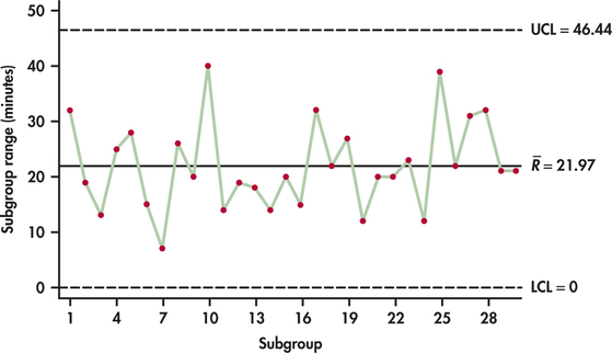
Figure 12.3 shows the R chart for the lab-testing process. The R chart shows no points outside the upper control limit. Furthermore, the ranges plotted over time show no unusual pattern. We can say that from the perspective of process variation, the process is in control.
We now construct the ˉx chart. Because the R chart exhibited in-control behavior, we can safely use the value of 21.967 computed earlier for ˉR in the computation of the ˉx chart limits. Referring to Table 12.2, we can find the grand mean:
ˉˉx=130(45.6+41.2+⋯+38.6)=1218.630=40.62
From Table 12.1 (page 603), we find A2=0.577. The center line and control limits for the ˉx chart are then as follows:
UCL=ˉˉx+A2ˉR=40.62+0.577(21.967)=53.29CL=ˉˉx=40.62LCL=ˉˉx−A2ˉR=40.62−0.577(21.967)=27.95
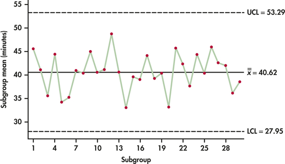
Figure 12.4 shows the ˉx chart. The subgroup means of the 30 samples do vary, but all lie within the range of variation marked out by the control limits. We are seeing the common cause variation of a stable process with no indications of special causes.
Example 12.2 shows that the lab-testing process for the ER is stable and in control. Does this mean the process is acceptable? This is not a statistical question but rather a managerial question for the ER and the hospital administration. Currently, the mean turnaround time is estimated to be 40.62 minutes. The process is stable and in control around that estimated mean. If this process performance is considered acceptable, then the control chart limits for both the ˉx chart and the R chart can be projected out into the future to monitor the process so as to maintain performance. If, however, the mean time of around 41 minutes is viewed as unacceptably high, then efforts need to be initiated to find ways to improve the process. Here is where the basic tools of flowcharts, Pareto charts, and cause-and-effect diagrams can be used by quality improvement teams to better understand the lab turnaround process and to search out the underlying causes for delay.
When efforts are made to improve a process, the control chart can play an important role. Control charts can be used to judge whether an attempt to improve a process has resulted in a successful change or not. Checking for successful change is a critical aspect of the Check phase of the PDCA cycle (page 593) and the Improve phase of the DMAIC model (page 594). Figure 12.5(a) shows a case where the control chart demonstrates a successful attempt to decrease the turnaround time. However, notice that a three-sigma signal doesn't occur until subgroup 41.
So far, we have considered only the basic "one point beyond the control limits" criterion to signal that a process may have gone out of control. We would like a quick signal when the process has changed from its original in-control state, but we also want to avoid "false alarms," signals that occur just by chance when the process hasn't changed. If the shift in the process is small to moderate, it may take some time before a subgroup falls outside the control limits. We can speed the response of a control chart to process change—at the cost of also enduring more false alarms—by adding patterns other than "one-point-out" as signals. The most common step in this direction is to add a runs signal to the control chart.
runs signal
There are numerous types of runs signals available with software. From Figure 12.5(a), we find that subgroups 34 and 35 have been highlighted. Both of these subgroups are beyond two standard deviations from the center line. Minitab uses a rule that signals if two out of three consecutive observations are more than two standard deviations from the center line (same side), while JMP signals if two consecutive observations are more than two standard deviations from the center line (same side). In either case, we have a signal of a possible change in the process earlier than the three-sigma signal at subgroup 41.
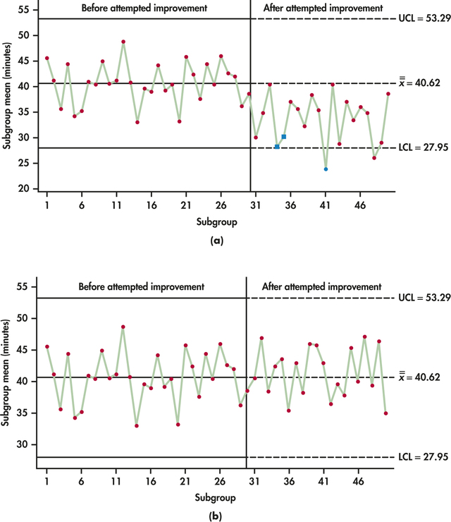
In light of the evidence of changed process with Figure 12.5(a), control chart limits should be revised, and the new process should be monitored to maintain the gains, as called for in the "Control" phase of the DMAIC model.
In contrast to Figure 12.5(a), if sample means after an attempt to improve are as seen in Figure 12.5(b), then the control chart provides no evidence of an impact from the attempted process improvement; the organization should seek alternative improvement ideas.
The preliminary samples of Example 12.2 appear to come from an in-control process. Let us now consider control chart implementation issues when there is evidence of special cause effects in the preliminary samples.


oring
A manufacturer of synthetic-rubber O-rings must monitor and control their dimensions. O-rings are used in numerous industries, including medical, aerospace, oil refining, automotive, and chemical processing. O-rings are doughnut-shaped gaskets used to seal joints against high pressure from gases or fluids. The two primary dimensions that need to be controlled are the cross-sectional width of the doughnut ring and the inside diameter of the inner circle of the doughnut. Within the O-ring product family, the manufacturer produces an aerospace industry class of O-rings known as AS568A. Table 12.3 gives the observations for 25 preliminary subgroups of size 4 for the inside diameter of AS568A-146 O-rings along with subgroup means and ranges. This O-ring is specified to have an inside diameter of 2.612 inches. The tolerances are set at ±0.02 inch around this specification.
| Subgroup | O-ring measurements | Sample mean |
Range | |||
| 1 | 2.6088 | 2.6120 | 2.6167 | 2.6059 | 2.61085 | 0.0108 |
| 2 | 2.5993 | 2.6120 | 2.6089 | 2.6046 | 2.60620 | 0.0127 |
| 3 | 2.6117 | 2.6074 | 2.6118 | 2.6101 | 2.61025 | 0.0044 |
| 4 | 2.6063 | 2.6055 | 2.6119 | 2.6076 | 2.60783 | 0.0064 |
| 5 | 2.6139 | 2.6030 | 2.6038 | 2.6097 | 2.60760 | 0.0109 |
| 6 | 2.6019 | 2.6075 | 2.6086 | 2.6076 | 2.60640 | 0.0067 |
| 7 | 2.6045 | 2.6005 | 2.5980 | 2.5964 | 2.59985 | 0.0081 |
| 8 | 2.6114 | 2.6050 | 2.6063 | 2.6086 | 2.60783 | 0.0064 |
| 9 | 2.6091 | 2.6100 | 2.6146 | 2.6100 | 2.61093 | 0.0055 |
| 10 | 2.6078 | 2.6067 | 2.6111 | 2.6044 | 2.60750 | 0.0067 |
| 11 | 2.6055 | 2.6089 | 2.6010 | 2.6093 | 2.60618 | 0.0083 |
| 12 | 2.6107 | 2.6098 | 2.6043 | 2.6095 | 2.60858 | 0.0064 |
| 13 | 2.6155 | 2.6050 | 2.6094 | 2.6050 | 2.60873 | 0.0105 |
| 14 | 2.6068 | 2.6067 | 2.6075 | 2.5975 | 2.60463 | 0.0100 |
| 15 | 2.6054 | 2.6021 | 2.6103 | 2.6054 | 2.60580 | 0.0082 |
| 16 | 2.6068 | 2.6084 | 2.6103 | 2.6004 | 2.60648 | 0.0099 |
| 17 | 2.6061 | 2.6185 | 2.5953 | 2.6075 | 2.60685 | 0.0232 |
| 18 | 2.6185 | 2.6096 | 2.6077 | 2.6050 | 2.61020 | 0.0135 |
| 19 | 2.6072 | 2.6067 | 2.6121 | 2.6017 | 2.60693 | 0.0104 |
| 20 | 2.6091 | 2.6113 | 2.6037 | 2.6092 | 2.60833 | 0.0076 |
| 21 | 2.6054 | 2.6149 | 2.6114 | 2.6020 | 2.60843 | 0.0129 |
| 22 | 2.6074 | 2.6092 | 2.6113 | 2.5992 | 2.60678 | 0.0121 |
| 23 | 2.6034 | 2.5972 | 2.6124 | 2.6070 | 2.60500 | 0.0152 |
| 24 | 2.6107 | 2.6101 | 2.6079 | 2.6072 | 2.60898 | 0.0035 |
| 25 | 2.6021 | 2.6073 | 2.6044 | 2.5995 | 2.60333 | 0.0078 |
EXAMPLE 12.3 ˉx and R Charts and out-of-Control Signals
oring
CASE 12.2 Our initial step is to study the variability of the O-ring process. Using the 25 ranges shown in Table 12.3, we find the average range to be
ˉR=125(0.0108+0.0127+⋯+0.0078)=0.238125=0.009524
From Table 12.1 (page 603), for subgroups of size n=4, the values of D3 and D4 are O and 2.282, respectively. Accordingly, the center line and control limits for the R chart are
UCL=D4ˉR=2.282(0.009524)=0.021734CL=ˉR=0.009524LCL=D3ˉR=0(0.009524)=0
Figure 12.6 is the R chart for the O-ring process. Subgroup 17 lies outside the upper control limit. Had we constructed an ˉx chart using ˉR=0.0009524, we would have found that Subgroup 17 would not have signaled out of control. It is not unusual for the R chart to signal out of control while the ˉx chart does not, or vice versa. Each chart is looking for different departures. The R chart is looking for changes in variability, and the ˉx chart is looking for changes in the process level. It is, of course, possible for both process variation and level to go out of control together, resulting in signals on both charts.
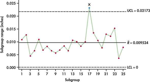
At this stage, an explanation should be sought for the out-of-control signal. Suppose that an investigation reveals a machine problem at the time of the out-of-control signal. Because a special cause was discovered, the associated subgroup should be set aside and a new R chart constructed. By deleting Subgroup 17, the revised range estimate based on the remaining 24 subgroups is:
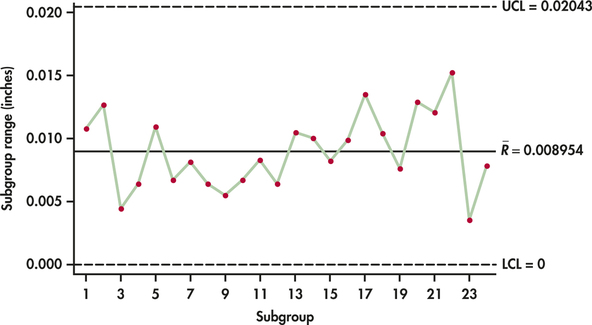
ˉR=0.214924=0.008954
Figure 12.7 shows the updated R chart applied to the 24 subgroups. Now, all the subgroup ranges are found to be in control. We can now turn our attention to the construction of the ˉx chart limits. For the 24 samples in Table 12.3, the grand mean is
ˉˉx=124(2.61085+2.60620+⋯+2.60333)=62.573624=2.60723
From Table 12.1 (page 603), we find A2=0.729. The center line and control limits for the ˉx chart are then
UCL=ˉˉx+A2ˉR=2.60723+0.729(0.008954)=2.61376CL=ˉˉx=2.60723LCL=ˉˉx−A2ˉR=2.60723−0.729(0.008954)=2.60070
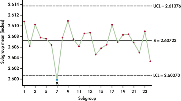
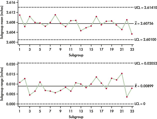
Figure 12.8 shows the ˉx chart. The ˉx chart shows an out-of-control signal at Subgroup 7. A special cause investigation reveals that the abnormally smaller diameters associated with this subgroup were caused by a problem in the postcuring stage that resulted in too much shrinkage of the rubberized material. With an explanation in hand, Subgroup 7 needs to be discarded and the R chart limits need to be recomputed. Figure 12.9 displays both the ˉx chart and the R chart based on the remaining 23 samples. The data for both charts appear well behaved. The two sets of control limits can be used for prospective control.
Apply Your Knowledge
Question 12.11
12.11 Interpreting signals.
Explain the difference in the interpretation of a point falling beyond the upper control limit of the ˉx chart versus a point falling beyond the upper control limit of the R chart.
12.11
A point falling beyond the upper control limit of the ˉx chart indicates a change in the process level; a point falling beyond the upper control limit of the R chart indicates a change in variation.
Question 12.12
12.12 Auto thermostats.
A maker of auto air conditioners checks a sample of four thermostatic controls from each hour's production. The thermostats are set at 75°F and then placed in a chamber where the temperature is raised gradually. The temperature at which the thermostat turns on the air conditioner is recorded. The process mean should be μ=75°. Past experience indicates that the response temperature of properly adjusted thermostats varies with . The mean response temperature for each hour's sample is plotted on an control chart. Calculate the center line and control limits for this chart.
Question 12.13
CASE 12.212.13 O-rings.
oring
Show the computations that confirm the limits of the chart and chart shown in Figure 12.9.
12.13
For
and charts
In the construction of subgroup control charts, the use of the simplistic range statistic instead of the sample standard deviation statistic is a historical artifact from when calculations were done by hand. Given the availability of computer software to do calculations, the need for computational simplicity is no longer a compelling argument. The fact that the range statistic is still in widespread use is probably due to training issues. It is much easier for corporate trainers to explain and for employees to comprehend the range statistic (largest minus smallest observation) than a statistic based on summing squared deviations, dividing the sum by , and then taking a square root!
The primary advantage of the sample standard deviation is that it uses all the data as opposed to the range statistic, which utilizes only two observation values (largest and smallest). For small subgroup sizes (), the range statistic competes well with the sample standard deviation statistic. However, for larger subgroup sizes, it is generally advisable to utilize the more efficient sample standard deviation.5
When using sample standard deviations, the chart is replaced by an chart. The chart is a plot of the subgroup standard deviations with appropriate control limits superimposed. In addition, the construction of the chart is based on the subgroup standard deviation values, not the range values. There is no difference in the calculation of the grand mean (), but we need to calculate the average sample standard deviation from the preliminary samples:
Here is a summary of how to construct and charts.
Construction of and Charts
Take regular samples of size from a process. The center line and control limits for an chart are
where is the average of the subgroup means and is the average of the subgroup standard deviations. The center line and control limits for an chart are
The control chart constants , , and depend on the sample size and are provided in Table 12.1 (page 603).
EXAMPLE 12.4 and Charts
lab
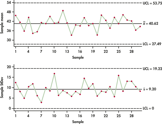
CASE 12.1 We leave the actual specific computations of the and charts for the lab-testing data to Exercise 12.15. Figure 12.10 shows the and charts produced by software. Comparing these control charts with the and charts of Figures 12.3 and 12.4 (pages 606 AND 607), we are left with the same conclusion: the lab-testing process is in control in terms of both level and variability.
Apply Your Knowledge
Question 12.14
12.14 Hospital losses.
hloss
Both nonprofit and for-profit hospitals are financially pressed by restrictions on reimbursement by insurers and the government. One hospital looked at its losses broken down by diagnosis. The leading source was joint replacement surgery. Table 12.4 gives data on the losses (in dollars) incurred by this hospital in treating major joint replacement patients.6 The hospital has taken from its records a random sample of eight such patients each month for 15 months.
- Calculate and for the first two subgroups to verify the table entries.
- Make an control chart using center lines and limits calculated from these past data. There are no points out of control.
- Because the chart is in control, base the chart on all 15 samples. Make this chart. Is it also in control?
Question 12.15
CASE 12.112.15 Lab testing.
lab
Show the computations that confirm the limits of the chart and chart shown in Figure 12.10.
12.15
For
Using and
Charts for individual observations
Up to this point we have concentrated on the application of control charts to statistics based on samples of two or more observations. There are, however, many applications where it is not practical to gather a sample of observations at a given time. For example, in low-volume manufacturing environments, the production rate is often slow, and therefore, the time between measurements is too long to allow rational subgroups to be formed. Some processes are just naturally viewed as a series of individual measurements. Data arising once a day, once a week, or once every two weeks do not lend themselves to being grouped into subgroups. Weekly sales or inventory levels are common company performance measurements monitored as individual observations.
| Subgroup | Losses (dollars) | Sample mean |
Standard deviation |
|||||||
| 1 | 6835 | 5843 | 6019 | 6731 | 6362 | 5696 | 7193 | 6206 | 6360.63 | 521.72 |
| 2 | 6452 | 6764 | 7083 | 7352 | 5239 | 6911 | 7479 | 5549 | 6603.63 | 817.12 |
| 3 | 7205 | 6374 | 6198 | 6170 | 6482 | 4763 | 7125 | 6241 | 6319.75 | 749.12 |
| 4 | 6021 | 6347 | 7210 | 6384 | 6807 | 5711 | 7952 | 6023 | 6556.88 | 736.51 |
| 5 | 7000 | 6495 | 6893 | 6127 | 7417 | 7044 | 6159 | 6091 | 6653.25 | 503.72 |
| 6 | 7783 | 6224 | 5051 | 7288 | 6584 | 7521 | 6146 | 5129 | 6465.75 | 1034.26 |
| 7 | 8794 | 6279 | 6877 | 5807 | 6076 | 6392 | 7429 | 5220 | 6609.25 | 1103.96 |
| 8 | 4727 | 8117 | 6586 | 6225 | 6150 | 7386 | 5674 | 6740 | 6450.63 | 1032.96 |
| 9 | 5408 | 7452 | 6686 | 6428 | 6425 | 7380 | 5789 | 6264 | 6479.00 | 704.70 |
| 10 | 5598 | 7489 | 6186 | 5837 | 6769 | 5471 | 5658 | 6393 | 6175.13 | 690.46 |
| 11 | 6559 | 5855 | 4928 | 5897 | 7532 | 5663 | 4746 | 7879 | 6132.38 | 1128.64 |
| 12 | 6824 | 7320 | 5331 | 6204 | 6027 | 5987 | 6033 | 6177 | 6237.88 | 596.56 |
| 13 | 6503 | 8213 | 5417 | 6360 | 6711 | 6907 | 6625 | 7888 | 6828.00 | 879.82 |
| 14 | 5622 | 6321 | 6325 | 6634 | 5075 | 6209 | 4832 | 6386 | 5925.50 | 667.79 |
| 15 | 6269 | 6756 | 7653 | 6065 | 5835 | 7337 | 6615 | 8181 | 6838.88 | 819.46 |
A series of individual observations can be viewed as a special case of the chart with . For an in-control process with mean and standard deviation , the sample mean control chart with known parameters and (page 602) is
If the goal is to maintain the process at a target level mean of , then is used to establish the control limits. In other cases, we need to estimate . For a set of consecutive observations , the estimate of is simply given by the sample mean .
In the area of quality control, several estimators have been developed in the estimation of . Interestingly, the estimator used by many statistical software packages is not based on the sample standard deviation. Instead, a more common alternative estimate of process variability is based on the variability observed between successive observations. For a series of observations, we define moving ranges as
moving ranges
for . The moving range statistic is simply a special case of the general range statistic , which is the largest observation minus the smallest observation in a given sample. In this case, successive observations are paired to form samples of size 2, allowing for the range to simply be computed as the absolute value of the difference between the two observations. For a series of observations, there will be a series of moving ranges. As a result, the mean moving range is given by:
By using the mean moving range, it can be shown that an unbiased estimate for the process standard deviation is given by , where the value of depends on the number of observations used in determining the individual ranges, which in this case is 2. From Table 12.1 (page 603), we find that . The control limits based on are given by
A control chart based on these limits is known as an individuals () chart.
individuals (I) chart
In conjunction with the individuals chart, some practitioners will plot the moving ranges with limits for the detection of changes in process variability. The moving range limits are simply the earlier R chart limits with used in place of :
Referring to Table 12.1 (page 603), we find that for ranges determined from two observations and . The result limits are then:
moving-range (MR) chart
A plot of the moving ranges with the preceding limits is known as as a moving-range (MR) chart. Here is a summary of how to construct and charts.
Construction of and Charts
For a series of individual observations, the center line and control limits for an chart are
where is the average of individual observations and is the average of the moving ranges . The center line and control limits for an chart are
EXAMPLE 12.5 Is LeBron in Control?
lebron1
Sports enthusiasts use a variety of statistics to prognosticate team and player performance for general entertainment, betting purposes, and fantasy league play. Indeed, there are literally hundreds of thousands of websites providing sports statistics on amateur and professional athletes and teams. Let us consider the performance of the professional basketball superstar LeBron James during the 2013-2014 season. Basketball players can be tracked on a variety of offensive and defensive measures. The number of minutes played from game to game varies, so it makes sense to consider measures in terms of a rate, such as points per minute or rebounds per minute.
Table 12.5 provides the points per minute (ppm) that LeBron had for each of the 77 consecutive regular-season games he played in.7 The sample mean for the 77 observations is
| 0.44717 | 0.68244 | 0.61563 | 0.72081 | 0.97177 | 0.48452 | 0.68431 | 1.10122 |
| 1.05500 | 0.93995 | 0.42345 | 0.72206 | 0.58537 | 1.04948 | 0.75472 | 0.74074 |
| 0.67944 | 0.62218 | 0.63063 | 0.68702 | 0.68539 | 0.44118 | 0.61551 | 0.88714 |
| 0.66237 | 0.58696 | 0.83272 | 0.53073 | 0.75486 | 0.65436 | 0.65712 | 0.41763 |
| 0.79400 | 0.90780 | 0.77264 | 0.72924 | 0.60877 | 0.57508 | 0.75780 | 0.77486 |
| 0.74742 | 0.72386 | 0.64943 | 0.80632 | 0.76726 | 0.62636 | 0.76011 | 0.33037 |
| 0.90281 | 0.85174 | 1.09185 | 0.98802 | 0.84622 | 0.64068 | 1.48058 | 0.60055 |
| 0.49912 | 0.37514 | 0.62585 | 0.49934 | 0.52720 | 0.55988 | 1.03200 | 0.39456 |
| 0.59547 | 0.83406 | 0.87558 | 0.57111 | 0.43261 | 0.82297 | 0.57922 | 0.70907 |
| 0.88820 | 0.78097 | 0.89444 | 1.03250 | 0.72289 |
The mean moving range is
The center line and control limits for the chart are
The center line and control limits for the chart are
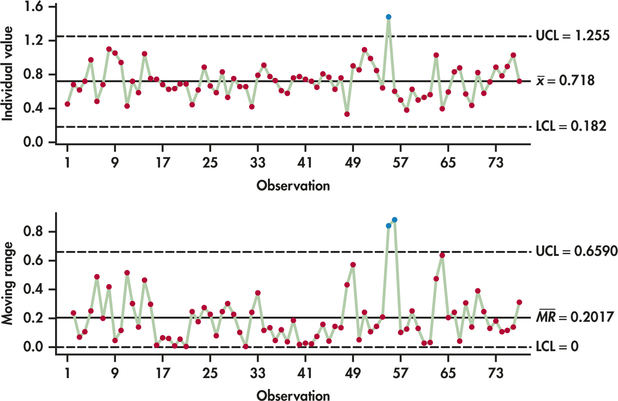
Figure 12.11 displays both the and the chart. For the most part, the chart shows a process that is stable around the center line. There is, however, a three-sigma signal with observation 55. In that game on March 3, 2014, Lebron scored 1.481 points per minute, which is much greater than expected by the upper control limit. Investigation of observation 55 reveals that Lebron scored, to date, a career high of 61 points. After the game, LeBron was quoted saying, “It felt like I had a golf ball, throwing it into the ocean.”
The chart reacts with two consecutive signals. The reason being is that there was a big jump up from observation 54 to 55 and then a big drop down from observation 55 to 56. As a result, the consecutive moving ranges are unusually large. Aside from LeBron's record performance, the control charts show that LeBron's offensive performance is an in-control process. This does not mean that we can predict his future individual game outcomes precisely, but rather it means that the level and average variability of his performance can be predicted with a high degree of confidence.
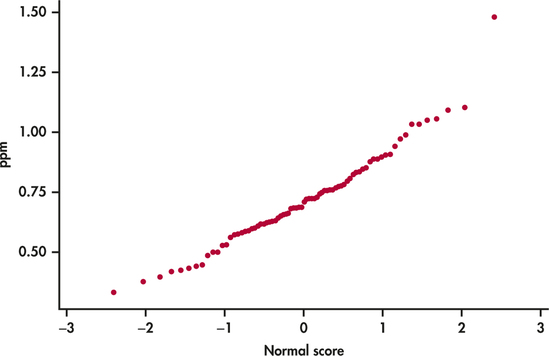
The individuals chart, like other control charts, is a three-sigma control chart with interpretation grounded in the Normal distribution. Unlike the mean chart based on sample sizes greater than one, the individuals chart does not have the advantage of the central limit theorem effect. Checking for Normality of the individual observations then becomes a particularly important step in the implementation of the individuals chart. Figure 12.12 shows the Normal quantile plot for the points per minute data. Aside from the one noted outlier, we see that the data are compatible with the Normal distribution.
Apply Your Knowledge
Question 12.16
12.16 LeBron.
lebron1
In Example 12.5 (pages 616–617), we observed an unusual observation associated with a record-breaking performance. Remove this point and reestimate the center lines and control limits for both the chart and chart. Comment on the process relative to the revised limits.
Question 12.17
12.17 Personal processes.
From your personal life, provide two examples of processes for which you would collect data in the form of individual measurements that ultimately might be monitored by an chart.
Question 12.18
12.18 LeBron in the playoffs.
lebron2
The control charts of Example 12.5 and Exercise 12.16 are based on regular-season performance. After the conclusion of the regular season, LeBron played in 20 playoff games. Here are his points per minute in the playoffs (read left to right):
| 0.70069 | 0.80335 | 0.83372 | 0.72261 | 0.60523 | 0.56242 | 0.70618 | 1.12730 |
| 0.66514 | 0.61224 | 0.51948 | 0.65381 | 0.89385 | 0.28747 | 0.78989 | 0.76026 |
| 0.93085 | 0.55253 | 0.74369 | 0.75121 |
Project the control limits from Exercise 12.16, and plot LeBron's playoff numbers. What do you conclude about LeBron's playoff performance?
Don't confuse control with capability!
A process in control is stable over time. With an in-control process, we can predict the mean and the amount of variation the process will show. Control charts are, so to speak, the voice of the process telling us what state it is in. There is no guarantee that a process in control produces products of satisfactory quality. “Satisfactory quality” is measured by comparing the product or service to some standard outside the process, set by technical specifications, customer expectations, or the goals of the organization. These external standards are unrelated to the internal state of the process, which is all that statistical control pays attention to.
Capability
Capability refers to the ability of a process to meet or exceed the requirements placed on it.
Capability has nothing to do with control—except for the very important point that, if a process is not in control, it is hard to tell if it is capable or not.
EXAMPLE 12.6 Capability
lab
CASE 12.1 Both the and charts and the and charts showed that the lab-testing process is stable and in control. Suppose that the ER stipulates that getting lab results must take no longer than 50 minutes. Figure 12.13 compares the distribution of individual lab test times with an upper specification limit (USL) of 50 minutes. We can clearly see that the process is not capable of meeting the specification.
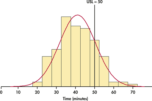

Managers must understand that, if a process that is in control does not have adequate capability, fundamental changes in the process are needed. The process is doing as well as it can and displays only the chance variation that is natural to its present state. Slogans to encourage the workers or disciplining the workers for poor performance will not change the state of the process. Better training for workers is a change in the process that may improve capability. New equipment or more uniform material may also help, depending on the findings of a careful investigation.
Figure 12.13 gives us a visual summary of the capability of the process, but managers often like a numerical summary of capability. One measure of capability is simply the percent of process outcomes that meet the specifications. When the variable we measure has a Normal distribution, we can use the estimated mean and standard deviation along with the Normal distribution to estimate this percent. When the variable is not Normal, we can use the actual percents of the measurements in the samples that meet the specifications.
There is a subtle point when it comes to estimating the standard deviation of the process. When performing process capability analysis in conjunction with subgroup charts, we could derive an estimate for based on the subgroup variability estimates or . However, these estimates are based solely on the within-subgroup variation. An alternative method of estimating the process standard deviation is to ignore the sub-grouping of the data and to simply estimate the standard deviation from the single set of all individual observations. If the process is out of control, then the single-set estimate will be larger than the subgroup-based estimates because the single-set estimate is capturing the extra variation associated with the mean shifts occurring between the subgroups. It makes little sense to summarize process capability on an out-of-control process. The summarization of process capability should occur only after the process is brought to a stable state. When the process is in control, the issue of whether to base capability analysis on a within-subgroup estimate or a single-set estimate becomes a moot point since either type will produce nearly identical results.

When performing capability analysis on a series of individual measurements in conjunction with an chart, software offers many options for estimating . One option is to simply use the sample standard deviation . It can be shown, however, that the sample standard deviation is a biased estimate of . The corrected estimate is
For series of more than 25 observations, is well approximated8 by
where is the number of individual observations. In the end, for most reasonably lengthed series, the differences between and are fairly inconsequential.
EXAMPLE 12.7 Percent Meeting Specifications
lab
CASE 12.1 Figure 12.13 shows that the distribution of individual turnaround times is approximately Normal. We found in Example 12.2 (pages 605–607) that . We now need an estimate of the standard deviation for the process producing the individual measurements.
If we use as the basis for the standard deviation estimate, then the estimate is given by
Table 12.1 (page 603) gives values for for sample sizes ranging from 2 to 25. From Example 12.2, we find . From Table 12.1, we find for , which gives the estimate for
We can now calculate the percent of lab tests that meet the upper specification:
It is estimated that about 84% of lab tests meet the ER specification of 50 minutes or less turnaround time.
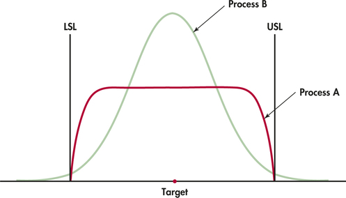
Even though percent meeting specifications seems to be a reasonable measure of process capability, there are some situations that can call into question its appropriateness. Figure 12.14 shows why. This figure compares the distributions of the diameter of the same part manufactured by two processes. The target diameter and the specification limits are marked. All the parts produced by Process A meet the specifications, but about 1.5% of those from Process B fail to do so. Nonetheless, Process B is superior to Process A because it is less variable: much more of Process B's output is close to the target. Process A produces many parts close to the lower specification limit (LSL) and the upper specification limit (USL). These parts meet the specifications, but they will fit and perform more poorly than parts with diameters close to the center of the specifications. A distribution like that for Process A might result from inspecting all the parts and discarding those whose diameters fall outside the specifications. That's not an efficient way to achieve quality.
We need a way to measure process capability that pays attention to the variability of the process (smaller is better). The standard deviation does that, but it doesn't measure capability because it takes no account of the specifications that the output must meet. Capability indices start with the idea of comparing process variation with the specifications. Process B will beat Process A by such a measure. Capability indices also allow us to measure process improvement—we can continue to drive down variation, and so improve the process, long after 100% of the output meets specifications. Continual improvement of processes is our goal, not just reaching “satisfactory” performance. The real importance of capability indices is that they give us numerical measures to describe ever-better process quality. Statistical software offers many capability indices, but we consider only the most basic ones.
capability indices
Capability Indices for Two-Sided Specifications
Consider a process with lower and upper specification limits (LSL and USL) for some measured characteristic of its output. The process mean for this characteristic is and the standard deviation is . The potential capability index is
The performance capability index is
Large values of or indicate more capable processes.
Capability indices start from the fact that Normal distributions are in practice about 6 standard deviations wide. That's the 99.7 part of the 68-95-99.7 rule. Conceptually, is the specification width as a multiple of the process width 6a. When , the process output will just fit within the specifications if the center is midway between LSL and USL. Larger values of are better—the process output can fit within the specs with room to spare. But a process with high can produce poor-quality product if it is not correctly centered. As we see with the next example, remedies this deficiency by considering both the center and the variability of the measurements.
EXAMPLE 12.8 Interpreting Capability Indices
Consider the series of pictures in Figure 12.15. We might think of a process that machines a metal part. Measure a dimension of the part that has LSL and USL as its specification limits. There is, of course, variation from part to part. The dimensions vary Normally with mean and standard deviation .
Figure 12.15(a) shows process width equal to the specification width. That is, . Almost all the parts will meet specifications if, as in this figure, the process mean is at the center of the specs. Because the mean is centered, it is from both LSL and USL, so also. In Figure 12.15(b), the mean has moved down to LSL. Only half the parts will meet the specifications. is unchanged because the process width has not changed. But sees that the center is right on the edge of the specifications, . The value becomes negative if is outside the specifications.
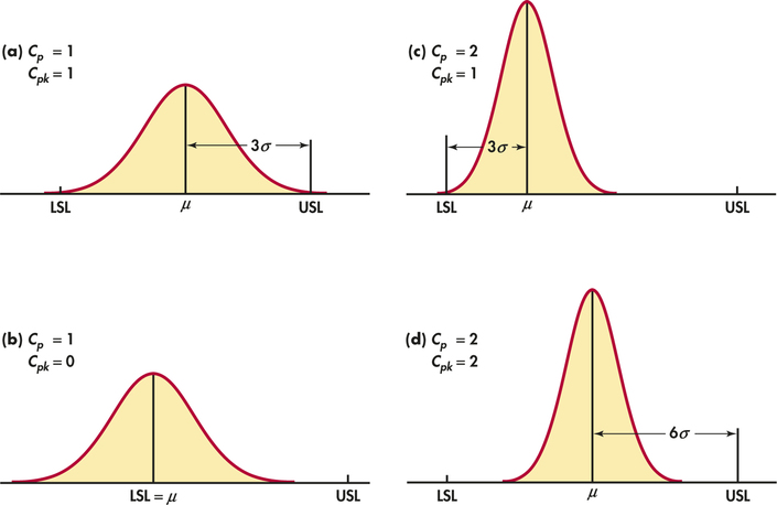
In Figures 12.15(c) and (d), the process has been reduced to half the value it had in Figures 12.15 (a) and (b). The process width is now half the specification width, so . In Figure 12.15(c), the center is just 3 of the new 's above LSL, so that . Figure 12.15(d) shows the same smaller accompanied by mean correctly centered between LSL and USL. rewards the process for moving the center from to away from the nearer limit by increasing from 1 to 2. You see that and are equal if the process is properly centered. If not, is smaller than .
Example 12.8 shows that, as a process moves off target, remains constant while decreases in value. Off-target processes have the potential of having higher capability if the mean is adjusted to the center of the specs. For these reasons, can be viewed as a measure of process potential while attempts to measure actual process performance.
EXAMPLE 12.9 O-Ring Process Capability
oring
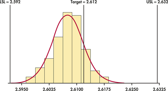
CASE 12.2 At the conclusion of the process study in Example 12.3 (pages 610–612), we found two special causes and eliminated from our data the subgroups on which those causes operated. From Figure 12.9 (page 612), after removal of the two subgroups, we find and . As noted in Case 12.2 (page 609), specification limits for the inside diameter are set at inches, which implies and . Figure 12.16 shows that the individual measurements are compatible with the Normal distribution.
From Table 12.1 (page 603), we find for , which gives the estimate for
In addition, the mean estimate is simply the grand mean . These estimates may be quite accurate if we have data on many past samples.
Estimates based on only a few observations may, however, be inaccurate because statistics from small samples can have large sampling variability. This important point is often not appreciated when capability indices are used in practice. To emphasize that we can only estimate the indices, we write and for values calculated from sample data. They are
Both indices are well above 1, which indicates that we have a highly capable process. However, the fact that is markedly smaller than indicates that the process is off target. Indeed, a close look at Figure 12.16 shows that the center of the distribution is to the left of the center of the specs. If we can adjust the center of the process distribution to the target of 2.612, then will increase and will equal .
Our discussion of capability indices has focused on capability relative to two specification limits. When there is only one specification limit involved, we can define one-sided indices as follows:
The change in denominator from 6 to 3 standard deviations reflects the focus on one specification rather than two.
EXAMPLE 12.10 Capability of a Lab-Testing Process
CASE 12.1 In Examples 12.2 and 12.7 (pages 605–607 and 621), we found the estimates for the mean and standard deviation:
In this application, the upper specification limit was set to 50 minutes. We estimate the one-sided upper capability index to be
The estimated capability index is considerably less than 1. As can be seen from Figure 12.13 (page 620), this reflects the fact that the process mean is close enough to the upper specification limit to result in a high percent of unacceptable outcomes.
We end our discussion on process capability indices on two cautionary notes. First, their interpretation is based on the assumption that the individual process measurements are Normally distributed. It is hard to interpret indices when the measurements are strongly non-Normal. It is best to apply capability indices only when a Normal quantile plot or histogram shows that the distribution is at least roughly Normal. Second, as we saw with Examples 12.9 and 12.10, process indices need to be estimated from the process data in hand. The implication is that estimated indices are statistics and thus are subject to sampling variation. A supplier under pressure from a large customer to measure often may base calculations on small samples from the process. The resulting estimate can differ greatly from the true process in either direction. As a rough rule of thumb, it is best to rely on indices computed from samples of at least 50 measurements.
Apply Your Knowledge
Question 12.19
12.19 Specification limits versus control limits.
The manager you report to is confused by LSL and USL versus LCL and UCL. The notations look similar. Carefully explain the conceptual difference between specification limits for individual measurements and control limits for .
12.19
Specifications limits track whether or not a process can meet a specification, often designated by a customer. The USL and LSL are determined by the customer, and then the process is monitored to see if the process can satisfy the customer’s demands. Control limits track whether or not a process is in control, without special cause variation acting on it. It measures inherent variation in the process and does not specify if the process can meet a customer’s specifications, only whether the process is free from outside special cause variation.
Question 12.20
12.20 versus .
Sketch Normal curves that represent measurements on products from a process with
- and .
- and .
- and .
Question 12.21
CASE 12.212.21 O-ring capability in terms of percent defective.
oring
Refer to Example 12.9 for the mean and standard deviation estimates for the O-ring application. Using software, estimate the percent of O-rings that do not meet specs. In quality applications, it is common to report defective rates in units of parts per million (ppm). What is the defective rate for the O-ring process in ppm?
12.21
0.000185438, or 185 ppm.
