12.3 Attribute Control Charts
 This page includes Video Technology Manuals
We have considered control charts for just one kind of data: measurements of a quantitative variable in some continuous scale of units. We described the distribution of measurements by its center and spread and use ˉx and R (or ˉx and s) charts for process control. In contrast to continuous data, discrete data typically result from counting. Examples of counting are the number (or proportion) of defective parts in a production run, the daily number of patients in a clinic, and the number of invoice errors. In the quality area, discrete data are known as attribute data. We consider the two most common control charts dedicated to attribute data: namely, the p chart for use when the data are proportions and the c chart for use when the data are counts of events that can occur in some interval of time, area, or volume.
Control charts for sample proportions

We studied the sampling distribution of a sample proportion ˆp in Chapter 5. When the binomial distribution underlying the sample proportions is well approximated by the Normal distribution, then the standard three-sigma framework can be applied to the sample proportion data. We ought to call such charts “ˆp charts” because they plot sample proportions. Unfortunately, they have always been called p charts in business practice. We will keep the traditional name but also keep our usual notation: p is a process proportion and ˆp is a sample proportion.
Construction of a p Chart
Take regular samples from a process that has been in control. The samples need not all be the same size. Denote the sample size for the ith sample as ni. Estimate the process proportion p of “successes” by
ˉp=total number of successes in past samplestotal number of opportunities in these samples
The center line and control limits for the p chart are
UCL=ˉp+3√ˉp(1−ˉp)niCL=ˉpLCL=ˉp−3√ˉp(1−ˉp)ni
where ni is the sample size for sample i. If the lower control limit computes to a negative value, then LCL is set to 0 because negative proportions are not possible.
If we have k preliminary samples of the same size n, then ˉp is just the average of the k sample proportions. In some settings, you may meet samples of unequal size—differing numbers of students enrolled in a month or differing numbers of parts inspected in a shift. The average ˉp estimates the process proportion p even when the sample sizes vary. In cases of unequal sample sizes, the width of the control limits will vary from sample to sample, as will be shown in Example 12.12 (pages 634–635).


Unscheduled absences by clerical and production workers are an important cost in many companies. Reducing the rate of absenteeism is, therefore, an important goal for a company's human relations department. A rate of absenteeism above 5% is a serious concern. Many companies set 3% absent as a desirable target. You have been asked to improve absenteeism in a production facility where 12% of the workers are now absent on a typical day.
You first do some background study—in greater depth than this very brief summary. Companies try to avoid hiring workers who are likely to miss work often, such as substance abusers. They may have policies that reward good attendance or penalize frequent absences by individual workers. Changing those policies in this facility will have to wait until the union contract is renegotiated. What might you do with the current workers under current policies? Studies of absenteeism of clerical and production workers who do repetitive, routine work under close supervision point to unpleasant work environment and harsh or unfair treatment by supervisors as factors that increase absenteeism. It's now up to you to apply this general knowledge to your specific problem.
First, collect data. Daily absenteeism data are already available. You carry out a sample survey that asks workers about their absences and the reasons for them (responses are anonymous, of course). Workers who are more often absent complain about their supervisor and about the lighting at their workstation. Workers complain that the restrooms are dirty and unpleasant. You do more data analysis:
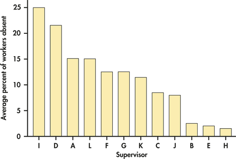
- A chart of the average absenteeism rate for the past month broken down by supervisor (Figure 12.17) shows important differences among supervisors. Only supervisors B, E, and H meet your goal of 5% or less absenteeism. Workers supervised by I and D have particularly high rates.
- Further data analysis (not shown) shows that certain workstations have substantially higher rates of absenteeism.
Now you take action. You retrain all the supervisors in human relations skills, using B, E, and H as discussion leaders. In addition, a trainer works individually with supervisors I and D. You ask supervisors to talk with any absent worker when he or she returns to work. Working with the engineering department, you study the workstations with high absenteeism rates and make changes such as better lighting. You refurbish the restrooms and schedule more frequent cleaning.
EXAMPLE 12.11 Absenteeism Rate p Chart
absent
CASE 12.3 Are your actions effective? You hope to see a reduction in absenteeism. To view progress (or lack of progress), you will keep a p chart of the proportion of absentees. The plant has 987 production workers. For simplicity, you just record the number who are absent from work each day. Only unscheduled absences count, not planned time off such as vacations.
Each day you will plot
ˆp=number of workers absent987
You first look back at data for the past three months. There were 64 workdays in these months. The total workdays available for the workers was
(64)(987)=63,168 person-days
Absences among all workers totaled 7580 person-days. The average daily proportion absent was therefore
ˉp=total days absenttotal days available for work=758063,168=0.120
The daily rate has been in control at this level.
These past data allow you to set up a p chart to monitor future proportions absent:
UCL=ˉp+3√ˉp(1−ˉp)n=0.120+3√(0.120)(0.880)987=0.120+0.031=0.151CL=ˉp=0.120LCL=ˉp−3√ˉp(1−ˉp)n=0.120−3√(0.120)(0.880)987=0.120−0.031=0.089
Table 12.8 gives the data for the next four weeks. Figure 12.18 is the p chart.
| Day | M | T | W | Th | F | M | T | W | Th | F |
| Workers absent | 129 | 121 | 117 | 109 | 122 | 119 | 103 | 103 | 89 | 105 |
| Proportion ˆp | 0.131 | 0.123 | 0.119 | 0.110 | 0.124 | 0.121 | 0.104 | 0.104 | 0.090 | 0.106 |
| Workers absent | 99 | 92 | 83 | 92 | 92 | 115 | 101 | 106 | 83 | 98 |
| Proportion ˆp | 0.100 | 0.093 | 0.084 | 0.093 | 0.093 | 0.117 | 0.102 | 0.107 | 0.084 | 0.099 |
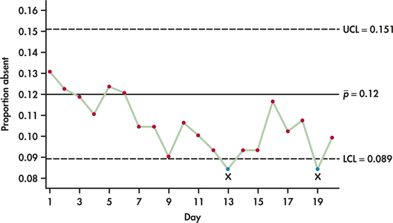
Figure 12.18 shows a clear downward trend in the daily proportion of workers who are absent. Days 13 and 19 lie below LCL, and a run of nine days below the center line is achieved at Day 15 and continues. (See Exercise 12.27 [page 627] for discussion of the “nine-in-a-row” out-of-control signal.) It appears that a special cause (the various actions you took) has reduced the absenteeism rate from around 12% to around 10%. The last two weeks' data suggest that the rate has stabilized at this level. You will update the chart based on the new data. If the rate does not decline further (or even rises again as the effect of your actions wears off), you will consider further changes.
Example 12.11 is a bit oversimplified. The number of workers available did not remain fixed at 987 each day. Hirings, resignations, and planned vacations change the number a bit from day to day. The control limits for a day's ˆp depend on n, the number of workers that day. If n varies, the control limits will move in and out from day to day. In this case, n is fairly large, which means that as long as the count of workers remains close to 987, the greater detail provided by variable limits will not likely change your conclusion. We demonstrate the construction of variable limits in the next example.
A single p chart for all workers is not the only, or even the best, choice in this setting. Because of the important role of supervisors in absenteeism, it would be wise to also keep separate p charts for the workers under each supervisor. These charts may show that you must reassign some supervisors.
EXAMPLE 12.12 Patient Satisfaction p Chart
bellin
Nationwide, health care organizations are instituting process improvement methods to improve the quality of health care delivery, including patient outcomes and patient satisfaction. Bellin Health (www.bellin.org) is a leader in the implementation of quality methods in a health care setting. Located in Green Bay, Wisconsin, Bellin Health serves nearly half a million people in northeastern Wisconsin and in the Upper Peninsula of Michigan. As part of its quality initiative, Bellin instituted a measurement control system of more than 250 quality indicators, which they later expanded to include more than 1200 quality indicators. Most of these quality indicators are monitored by control charts.
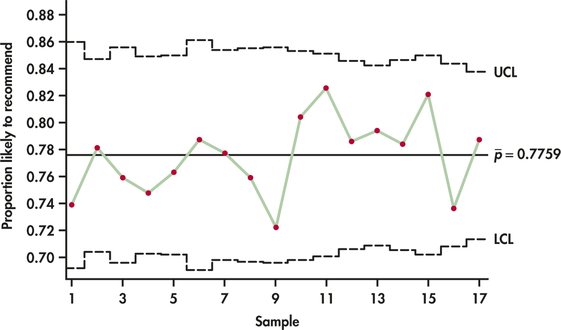
Table 12.9 gives the numbers of Bellin ambulatory (outpatient) surgery patients sampled each quarter for 17 consecutive quarters. Also provided is the number of patients out of each sample who said they would likely recommend Bellin to others for ambulatory surgery.10 The number of patients who would likely recommend Bellin can be divided by the sample size to give the sample proportion of patients who are likely to recommend Bellin. These proportions are also provided in Table 12.9.
The average quarterly proportion of patients likely to recommend Bellin is computed as follows:
ˉP=164+239+⋅⋅⋅+319222+306+⋅⋅⋅+405=37804872=0.7759
The upper and lower control limits for each sample are given by
UCL=0.7759+3√(0.7759)(0.2241)ni=0.7759+1.2510√niLCL=0.7759+3√(0.7759)(0.2241)ni=0.7759−1.2510√ni
For the first recorded quarter, the control limits are
UCL=0.7759+1.2510√222=0.8599LCL=0.7759−1.2510√222=0.6919
| Quarter | Patients likely to recommend | Total number of patients | Proportion |
| 1 | 164 | 222 | 0.7387 |
| 2 | 239 | 306 | 0.7810 |
| 3 | 186 | 245 | 0.7592 |
| 4 | 219 | 293 | 0.7474 |
| 5 | 219 | 287 | 0.7631 |
| 6 | 170 | 216 | 0.7870 |
| 7 | 199 | 256 | 0.7773 |
| 8 | 189 | 249 | 0.7590 |
| 9 | 177 | 245 | 0.7224 |
| 10 | 209 | 260 | 0.8038 |
| 11 | 227 | 275 | 0.8255 |
| 12 | 253 | 322 | 0.7857 |
| 13 | 278 | 350 | 0.7943 |
| 14 | 247 | 315 | 0.7841 |
| 15 | 234 | 285 | 0.8211 |
| 16 | 251 | 341 | 0.7361 |
| 17 | 319 | 405 | 0.7877 |
Figure 12.19 displays the p chart for all the proportions. Notice first that the control limits are of varying widths. The sample proportions are behaving as an in-control process around the center line with no out-of-control signals. Even though the stability of the process implies that Bellin is sustaining a fairly high level of satisfaction, management's goal is no doubt to find ways to increase satisfaction to even higher levels and thus cause an upward trend or upward shift in the process.
Apply Your Knowledge
Question 12.41
12.41 Unpaid invoices.
The controller's office of a corporation is concerned that invoices that remain unpaid after 30 days are damaging relations with vendors. To assess the magnitude of the problem, a manager searches payment records for invoices that arrived in the past 10 months. The average number of invoices is 2875 per month, with relatively little month-to-month variation. Of all these invoices, 960 remained unpaid after 30 days.
- What is the total number of opportunities for unpaid invoices? What is ˉp?
- Give the center line and control limits for a p chart on which to plot the future monthly proportions of unpaid invoices.
12.41
(a) 28750. ˉp=0.0334. (b) CL=0.0334, UCL=0.0435, LCL=0.0233.
Question 12.42
CASE 12.312.42 Setting up a p chart.
absent
After inspecting Figure 12.18 (page 633), you decide to monitor the future absenteeism rates using a center line and control limits calculated from the second two weeks of data recorded in Table 12.8. Find ˉp for these 10 days and give the new values of CL, LCL, and UCL.
Control charts for counts per unit of measure
In the discussion of the p chart, there is a limit to the number of occurrences we can count. For example, if 100 parts are inspected, the most defective parts we could find would be 100. In contrast, if we were counting the number of stitch flaws in an area of carpet, then the count could be 0, 1, 2, 3, and so on indefinitely. This latter example represents the Poisson setting discussed in Section 5.2. The Poisson distribution accounts for random occurrence of events within a continuous interval of time, area, or volume. From Section 5.2, we learned that a Poisson distribution with mean μ has a standard deviation of √μ. The Normal distribution can be used to approximate the Poisson distribution. As a rule of thumb, the Normal distribution is an adequate approximation for the Poisson distribution when μ≥5. With these facts in mind, we can establish a three-sigma control chart for Poisson count data.
Construction of a c Chart
Suppose that k nonoverlapping units are sampled and c1, c2, …, ck are the observed counts. Estimate the process mean count ˉc by
ˉc=1k(c1+c2+⋯+ck)
The center line and control limits for the c chart are
UCL=ˉc+3√ˉcCL=ˉcLCL=ˉc−3√ˉc
If the lower control limit computes to a negative value, then LCL is set to 0 because negative counts are not possible.
EXAMPLE 12.13 Work Safety c Chart
safety
State and federal laws require employers to provide safe working conditions for their workers. Beyond the legal requirements, many companies have implemented process improvement measures, such as Six-Sigma methods, to improve worker safety.
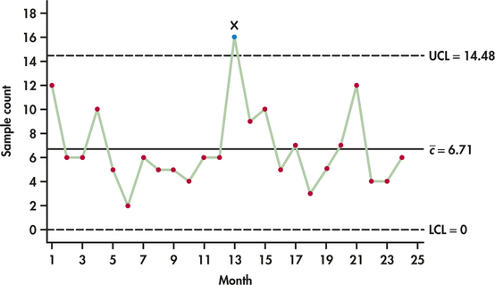
| Month: | 1 | 2 | 3 | 4 | 5 | 6 | 7 | 8 | 9 | 10 | 11 | 12 |
| Injuries: | 12 | 6 | 6 | 10 | 5 | 2 | 6 | 5 | 5 | 4 | 6 | 6 |
| Month: | 13 | 14 | 15 | 16 | 17 | 18 | 19 | 20 | 21 | 22 | 23 | 24 |
| Injuries: | 16 | 9 | 10 | 5 | 7 | 3 | 5 | 7 | 12 | 4 | 4 | 6 |
Companies recognize that such efforts have beneficial effects on employee satisfaction and reduce liability and loss of workdays, all of which can improve productivity and corporate profitability. For a manufacturing facility, Table 12.10 provides 24 months of the counts of Occupational Safety and Health Administration (OSHA) reportable injuries.
The average monthly number of injuries is calculated as follows:
ˉc=12+6+⋯+624=16124=6.7083
The center line and control limits are given by
UCL=ˉc+3√ˉc=6.7083+3√6.7083=14.48CL=ˉc=6.7083LCL=ˉc−3√ˉc=6.7083−3√6.7083=−1.06→0
Figure 12.20 shows the sequence plot of the counts along with the previously computed control limits. We can see that the 13th count falls above the upper control limit. This unusually high number of injuries is a signal for management investigation. If a special cause can be found for the out-of-control signal, then the associated observation should be removed from the preliminary data and the control limits should be recomputed. We leave the recomputation of this c chart application to Exercise 12.43.
Apply Your Knowledge
Question 12.43
12.43 Worker safety.
safety
An investigation of the out-of-control signal seen in Figure 12.20 revealed that not only were there new hires that month, but new machinery was installed. The combination of relatively inexperienced employees and unfamiliarity with the new machinery resulted in an unusually high number of injuries. Remove the out-of-control observation from the data count series and recompute the c chart control limits. Comment on control of the remaining counts.
12.43
CL=6.304, UCL=13.84, LCL=−1.23, so use 0. The remaining points are in control.
Question 12.44
12.44 Positive lower control limit?
What values of ˉc are associated with a positive lower control limit for the c chart?