13.5 Moving-Average and Smoothing Models
In the previous sections, we learned that regression is a powerful tool for capturing a variety of systematic effects in time series data. In practice, when we need forecasts that are as accurate as possible, regression and other sophisticated time series methods are commonly employed. However, it is often not practical or necessary to pursue detailed modeling for each and every one of the numerous time series encountered in business. One popular alternative approach used by business practitioners is based on the strategy of “smoothing” out the random or irregular variation inherent to all time series. By doing so, we gain a general feel for the longer-term movements in a time series.
Moving-average models
Perhaps the most common method used in practice to smooth out short-term fluctuations is the moving-average model. A moving average can be thought of as a rolling average in that the average of the last several values of the time series is used to forecast the next value.
Moving-Average Forecast Model
The moving-average forecast model uses the average of the last k values of the time series as the forecast for time period t. The equation is
ˆyt=yt-1+yt-2+⋯+yt-kk
The number of preceding values included in the moving average is called the span of the moving average.
Some care should be taken in choosing the span k for a moving-average forecast model. As a general rule, larger spans smooth the time series more than smaller spans by averaging many ups and downs in each calculation. Smaller spans tend to follow the ups and downs of the time series.
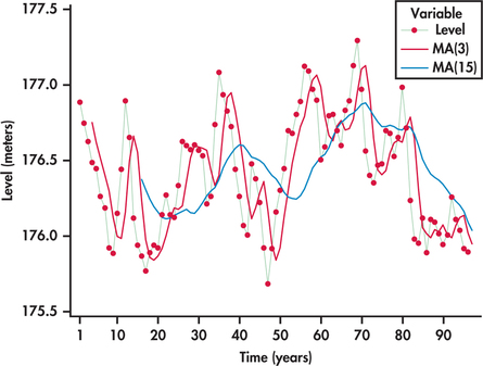
EXAMPLE 13.26 Great Lakes water Levels
lakes
Consider again the annual average water levels of Lakes Michigan and Huron studied in Example 13.23 (page 687). Figure 13.45 displays moving-average one-step ahead forecasts based on a span of three years and moving averages based on a span of 15 years.
The 15-year moving averages are much more smoothed out than the three-year moving averages. The 15-year moving averages provide a long-term perspective of the cyclic movements of the lake levels. However, for this series, the 15-year moving average model does not seem to be a good choice for short-term forecasting. Because the 15-year moving averages are “anchored” so many years into the past, this model tends to lag behind when the series shifts in another direction. In contrast, the three-year moving averages are better able to follow the larger ups and downs while smoothing the smaller changes in the time series.
The lake series has 96 observations ending with 2013. Here is the computation for the three-year moving-average forecast of the lake level for 2014:
ˆy97=y96+y95+y943=527.8483=175.95
When dealing with seasonal data, it is generally recommended that the length of the season be used for the value of k. In doing so, the average is based on the full cycle of the seasons, which effectively takes out the seasonality component of the data.
EXAMPLE 13.27 Light Rail Usage
rail
Figure 13.46 displays the quarterly number of U.S. passengers (in thousands) using light rail as a mode of transportation. The series begins with the first quarter of 2009 and ends with the first quarter of 2014.26 We can see a regularity to the series: the first quarter’s ridership tends to be lowest; then there is a progressive rise in ridership going into the second and third quarters, followed by a decline in the fourth quarter. Superimposed on the series are the moving-average forecasts based on a span of k=4. Notice that the seasonal pattern in the time series is not present in the moving averages. The moving averages are a smoothed-out version of the original time series, reflecting only the general trending in the series, which is upward.
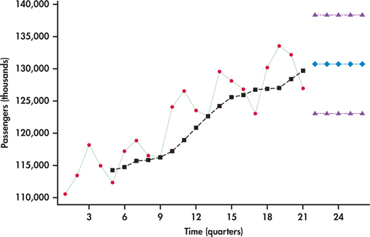
Even though the moving averages help highlight the long-run trend of a time series, the moving-average model is not designed for making forecasts in the presence of trends. The problem is that the moving average is derived from past observations all the while the process is trending away from those observations. So, the moving averages are always lagging behind. Figure 13.46 also shows the moving-average model forecasts and prediction limits projected into the future. Notice that the moving-average model makes no accommodation for the trend in its forecasts.
Apply Your Knowledge
Question 13.46
13.46 Information services hires rate.
The U.S. Department of Labor tracks hiring activity in various industry sectors. Consider monthly data on the hires rate (%) in the information services sector from January 2009 through June 2014.27 “Hires rate” is defined as the number of hires during the month divided by the number of employees who worked during or received pay for the pay period.
- Use software to make a time plot of the hires rate time series. Describe the basic features of the time series. Be sure to comment on whether a trend or significant shifts are present or not in the series.
- Calculate 1-month, 2-month, 3-month, and 4-month moving-average forecasts for the hires rate time series.Page 694
- Compute the residuals for the 1-month, 2-month, 3-month, and 4-month moving-average models fitted in part (b). (Note: Given the different spans, you will find a different number of residuals for each of the models.)
hires
Question 13.47
13.47 Comparing models for hires rate with MAD.
When comparing competing forecast methods, a primary concern is the relative accuracy of the methods. Ultimately, how well a forecasting method does is reflected in the residuals (“prediction errors”).
One measure of forecasting accuracy is mean absolute deviation (MAD). As the name suggests, it is a measure of the average size of the prediction errors. For a given set of residuals (et),
MAD=Σ|et|n
where et is the residual for period t and n is the number of available residuals. Compute MAD for the residuals from the 1-month, 2-month, 3-month, and 4-month moving-average models determined in Exercise 13.46, part (c).
- What moving-average span value corresponds with the smallest MAD?
mean absolute deviation (MAD)
13.47
(a) The MADs are: 1-month: 0.46769, 2-month: 0.37500, 3-month: 0.36138, 4-month: 0.34619. (b) The 3-month MAD is the smallest.
hires
Question 13.48
13.48 Comparing models for hires rate with MSE.
In Exercise 13.47, the mean absolute deviation was introduced as a measure of forecasting accuracy. Another measure is mean squared error (MSE), which is a measure of the average size of the prediction errors in squared units:
MSE=∑e2tn
where et is the residual for period t and n is the number of available residuals. (Note: Some software refers to this measure as mean squared deviation, or MSD.)
- Compute MSE for the residuals from the 1-month, 2-month, 3-month, and 4-month moving-average models determined in Exercise 13.46, part (c).
- What moving-average span value corresponds with the smallest MSE?
mean squared error (MSE)
hires
Question 13.49
13.49 Comparing models for hires rate with MAPE.
MAD (Exercise 13.47) measures the average magnitude of the prediction errors, and MSE (Exercise 13.48) measures the average squared magnitude of the prediction errors. To put the prediction errors in perspective, it can be useful to measure the errors in terms of percents. One such measure is mean absolute percentage error (MAPE):
MAPE=∑(|et|yt)n×100%
where et is the residual for period t, yt is the actual observation for period t, and n is the number of available residuals.
mean absolute percentage error (MAPE)
- Compute MAPE to the hundredth place for residuals from the 1-month, 2-month, 3-month, and 4-month moving-average models determined in Exercise 13.46, part (c).
- What moving-average span value corresponds with the smallest MAPE?
13.49
(a) The MAPEs are: 1-month: 22.0042, 2-month: 17.3309, 3-month: 16.5842, 4-month: 17.2786. (b) The 3-month MAPE is the smallest.
hires
Moving average and seasonal ratios
Figure 13.46 illustrated that we should not rely on moving averages for predicting future observations of a trending series. However, we can use the moving averages to isolate the general trend movement. By comparing the seasonal observations relative to the general trend, we have a means of estimating the seasonal component. Recall that with Examples 13.16 and 13.18, we used seasonal indicator variables in a regression model to estimate the seasonal effect. In practice, there is another approach for estimating the seasonal effect without the use of regression.
The approach utilizes the moving averages to provide a baseline for the general level of the series, not to provide forecasts. Instead of projecting the moving averages into the future, we use them as a summary of the past. Consider, for example, the first computed moving average on quarterly data:
y1+y2+y3+y44
If we were to use this average as a forecast, then it would forecast period 5. Instead, we look at the average as representing the past level of the time series. A minor difficulty can arise when using the moving average to estimate the past level of the time series. Because the moving average was based on periods 1, 2, 3, and 4, it is technically centered on period t=2.5. This is problematic because we want to compare the observations that fall on the whole number time periods with the level of the series to estimate the seasonality component. The solution to this difficulty can be recognized by considering the next moving average in the quarter series:
y2+y3+y4+y54
The preceding moving average represents the level of the series at t=3.5. We now have one moving average representing t=2.5 and another one representing t=3.5. By taking the average of these two moving averages, we now have a new average that will be centered on t=3. This average is referred to as centered moving average (CMA).
centered moving average (CMA)
The second step of averaging the averages is only necessary when the number of seasons is even, as with semiannual, quarterly, or monthly data. However, if the number of seasons is odd, then the initial moving average is the centered moving average. As an example, if we had data for the seven days of the week, then we would take a moving average of span 7. The average of the first seven periods will center on t=4. Let’s now illustrate the computation of centered moving averages with an example.
EXAMPLE 13.28 Light Rail Usage and Centered Moving Averages
rail
Excel is a convenient way to manually compute the moving averages and centered moving averages. Figure 13.47 shows a screenshot of the Excel computations for the light rail usage data. The first moving average of 114279.25 is computed as the average of the first four periods. In terms of the Excel spreadsheet shown in Figure 13.47, enter
=AVERAGE(D2:D5)
in cell E3 and copy the formula down to cell E20. As a result, we find that the second moving average of 114721.25 is computed as the average of periods 2 through 5. The first centered moving average is then
CMA=114279.25+114721.252=229000.52=114500.25
This value can be seen in the spreadsheet and was obtained by entering
=AVERAGE(E3:E4)
in cell F4. This first centered moving average is properly sitting on t=3. The remaining centered moving averages can be found by copying the formula in cell F4 down to cell F20. The last moving average found in cell E20 involves periods 18 through 21, and it represents t=19.5. The next-to-last moving average in cell E19 represents t=18.5. The average of these two averages gives the last shown centered moving average of 130216.86 (cell F20), which represents t=19.
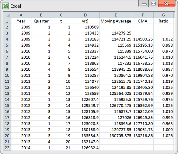
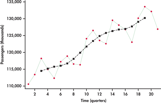
Figure 13.48 shows the centered moving averages plotted on the passenger series. Similar to Figure 13.46, the averages show the general trend. However, unlike Figure 13.46, these averages are shifted back in time to provide an estimate of where the level of the process was as opposed to a forecast of where the process might be.
seasonal ratio
Now that we have an appropriate baseline estimate for the level of the process historically, we can compute the seasonal component. Probably the most common approach is to compute a seasonal ratio. The ratio approach works on the basis of a multiplicative seasonal model studied earlier, namely,
ˆy=TREND×SEASON
For the observed data y, the basic idea behind seasonal ratios can be seen by rearranging the trend-times-seasonal model:
yTREND=SEASON
This ratio says that we can isolate the seasonal component by dividing the data by the level of series as estimated by the trend component. Let’s see how this works by continuing our study of the light rail passenger series.
EXAMPLE 13.29 Light Rail Usage and Seasonal Ratios
From Example 13.28, we used the moving averages to estimate the level of time series, which is trending over time. For each of the estimated levels given by the centered moving averages, we calculate the ratio of actual sales divided by the centered moving average. For the spreadsheet shown in Figure 13.47, we would enter
=D4/F4
in cell G4 and then copy the formula down to cell G20. The resulting ratios are shown in the last column of the Excel spreadsheet.
Because we have more than one seasonal ratio observation for a given quarter, we average these ratios by quarter. That is, we compute the average for all the quarter 1 ratios, then the average for all the quarter 2 ratios, and so on. These averages become our seasonal ratio estimates. The following table displays the seasonal ratios that result.
| Quarter | Seasonality ratio |
| 1 | 0.970 |
| 2 | 1.016 |
| 3 | 1.022 |
| 4 | 0.993 |
The seasonality ratios are a snapshot of the typical ups and downs over the course of a year. If you think of the ratios in terms of percents, then the ratios show how each quarter compares to the average level for all four quarters of a given year. For example, the first quarter’s ratio is 0.97, or 97%, indicating that the number of passengers for the first quarter sales are typically 3% below the average for all four quarters. The third quarter’s ratio is 1.022, or 102.2%, indicating that ridership in the third quarter is typically 2.2% above the annual average. Figure 13.49 plots the seasonality factors by quarter. The reference line marked at 1.0 (100%) is a visual aid for interpreting the factors compared to the overall average quarterly ridership. Notice how the seasonality ratios mimic the pattern that is repeated every four quarters in Figure 13.46 (page 693).
The centered moving averages provide us with a historical baseline of the trend level. They, however, are not intended for forecasting the series into the future. With seasonal ratios in hand, the next step is to seasonally adjust the series so that we can estimate the overall trend for forecasting purposes.

EXAMPLE 13.30 Seasonally Adjusted Light Rail Usage
rail
By again rearranging the trend-times-seasonal model, we obtain
ySEASON=TREND
This ratio tells us how to seasonally adjust a series. In particular, by dividing the original series by the seasonal component, we are then left with the trend component with no seasonality. Dividing each observation of the original series by its respective seasonal ratio found in Example 13.29 results in the series shown in Figure 13.50. This adjusted series does not show the regular ups and downs of the original unadjusted data. At this stage, we can come up with a trend line equation using regression as seen in Figure 13.50. Our trend-and-season predictive model is then
ˆyt=(111,199+1010.9t)×SR
where SR is the seasonality ratio for the appropriate quarter corresponding to the value of t.
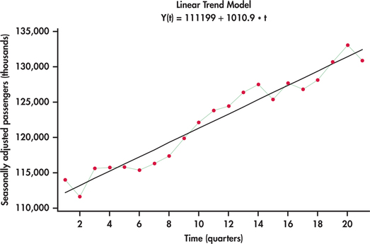
To illustrate the computation of a forecast, we note that the series ended on the first quarter with t=21. This means that the next period in the future is the second quarter with t=22. Accordingly, the forecast would be
ˆyt=[111,199+1010.9(22)]×1.016=135,573.82
Many economic time series are routinely adjusted by season to make the overall trend, if it exists, in the numbers more apparent. Government agencies often release both versions of a time series, so be careful to notice whether you are analyzing seasonally adjusted data when using government sources.
For the series of Example 13.30, the regression output for the trend fit would show that the trend coefficient is significant with a P-value of less than 0.0005. In some cases, we may find that the seasonally adjusted series exhibits no significant trend. In such cases, we shouldn’t impose the use of the trend model unnecessarily. For example, if we find the seasonally adjusted series to exhibit “flat” random behavior, then we would simply project the average of the series into the future and make adjustments upon the average value.
Apply Your Knowledge
Question 13.50
CASE 13.113.50 Seasonality ratios for Amazon sales data.
In Example 13.18 (pages 675–676), the seasonal component was estimated with the use of indicator variables. As an alternative, the seasonality can be captured with seasonal ratios computed by means of moving averages.
- Use the moving-average approach to compute seasonal ratios and report their values.
- Produce and plot the seasonally adjusted series. What are your impressions of this plot?
- Fit and report an exponential trend model fitted to the seasonally adjusted series.
- Provide a forecast for Amazon sales for the future period of t=59. How does this forecast compare with the forecasts provided in Example 13.18?
amazon
Exponential smoothing models
Moving-average forecast models appeal to our intuition. Using the average of several of the most recent data values to forecast the next value of the time series is easy to understand conceptually. However, two criticisms can be made against moving-average models. First, our forecast for the next time period ignores all but the last k observations in our data set. If you have 100 observations and use a span of k=5, your forecast will not use 95% of your data! Second, the data values used in our forecast are all weighted equally. In many settings, the current value of a time series depends more on the most recent value and less on past values. We may improve our forecasts if we give the most recent values greater “weight” in our forecast calculation. Exponential smoothing models address both of these criticisms.
Several variations exist on the basic exponential smoothing model. We look at the details of the simple exponential smoothing model, which we refer to as, simply, the exponential smoothing model. More complex variations exist to handle time series with specific features, but the details of these models are beyond the scope of this chapter. We only mention the scenarios for which these more complex models are appropriate.
Exponential Smoothing Model
The exponential smoothing model uses a weighted average of the observed value yt−1 and the forecasted value ˆyt−1 as the forecast for time period t. The forecasting equation is
ˆyt=wyt−1+(1−w)ˆyt−1
The weight w is called the smoothing constant for the exponential smoothing model and is traditionally assumed have a range of 0≤w≤1.
It should be noted that in the time series literature, there is no consistency on the assumption about the range of w in terms of inclusion or exclusion of the values of 0 and 1 as choices for w. Even with software there are differences. Excel allows w to be 1 but not 0. JMP and Minitab allow w to be 0 or 1. At the end of this section, we note that statistical software can even allow for a wider range for w.
Choosing the smoothing constant w in the exponential smoothing model is similar to choosing the span k in the moving-average model—both relate directly to the smoothness of the model. Smaller values of w correspond to greater smoothing of movements in the time series. Larger values of w put most of the weight on the most recent observed value, so the forecasts tend to be close to the most recent movement in the series. Some series are better suited for larger w, while others are better suited for smaller w. Let’s explore a couple of examples to gain insights.
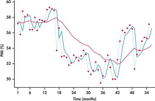
EXAMPLE 13.31 PMI Index Series
pmi
On the first business day of each month, the Institute for Supply Management (ISM) issues the ISM Manufacturing Report on Business. This report is viewed by many economists, business leaders, and government agencies as an important short-term economic barometer of the manufacturing sector of the economy. In the report, one of the economic indicators reported is the PMI index. The acronym PMI originally stood for Purchasing Manager’s Index, but ISM now only uses the acronym without any reference to its past meaning.
PMI is a composite index based on a survey of purchasing managers at roughly 300 U.S. manufacturing firms. The components of the index relate to new orders, employment, order backlogs, supplier deliveries, inventories, and prices. The index is scaled as a percent—a reading above 50% indicates that the manufacturing economy is generally expanding, while a reading below 50% indicates that it is generally declining.
Figure 13.51 displays the monthly PMI values from January 2010 through July 2014.28 Also displayed are the forecasts from the exponential smoothing with w=0.1 and w=0.7.
The PMI series shows a meandering movement due to successive observations tending to be close to each other. Earlier, we referred to this behavior as positive autocorrelation (page 678). With successive observations being close, it would seem intuitive that a larger smoothing constant would work better for tracking and forecasting the series. Indeed, we can see from Figure 13.51 that the forecasts based on w=0.7 track much closer to the PMI series than the forecasts based on w=0.1. With a smoothing constant of 0.1, the model smoothes out much of the movement (both short term and long term) in the series. As a result, the forecasts react slowly to momentum shifts in the series.
When successive observations do not show a persistence to be close to each other, a larger value for w is no longer a preferable choice, as we can see with the next example.
EXAMPLE 13.32 Disney Returns
disney
In Example 13.1 (pages 645–646), we first studied the weekly returns of Disney stock with a time plot. The time plot along with the runs test (Example 13.5, page 653) and ACF (Example 13.6, pages 653–654) showed that the returns series is consistent with a random series.
Figure 13.52(a) shows the last 20 observations of the series with forecasts based on w=0.7. With a smoothing constant of 0.7, the one-step-ahead forecasts are close in value to the most recent observation in the returns series. Because the returns are bouncing around randomly, we find that the forecasts are also bouncing around randomly but are often considerably off from the actual observations they are attempting to predict. Looking closely at Figure 13.52(a), we see that when a return is higher than the average, then the forecast for the next period’s return is also higher than average. But, with randomness, the next period’s return can easily be below the average, resulting in the forecast being considerably off mark. Based on a similar argument, a return that is below average can result in a forecast for next period being considerably off. In other words, a larger w is giving unnecessary weight to random movements, which, by their very nature, have no predictive value.
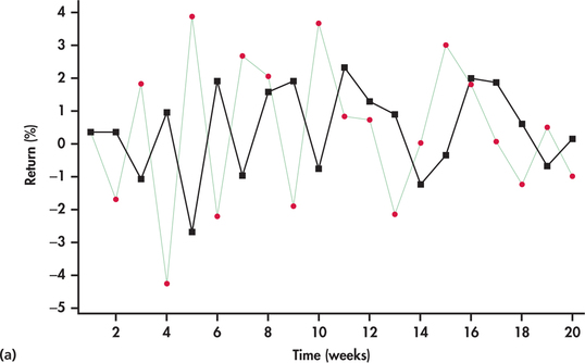
Figure 13.52(b) shows the forecasts based on a smaller smoothing constant, w=0.1. With a smaller smoothing constant, we see a more smoothed-out forecast curve with the forecasts being less reactive to the up-and-down, short-term random movements of the returns. As we progressively make the smoothing constant smaller, the forecast curve converges to the overall average of the observations.
A little algebra is needed to see how the exponential smoothing model utilizes the data differently than the moving-average model. We start with the forecasting equation for the exponential smoothing model and imagine forecasting the value of the time series for the time period n+1, where n is the number of observed values in the time series:
ˆyn+1=wyn+(1−w)ˆyn=wyn+(1−w)[wyn−1+(1−w)ˆyn−1]=wyn+(1−w)wyn−1+(1−w)2ˆyn−1=wyn+(1−w)wyn−1+(1−w)2[wyn−2+(1−w)ˆyn−2]=wyn+(1−w)wyn−1+(1−w)2wyn−2+(1−w)3ˆyn−2⋮=wyn+(1−w)wyn−1+(1−w)2wyn−2+⋯+(1−w)n−2wy2+(1−w)n−1ˆy1
This alternative version of the forecast equation shows exactly how our forecast depends on the values of the time series. Notice that the calculation of ˆyn+1 can be tracked all the way back to the initial forecast ˆy1. It is common practice to initiate the exponential smoothing model by using the actual value of the first time period y1 as the forecast for the first time period ˆy1. Excel and JMP indeed initiate the exponential smoothing model in this manner. However, Minitab’s default is to use the average of the first six observations as the initial forecast. This default can be changed so that the initial forecast is the first observation. We also learn from the backtracking that the forecast for yn+1 uses all available values of the time series y1, y2, …, yn, not just the most recent k-values like a moving-average model would. The weights on the observations decrease exponentially in value by a factor of (1−w) as you read the equation from left to right down to the y2. This factor of (1−w) is known as the damping factor.
damping factor
While the second version of our forecasting equation reveals some important properties of the exponential smoothing model, it is easier to use the first version of the equation for calculating forecasts.
EXAMPLE 13.33 Forecasting PMI
pmi
Consider forecasting August 2014 PMI using an exponential smoothing model with w=0.7. The PMI series ended on t=55. This means that the forecasting of August 2014 is forecasting period 56:
ˆy56=0.7y55+(1−0.7)ˆy55
We need the forecasted value ˆy55 to finish our calculation. However, to calculate ˆy55, we will need the forecasted value of ˆy54! In fact, this pattern continues, and we need to calculate all past forecasts before we can calculate ˆy56. We calculate the first few forecasts here and leave the remaining calculations for software. Taking ˆy1 to be y1, the calculations begin as follows:
ˆy2=0.7×y1+(1−0.7)׈y1=(0.7)(57.2)+(0.3)(57.2)=57.2ˆy3=0.7×y2+(1−0.7)׈y2=(0.7)(55.8)+(0.3)(57.2)=56.22ˆy4=0.7×y3+(1−0.7)+ˆy3=(0.7)(58.8)+(0.3)(56.22)=58.026
Software continues our calculations to arrive at a forecast for y55 of 55.248. We use this value to complete our forecast calculation for y56:
ˆy56=0.7×y55+(1−0.7)׈y55=(0.7)(57.1)+(0.3)(55.248)=56.544
With the forecasted value for August 2014 from Example 13.33, the forecast for September requires only one calculation:
ˆy57=(0.7)(y56)+(0.3)(56.544)
Once we observe the actual PMI for August 2014 (y56), we can enter that value into the preceding forecast equation. Updating forecasts from exponential smoothing models only requires that we keep track of last period’s forecast and last period’s observed value. In contrast, moving-average models require that we keep track of the last k observed values of the time series.
In Examples 13.31 and 13.32, we illustrated situations in which either larger or smaller smoothing constants are preferable. However, our discussions only revolved around values of 0.1 and 0.7 for w. These choices are quite arbitrary and were only used for illustrative purposes. In practice, we want to fine-tune the smoothing constant with the hope to obtain tighter forecasts.
One approach is to try different values of w along with a measure of forecast accuracy and find the value of w that does best. For example, we can search for the value of w that minimizes mean squared error (MSE); MSE is a measure of forecasting accuracy that was introduced in Exercise 13.48 (page 694). Spreadsheets can be utilized to do the computations on different possible values of w to help us hone in on a reasonable choice of w. As an alternative, statistical software packages (such as JMP and Minitab) provide an option to estimate the “optimal” smoothing constant. Earlier we mentioned that there is a more general class of time series known as ARIMA models (page 682). It turns out that the exponential smoothing forecast equation is the optimal equation for a very special ARIMA model.29 This special ARIMA model has a certain parameter that is directly related to the smoothing constant w. So, by estimating the parameter, we have an estimate for w.
EXAMPLE 13.34 Optimal Smoothing Constant for PMI Index Series
pmi
Figure 13.53 shows output from JMP and Minitab for the estimation of the optimal smoothing constant. JMP reports the value as 0.7953, and Minitab reports the value as 0.7908. The slight difference in these values is because the software applications use different procedures for estimating ARIMA parameters.
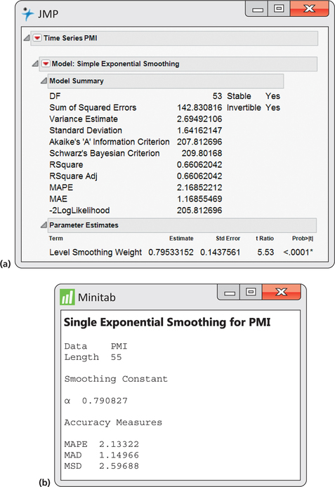
When we defined the exponential smoothing model (page 700), we stated that the smoothing constant is traditionally assumed to fall in the range of 0≤w≤1. A smoothing constant value in this range has intuitive appeal as being a weighted average of the observation and forecast in which the weights are positive percentages adding up to 100%. For example, a w of 0.40 implies 40% weight on the observation value and 60% weight on the forecast value.
However, it turns out that when the exponential smoothing model is viewed from the perspective of being connected to an ARIMA model, then the smoothing constant can possibly take on a value greater than 1. When finding an optimal value for w, Minitab allows w to fall in the range of 0≤w<2. JMP provides the user with a number of options in its estimation of the smoothing constant: (1) constrained to the range of 0≤w≤1; (2) constrained to the range of 0≤w<2; (3) allowing w to be any possible value with no constraints. Without going into the technical reasons, it can be shown that as long as w is in the range of 0≤w<2, then the forecasting model is considered stable. If software estimates w to be greater than 1, then there are a couple of options. The first option is to go ahead and use it in the exponential smoothing model. There is nothing technically wrong with doing so. However, there are practitioners who are uncomfortable with a smoothing constant greater than 1 and prefer to have the traditional constraint. In such a case, the next best option in terms of minimizing MSE is to choose a value of 1 for w.
Similar to the moving-average model, the simple exponential smoothing model is best suited for forecasting time series with no strong trend. It is also not designed to track seasonal movements. Variations on the simple exponential smoothing model have been developed to handle time series with a trend (double exponential smoothing and Holt’s exponential smoothing), with seasonality (seasonal exponential smoothing), and with both trend and seasonality (Winters’ exponential smoothing). Your software may offer one or more of these smoothing models.
Apply Your Knowledge
Question 13.51
13.51 Domestic average air fare.
The Bureau of Transportation Statistics conducts a quarterly survey to monitor domestic and international airfares.30 Here are the average airfares (inflation adjusted) for U.S. domestic flights for 2000 through 2013:
| Year | Airfare | Year | Airfare | Year | Airfare |
| 2000 | $463.56 | 2005 | $370.63 | 2010 | $363.51 |
| 2001 | $426.27 | 2006 | $384.30 | 2011 | $381.14 |
| 2002 | $409.97 | 2007 | $369.25 | 2012 | $385.00 |
| 2003 | $404.36 | 2008 | $379.86 | 2013 | $385.97 |
| 2004 | $381.84 | 2009 | $341.27 |
- Hand calculate forecasts for the time series using an exponential smoothing model with w=0.2. Provide a forecast for the average U.S. domestic airfare for 2014.
- Hand calculate forecasts for the time series using an exponential smoothing model with w=0.8. Provide a forecast for the average U.S. domestic airfare for 2014.
- Write down the forecast equation for the 2015 average U.S. domestic airfare based on the exponential smoothing model with w=0.2.
13.51
(a) and (b)
| Year | Airfare | Forecast w=0.2 |
Forecast w=0.8 |
|---|---|---|---|
| 2000 | 463.56 | 463.56 | 463.56 |
| 2001 | 426.27 | 463.56 | 463.56 |
| 2002 | 409.97 | 456.10 | 433.73 |
| 2003 | 404.36 | 446.88 | 414.72 |
| 2004 | 381.84 | 438.37 | 406.43 |
| 2005 | 370.63 | 427.07 | 386.76 |
| 2006 | 384.3 | 415.78 | 373.86 |
| 2007 | 369.25 | 409.48 | 382.21 |
| 2008 | 379.86 | 401.44 | 371.84 |
| 2009 | 341.27 | 397.12 | 378.26 |
| 2010 | 363.51 | 385.95 | 348.67 |
| 2011 | 381.14 | 381.46 | 360.54 |
| 2012 | 385 | 381.40 | 377.02 |
| 2013 | 385.97 | 382.12 | 383.40 |
| 2014 | 382.89 | 385.46 |
(c) ˆy2015=(0.2)(y2014)+(0.8)(382.89).
Question 13.52
13.52 Domestic average airfare.
Refer to Exercises 13.47, 13.48, and 13.49 (page 694) for explanation of the forecast accuracy measures MAD, MSE, and MAPE.
- Based on the forecasts calculated in part (a) of Exercise 13.51, calculate MAD, MSE, and MAPE.
- Based on the forecasts calculated in part (b) of Exercise 13.51, calculate MAD, MSE, and MAPE.