13.1 Assessing Time Series Behavior
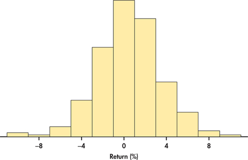
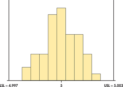
When possible, data analysis should always begin with a plot. What we choose as an initial plot can be critical. Consider the case of a manufactured part that has a dimensional specification of 5 millimeters (mm) with tolerances of ±0.003. This means that any part that is less than 4.997 mm or greater than 5.003 mm is considered defective. Suppose 50 parts were sampled from the manufacturing process. It is tempting to start the data analysis with a histogram plot such as Figure 13.1. The specification limits have been added to the plot. The histogram shows a fairly symmetric distribution centered on the specification of 5 mm. Relative to the tolerance limits, the histogram suggests a highly capable process with little chance of producing a defective item. But before handing out a quality award to manufacturing, let us recall a time plot, which was in introduced in Chapter 1.
Time Plot
A time plot of a variable plots each observation against the time at which it was measured. Time is marked on the horizontal scale of the plot, and the variable you are studying is marked on the vertical scale. Connecting sequential data points by lines helps emphasize any change over time.
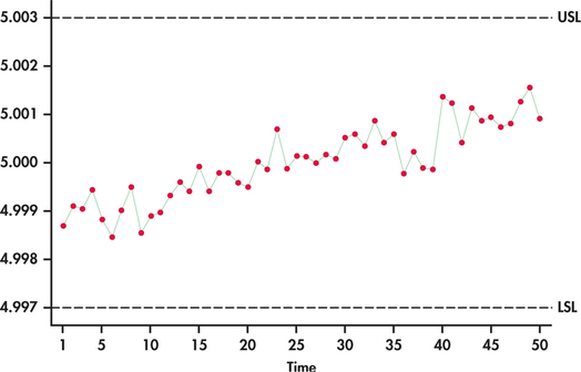
We have previously seen an example of a time plot in Figure 1.12 (page 20). There we saw that T-bill interest rates show a series in which successive observations are close together in value, and as a result, the series exhibits a “meandering” or “snakelike” type of movement. Figure 13.2 is a time plot of the 50 manufactured parts plotted in order of manufacture and exhibits a general upward trend over time.

Compared to the histogram, this graph gives a dramatically different conclusion about the process. It is not stable between the target tolerances. In fact, if the pattern continues, we would expect the process to produce many defective parts. For this process, the histogram is misleading. In general, a histogram is used to describe a single population, but the population is changing over time here. The moral of the story is clear. The first step in the analysis of time series data should always be the construction of a time plot.
Time series can exhibit a variety of patterns over time. We explore many of these patterns in this chapter and learn how to exploit them for forecasting purposes. But before we do so, let us explore a special type of process that is patternless.
EXAMPLE 13.1 Stock Price Returns

Whether it is by smartphone, laptop, or tablet, investors around the world are habitually checking the ups and downs of individual stock prices or indices (like the Dow Jones or S&P 500). Even the most casual investor knows that stock prices constantly change over time. If the changes are large enough, investors can make a fortune or suffer a great loss.
disney
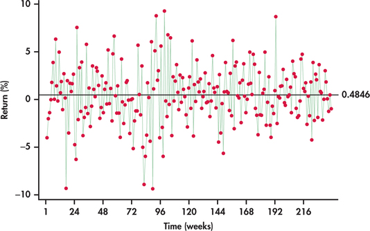
Figure 13.3 plots the weekly stock price returns of Disney stock as a percent from the beginning of January 2010 through the end of July 2014.2 To add perspective, a horizontal line at the average has been superimposed on the plot. We are left with some impressions:
- The returns exhibit clear variation with lows near −10% and highs near +10%.
- The returns scatter around the average of 0.4846% with no tendency to trend away from the average over time.
- Sometimes, consecutive returns bounce from one side of the average to the other side, while at other times, they do not. Overall, there is no persistent pattern in the sequence of consecutive observations. The fact that a return is above or below the average seems to provide no insight as to whether future returns will fall above or below the average.
- The variation of the returns around the sample average appears about the same throughout the series.
In the formal area of time series analysis, there are numerous, often quite technical, ways to classify time series based on their behavior. For our discussions, a time series characterized by a constant mean level, no systematic pattern of observations, and a constant level variation as found in Example 13.1 defines a random process.
random process
Moving forward, it will be convenient to use the subscript t to represent the time period. As an example, for a time series y, y1 represents the observation value for the time series y at period 1 and, likewise, y2 represents the value of the series at period 2. Basically, t is a time index for the periods. Periods are regular time intervals such as hours, shifts, days, weeks, months, quarters, years, and so on.
A random process can be represented by the following equation:
yt=μ+εt
The deviations εt represent “noise” that prevents us from observing the value of μ. These deviations are independent, with mean 0 and standard deviation σ.
As we saw with Example 13.1, random processes do occur in practice. It is often the case, however, that time series data exhibit patterns, or systematic departures from random behavior. A random process lacks any regularity in terms of a pattern. As such, a random process can be viewed as producing irregular variation. In practice, a time series can often be decomposed into the following components.
Time Series Components
- Trend component represents a persistent, long-term rise or fall in the time series.
- Seasonal component represents a pattern in a time series that repeats itself at known regular intervals of time.
- Cyclic component represents a meandering or wavelike pattern in a time series. The rises and falls of the time series from the cyclic component are not of a fixed number of periods.
- Irregular component represents the erratic or unpredictable movements of a time series with no definable pattern.
The time series of Figure 13.2 is clearly dominated by a trend component. Figure 1.12 illustrates the cyclical pattern of T-bill interest rates over time. For economic series, cyclic variation is often believed to reflect general economic conditions with periods of economic expansions and contractions. A time series with cyclic behavior tends to show a persisting tendency for successive observations to be correlated with each other. Such a tendency is often described as autoregressive behavior.
autoregressive behavior
It is important to note that the trend, seasonal, and cyclic components represent some form of persisting pattern, while the irregular component is the patternless component. A random process is a time series only given by the irregular component. Random variation will always be a component of any time series. For example, once we remove the trend component of the trending series of Figure 13.2, we are left with random variation. From this perspective, the irregular component can be thought to represent the variability in the time series after the other components have been removed.
Let us now turn to an example of a time series exhibiting a combination of components.


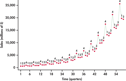
amazon
Once just an online bookseller, Amazon continually expands its business from providing a wide selection of consumer goods for online shoppers to providing services and technology for businesses to build their own online operations. Figure 13.4 displays a time plot of Amazon’s quarterly sales (in millions of dollars), beginning with the first quarter of 2000 and ending with the second quarter of 2014.3 The plot shows a time series that is very different than the random behavior exhibited in Figure 13.3. Breaking down the plot, we find:
- Sales are steadily trending upward with time at an increasing rate.
- Sales show strong seasonality, with the fourth quarter being the strongest.
- The variation of sales increases with time. This is particularly evident with the fourth quarter in that the amount of increase in fourth quarter sales increases each year.
The strong fourth quarter seasonality here is clearly related to the holiday shopping season from Thanksgiving to Christmas. However, be aware that companies can follow different fiscal periods. For example, the first quarter of Apple, Inc., spans the holiday shopping season.
Our visual inspection of the Amazon sales series reveals a series influenced by both trend and seasonal components. In this chapter, we learn how to use regression methods of Chapters 10 and 11 to estimate each of the components embedded in the time series with the goal to build a predictive model for the time series. In the process of estimating the effects of trend and seasonal components on the Amazon series, we later reveal that the series is also influenced by a cyclical or autoregressive pattern.
Before proceeding to the modeling of time series, let us first add two more tools to the data analysis toolkit for assessing whether a time series exhibits randomness or not.
Runs test
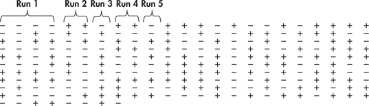
One simple numerical check for randomness of a time series is a runs test. As a first step, the runs test classifies each observation as being above (+) or below (−) some reference value such as the sample mean. Based on this classification, a run is a string of consecutive pluses or minuses. To illustrate, suppose that we observe the following sequence of 10 observations:
| 5 | 6 | 7 | 8 | 13 | 14 | 15 | 16 | 17 | 19 |
What do you notice about the sequence? It is distinctly nonrandom because the observations increase in value. Assigning + and − symbols relative to the sample mean of 12, we have the following:
| − | − | − | − | + | + | + | + | + | + |
In this sequence, there are two runs: − − − − and + + + + + + . The trending values result in runs of longer length, which, in turn, leaves us with a very small number of runs. Imagine now a very different nonrandom sequence of 10 observations. Suppose that the consecutive observations oscillate from one side of the mean to the other side. In such a case, the runs will be of length one (either + or −) and we would observe 10 runs. These extreme examples bring out the essence of the runs test. Namely, if we observe too few runs or too many runs, then we should suspect that the process is not random. In a hypothesis-testing framework, we are considering the following competing hypotheses:
- H0: Observations arise from a random process.
- Ha: Observations arise from a nonrandom process.
By the phrase “nonrandom process” we are not suggesting that the process is not subject to random variation. The term “nonrandom process” means that a process is not subject to “pure” random variation. Time series with patterns such as trends and/or seasonality are examples of nonrandom processes. We utilize the following facts to use the runs count to test the hypothesis of a random process.
Runs Test for Randomness
For a sequence of n observations, let nA be the number of observations above the mean, and let nB be the number of observations below or equal to the mean. If the underlying process generating the observations is random, then the number of runs statistic R has mean
μR=2nAnB+nn
and standard deviation
σR=√2nAnB(2nAnB−n)n2(n−1)
The runs test rejects the hypothesis of a random process when the observed number of runs R is far from its mean. For sequences of at least 10 observations, the runs statistic is well approximated by the Normal distribution.
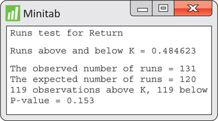
EXAMPLE 13.2 Runs Test and Stock Price Returns
disney
In Example 13.1, we observed n=238 weekly returns. To make the necessary counts for the runs test, it is convenient to subtract the sample mean from each of the observations. The focus can then be simply on whether the resulting observations are positive or negative. Figure 13.5 shows the sequence of pluses and minuses for the price change series with the first five runs identified. Going through the whole sequence, we find 131 runs, and we also find nA=119 observations above the sample mean of 0.4846 and nB=119 observations below or equal to the sample mean. Given these counts, the number of runs has mean
μR=2nAnB+nn=2(119)(119)+238238=120
and standard deviation
σR=√2nAnB(2nAnB−n)n2(n−1)=√2(119)(119)[2(119)(119)−238]2382(237)=√59.249=7.697
The observed number of runs of 131 deviates by 11 runs from the expected number (mean) of runs, which is 120. The results can be summarized with a P-value. The test statistic is given by
z=R−μRσR=131−1207.697=1.429
Because evidence against randomness is associated with either too many or too few runs, we have a two-sided test with a P-value of
P=2P(Z≥1.429)=0.153
The P-value indicates that there is not strong enough evidence to reject the hypothesis of a random process.
Figure 13.6 shows Minitab output for the runs test. We find all the values counted or computed in Example 13.2 to be what are found in the software output.
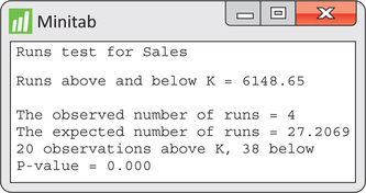
EXAMPLE 13.3 Runs Test and Amazon Sales
amazon
CASE 13.1 Figure 13.7 shows Minitab’s runs test output applied to the Amazon sales series. Here, we see that there are only four observed runs versus the expected number of about 27. The reported P-value of 0.000 shows that the evidence is very strong against the null hypothesis of randomness.
Apply Your Knowledge
Question 13.1
13.1 Disney prices.
In Example 13.1, we found the weekly returns of Disney stock to be consistent with a random process. What can we say about the time series of the weekly closing prices?
- Using software, construct a time plot of weekly prices. Is the series consistent with a random process? If not, explain the nature of the inconsistency.
- The sample mean of the prices is ˉy=48.8404. Count the number of runs in the series. Is your count consistent with your conclusion in part (a)?
13.1
(a) The series is not random; it is increasing over time. (b) There are only 8 runs. Because there should be many more runs than just 8, the process isn’t random. This is consistent with part (a).
disney
Question 13.2
13.2 Spam process.
Most email servers keep inboxes clean by automatically moving incoming mail that is determined to be spam to a “Junk” folder. Here are the weekly counts of the number of emails moved to a Junk folder for 10 consecutive weeks:
| 194 | 227 | 201 | 152 | 202 | 178 | 229 | 202 | 247 | 155 |
Answer the following parts without the aid of software.
- Find the observed and expected number of runs.
- Determine the P-value of the hypothesis test for randomness.
Autocorrelation function
The runs test serves as a simple numerical check for the question of randomness. However, most statistical software packages provide a more comprehensive check of randomness based on computing the correlations among the observations over time.
The idea is that if a process is exhibiting some sort of persisting pattern over time, then the observations will potentially reflect some sort of association relative to prior observations. To check whether or not associations exist, we need a way of relating observations made at different time periods. We illustrate this by example.
EXAMPLE 13.4 Lagging Disney Returns
disney
Consider again the 238 weekly Disney returns of Example 13.1. By using the established system of notation, the time series can be denoted as returnt, where t=1,2,…,238. To compare observations with prior observations, we create new variables that take on earlier values of the original variable. This is accomplished by a process known as lagging.
lagging
By lagging a variable, we are creating another variable by arranging the data so that original observations are lined up with prior observations from a certain number of periods back.
Here, for example, are the return data along with lagged variables going one and two periods back:
| t | returnt | returnt−1 | returnt−2 |
| 1 | −4.01 | * | * |
| 2 | −2.04 | −4.01 | * |
| 3 | −1.41 | −2.04 | −4.01 |
| 4 | −0.04 | −1.41 | −2.04 |
| 5 | 1.79 | −0.04 | −1.41 |
| ⋮ | ⋮ | ⋮ | ⋮ |
| 236 | −1.24 | 0.06 | 1.81 |
| 237 | 0.49 | −1.24 | 0.06 |
| 238 | −0.99 | 0.49 | −1.24 |
The variable returnt−1 is called a lag one variable, and the variable returnt−2 is called a lag two variable. For any given time period, notice that the lag one variable takes on the value of the immediately preceding observation, while the lag two variable takes on the value of the observation from two periods back. The asterisk symbol (*) denotes a missing value. For example, there is a missing value for the lag one variable in period one because there is no available observation prior to period one.
lag variable
Once lagged variables are created, we can more easily investigate the presence of (or lack of) associations between observations over time. For example, Figure 13.8(a) shows a scatterplot of the original observations returnt against the lag one observations returnt−1. Similarly, Figure 13.8(b) shows returnt against returnt−2. The scatterplots show no visual evidence of relationships between observations one apart and two apart. The lack of associations between observations over time is consistent with a random process.
Going beyond the visual inspection of the scatterplots, we can compute the sample correlation between returnt and returnt−1 and also the sample correlation between returnt and returnt−2. Because we are not looking to compute the correlation between two arbitrary variables but rather a correlation computed from observations taken from a single time series, the computed correlation is commonly referred to as an autocorrelation ("self" correlation).
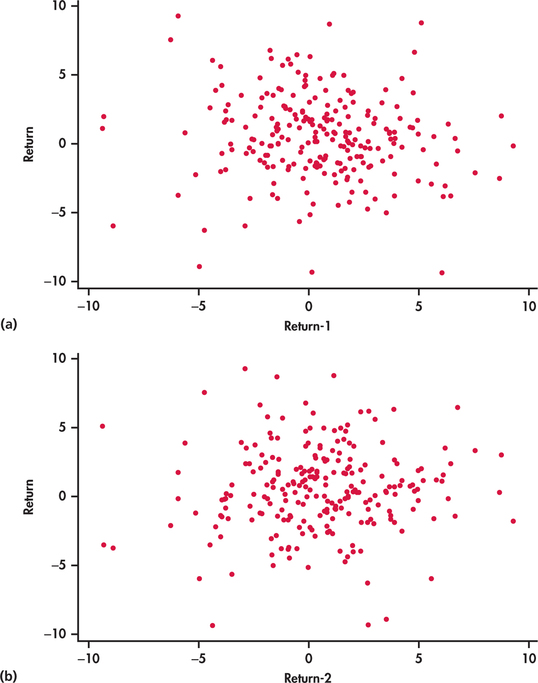
Autocorrelation
The correlation between successive values yt−1 and yt of a time series is called lag one autocorrelation. The correlation between values two periods apart is called lag two autocorrelation. In general, the correlation between values k periods apart is called lag k autocorrelation.
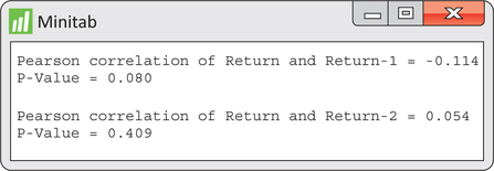
EXAMPLE 13.5 Lag One and Two Autocorrelations for Disney Returns
disney

Figure 13.9 shows the sample lag one and lag two autocorrelations, computed by Minitab. The output also provides the P-values for testing the null hypothesis H0:ρ=0 that the population correlation is 0. We find for each autocorrelation, the associated P-value is not significant at the 5% level of significance. Thus, for either lag, there is not strong enough evidence to reject the null hypothesis of underlying correlation of 0.
Examples 13.4 and 13.5 explored the first two lags of the returns series. We could have gone further back and created a third lag, a fourth lag, and so on. Lagging a variable and then computing the autocorrelations for different lags can be a bit of a cumbersome task. Fortunately, there is a convenient alternative offered by statistical software. In particular, software will compute the autocorrelations for several lags in one shot and then will plot the autocorrelations as a bar graph. This resulting graph is known as an autocorrelation function (ACF).
autocorrelation function (ACF)
EXAMPLE 13.6 ACF for Disney Returns
disney
ACF outputs from Minitab and JMP are given in Figure 13.10. Notice that the first autocorrelation is plotted negative while the second autocorrelation is plotted positive. From the JMP output, we see that the first two autocorrelations are reported to be −0.1133 and 0.0537, which are basically the values shown in Figure 13.9.4
What we also find with the ACF is a band of lines superimposed symmetrically around the 0 correlation value. These lines serve as a test of the significance of the autocorrelations. If a process is truly random, the underlying process autocorrelation at any lag k is theoretically 0. However, as we have learned throughout the book, sample statistics (in this case, sample autocorrelations) are subject to sampling variation.
The lines seen on the ACF attempt to incorporate sampling variability of the autocorrelation statistic. In particular, if the underlying autocorrelation at a particular lag k is truly 0, then with repeated samples from the process, we would expect 95% of the lag k sample autocorrelations to fall within the band limits. Therefore, for any given lag, the limits are an implementation of a 5% level significance test of the null hypothesis that the underlying process autocorrelation is zero. We see from Figure 13.10 that none of the sample autocorrelations breach the limits. The ACF leaves us with no suspicion against randomness, which confirms both our initial visual inspection of the time series with Figure 13.3 (page 646) and the results of the runs test in Example 13.2 (pages 649–650).
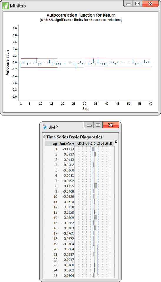
A word of caution is required when using the ACF significance limits shown in Figure 13.10. The limits are simultaneously testing several autocorrelation values. The problem is that although the probability of false rejection is 0.05 when testing any one autocorrelation, the chances are collectively higher than 0.05 that at least one of several sample autocorrelations will fall outside the limits when the process is truly random. There are alternative tests that have been designed to simultaneously test more than one autocorrelation and to control the false rejection rate. However, these tests are topics of a more advanced treatment of time series analysis than done here. Short of advanced testing procedures, background knowledge of the time series under investigation along with common sense goes a long way to help minimize the possibility of overreacting. If one sample autocorrelation falls outside the ACF limits at some “oddball” lag but all the remaining autocorrelations are insignificant, there is probably good reason to resist the temptation to reject randomness.
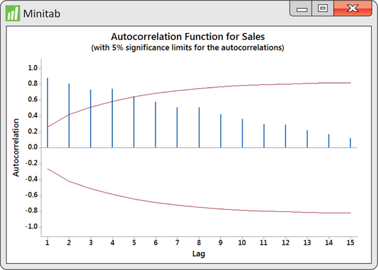
EXAMPLE 13.7 ACF for Amazon Sales
disney
In contrast to the ACF output of Figure 13.10, the ACF of Figure 13.11 leaves us with a very different impression about the time series in question. We find that the first four sample autocorrelations go beyond the significance limits. Furthermore, the remaining sample autocorrelations show a block-like pattern. The sample autocorrelations for a random process are expected to “swim” between the limits with no pattern as seen in the Disney returns ACF of Figure 13.10. In the end, the ACF for the Amazon sales series is providing us with strong evidence that the underlying process generating the observations is not random.
Apply Your Knowledge
Question 13.3
13.3 Disney prices.
Continue the study of Disney closing prices from Exercise 13.1 (page 651).
- Using software, create a lag one variable for prices. Make a scatterplot of prices plotted against the lag one variable. Describe what you see.
- Find the correlation between prices and their first lag. Test the null hypothesis that the underlying lag one correlation ρ is 0. What is the P-value? What do you conclude?
13.3
(a) The price and lag one price are linearly related. (b) r=0.99665. H0:ρ=0, Ha:ρ≠0. P-value<0.0001. The underlying lag one correlation is significantly different from 0. The price and lag one price are significantly correlated.
disney
Question 13.4
13.4 Disney prices.
Continue with the study of the Disney price series.
- Obtain the ACF for the price series. How many autocorrelations are beyond the ACF significance limits?
- Aside from autocorrelations falling beyond significance limits, what else do you see in the ACF that gives evidence against randomness?
disney
Forecasts
Once we assess the behavior of a time series, our ultimate goal is to make a forecast of future values. For patterned processes, the forecasts exploit the nature of the pattern. We explore the modeling and forecasting of patterned processes in the sections to follow.
forecast
What about a forecast of a future weekly Disney return? Given the random behavior of the returns, an intuitive forecast for future values would simply be the sample mean (ˉy=0.4846%), which is superimposed on Figure 13.3 (page 646). Often, we are interested in going beyond a single-valued guess of a future observation to reporting a range of likely future observations. As first introduced in Chapter 10, an interval for the prediction of individual observations is known as a prediction interval.
Establishing a prediction interval depends on the distribution of the individual observations. Figure 13.12 provides a histogram of the weekly Disney returns data. We see that the data are fairly compatible with the Normal distribution. It is worth noting, however, that stock price returns are often found to follow a symmetric distribution with tails a bit thicker than the Normal distribution. For our discussions, the Normal distribution is sufficient.
This brings up a point that should be emphasized. Randomness and distribution are distinct concepts. A process can be random and Normal, but it can also be random and not Normal. It is a common mistake to believe that randomness implies Normality.
Our returns data have standard deviation s=3.0609%. Assuming Normality for the price changes, we can use the 68-95-99.7 rule to provide an approximate 95% prediction interval for future observations:
ˉy±2s=0.4846±2(3.0609)=(−5.64%,6.61%)