1.4 Density Curves and the Normal Distributions
 This page includes Video Technology Manuals
 This page includes Statistical Videos
We now have a kit of graphical and numerical tools for describing distributions. What is more, we have a clear strategy for exploring data on a single quantitative variable:
- Always plot your data: make a graph, usually a histogram or a stemplot.
- Look for the overall pattern (shape, center, spread) and for striking deviations such as outliers.
- Calculate a numerical summary to briefly describe center and spread.
Here is one more step to add to this strategy:
- Sometimes the overall pattern of a large number of observations is so regular that we can describe it by a smooth curve.
Density curves
mathematical model
A density curve is a mathematical model for the distribution of a quantitative variable. Mathematical models are idealized descriptions. They allow us to easily make many statements in an idealized world. The statements are useful when the idealized world is similar to the real world. The density curves that we study give a compact picture of the overall pattern of data. They ignore minor irregularities as well as outliers. For some situations, we are able to capture all of the essential characteristics of a distribution with a density curve. For other situations, our idealized model misses some important characteristics. As with so many things in statistics, your careful judgment is needed to decide what is important and how close is good enough.
EXAMPLE 1.28 Fuel Efficiency

canfuel
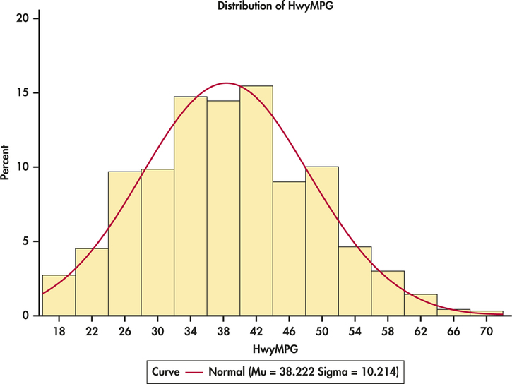
Figure 1.17 is a histogram of the fuel efficiency, expressed as miles per gallon (MPG), for highway driving, for 1067 motor vehicles (2014 model year) reported by Natural Resources Canada.25 Superimposed on the histogram is a density curve. The histogram shows that there are a few vehicles with very good fuel efficiency. These are high outliers in the distribution. The distribution is somewhat skewed to the right, reflecting the successful attempts of the auto industry to produce high-fuel-efficiency vehicles. The center of the distribution is about 38 MPG. There is a single peak, and both tails fall off quite smoothly. The density curve in Figure 1.17 fits the distribution described by the histogram fairly well.
Some of these vehicles in our example have been engineered to give excellent fuel efficiency. A marketing campaign based on this outstanding performance could be very effective for selling vehicles in an economy with high fuel prices. Be careful about how you deal with outliers. They may be data errors or they may be the most important feature of the distribution. Computer software cannot make this judgment. Only you can.
Here are some details about density curves. We need these basic ideas to understand the rest of this chapter.
Density Curve
A density curve is a curve that
- is always on or above the horizontal axis
- has area exactly 1 underneath it.
A density curve describes the overall pattern of a distribution. The area under the curve and above any range of values is the proportion of all observations that fall in that range.
The median and mean of a density curve
Our measures of center and spread apply to density curves as well as to actual sets of observations. The median and quartiles are easy. Areas under a density curve represent proportions of the total number of observations. The median is the point with half the observations on either side. So the median of a density curve is the equal-areas point—the point with half the area under the curve to its left and the remaining half of the area to its right. The quartiles divide the area under the curve into quarters. One-fourth of the area under the curve is to the left of the first quartile, and three-fourths of the area is to the left of the third quartile. You can roughly locate the median and quartiles of any density curve by eye by dividing the area under the curve into four equal parts.
EXAMPLE 1.29 Symmetric Density Curves
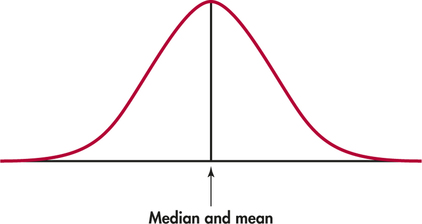
Because density curves are idealized patterns, a symmetric density curve is exactly symmetric. The median of a symmetric density curve is, therefore, at its center. Figure 1.18(a) shows the median of a symmetric curve.
The situation is different for skewed density curves. Here is an example.
EXAMPLE 1.30 Skewed Density Curves
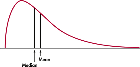
It isn—t so easy to spot the equal-areas point on a skewed curve. There are mathematical ways of finding the median for any density curve. We did that to mark the median on the skewed curve in Figure 1.18(b).
Apply Your Knowledge
Question 1.70
1.70 Another skewed curve.
Sketch a curve similar to Figure 1.18(b) for a left-skewed density curve. Be sure to mark the location of the mean and the median.
What about the mean? The mean of a set of observations is its arithmetic average. If we think of the observations as weights strung out along a thin rod, the mean is the point at which the rod would balance. This fact is also true of density curves. The mean is the point at which the curve would balance if made of solid material.
EXAMPLE 1.31 Mean and Median
Figure 1.19 illustrates this fact about the mean. A symmetric curve balances at its center because the two sides are identical. The mean and median of a symmetric density curve are equal, as in Figure 1.18(a). We know that the mean of a skewed distribution is pulled toward the long tail. Figure 1.18(b) shows how the mean of a skewed density curve is pulled toward the long tail more than is the median. It is hard to locate the balance point by eye on a skewed curve. There are mathematical ways of calculating the mean for any density curve, so we are able to mark the mean as well as the median in Figure 1.18(b).

Median and Mean of a Density Curve
The median of a density curve is the equal-areas point, the point that divides the area under the curve in half.
The mean of a density curve is the balance point, at which the curve would balance if made of solid material.
The median and mean are the same for a symmetric density curve. They both lie at the center of the curve. The mean of a skewed curve is pulled away from the median in the direction of the long tail.
We can roughly locate the mean, median, and quartiles of any density curve by eye. This is not true of the standard deviation. When necessary, we can once again call on more advanced mathematics to learn the value of the standard deviation. The study of mathematical methods for doing calculations with density curves is part of theoretical statistics. Though we are concentrating on statistical practice, we often make use of the results of mathematical study.
Because a density curve is an idealized description of the distribution of data, we need to distinguish between the mean and standard deviation of the density curve and the mean ˉx and standard deviation s computed from the actual observations. The usual notation for the mean of an idealized distribution is μ (the Greek letter mu). We write the standard deviation of a density curve as σ (the Greek letter sigma).
mean μ
standard deviation σ
Apply Your Knowledge
Question 1.71
1.71 A symmetric curve.
Sketch a density curve that is symmetric but has a shape different from that of the curve in Figure 1.18(a) (page 40).
Question 1.72
1.72 A uniform distribution.
Figure 1.20 displays the density curve of a uniform distribution. The curve takes the constant value 1 over the interval from 0 to 1 and is 0 outside that range of values. This means that data described by this distribution take values that are uniformly spread between 0 and 1. Use areas under this density curve to answer the following questions.
uniform distribution
- What percent of the observations lie above 0.7?
- What percent of the observations lie below 0.4?
- What percent of the observations lie between 0.45 and 0.70?
- Why is the total area under this curve equal to 1?
- What is the mean μ of this distribution?


Question 1.73
1.73 Three curves.
Figure 1.21 displays three density curves, each with three points marked. At which of these points on each curve do the mean and the median fall?
1.73
(a) The mean is at point C, the median is at point B. (b) The mean and median are both at point A. (c) The mean is at point A, the median is at point B.
Normal distributions
One particularly important class of density curves has already appeared in Figure 1.18(a). These density curves are symmetric, single-peaked, and bell-shaped. They are called Normal curves, and they describe Normal distributions. All Normal distributions have the same overall shape. The exact density curve for a particular Normal distribution is described by giving its mean μ and its standard deviation σ. The mean is located at the center of the symmetric curve and is the same as the median. Changing μ without changing σ moves the Normal curve along the horizontal axis without changing its spread. The standard deviation σ controls the spread of a Normal curve. Figure 1.22 shows two Normal curves with different values of σ. The curve with the larger standard deviation is more spread out.
Normal distributions
The standard deviation σ is the natural measure of spread for Normal distributions. Not only do μ and σ completely determine the shape of a Normal curve, but we can locate σ by eye on the curve. Here’s how. Imagine that you are skiing down a mountain that has the shape of a Normal curve. At first, you descend at an ever-steeper angle as you go out from the peak:

The points at which this change of curvature takes place are located along the horizontal axis at distance σ on either side of the mean μ. Remember that μ and σ alone do not specify the shape of most distributions and that the shape of density curves in general does not reveal σ. These are special properties of Normal distributions.

Why are the Normal distributions important in statistics? Here are three reasons. First, Normal distributions are good descriptions for some distributions of real data. Distributions that are often close to Normal include scores on tests taken by many people (such as GMAT exams), repeated careful measurements of the same quantity (such as measurements taken from a production process), and characteristics of biological populations (such as yields of corn). Second, Normal distributions are good approximations to the results of many kinds of chance outcomes, such as tossing a coin many times. Third, and most important, many of the statistical inference procedures that we study in later chapters are based on Normal distributions.
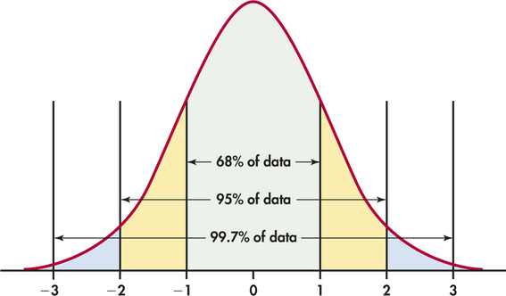
The 68-95-99.7 rule
Although there are many Normal curves, they all have common properties. In particular, all Normal distributions obey the following rule.
The 68-95-99.7 Rule
In the Normal distribution with mean μ and standard deviation σ:
- 68% of the observations fall within σ of the mean μ.
- 95% of the observations fall within 2σ of μ.
- 99.7% of the observations fall within 3σ of μ.
Figure 1.23 illustrates the 68–95–99.7 rule. By remembering these three numbers, you can think about Normal distributions without constantly making detailed calculations.
EXAMPLE 1.32 Using the 68-95-99.7 Rule
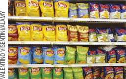
The distribution of weights of 9-ounce bags of a particular brand of potato chips is approximately Normal with mean μ=9.12 ounce and standard deviation σ=0.15 ounce. Figure 1.24 shows what the 68-95-99.7 rule says about this distribution.
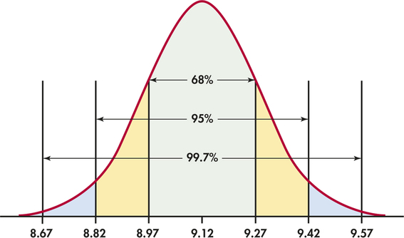
Two standard deviations is 0.3 ounce for this distribution. The 95 part of the 68-95-99.7 rule says that the middle 95% of 9-ounce bags weigh between 9.12−3 and 9.12+3 ounces, that is, between 8.82 ounces and 9.42 ounces. This fact is exactly true for an exactly Normal distribution. It is approximately true for the weights of 9-ounce bags of chips because the distribution of these weights is approximately Normal.
The other 5% of bags have weights outside the range from 8.82 to 9.42 ounces. Because the Normal distributions are symmetric, half of these bags are on the heavy side. So the heaviest 2.5% of 9-ounce bags are heavier than 9.42 ounces.
The 99.7 part of the 68-95-99.7 rule says that almost all bags (99.7% of them) have weights between μ−3σ and μ+3σ. This range of weights is 8.67 to 9.57 ounces.
Because we will mention Normal distributions often, a short notation is helpful. We abbreviate the Normal distribution with mean μ and standard deviation σ as N(μ,σ). For example, the distribution of weights in the previous example is N(9.12, 0.15).
Apply Your Knowledge
Question 1.74
1.74 Heights of young men.
Product designers often must consider physical characteristics of their target population. For example, the distribution of heights of men aged 20 to 29 years is approximately Normal with mean 69 inches and standard deviation 2.5 inches. Draw a Normal curve on which this mean and standard deviation are correctly located. (Hint: Draw the curve first, locate the points where the curvature changes, then mark the horizontal axis.)
Question 1.75
1.75 More on young men’s heights.
The distribution of heights of young men is approximately Normal with mean 69 inches and standard deviation 2.5 inches. Use the 68-95-99.7 rule to answer the following questions.
- What percent of these men are taller than 74 inches?
- Between what heights do the middle 95% of young men fall?
- What percent of young men are shorter than 66.5 inches?
1.75
(a) 2.5%. (b) Between 64 and 74 inches. (c) 16%.
Question 1.76
1.76 Test scores.
Many states have programs for assessing the skills of students in various grades. The Indiana Statewide Testing for Educational Progress (ISTEP) is one such program.26 In a recent year 76,531, tenth-grade Indiana students took the English/language arts exam. The mean score was 572, and the standard deviation was 51. Assuming that these scores are approximately Normally distributed, N(572, 51), use the 68-95-99.7 rule to give a range of scores that includes 95% of these students.
Question 1.77
1.77 Use the 68-95-99.7 rule.
Refer to the previous exercise. Use the 68-95-99.7 rule to give a range of scores that includes 99.7% of these students.
1.77
99.7% of students have scores between 419 and 725.
The standard Normal distribution
As the 68-95-99.7 rule suggests, all Normal distributions share many common properties. In fact, all Normal distributions are the same if we measure in units of size σ about the mean μ as center. Changing to these units is called standardizing. To standardize a value, subtract the mean of the distribution and then divide by the standard deviation.
Standardizing and z-Scores
If x is an observation from a distribution that has mean μ and standard deviation σ, the standardized value of x is
z=x−μσ
A standardized value is often called a z-score.
A z-score tells us how many standard deviations the original observation falls away from the mean, and in which direction. Observations larger than the mean are positive when standardized, and observations smaller than the mean are negative when standardized.
EXAMPLE 1.33 Standardizing Potato Chip Bag Weights
The weights of 9-ounce potato chip bags are approximately Normal with μ=9.12 ounces and σ=0.15 ounce. The standardized weight is
z=weight−9.120.15
A bag’s standardized weight is the number of standard deviations by which its weight differs from the mean weight of all bags. A bag weighing 9.3 ounces, for example, has standardized weight
z=9.3−9.120.15=1.2
or 1.2 standard deviations above the mean. Similarly, a bag weighing 8.7 ounces has standardized weight
z=8.7−9.120.15=−2.8
or 2.8 standard deviations below the mean bag weight.
If the variable we standardize has a Normal distribution, standardizing does more than give a common scale. It makes all Normal distributions into a single distribution, and this distribution is still Normal. Standardizing a variable that has any Normal distribution produces a new variable that has the standard Normal distribution.
Standard Normal Distribution
The standard Normal distribution is the Normal distribution N(0,1) with mean 0 and standard deviation 1.
If a variable x has any Normal distribution N(μ,σ) with mean μ and standard deviation σ, then the standardized variable
z=x−μσ
has the standard Normal distribution.
Apply Your Knowledge
Question 1.78
1.78 SAT versus ACT.
Emily scores 650 on the Mathematics part of the SAT. The distribution of SAT scores in a reference population is Normal, with mean 500 and standard deviation 100. Michael takes the American College Testing (ACT) Mathematics test and scores 28. ACT scores are Normally distributed with mean 18 and standard deviation 6. Find the standardized scores for both students. Assuming that both tests measure the same kind of ability, who has the higher score?
Normal distribution calculations
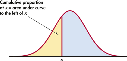
Areas under a Normal curve represent proportions of observations from that Normal distribution. There is no easy formula for areas under a Normal curve. To find areas of interest, either software that calculates areas or a table of areas can be used. The table and most software calculate one kind of area: cumulative proportions. A cumulative proportion is the proportion of observations in a distribution that lie at or below a given value. When the distribution is given by a density curve, the cumulative proportion is the area under the curve to the left of a given value. Figure 1.25 shows the idea more clearly than words do.
cumulative proportion
The key to calculating Normal proportions is to match the area you want with areas that represent cumulative proportions. Then get areas for cumulative proportions. The following examples illustrate the methods.
EXAMPLE 1.34 The NCAA Standard for SAT Scores
The National Collegiate Athletic Association (NCAA) requires Division I athletes to get a combined score of at least 820 on the SAT Mathematics and Verbal tests to compete in their first college year. (Higher scores are required for students with poor high school grades.) The scores of the 1.4 million students who took the SATs were approximately Normal with mean 1026 and standard deviation 209. What proportion of all students had SAT scores of at least 820?
Here is the calculation in pictures: the proportion of scores above 820 is the area under the curve to the right of 820. That’s the total area under the curve (which is always 1) minus the cumulative proportion up to 820.
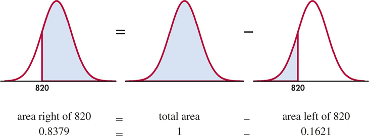
That is, the proportion of all SAT takers who would be NCAA qualifiers is 0.8379, or about 84%.
There is no area under a smooth curve and exactly over the point 820. Consequently, the area to the right of 820 (the proportion of scores >820) is the same as the area at or to the right of this point (the proportion of scores ≥820). The actual data may contain a student who scored exactly 820 on the SAT. That the proportion of scores exactly equal to 820 is 0 for a Normal distribution is a consequence of the idealized smoothing of Normal distributions for data.
EXAMPLE 1.35 NCAA Partial Qualifiers
The NCAA considers a student a “partial qualifier”—eligible to practice and receive an athletic scholarship, but not to compete—if the combined SAT score is at least 720. What proportion of all students who take the SAT would be partial qualifiers? That is, what proportion have scores between 720 and 820? Here are the pictures:
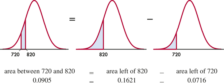
About 9% of all students who take the SAT have scores between 720 and 820.
How do we find the numerical values of the areas in Examples 1.34 and 1.35? If you use software, just plug in mean 1026 and standard deviation 209. Then ask for the cumulative proportions for 820 and for 720. (Your software will probably refer to these as “cumulative probabilities.” We will learn in Chapter 4 why the language of probability fits.) If you make a sketch of the area you want, you will rarely go wrong.
You can use the Normal Curve applet on the text website to find Normal proportions. The applet is more flexible than most software—it will find any Normal proportion, not just cumulative proportions. The applet is an excellent way to understand Normal curves. But, because of the limitations of web browsers, the applet is not as accurate as statistical software.
If you are not using software, you can find cumulative proportions for Normal curves from a table. That requires an extra step, as we now explain.
Using the standard Normal table
The extra step in finding cumulative proportions from a table is that we must first standardize to express the problem in the standard scale of z-scores. This allows us to get by with just one table, a table of standard Normal cumulative proportions. Table A in the back of the book gives cumulative proportions for the standard Normal distribution. Table A also appears on the inside front cover. The pictures at the top of the table remind us that the entries are cumulative proportions, areas under the curve to the left of a value z.
EXAMPLE 1.36 Find the Proportion from z
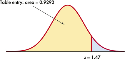
What proportion of observations on a standard Normal variable z take values less than z=1.47?
To find the area to the left of 1.47, locate 1.4 in the left-hand column of Table A, then locate the remaining digit 7 as 0.07 in the top row. The entry opposite 1.4 and under 0.07 is 0.9292. This is the cumulative proportion we seek. Figure 1.26 illustrates this area.
Now that you see how Table A works, let’s redo the NCAA Examples 1.34 and 1.35 using the table.
EXAMPLE 1.37 Find the Proportion from X
What proportion of all students who take the SAT have scores of at least 820? The picture that leads to the answer is exactly the same as in Example 1.34 (pages 46-47). The extra step is that we first standardize in order to read cumulative proportions from Table A. If X is SAT score, we want the proportion of students for whom X≥820.
Step 1. Standardize. Subtract the mean, then divide by the standard deviation, to transform the problem about X into a problem about a standard Normal Z:
X≥820X−1026209≥820−1026209Z≥−0.99
Step 2. Use the table. Look at the pictures in Example 1.34. From Table A, we see that the proportion of observations less than -0.99 is 0.1611. The area to the right of -0.99 is, therefore, 1-0.1611=0.8389. This is about 84%.
The area from the table in Example 1.37 (0.8389) is slightly less accurate than the area from software in Example 1.34 (0.8379) because we must round z to two places when we use Table A. The difference is rarely important in practice.
EXAMPLE 1.38 Proportion of Partial Qualifiers
What proportion of all students who take the SAT would be partial qualifiers in the eyes of the NCAA? That is, what proportion of students have SAT scores between 720 and 820? First, sketch the areas, exactly as in Example 1.35. We again use X as shorthand for an SAT score.
Step 1. Standardize.
720≤720−1026209≤−1.46≤X<X−1026209<Z<820820−1026209−0.99
Step 2. Use the table.
area between-1.46
As in Example 1.35, about 9% of students would be partial qualifiers.
Sometimes we encounter a value of more extreme than those appearing in Table A. For example, the area to the left of is not given directly in the table. The -values in Table A leave only area 0.0002 in each tail unaccounted for. For practical purposes, we can act as if there is zero area outside the range of Table A.
Apply Your Knowledge
Question 1.79
1.79 Find the proportion.
Use the fact that the ISTEP scores from Exercise 1.76 (page 44) are approximately Normal, . Find the proportion of students who have scores less than 620. Find the proportion of students who have scores greater than or equal to 620. Sketch the relationship between these two calculations using pictures of Normal curves similar to the ones given in Example 1.34 (page 46).
1.79
0.8264. 0.1736.
Question 1.80
1.80 Find the proportion.
Use the fact that the ISTEP scores are approximately Normal, . Find the proportion of students who have scores between 500 and 650. Use pictures of Normal curves similar to the ones given inExample 1.35 (page 47) to illustrate your calculations.
Inverse Normal calculations
Example 1.34 through 1.37 illustrate the use of Normal distributions to find the proportion of observations in a given event, such as “SAT score between 720 and 820.” We may, instead, want to find the observed value corresponding to a given proportion.
Statistical software will do this directly. Without software, use Table A backward, finding the desired proportion in the body of the table and then reading the corresponding from the left column and top row.
EXAMPLE 1.39 How High for the Top 10%?
Scores on the SAT Verbal test in recent years follow approximately the distribution. How high must a student score be for it to place in the top 10% of all students taking the SAT?
Again, the key to the problem is to draw a picture. Figure 1.27 shows that we want the score with area above it to be 0.10. That’s the same as area below equal to 0.90.
Statistical software has a function that will give you the for any cumulative proportion you specify. The function often has a name such as “inverse cumulative probability.” Plug in mean 505, standard deviation 110, and cumulative proportion 0.9. The software tells you that . We see that a student must score at least 646 to place in the highest 10%.
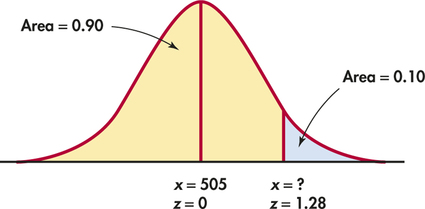
Without software, first find the standard score with cumulative proportion 0.9, then “unstandardize” to find . Here is the two-step process:
- Use the table. Look in the body of Table A for the entry closest to 0.9. It is 0.8997. This is the entry corresponding to . So is the standardized value with area 0.9 to its left.
- Unstandardize to transform the solution from back to the original scale. We know that the standardized value of the unknown is . So itself satisfies
Solving this equation for gives
This equation should make sense: it finds the that lies 1.28 standard deviations above the mean on this particular Normal curve. That is the “unstandardized” meaning of . The general rule for unstandardizing a -score is
Apply Your Knowledge
Question 1.81
1.81 What score is needed to be in the top 25%?
Consider the ISTEP scores, which are approximately Normal, . How high a score is needed to be in the top 25% of students who take this exam?
1.81
606.17.
Question 1.82
1.82 Find the score that 70% of students will exceed.
Consider the ISTEP scores, which are approximately Normal, . Seventy percent of the students will score above on this exam. Find .
Assessing the Normality of data
The Normal distributions provide good models for some distributions of real data. Examples include the miles per gallon ratings of vehicles, average payrolls of Major League Baseball teams, and statewide unemployment rates. The distributions of some other common variables are usually skewed and, therefore, distinctly non-Normal. Examples include personal income, gross sales of business firms, and the service lifetime of mechanical or electronic components. While experience can suggest whether or not a Normal model is plausible in a particular case, it is risky to assume that a distribution is Normal without actually inspecting the data.
The decision to describe a distribution by a Normal model may determine the later steps in our analysis of the data. Calculations of proportions, as we have done earlier, and statistical inference based on such calculations follow from the choice of a model. How can we judge whether data are approximately Normal?
A histogram or stemplot can reveal distinctly non-Normal features of a distribution, such as outliers, pronounced skewness, or gaps and clusters. If the stemplot or histogram appears roughly symmetric and single-peaked, however, we need a more sensitive way to judge the adequacy of a Normal model. The most useful tool for assessing Normality is another graph, the Normal quantile plot.27
Normal quantile plot
Here is the idea of a simple version of a Normal quantile plot. It is not feasible to make Normal quantile plots by hand, but software makes them for us, using more sophisticated versions of this basic idea.
- Arrange the observed data values from smallest to largest. Record what percentile of the data each value occupies. For example, the smallest observation in a set of 20 is at the 5% point, the second smallest is at the 10% point, and so on.
- Find the same percentiles for the Normal distribution using Table A or statistical software. Percentiles of the standard Normal distribution are often called Normal scores. For example, is the 5% point of the standard Normal distribution, and is the 10% point.
Normal scores
- Plot each data point against the corresponding Normal score . If the data distribution is close to standard Normal, the plotted points will lie close to the 45-degree line . If the data distribution is close to any Normal distribution, the plotted points will lie close to some straight line.
Any Normal distribution produces a straight line on the plot because standardizing turns any Normal distribution into a standard Normal distribution. Standardizing is a transformation that can change the slope and intercept of the line in our plot but cannot turn a line into a curved pattern.
Use of Normal Quantile Plots
If the points on a Normal quantile plot lie close to a straight line, the plot indicates that the data are Normal. Systematic deviations from a straight line indicate a non-Normal distribution. Outliers appear as points that are far away from the overall pattern of the plot.
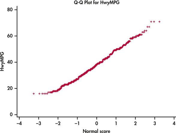
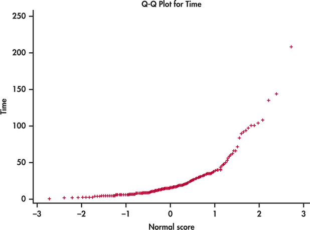
Figure 1.28 through Figure 1.31 (pages 52-54) are Normal quantile plots for data we have met earlier. The data are plotted vertically against the corresponding Normal scores plotted horizontally. For small data sets, the z axis extends from -3 to 3 because almost all of a standard Normal curve lies between these values. With larger sample sizes, values in the extremes are more likely and the z axis will extend farther from zero. These figures show how Normal quantile plots behave.
EXAMPLE 1.40 IQ Scores Are Normal
iq
In Example 1.19 (page 18) we examined the distribution of IQ scores for a sample of 60 fifth-grade students. Figure 1.28 gives a Normal quantile plot for these data. Notice that the points have a pattern that is pretty close to a straight line. This pattern indicates that the distribution is approximately Normal. When we constructed a histogram of the data in Figure 1.11 (page 19), we noted that the distribution has a single peak, is approximately symmetric, and has tails that decrease in a smooth way. We can now add to that description by stating that the distribution is approximately Normal.
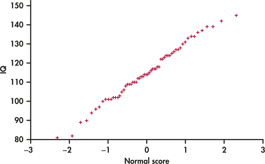
Figure 1.28 does, of course, show some deviation from a straight line. Real data almost always show some departure from the theoretical Normal model. It is important to confine your examination of a Normal quantile plot to searching for shapes that show clear departures from Normality. Don—t overreact to minor wiggles in the plot. When we discuss statistical methods that are based on the Normal model, we will pay attention to the sensitivity of each method to departures from Normality. Many common methods work well as long as the data are reasonably symmetric and outliers are not present.
EXAMPLE 1.41 T-Bill Interest Rates Are Not Normal

CASE 1.1
tbill
We made a histogram for the distribution of interest rates for T-bills in Example 1.12 (page 12). A Normal quantile plot for these data is shown in Figure 1.29. This plot shows some interesting features of the distribution. First, in the central part, from about to , the points fall approximately on a straight line. This suggests that the distribution is approximately Normal in this range. In both the lower and the upper extremes, the points flatten out. This occurs at an interest rate of around 1% for the lower tail and at 15% for the upper tail.
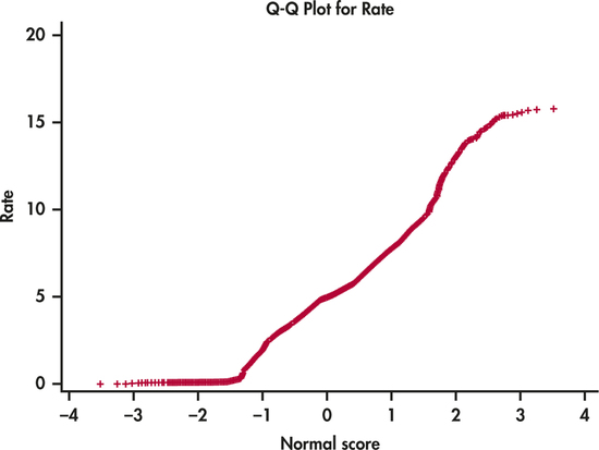
The idea that distributions are approximately Normal within a range of values is an old tradition. The remark “All distributions are approximately Normal in the middle” has been attributed to the statistician Charlie Winsor.28
Apply Your Knowledge
Question 1.83
CASE 1.21.83 Length of time to start a business.
In Exercise 1.33, we noted that the sample of times to start a business from 25 countries contained an outlier. For Suriname, the reported time is 208 days. This case is the most extreme in the entire data set. Figure 1.30 shows the Normal quantile plot for all 189 countries, including Suriname.
- These data are skewed to the right. How does this feature appear in the Normal quantile plot?
- Find the point for Suriname on the plot. Do you think that Suriname is truly an outlier, or is it part of a very long tail in this distribution? Explain your answer.
- Compare the shape of the upper portion of this Normal quantile plot with the upper portion of the plot for the T-bill interest rates in Figure 1.29, and with the upper portion of the plot for the IQ scores in Figure 1.28. Make a general statement about what the shape of the upper portion of a Normal quantile plot tells you about the upper tail of a distribution.
1.83
(a) The points fall below the 45º line; they form a straight line at first but then, near the right side, begin to increase steeply, indicating the right-skew. (b) It is likely part of a very long tail as it aligns perfectly with the curvature; see the Normal quantile plot. (c) The upper portion of the Normal quantile plot can show if a right-skew exists; specifically, if the points on the plot get steeper than a 45º line, this indicates a right-skew or long right tail.
tts25
Question 1.84
1.84 Fuel efficiency.
Figure 1.31 is a Normal quantile plot for the fuel efficiency data. We looked at these data in Example 1.28. A histogram was used to display the distribution in Figure 1.17 (page 39). This distribution is approximately Normal.
- How is this fact displayed in the Normal quantile plot?
- Does the plot reveal any deviations from Normality? Explain your answer.
canfuel
There are several variations on the way that diagnostic plots are used to assess Normality. We have chosen to plot the data on the y axis and the normal scores on the x axis. Some software packages switch the axes. These plots are sometimes called “Q-Q Plots.“ Other plots transform the data and the normal scores into cumulative probabilities and are called “P-P Plots.” The basic idea behind all these plots is the same. Plots with points that lie close to a straight line indicate that the data are approximately
Normal. When using these diagnostic plots, you should always look at a histogram or other graphical summary of the distribution to help you interpret the plot.

BEYOND THE BASICS: Density Estimation
A density curve gives a compact summary of the overall shape of a distribution. Figure 1.17 (page 39) shows a Normal density curve that summarizes the distribution of miles per gallon ratings for 1067 vehicles.
Many distributions do not have the Normal shape. There are other families of density curves that are used as mathematical models for various distribution shapes.
Modern software offers a more flexible option: density estimation. A density estimator does not start with any specific shape, such as the Normal shape. It looks at the data and draws a density curve that describes the overall shape of the data.
density estimation
EXAMPLE 1.42 Fuel Efficiency Data
canfuel
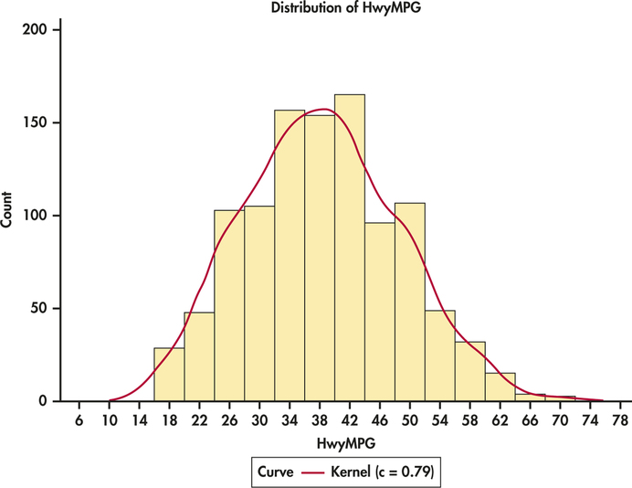
Figure 1.32 gives the histogram of the miles per gallon distribution with a density estimate produced by software. Compare this figure with Figure 1.17 (page 39). The two curves are very similar indicating that the Normal distribution gives a reasonably good fit for these data.
Density estimates can capture other unusual features of a distribution. Here is an example.
EXAMPLE 1.43 StubHub!
stubhub
StubHub! is a website where fans can buy and sell tickets to sporting events. Ticket holders wanting to sell their tickets provide the location of their seats and the selling price. People wanting to buy tickets can choose from among the tickets offered for a given event.29
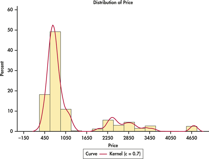
Tickets for the 2015 NCAA women’s basketball tournament were available from StubHub! in a package deal that included the semifinal games and the championship game. On June 28, 2014, StubHub! listed 518 tickets for sale. A histogram of the distribution of ticket prices with a density estimate is given in Figure 1.33. The distribution has three peaks; one around $700, another around $2800, and the third around $4650. This is the identifying characteristic of a trimodal distribution. There appears to be three types of tickets. How would you name the three types?
trimodal distribution
Example 1.43 reminds us of a continuing theme for data analysis. We looked at a histogram and a density estimate and saw something interesting. This led us to speculate. Additional data on the type and location of the seats may explain more about the prices than we see in Figure 1.33.
