2.5 Relations in Categorical Data
 This page includes Video Technology Manuals
We have concentrated on relationships in which at least the response variable is quantitative. Now we shift to describing relationships between two or more categorical variables. Some variables—such as gender, race, and occupation—are categorical by nature. Other categorical variables are created by grouping values of a quantitative variable into classes. Published data often appear in grouped form to save space. To analyze categorical data, we use the counts or percents of cases that fall into various categories.

CASE 2.2 Does the Right Music Sell the Product?

wine
Market researchers know that background music can influence the mood and the purchasing behavior of customers. One study in a supermarket in Northern Ireland compared three treatments: no music, French accordion music, and Italian string music. Under each condition, the researchers recorded the numbers of bottles of French, Italian, and other wine purchased.14 Here is the two-way table that summarizes the data:
| Counts for wine and music | ||||
|---|---|---|---|---|
| Music | ||||
| Wine | None | French | Italian | Total |
| French | 30 | 39 | 30 | 99 |
| Italian | 11 | 1 | 19 | 31 |
| Other | 43 | 35 | 35 | 113 |
| Total | 84 | 75 | 84 | 243 |
The data table for Case 2.2 is a two-way table because it describes two categorical variables. The type of wine is the row variable because each row in the table describes the data for one type of wine. The type of music played is the column variable because each column describes the data for one type of music.The entries in the table are the counts of bottles of wine of the particular type sold while the given type of music was playing. The two variables in this example, wine and music, are both categorical variables.
two-way table row and column variables
This two-way table is a 3×3 table, to which we have added the marginal totals obtained by summing across rows and columns. For example, the first-row total is 30+39+30=99. The grand total, the number of bottles of wine in the study, can be computed by summing the row totals, 99+31+113=243, or the column totals, 84+75+84=243. It is a good idea to do both as a check on your arithmetic.
Marginal distributions
How can we best grasp the information contained in the wine and music table? First, look at the distribution of each variable separately. The distribution of a categorical variable says how often each outcome occurred. The “Total” column at the right margin of the table contains the totals for each of the rows. These are called marginal row totals. They give the numbers of bottles of wine sold by the type of wine: 99 bottles of French wine, 31 bottles of Italian wine, and 113 bottles of other types of wine. Similarly, the marginal column totals are given in the “Total” row at the bottom margin of the table. These are the numbers of bottles of wine that were sold while different types of music were being played: 84 bottles when no music was playing, 75 bottles when French music was playing, and 84 bottles when Italian music was playing.
marginal row totals
marginal column totals
Percents are often more informative than counts. We can calculate the distribution of wine type in percents by dividing each row total by the table total. This distribution is called the marginal distribution of wine type.
marginal distribution
Marginal Distributions
To find the marginal distribution for the row variable in a two-way table, divide each row total by the total number of entries in the table. Similarly, to find the marginal distribution for the column variable in a two-way table, divide each column total by the total number of entries in the table.
Although the usual definition of a distribution is in terms of proportions, we often multiply these by 100 to convert them to percents. You can describe a distribution either way as long as you clearly indicate which format you are using.
EXAMPLE 2.25 Calculating a Marginal Distribution
wine
CASE 2.2 Let's find the marginal distribution for the types of wine sold. The counts that we need for these calculations are in the margin at the right of the table:
| Wine | Total |
|---|---|
| French | 99 |
| Italian | 31 |
| Other | 113 |
| Total | 243 |
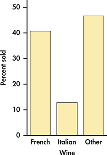
The percent of bottles of French wine sold is
bottles of French wine soldtotal sold=99243=0.4074=40.74%
Similar calculations for Italian wine and other wine give the following distribution in percents:
| Wine | French | Italian | Other |
| Percent | 40.74 | 12.76 | 46.50 |
The total should be 100% because each bottle of wine sold is classified into exactly one of these three categories. In this case, the total is exactly 100%. Small deviations from 100% can occur due to roundoff error.
As usual, we prefer to display numerical summaries using a graph. Figure 2.21 is a bar graph of the distribution of wine type sold. In a two-way table, we have two marginal distributions, one for each of the variables that defines the table.
Apply Your Knowledge
Question 2.91
CASE 2.22.91 Marginal distribution for type of music
Find the marginal distribution for the type of music. Display the distribution using a graph.
2.91
| Music | Frequency | Percent |
|---|---|---|
| French | 75 | 30.86 |
| Italian | 84 | 34.57 |
| None | 84 | 34.57 |
wine
In working with two-way tables, you must calculate lots of percents. Here's a tip to help you decide what fraction gives the percent you want. Ask, “What group represents the total that I want a percent of?” The count for that group is the denominator of the fraction that leads to the percent. In Example 2.25, we wanted percents “of bottles of the different types of wine sold,” so the table total is the denominator.
Apply Your Knowledge
Question 2.92
2.92 Construct a two-way table
Construct your own 2×3 table. Add the marginal totals and find the two marginal distributions.
Question 2.93
2.93 Fields of study for college students
The following table gives the number of students (in thousands) graduating from college with degrees in several fields of study for seven countries:15
| Field of study | Canada | France | Germany | Italy | Japan | U.K. | U.S. |
|---|---|---|---|---|---|---|---|
| Social sciences, business, law | 64 | 153 | 66 | 125 | 259 | 152 | 878 |
| Science, mathematics, engineering | 35 | 111 | 66 | 80 | 136 | 128 | 355 |
| Arts and humanities | 27 | 74 | 33 | 42 | 123 | 105 | 397 |
| Education | 20 | 45 | 18 | 16 | 39 | 14 | 167 |
| Other | 30 | 289 | 35 | 58 | 97 | 76 | 272 |
- Calculate the marginal totals, and add them to the table.
- Find the marginal distribution of country, and give a graphical display of the distribution.
- Do the same for the marginal distribution of field of study.
2.93
(a)
| FieldOfStudy | Canada | France | Germany | Italy | Japan | UK | US | Total |
|---|---|---|---|---|---|---|---|---|
| SocBusLaw | 64 | 153 | 66 | 125 | 259 | 152 | 878 | 1697 |
| SciMathEng | 35 | 111 | 66 | 80 | 136 | 128 | 355 | 911 |
| ArtsHum | 27 | 74 | 33 | 42 | 123 | 105 | 397 | 801 |
| Educ | 20 | 45 | 18 | 16 | 39 | 14 | 167 | 319 |
| Other | 100 | 100 | 100 | 100 | 100 | 100 | 100 | 857 |
| Total | 176 | 672 | 218 | 321 | 654 | 475 | 2069 | 4585 |
(b)
| Country | Frequency | Percent |
|---|---|---|
| Canada | 176 | 3.84 |
| France | 672 | 14.66 |
| Germany | 218 | 4.75 |
| Italy | 321 | 7 |
| Japan | 654 | 14.26 |
| UK | 475 | 10.36 |
| US | 2069 | 45.13 |
(c)
| FieldOfStudy | Frequency | Percent |
|---|---|---|
| ArtsHum | 801 | 17.47 |
| Educ | 319 | 6.96 |
| Other | 857 | 18.69 |
| SciMathEng | 911 | 19.87 |
| SocBusLaw | 1697 | 37.01 |
fos
Conditional distributions
The 3×3 table for Case 2.2 contains much more information than the two marginal distributions. We need to do a little more work to describe the relationship between the type of music playing and the type of wine purchased. Relationships among categorical variables are described by calculating appropriate percents from the counts given.
Conditional Distributions
To find the conditional distribution of the column variable for a particular value of the row variable in a two-way table, divide each count in the row by the row total. Similarly, to find the conditional distribution of the row variable for a particular value of the column variable in a two-way table, divide each count in the column by the column total.
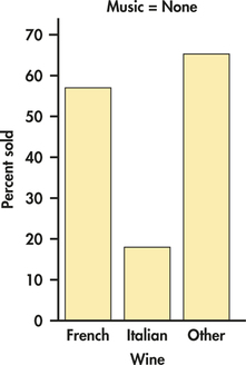
EXAMPLE 2.26 Wine Purchased When No Music Was Playing
wine
CASE 2.2 What types of wine were purchased when no music was playing? To answer this question, we find the marginal distribution of wine type for the value of music equal to none. The counts we need are in the first column of our table:
| Music | |
|---|---|
| Wine | None |
| French | 30 |
| Italian | 11 |
| Other | 43 |
| Total | 84 |
What percent of French wine was sold when no music was playing? To answer this question, we divide the number of bottles of French wine sold when no music was playing by the total number of bottles of wine sold when no music was playing:
3084=0.3571=35.71%
In the same way, we calculate the percents for Italian and other types of wine. Here are the results:
| Wine type: | French | Italian | Other |
| Percent when no music is playing: | 35.7 | 13.1 | 51.2 |
Other wine was the most popular choice when no music was playing, but French wine has a reasonably large share. Notice that these percents sum to 100%. There is no roundoff error here. The distribution is displayed in Figure 2.22.
Apply Your Knowledge
Question 2.94
CASE 2.22.94 Conditional distribution when French music was playing
- Write down the column of counts that you need to compute the conditional distribution of the type of wine sold when French music was playing.
- Compute this conditional distribution.
- Display this distribution graphically.
- Compare this distribution with the one in Example 2.26. Was there an increase in sales of French wine when French music was playing rather than no music?
wine
Question 2.95
CASE 2.22.95 Conditional distribution when Italian music was playing
wine
- Write down the column of counts that you need to compute the conditional distribution of the type of wine sold when Italian music was playing.
- Compute this conditional distribution.
- Display this distribution graphically.
- Compare this distribution with the one in Example 2.26. Was there an increase in sales of Italian wine when Italian music was playing rather than no music?
2.95
(a)
| Music | |
|---|---|
| Wine | Italian |
| French | 30 |
| Italian | 19 |
| Other | 35 |
| Total | 84 |
(b)
| Percent | Frequency | Percent |
|---|---|---|
| French | 30 | 35.71 |
| Italian | 19 | 22.62 |
| Other | 35 | 41.67 |
(d) Yes, the percent went up from 13.1% to 22.62%.
Question 2.96
CASE 2.22.96 Compare the conditional distributions
In Example 2.26, we found the distribution of sales by wine type when no music was playing. In Exercise 2.94, you found the distribution when French music was playing, and in Exercise 2.95, you found the distribution when Italian music was playing. Examine these three conditional distributions carefully, and write a paragraph summarizing the relationship between sales of different types of wine and the music played.
wine
For Case 2.2, we examined the relationship between sales of different types of wine and the music that was played by studying the three conditional distributions of type of wine sold, one for each music condition. For these computations, we used the counts from the 3×3 table, one column at a time. We could also have computed conditional distributions using the counts for each row. The result would be the three conditional distributions of the type of music played for each of the three wine types. For this example, we think that conditioning on the type of music played gives us the most useful data summary. Comparing conditional distributions can be particularly useful when the column variable is an explanatory variable.

The choice of which conditional distribution to use depends on the nature of the data and the questions that you want to ask. Sometimes you will prefer to condition on the column variable, and sometimes you will prefer to condition on the row variable. Occasionally, both sets of conditional distributions will be useful. Statistical software will calculate all of these quantities. You need to select the parts of the output that are needed for your particular questions. Don't let computer software make this choice for you.
Apply Your Knowledge
Question 2.97
2.97 Fields of study by country for college students
In Exercise 2.93, you examined data on fields of study for graduating college students from seven countries.
- Find the seven conditional distributions giving the distribution of graduates in the different fields of study for each country.
- Display the conditional distributions graphically.
- Write a paragraph summarizing the relationship between field of study and country.
2.97
(a)
| Percent | Canada | France | Germany | Italy | Japan | UK | US |
|---|---|---|---|---|---|---|---|
| SocBusLaw | 36.36 | 22.77 | 30.28 | 38.9 | 39.6 | 32 | 42.4 |
| SciMathEng | 19.89 | 16.52 | 30.28 | 24.9 | 20.8 | 27 | 17.2 |
| ArtsHum | 15.34 | 11.01 | 15.14 | 13.1 | 18.81 | 22.1 | 19.2 |
| Educ | 11.36 | 6.7 | 8.26 | 4.98 | 5.96 | 2.95 | 8.07 |
| Other | 17.05 | 43.01 | 16.06 | 18.1 | 14.83 | 16 | 13.2 |
| Total | 100 | 100 | 100 | 100 | 100 | 100 | 100 |
(c) The graph shows that most countries have similarities in their distributions of students among fields of study. Most countries have the most students in Social sciences, business, and law followed second by Science, math, and engineering. France, however, is unique as it has a huge percentage in Other, much more than the other countries shown. Also, the United Kingdom has an extremely low percentage in Education.
fos
Question 2.98
2.98 Countries by fields of study for college students
Refer to the previous exercise. Answer the same questions for the conditional distribution of country for each field of study.
fos
Question 2.99
2.99 Compare the two analytical approaches
In the previous two exercises, you examined the relationship between country and field of study in two different ways.
- Compare these two approaches.
- Which do you prefer? Give a reason for your answer.
- What kinds of questions are most easily answered by each of the two approaches? Explain your answer.
2.99
(a) The first approach looks at the distribution of fields of studies within each country, suggesting the popularity of fields among each country. The second approach is somewhat biased or misleading because of different population sizes, so bigger countries will generally have more students in each field of study.
fos
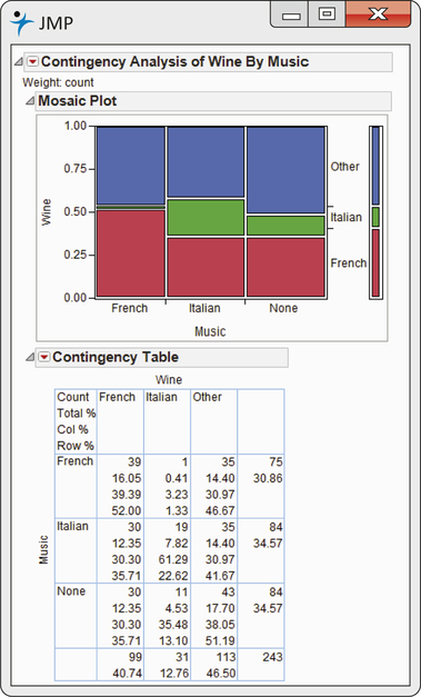
Mosaic plots and software output
Statistical software will compute all of the quantities that we have discussed in this section. Included in some output is a very useful graphical summary called a mosaic plot. Here is an example.
mosaic plot
EXAMPLE 2.27 Software Output for Wine and Music
wine
CASE 2.2 Output from JMP statistical software for the wine and music data is given in Figure 2.23. The mosaic plot is given in the top part of the display. Here, we think of music as the explanatory variable and wine as the response variable, so music is displayed across the x axis in the plot. The conditional distributions of wine for each type of music are displayed in the three columns. Note that when French is playing, 52% of the wine sold is French wine. The red bars display the percents of French wine sold for each type of music. Similarly, the green and blue bars display the correspondence to Italian wine and other wine, respectively. The widths of the three sets of bars display the marginal distribution of music. We can see that the proportions are approximately equal, but the French wine sold a little less than the other two categories of wine.
Simpson's paradox
As is the case with quantitative variables, the effects of lurking variables can change or even reverse relationships between two categorical variables. Here is an example that demonstrates the surprises that can await the unsuspecting user of data.
EXAMPLE 2.28 Which Customer Service Representative Is Better?
cserv
A customer service center has a goal of resolving customer questions in 10 minutes or less. Here are the records for two representatives:
| Representative | ||
|---|---|---|
| Goal met | Ashley | Joshua |
| Yes | 172 | 118 |
| No | 28 | 82 |
| Total | 200 | 200 |
Ashley has met the goal 172 times out of 200, a success rate of 86%. For Joshua, the success rate is 118 out of 200, or 59%. Ashley clearly has the better success rate.
Let's look at the data in a little more detail. The data summarized come from two different weeks in the year.
EXAMPLE 2.29 Let's Look at the Data More Carefully
cserv
Here are the counts broken down by week:
| Week 1 | Week 2 | ||||
|---|---|---|---|---|---|
| Goal met | Ashley | Joshua | Ashley | Joshua | |
| Yes | 162 | 19 | 10 | 99 | |
| No | 18 | 1 | 10 | 81 | |
| Total | 180 | 20 | 20 | 180 | |
For Week 1, Ashley met the goal 90% of the time (162/180), while Joshua met the goal 95% of the time (19/20). Joshua had the better performance in Week 1. What about Week 2? Here, Ashley met the goal 50% of the time (10/20), while the success rate for Joshua was 55% (99/180). Joshua again had the better performance. How does this analysis compare with the analysis that combined the counts for the two weeks? That analysis clearly showed that Ashley had the better performance, 86% versus 59%.
These results can be explained by a lurking variable related to week. The first week was during a period when the product had been in use for several months. Most of the calls to the customer service center concerned problems that had been encountered before. The representatives were trained to answer these questions and usually had no trouble in meeting the goal of resolving the problems quickly. On the other hand, the second week occurred shortly after the release of a new version of the product. Most of the calls during this week concerned new problems that the representatives had not yet encountered. Many more of these questions took longer than the 10-minute goal to resolve.
Look at the total in the bottom row of the detailed table. During the first week, when calls were easy to resolve, Ashley handled 180 calls and Joshua handled 20. The situation was exactly the opposite during the second week, when calls were difficult to resolve. There were 20 calls for Ashley and 180 for Joshua.
The original two-way table, which did not take account of week, was misleading. This example illustrates Simpson's paradox.
Simpson's Paradox
An association or comparison that holds for all of several groups can reverse direction when the data are combined to form a single group. This reversal is called Simpson's paradox.
The lurking variables in Simpson's paradox are categorical. That is, they break the cases into groups, as when calls are classified by week. Simpson's paradox is just an extreme form of the fact that observed associations can be misleading when there are lurking variables.
Apply Your Knowledge
Question 2.100
2.100 Which hospital is safer?
Insurance companies and consumers are interested in the performance of hospitals. The government releases data about patient outcomes in hospitals that can be useful in making informed health care decisions. Here is a two-way table of data on the survival of patients after surgery in two hospitals. All patients undergoing surgery in a recent time period are included. “Survived” means that the patient lived at least six weeks following surgery.
| Hospital A | Hospital B | |
|---|---|---|
| Died | 63 | 16 |
| Survived | 2037 | 784 |
| Total | 2100 | 800 |
What percent of Hospital A patients died? What percent of Hospital B patients died? These are the numbers one might see reported in the media.
hosp
Question 2.101
2.101 Patients in “poor” or “good” condition
Not all surgery cases are equally serious, however. Patients are classified as being in either “poor” or “good” condition before surgery. Here are the data broken down by patient condition. Check that the entries in the original two-way table are just the sums of the “poor” and “good” entries in this pair of tables.
| Good Condition | ||
|---|---|---|
| Hospital A | Hospital B | |
| Died | 6 | 8 |
| Survived | 594 | 592 |
| Total | 600 | 600 |
| Poor Condition | ||
|---|---|---|
| Hospital A | Hospital B | |
| Died | 57 | 8 |
| Survived | 1443 | 192 |
| Total | 1500 | 200 |
- Find the percent of Hospital A patients who died who were classified as “poor” before surgery. Do the same for Hospital B. In which hospital do “poor” patients fare better?
- Repeat part (a) for patients classified as “good” before surgery.
- What is your recommendation to someone facing surgery and choosing between these two hospitals?
- How can Hospital A do better in both groups, yet do worse overall? Look at the data and carefully explain how this can happen.
2.101
(a) For patients in poor condition, 3.8% of Hospital A's patients died, and 4% of Hospital B's patients died. (b) For patients in good condition, 1% of Hospital A's patients died, while 1.33% of Hospital B's patients died. (c) The percentage of deaths for both conditions is lower for Hospital A, so recommend Hospital A. (d) Because Hospital A had so many more patients in poor condition (1500) compared to good condition patients (600), its overall percentage is mostly representing poor condition patients, who have a high death rate. Similarly, Hospital B had very few patients in poor condition (200) compared to good condition patients (600), so its overall percentage is mostly representing good condition patients, who have a low death rate, making their overall percentage lower.
hosp
The data in Example 2.28 can be given in a three-way table that reports counts for each combination of three categorical variables: week, representative, and whether or not the goal was met. In Example 2.29, we constructed two two-way tables for representative by goal, one for each week. The original table, the one that we showed in Example 2.28, can be obtained by adding the corresponding counts for the two tables in Example 2.29. This process is called aggregating the data. When we aggregated data in Example 2.28, we ignored the variable week, which then became a lurking variable. Conclusions that seem obvious when we look only at aggregated data can become quite different when the data are examined in more detail.
three-way table
aggregation