CHAPTER 2 Review Exercises
Question 2.119
2.119 Companies of the world with logs
inccom
In Exercises 2.10 (page 72), 2.27 (page 78), and 2.58 (pages 95–96), you examined the relationship between the numbers of companies that are incorporated and are listed on their country's stock exchange at the end of the year using data collected by the World Bank.24 In this exercise, you will explore the relationship between the numbers for 2012 and 2002 using logs.
- Which variable do you choose to be the explanatory variable, and which do you choose to be the response variable? Explain your answer.
- Plot the data with the least-squares regression line. Summarize the major features of your plot.
- Give the equation of the least-squares regression line.
- Find the predicted value and the residual for Sweden.
- Find the correlation between the two variables.
- Compare the results found in this exercise with those you found in Exercises 2.10, 2.27, and 2.58. Do you prefer the analysis with the original data or the analysis using logs? Give reasons for your answer.
2.119
(a) The log 2002 data (explanatory) should explain the log 2012 data (response). (b) There is a strong positive linear relationship. (c) ˆy=0.33695+0.93406x. (d) ˆy=5.5935, residual=0.2116. (e) r=0.9133. (f) Answers will vary.
Question 2.120
2.120 Residuals for companies of the world with logs
Refer to the previous exercise.
inccom
- Use a histogram to examine the distribution of the residuals.
- Make a Normal quantile plot of the residuals.
- Summarize the distribution of the residuals using the graphical displays that you created in parts (a) and (b).
- Repeat parts (a), (b), and (c) for the original data, and compare these results with those you found in parts (a), (b), and (c). Which do you prefer? Give reasons for your answer.
Question 2.121
2.121 Dwelling permits and sales for 21 European countries
The Organization for Economic Cooperation and Development (OECD) collects data on Main Economic Indicators (MEIs) for many countries. Each variable is recorded as an index, with the year 2000 serving as a base year. This means that the variable for each year is reported as a ratio of the value for the year divided by the value for 2000. Use of indices in this way makes it easier to compare values for different countries.25
meis
- Make a scatterplot with sales as the response variable and permits issued for new dwellings as the explanatory variable. Describe the relationship. Are there any outliers or influential observations?
- Find the least-squares regression line and add it to your plot.
- What is the predicted value of sales for a country that has an index of 160 for dwelling permits?
- The Netherlands has an index of 160 for dwelling permits. Find the residual for this country.
- What percent of the variation in sales is explained by dwelling permits?
2.121
(a) There is a weak positive linear relationship. There is one high x outlier and one high Y outlier. (b) ˆy=109.82043+0.12635x. (c) ˆy=130.0361. (d) −23.0361. (e) 10.27%.
Question 2.122
2.122 Dwelling permits and production
Refer to the previous exercise.
meis
- Make a scatterplot with production as the response variable and permits issued for new dwellings as the explanatory variable. Describe the relationship. Are there any outliers or influential observations?
- Find the least-squares regression line and add it to your plot.
- What is the predicted value of production for a country that has an index of 160 for dwelling permits?
- The Netherlands has an index of 160 for dwelling permits. Find the residual for this country.
- What percent of the variation in production is explained by dwelling permits? How does this value compare with the value you found in the previous exercise for the percent of variation in sales that is explained by building permits?
Question 2.123
2.123 Sales and production
Refer to the previous two exercises.
meis
- Make a scatterplot with sales as the response variable and production as the explanatory variable. Describe the relationship. Are there any outliers or influential observations?
- Find the least-squares regression line and add it to your plot.
- What is the predicted value of sales for a country that has an index of 125 for production?
- Finland has an index of 125 for production. Find the residual for this country.
- What percent of the variation in sales is explained by production? How does this value compare with the percents of variation that you calculated in the two previous exercises?
2.123
(a) There is little to no relationship. There are four potential X outliers. (b) ˆy=112.25678+0.11496x. (c) ˆy=126.6262. (d) 9.3738. (e) 2.29%.
Question 2.124
2.124 Salaries and raises
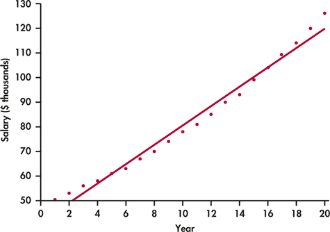
For this exercise, we consider a hypothetical employee who starts working in Year 1 at a salary of $50,000. Each year her salary increases by approximately 5%. By Year 20, she is earning $126,000. The following table gives her salary for each year (in thousands of dollars): 
raises
| Year | Salary | Year | Salary | Year | Salary | Year | Salary |
|---|---|---|---|---|---|---|---|
| 1 | 50 | 6 | 63 | 11 | 81 | 16 | 104 |
| 2 | 53 | 7 | 67 | 12 | 85 | 17 | 109 |
| 3 | 56 | 8 | 70 | 13 | 90 | 18 | 114 |
| 4 | 58 | 9 | 74 | 14 | 93 | 19 | 120 |
| 5 | 61 | 10 | 78 | 15 | 99 | 20 | 126 |
- Figure 2.24 is a scatterplot of salary versus year with the least-squares regression line. Describe the relationship between salary and year for this person.
- The value of r2 for these data is 0.9832. What percent of the variation in salary is explained by year? Would you say that this is an indication of a strong linear relationship? Explain your answer.
Question 2.125
2.125 Look at the residuals
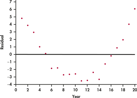
Refer to the previous exercise. Figure 2.25 is a plot of the residuals versus year.
raises
- Interpret the residual plot.
- Explain how this plot highlights the deviations from the least-squares regression line that you can see in Figure 2.24.
2.125
(a) The data are not linear; a curve is a better fit. (b) The residual plot emphasizes the curve seen in the scatterplot.
Question 2.126
2.126 Try logs
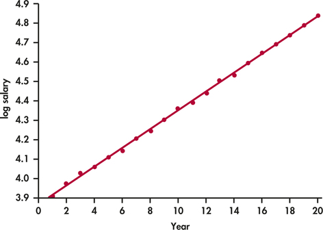
Refer to the previous two exercises. Figure 2.26 is a scatterplot with the least-squares regression line for log salary versus year. For this model, r2=0.9995.
raises
- Compare this plot with Figure 2.24. Write a short summary of the similarities and the differences.
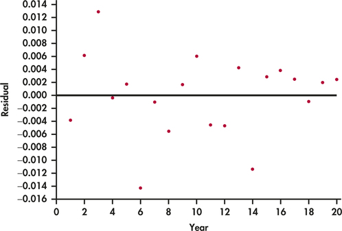
- Figure 2.27 is a plot of the residuals for the model using year to predict log salary. Compare this plot with Figure 2.25 and summarize your findings.
Question 2.127
2.127 Predict some salaries
The individual whose salary we have been studying in Exercises 2.124 through 2.126 wants to do some financial planning. Specifically, she would like to predict her salary five years into the future, that is, for Year 25. She is willing to assume that her employment situation will be stable for the next five years and that it will be similar to the last 20 years.
raises
- Use the least-squares regression equation constructed to predict salary from year to predict her salary for Year 25.
- Use the least-squares regression equation constructed to predict log salary from year to predict her salary for Year 25. Note that you will need to convert the predicted log salary back to the predicted salary. Many calculators have a function that will perform this operation.
- Which prediction do you prefer? Explain your answer.
- Someone looking at the numerical summaries, and not the plots, for these analyses says that because both models have very high values of r2, they should perform equally well in doing this prediction. Write a response to this comment.
- Write a short paragraph about the value of graphical summaries and the problems of extrapolation using what you have learned from studying these salary data.
2.127
(a) $139,579. (b) The prediction is: ˆy=5.07551, or $160,053.80. (c) The log prediction is better because the data are curved. (d) Even if r2 is high, that doesn't mean a linear fit is appropriate. If the data follow a curve, a transformation is needed and should give an even higher r2. (e) Graphs can show you trends that numerical summaries cannot.
Question 2.128
2.128 Faculty salaries
Data on the salaries of a sample of professors in a business department at a large university are given below. The salaries are for the academic years 2014–2015 and 2015–2016. 
facsal
| 2014–2015 salary ($) |
2015–2016 salary ($) |
2014–2015 salary ($) |
2015–2016 salary ($) |
|---|---|---|---|
| 145,700 | 147,700 | 136,650 | 138,650 |
| 112,700 | 114,660 | 132,160 | 134,150 |
| 109,200 | 111,400 | 74,290 | 76,590 |
| 98,800 | 101,900 | 74,500 | 77,000 |
| 112,000 | 113,000 | 83,000 | 85,400 |
| 111,790 | 113,800 | 141,850 | 143,830 |
| 103,500 | 105,700 | 122,500 | 124,510 |
| 149,000 | 150,900 | 115,100 | 117,100 |
- Construct a scatterplot with the 2015–2016 salaries on the vertical axis and the 2014–2015 salaries on the horizontal axis.
- Comment on the form, direction, and strength of the relationship in your scatterplot.
- What proportion of the variation in 2015–2016 salaries is explained by 2014–2015 salaries?
Question 2.129
2.129 Find the line and examine the residuals
Refer to the previous exercise.
facsal
- Find the least-squares regression line for predicting 2015–2016 salaries from 2014–2015 salaries.
- Analyze the residuals, paying attention to any outliers or influential observations. Write a summary of your findings.
2.129
(a) ˆy=2990.4+0.99216x. (b) The residual plot shows two Y outliers, one high and one low.
Question 2.130
2.130 Bigger raises for those earning less
Refer to the previous two exercises. The 2014–2015 salaries do an excellent job of predicting the 2015–2016 salaries. Is there anything more that we can learn from these data? In this department, there is a tradition of giving higher-than-average percent raises to those whose salaries are lower. Let's see if we can find evidence to support this idea in the data.
facsal
- Compute the percent raise for each faculty member. Take the difference between the 2015–2016 salary and the 2014–2015 salary, divide by the 2014–2015 salary, and then multiply by 100. Make a scatterplot with the raise as the response variable and the 2014–2015 salary as the explanatory variable. Describe the relationship that you see in your plot.
- Find the least-squares regression line and add it to your plot.
- Analyze the residuals. Are there any outliers or influential cases? Make a graphical display and include it in a short summary of what you conclude.
- Is there evidence in the data to support the idea that greater percentage raises are given to those with lower salaries? Summarize your findings and include numerical and graphical summaries to support your conclusion.
Question 2.131
2.131 Marketing your college
facsal
Colleges compete for students, and many students do careful research when choosing a college. One source of information is the rankings compiled by U.S. News & World Report. One of the factors used to evaluate undergraduate programs is the proportion of incoming students who graduate. This quantity, called the graduation rate, can be predicted by other variables such as the SAT or ACT scores and the high school records of the incoming students. One of the components in U.S. News & World Report rankings is the difference between the actual graduation rate and the rate predicted by a regression equation.26 In this chapter, we call this quantity the residual. Explain why the residual is a better measure to evaluate college graduation rates than the raw graduation rate.
2.131
Graduation rates can be different based on the difficulty of programs and/or how good the incoming students are. The residual, or difference between actual graduation rate and predicted graduation rate, is better because it shows if a program is doing better or worse than what is expected given the other variables regarding the incoming students.
Question 2.132
2.132 Planning for a new product
The editor of a statistics text would like to plan for the next edition. A key variable is the number of pages that will be in the final version. Text files are prepared by the authors using a word processor called LaTeX, and separate files contain figures and tables. For the previous edition of the text, the number of pages in the LaTeX files can easily be determined, as well as the number of pages in the final version of the text. Here are the data:
tpages
| Chapter | |||||||||||||
|---|---|---|---|---|---|---|---|---|---|---|---|---|---|
| 1 | 2 | 3 | 4 | 5 | 6 | 7 | 8 | 9 | 10 | 11 | 12 | 13 | |
| LaTeX pages |
77 | 73 | 59 | 80 | 45 | 66 | 81 | 45 | 47 | 43 | 31 | 46 | 26 |
| Text pages |
99 | 89 | 61 | 82 | 47 | 68 | 87 | 45 | 53 | 50 | 36 | 52 | 19 |
- Plot the data and describe the overall pattern.
- Find the equation of the least-squares regression line, and add the line to your plot.
- Find the predicted number of pages for the next edition if the number of LaTeX pages for a chapter is 62.
- Write a short report for the editor explaining to her how you constructed the regression equation and how she could use it to estimate the number of pages in the next edition of the text.
Question 2.133
2.133 Points scored in women's basketball games
Use the Internet to find the scores for the past season's women's basketball team at a college of your choice. Is there a relationship between the points scored by your chosen team and the points scored by their opponents? Summarize the data and write a report on your findings.
Question 2.134
2.134 Look at the data for men
Refer to the previous exercise. Analyze the data for the men's team from the same college, and compare your results with those for the women.
Question 2.135
2.135 Circular saws
The following table gives the weight (in pounds) and amps for 19 circular saws. Saws with higher amp ratings tend to also be heavier than saws with lower amp ratings. We can quantify this fact using regression.
circsaw
| Weight | Amps | Weight | Amps | Weight | Amps |
|---|---|---|---|---|---|
| 11 | 15 | 9 | 10 | 11 | 13 |
| 12 | 15 | 11 | 15 | 13 | 14 |
| 11 | 15 | 12 | 15 | 10 | 12 |
| 11 | 15 | 12 | 14 | 11 | 12 |
| 12 | 15 | 10 | 10 | 11 | 12 |
| 11 | 15 | 12 | 13 | 10 | 12 |
| 13 | 15 |
- We will use amps as the explanatory variable and weight as the response variable. Give a reason for this choice.
- Make a scatterplot of the data. What do you notice about the weight and amp values?
- Report the equation of the least-squares regression line along with the value of r2.
- Interpret the value of the estimated slope.
- How much of an increase in amps would you expect to correspond to a one-pound increase in the weight of a saw, on average, when comparing two saws?
- Create a residual plot for the model in part (b). Does the model indicate curvature in the data?
2.135
(a) Higher amps means a bigger motor and more weight. (b) As amps increase, so does weight. (c) ˆy=5.8+0.4x. r2=45.71%. (d) For every 1 amp increase, weight increases by 0.4 pounds. (e) 2.5 amps. (f) Yes, somewhat.
Question 2.136
2.136 Circular saws
The table in the previous exercise gives the weight (in pounds) and amps for 19 circular saws. The data contain only five different amp ratings among the 19 saws.
circsaw
- Calculate the correlation between the weights and the amps of the 19 saws.
- Calculate the average weight of the saws for each of the five amp ratings.
- Calculate the correlation between the average weights and the amps. Is the correlation between average weights and amps greater than, less than, or equal to the correlation between individual weights and amps?
Question 2.137
2.137 What correlation does and doesn't say
Construct a set of data with two variables that have different means and correlation equal to one. Use your example to illustrate what correlation does and doesn't say.
2.137
A correlation measures the strength of a linear relationship, or, that is to say, the relationship between Fund A and Fund B is consistent along a straight line. It doesn't mean they have to change by the same amount or a slope of 1. So as long as Fund A moves 20% and Fund B moves 10% consistently, up or down, you will still remain on the same regression line, and they will remain perfectly correlated.
Question 2.138
2.138 Simpson's paradox and regression
Simpson's paradox occurs when a relationship between variables within groups of observations reverses when all of the data are combined. The phenomenon is usually discussed in terms of categorical variables, but it also occurs in other settings. Here is an example:
simreg
| y | x | Group | y | x | Group |
|---|---|---|---|---|---|
| 10.1 | 1 | 1 | 18.3 | 6 | 2 |
| 8.9 | 2 | 1 | 17.1 | 7 | 2 |
| 8.0 | 3 | 1 | 16.2 | 8 | 2 |
| 6.9 | 4 | 1 | 15.1 | 9 | 2 |
| 6.1 | 5 | 1 | 14.3 | 10 | 2 |
- Make a scatterplot of the data for Group 1. Find the least-squares regression line and add it to your plot. Describe the relationship between y and x for Group 1.
- Do the same for Group 2.
- Make a scatterplot using all 10 observations. Find the least-squares line and add it to your plot.
- Make a plot with all of the data using different symbols for the two groups. Include the three regression lines on the plot. Write a paragraph about Simpson's paradox for regression using this graphical display to illustrate your description.
Question 2.139
2.139 Wood products
A wood product manufacturer is interested in replacing solid-wood building material by less-expensive products made from wood flakes.27 The company collected the following data to examine the relationship between the length (in inches) and the strength (in pounds per square inch) of beams made from wood flakes:
wood
| Length | 5 | 6 | 7 | 8 | 9 | 10 | 11 | 12 | 13 | 14 |
| Strength | 446 | 371 | 334 | 296 | 249 | 254 | 244 | 246 | 239 | 234 |
- Make a scatterplot that shows how the length of a beam affects its strength.
- Describe the overall pattern of the plot. Are there any outliers?
- Fit a least-squares line to the entire set of data. Graph the line on your scatterplot. Does a straight line adequately describe these data?
- The scatterplot suggests that the relation between length and strength can be described by two straight lines, one for lengths of 5 to 9 inches and another for lengths of 9 to 14 inches. Fit least-squares lines to these two subsets of the data, and draw the lines on your plot. Do they describe the data adequately? What question would you now ask the wood experts?
2.139
(b) The strength decreases with length until 9 inches then levels off. There are no outliers. (c) The line does not adequately describe the relationship because the relationship changes after length 9 inches. (d) The two lines adequately explain the data. Ask the wood expert what happens at 10 inches.
Question 2.140
2.140 Aspirin and heart attacks
Does taking aspirin regularly help prevent heart attacks? “Nearly five decades of research now link aspirin to the prevention of stroke and heart attacks.” So says the Bayer Aspirin website, bayeraspirin.com. The most important evidence for this claim comes from the Physicians’ Health Study. The subjects were 22,071 healthy male doctors at least 40 years old. Half the subjects, chosen at random, took aspirin every other day. The other half took a placebo, a dummy pill that looked and tasted like aspirin. Here are the results.28 (The row for “None of these” is left out of the two-way table.)
| Aspirin group |
Placebo group |
|
|---|---|---|
| Fatal heart attacks | 10 | 26 |
| Other heart attacks | 129 | 213 |
| Strokes | 119 | 98 |
| Total | 11,037 | 11,034 |
What do the data show about the association between taking aspirin and heart attacks and stroke? Use percents to make your statements precise. Include a mosaic plot if you have access to the needed software. Do you think the study provides evidence that aspirin actually reduces heart attacks (cause and effect)?
aspirin
Question 2.141
2.141 More smokers live at least 20 more years!
You can see the headlines “More smokers than nonsmokers live at least 20 more years after being contacted for study!” A medical study contacted randomly chosen people in a district in England. Here are data on the 1314 women contacted who were either current smokers or who had never smoked. The tables classify these women by their smoking status and age at the time of the survey and whether they were still alive 20 years later.29
smokers
| Age 18 to 44 | Age 45 to 64 | Age 65+ | ||||
|---|---|---|---|---|---|---|
| Smoker | Not | Smoker | Not | Smoker | Not | |
| Dead | 19 | 13 | 78 | 52 | 42 | 165 |
| Alive | 269 | 327 | 167 | 147 | 7 | 28 |
- From these data, make a two-way table of smoking (yes or no) by dead or alive. What percent of the smokers stayed alive for 20 years? What percent of the nonsmokers survived? It seems surprising that a higher percent of smokers stayed alive.
- The age of the women at the time of the study is a lurking variable. Show that within each of the three age groups in the data, a higher percent of nonsmokers remained alive 20 years later. This is another example of Simpson's paradox.
- The study authors give this explanation: “Few of the older women (over 65 at the original survey) were smokers, but many of them had died by the time of follow-up.” Compare the percent of smokers in the three age groups to verify the explanation.
2.141
(a) Smokers 76.12%, Nonsmokers 68.58%. (b) Age 18 to 44 alive: Smokers 93.4%, Nonsmokers 96.18%. Age 45 to 64 alive: Smokers 68.16%, Nonsmokers 73.87%. Age 65 and Over alive: Smokers 14.29%, Nonsmokers 14.51%. (c) The percentages of smokers are 45.86% (18 to 44), 55.18% (45 to 64), 20.25% (65 and Over).
Question 2.142
2.142 Recycled product quality
Recycling is supposed to save resources. Some people think recycled products are lower in quality than other products, a fact that makes recycling less practical. People who actually use a recycled product may have different opinions from those who don't use it. Here are data on attitudes toward coffee filters made of recycled paper among people who do and don't buy these filters:30
recycle
| Think the quality of the recycled product is: |
|||
|---|---|---|---|
| Higher | The same | Lower | |
| Buyers | 20 | 7 | 9 |
| Nonbuyers | 29 | 25 | 43 |
- Find the marginal distribution of opinion about quality. Assuming that these people represent all users of coffee filters, what does this distribution tell us?
- How do the opinions of buyers and nonbuyers differ? Use conditional distributions as a basis for your answer. Include a mosaic plot if you have access to the needed software. Can you conclude that using recycled filters causes more favorable opinions? If so, giving away samples might increase sales.