2.2 Correlation
 This page includes Video Technology Manuals
 This page includes Statistical Videos
A scatterplot displays the form, direction, and strength of the relationship between two quantitative variables. Linear relationships are particularly important because a straight line is a simple pattern that is quite common. We say a linear relationship is strong if the points lie close to a straight line and weak if they are widely scattered about a line. Our eyes are not good judges of how strong a linear relationship is.

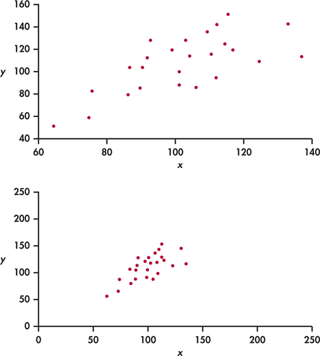
The two scatterplots in Figure 2.7 depict exactly the same data, but the lower plot is drawn smaller in a large field. The lower plot seems to show a stronger linear relationship. Our eyes are often fooled by changing the plotting scales or the amount of white space around the cloud of points in a scatterplot.8 We need to follow our strategy for data analysis by using a numerical measure to supplement the graph. Correlation is the measure we use.
The correlation r
Correlation
The correlation measures the direction and strength of the linear relationship between two quantitative variables. Correlation is usually written as r.
Suppose that we have data on variables x and y for n cases. The values for the first case are x1 and y1, the values for the second case are x2 and y2, and so on. The means and standard deviations of the two variables are ˉx and sx for the x-values, and ˉy and sy for the y-values. The correlation r between x and y is
r=1n−1Σ
As always, the summation sign means “add these terms for all cases.” The formula for the correlation is a bit complex. It helps us to see what correlation is, but in practice you should use software or a calculator that finds from keyed-in values of two variables and .

The formula for begins by standardizing the data. Suppose, for example, that is height in centimeters and is weight in kilograms and that we have height and weight measurements for people. Then and are the mean and standard deviation of the heights, both in centimeters. The value
is the standardized height of the th person. The standardized height says how many standard deviations above or below the mean a person's height lies. Standardized values have no units—in this example, they are no longer measured in centimeters. Similarly, the standardized weights obtained by subtracting and dividing by are no longer measured in kilograms. The correlation is an average of the products of the standardized height and the standardized weight for the people.
Apply Your Knowledge
Question 2.23
CASE 2.12.23 Spending on education
In Example 2.3 (page 66), we examined the relationship between spending on education and population for the 50 states in the United States. Compute the correlation between these two variables.
2.23
.
edspend
Question 2.24
CASE 2.12.24 Change the units
Refer to Exercise 2.6 (page 67), where you changed the units to millions of dollars for education spending and to thousands for population.
- Find the correlation between spending on education and population using the new units.
- Compare this correlation with the one that you computed in the previous exercise.
- Generally speaking, what effect, if any, did changing the units in this way have on the correlation?
edspend
Facts about correlation
The formula for correlation helps us see that is positive when there is a positive association between the variables. Height and weight, for example, have a positive association. People who are above average in height tend to be above average in weight. Both the standardized height and the standardized weight are positive. People who are below average in height tend to have below-average weight. Then both standardized height and standardized weight are negative. In both cases, the products in the formula for are mostly positive, so is positive. In the same way, we can see that is negative when the association between and is negative. More detailed study of the formula gives more detailed properties of . Here is what you need to know to interpret correlation.
- Correlation makes no distinction between explanatory and response variables. It makes no difference which variable you call and which you call in calculating the correlation.
- Correlation requires that both variables be quantitative, so it makes sense to do the arithmetic indicated by the formula for . We cannot calculate a correlation between the incomes of a group of people and what city they live in because city is a categorical variable.
- Because uses the standardized values of the data, does not change when we change the units of measurement of , , or both. Measuring height in inches rather than centimeters and weight in pounds rather than kilograms does not change the correlation between height and weight. The correlation itself has no unit of measurement; it is just a number.
- Positive indicates positive association between the variables, and negative indicates negative association.
- The correlation is always a number between and 1. Values of near 0 indicate a very weak linear relationship. The strength of the linear relationship increases as moves away from 0 toward either or 1. Values of close to or 1 indicate that the points in a scatterplot lie close to a straight line. The extreme values and occur only in the case of a perfect linear relationship, when the points lie exactly along a straight line.
- Correlation measures the strength of only a linear relationship between two variables. Correlation does not describe curved relationships between variables, no matter how strong they are.
- Like the mean and standard deviation, the correlation is not resistant: is strongly affected by a few outlying observations. Use with caution when outliers appear in the scatterplot.
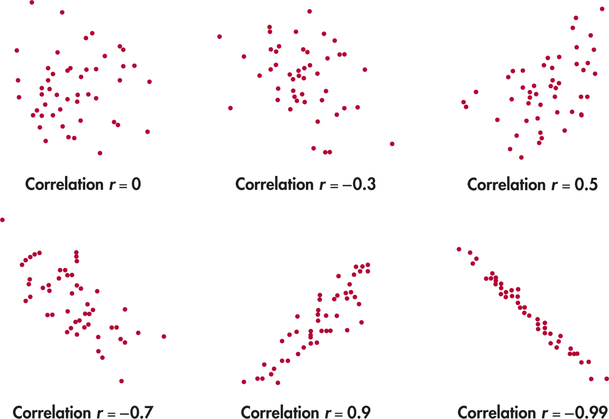
The scatterplots in Figure 2.8 illustrate how values of closer to 1 or correspond to stronger linear relationships. To make the meaning of clearer, the standard deviations of both variables in these plots are equal, and the horizontal and vertical scales are the same. In general, it is not so easy to guess the value of from the appearance of a scatterplot. Remember that changing the plotting scales in a scatterplot may mislead our eyes, but it does not change the correlation.
Remember that correlation is not a complete description of two-variable data, even when the relationship between the variables is linear. You should give the means and standard deviations of both and along with the correlation. (Because the formula for correlation uses the means and standard deviations, these measures are the proper choice to accompany a correlation.) Conclusions based on correlations alone may require rethinking in the light of a more complete description of the data.
EXAMPLE 2.8 Forecasting Earnings
Stock analysts regularly forecast the earnings per share (EPS) of companies they follow. EPS is calculated by dividing a company's net income for a given time period by the number of common stock shares outstanding. We have two analysts’ EPS forecasts for a computer manufacturer for the next six quarters. How well do the two forecasts agree? The correlation between them is , but the mean of the first analyst's forecasts is $3 per share lower than the second analyst's mean.
These facts do not contradict each other. They are simply different kinds of information. The means show that the first analyst predicts lower EPS than the second. But because the first analyst's EPS predictions are about $3 per share lower than the second analyst's for every quarter, the correlation remains high. Adding or subtracting the same number to all values of either or does not change the correlation. The two analysts agree on which quarters will see higher EPS values. The high shows this agreement, despite the fact that the actual predicted values differ by $3 per share.
Apply Your Knowledge
Question 2.25
2.25 Strong association but no correlation
Here is a data set that illustrates an important point about correlation:
| 20 | 30 | 40 | 50 | 60 | |
| 10 | 30 | 50 | 30 | 10 |
- Make a scatterplot of versus .
- Describe the relationship between and . Is it weak or strong? Is it linear?
- Find the correlation between and .
- What important point about correlation does this exercise illustrate?
2.25
(b) It is very strong but not linear; it has a curved relationship or parabola. (c) . (d) The correlation is only good for measuring the strength of a linear relationship.
corr

Question 2.26
2.26 Brand names and generic products
- If a store always prices its generic “store brand” products at exactly 90% of the brand name products’ prices, what would be the correlation between these two prices? (Hint: Draw a scatterplot for several prices.)
- If the store always prices its generic products $1 less than the corresponding brand name products, then what would be the correlation between the prices of the brand name products and the store brand products?