2.3 Least-Squares Regression
 This page includes Video Technology Manuals
 This page includes Statistical Videos
Correlation measures the direction and strength of the straight-line (linear) relationship between two quantitative variables. If a scatterplot shows a linear relationship, we would like to summarize this overall pattern by drawing a line on the scatterplot. A regression line summarizes the relationship between two variables, but only in a specific setting: when one of the variables helps explain or predict the other. That is, regression describes a relationship between an explanatory variable and a response variable.
Regression Line
A regression line is a straight line that describes how a response variable y changes as an explanatory variable x changes. We often use a regression line to predict the value of y for a given value of x.
EXAMPLE 2.9 World Financial Markets
finmark
The World Economic Forum studies data on many variables related to financial development in the countries of the world. They rank countries on their financial development based on a collection of factors related to economic growth.9 Two of the variables studied are gross domestic product per capita and net assets per capita. Here are the data for 15 countries that ranked high on financial development:
| Country | GDP | Assets | Country | GDP | Assets | Country | GDP | Assets |
|---|---|---|---|---|---|---|---|---|
| United Kingdom | 43.8 | 199 | Switzerland | 67.4 | 358 | Germany | 44.7 | 145 |
| Australia | 47.4 | 166 | Netherlands | 52.0 | 242 | Belgium | 47.1 | 167 |
| United States | 47.9 | 191 | Japan | 38.6 | 176 | Sweden | 52.8 | 169 |
| Singapore | 40.0 | 168 | Denmark | 62.6 | 224 | Spain | 35.3 | 152 |
| Canada | 45.4 | 170 | France | 46.0 | 149 | Ireland | 61.8 | 214 |
In this table, GDP is gross domestic product per capita in thousands of dollars and assets is net assets per capita in thousands of dollars. Figure 2.9 is a scatterplot of the data. The correlation is r=0.76. The scatterplot includes a regression line drawn through the points.
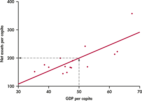
Suppose we want to use this relationship between GDP per capita and net assets per capita to predict the net assets per capita for a country that has a GDP per capita of $50,000. To predict the net assets per capita (in thousands of dollars), first locate 50 on the x axis. Then go “up and over” as in Figure 2.9 to find the GDP per capita y that corresponds to x=50. We predict that a country with a GDP per capita of $50,000 will have net assets per capita of about $200,000.
prediction
The least-squares regression line
Different people might draw different lines by eye on a scatterplot. We need a way to draw a regression line that doesn't depend on our guess as to where the line should be. We will use the line to predict y from x, so the prediction errors we make are errors in y, the vertical direction in the scatterplot. If we predict net assets per capita of 177 and the actual net assets per capita are 170, our prediction error is
error=observed y−predicted y =170−177=−7
The error is −$7,000.
Apply Your Knowledge
Question 2.44
2.44 Find a prediction error
Use Figure 2.9 to estimate the net assets per capita for a country that has a GDP per capita of $40,000. If the actual net assets per capita are $170,000, find the prediction error.
Question 2.45
2.45 Positive and negative prediction errors
Examine Figure 2.9 carefully. How many of the prediction errors are positive? How many are negative?
2.45
There are 7 (one is just barely above the line) positive prediction errors and 8 negative prediction errors.
No line will pass exactly through all the points in the scatterplot. We want the vertical distances of the points from the line to be as small as possible.
EXAMPLE 2.10 The Least-Squares Idea
finmark
Figure 2.10 illustrates the idea. This plot shows the data, along with a line. The vertical distances of the data points from the line appear as vertical line segments.
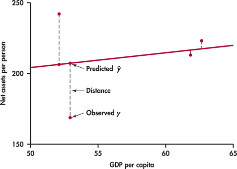
There are several ways to make the collection of vertical distances “as small as possible.” The most common is the least-squares method.
Least-Squares Regression Line
The least-squares regression line of y on x is the line that makes the sum of the squares of the vertical distances of the data points from the line as small as possible.
One reason for the popularity of the least-squares regression line is that the problem of finding the line has a simple solution. We can give the recipe for the least-squares line in terms of the means and standard deviations of the two variables and their correlation.
Equation of the Least-Squares Regression Line
We have data on an explanatory variable x and a response variable y for n cases. From the data, calculate the means ˉx and ˉy and the standard deviations sx and sy of the two variables and their correlation r. The least-squares regression line is the line
ŷ=b0+b1x
with slope
b1=rsysx
and intercept
b0=ˉy−b1ˉx
We write ˆy (read “y hat”) in the equation of the regression line to emphasize that the line gives a predicted response ˆy for any x. Because of the scatter of points about the line, the predicted response will usually not be exactly the same as the actually observed response y. In practice, you don't need to calculate the means, standard deviations, and correlation first. Statistical software or your calculator will give the slope b1 and intercept b0 of the least-squares line from keyed-in values of the variables x and y. You can then concentrate on understanding and using the regression line. Be warned—different software packages and calculators label the slope and intercept differently in their output, so remember that the slope is the value that multiplies x in the equation.
EXAMPLE 2.11 The Equation for Predicting Net Assets
finmark
The line in Figure 2.9 is in fact the least-squares regression line for predicting net assets per capita from GDP per capita. The equation of this line is
ŷ=−27.17+4.500x
slope
The slope of a regression line is almost always important for interpreting the data. The slope is the rate of change, the amount of change in ˆy when x increases by 1. The slope b1=4.5 in this example says that each additional $1000 of GDP per capita is associated with an additional $4500 in net assets per capita.
intercept
The intercept of the regression line is the value of ˆy when x=0. Although we need the value of the intercept to draw the line, it is statistically meaningful only when x can actually take values close to zero. In our example, x=0 occurs when a country has zero GDP. Such a situation would be very unusual, and we would not include it within the framework of our analysis.
EXAMPLE 2.12 Predict Net Assets
prediction
The equation of the regression line makes prediction easy. Just substitute a value of x into the equation. To predict the net assets per capita for a country that has a GDP per capita of $50,000, we use x=50:
finmark
ŷ=−27.17+4.500x =−27.17+(4.500)(50) =−27.17+225.00=198
The predicted net assets per capita is $198,000.

plot the line
To plot the line on the scatterplot, you can use the equation to find ˆy for two values of x, one near each end of the range of x in the data. Plot each ˆy above its x, and draw the line through the two points. As a check, it is a good idea to compute ˆy for a third value of x and verify that this point is on your line.
Apply Your Knowledge
Question 2.46
2.46 A regression line
A regression equation is y=15+30x.
- What is the slope of the regression line?
- What is the intercept of the regression line?
- Find the predicted values of y for x=10, for x=20, and for x=30.
- Plot the regression line for values of x between 0 and 50.
EXAMPLE 2.13 GDP and Assets Results Using Software
finmark
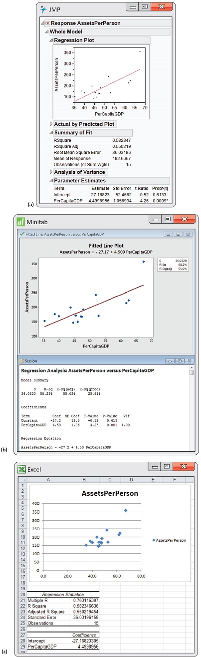
Figure 2.11 displays the selected regression output for the world financial markets data from JMP, Minitab, and Excel. The complete outputs contain many other items that we will study in Chapter 10.
Coefficient
Let's look at the Minitab output first. A table gives the regression intercept and slope under the heading “Coefficients.” Coefficient is a generic term that refers to the quantities that define a regression equation. Note that the intercept is labeled “Constant,” and the slope is labeled with the name of the explanatory variable. In the table, Minitab reports the intercept as −27.2 and the slope as 4.50 followed by the regression equation.
Excel provides the same information in a slightly different format. Here the intercept is reported as −27.16823305, and the slope is reported as 4.4998956. Check the JMP output to see how the regression coefficients are reported there.
How many digits should we keep in reporting the results of statistical calculations? The answer depends on how the results will be used. For example, if we are giving a description of the equation, then rounding the coefficients and reporting the equation as y=−27+4.5x would be fine. If we will use the equation to calculate predicted values, we should keep a few more digits and then round the resulting calculation as we did in Example 2.12.
Apply Your Knowledge
Question 2.47
2.47 Predicted values for GDP and assets
Refer to the world financial markets data in Example 2.9.
- Use software to compute the coefficients of the regression equation. Indicate where to find the slope and the intercept on the output, and report these values.
- Make a scatterplot of the data with the least-squares line.
- Find the predicted value of assets for each country.
- Find the difference between the actual value and the predicted value for each country.
2.47
(a) b1=4.4999. b0=227.1682. (c) and (d)
| Country | Predicted | Prediction Error |
|---|---|---|
| United Kingdom | 169.927 | 29.0728 |
| Australia | 186.127 | -20.1268 |
| United States | 188.377 | 2.6232 |
| Singapore | 152.828 | 15.1724 |
| Canada | 177.127 | -7.127 |
| Switzerland | 276.125 | 81.8753 |
| Netherlands | 206.826 | 35.1737 |
| Japan | 146.528 | 29.4723 |
| Denmark | 254.525 | -30.5252 |
| France | 179.827 | -30.827 |
| Germany | 173.977 | -28.9771 |
| Belgium | 184.777 | -17.7768 |
| Sweden | 210.426 | -41.4263 |
| Spain | 131.678 | 20.3219 |
| Ireland | 250.925 | -36.9253 |
finmark
Facts about least-squares regression
Regression as a way to describe the relationship between a response variable and an explanatory variable is one of the most common statistical methods, and least squares is the most common technique for fitting a regression line to data. Here are some facts about least-squares regression lines.
Fact 1. There is a close connection between correlation and the slope of the least-squares line. The slope is
b1=rsysx
This equation says that along the regression line, a change of one standard deviation in x corresponds to a change of r standard deviations in y. When the variables are perfectly correlated (r=1 or r=−1), the change in the predicted response ˆy is the same (in standard deviation units) as the change in x. Otherwise, because −1≤r≤1, the change in ˆy is less than the change in x. As the correlation grows less strong, the prediction ˆy moves less in response to changes in x.
Fact 2. The least-squares regression line always passes through the point (ˉx,ˉy) on the graph of y against x. So the least-squares regression line of y on x is the line with slope rsy/sx that passes through the point (ˉx,ˉy). We can describe regression entirely in terms of the basic descriptive measures ˉx,sx,ˉy,sy, and r.
Fact 3. The distinction between explanatory and response variables is essential in regression. Least-squares regression looks at the distances of the data points from the line only in the y direction. If we reverse the roles of the two variables, we get a different least-squares regression line.
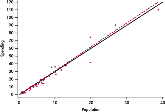
EXAMPLE 2.14 Education Spending and Population
edspend
CASE 2.1 Figure 2.12 is a scatterplot of the education spending data described in Case 2.1 (page 65). There is a positive linear relationship.
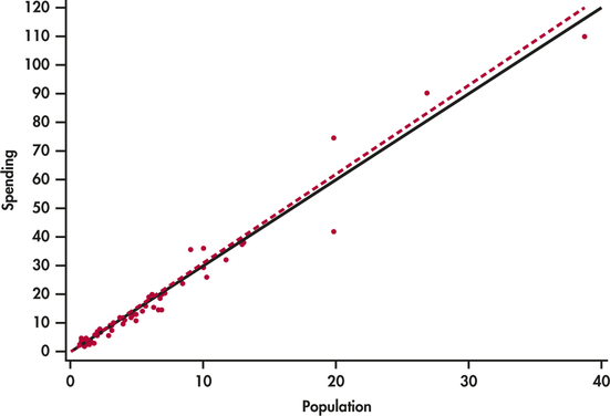
The two lines on the plot are the two least-squares regression lines. The regression line for using population to predict education spending is solid. The regression line for using education spending to predict population is dashed. The two regressions give different lines. In the regression setting, you must choose one variable to be explanatory.
Interpretation of r2
The square of the correlation r describes the strength of a straight-line relationship. Here is the basic idea. Think about trying to predict a new value of y. With no other information than our sample of values of y, a reasonable choice is ˉy.
Now consider how your prediction would change if you had an explanatory variable. If we use the regression equation for the prediction, we would use ŷ=b0+b1x. This prediction takes into account the value of the explanatory variable x.
Let's compare our two choices for predicting y. With the explanatory variable x, we use ˆy; without this information, we use ˉy, the sample of the response variable. How can we compare these two choices? When we use ˉy to predict, our prediction error is y−ˉy. If, instead, we use ˆy, our prediction error is y−ŷ. The use of x in our prediction changes our prediction error from is y−ˉy to y−ŷ. The difference is ŷ−ˉy. Our comparison uses the sums of squares of these differences Σ(y−ˉy)2 and Σ(ŷ−ˉy)2. The ratio of these two quantities is the square of the correlation:
r2=Σ(ŷ−ˉy)2Σ(y−ˉy)2
The numerator represents the variation in y that is explained by x, and the denominator represents the total variation in y.
Percent of Variation Explained by the Least-Squares Equation
To find the percent of variation explained by the least-squares equation, square the value of the correlation and express the result as a percent.
EXAMPLE 2.15 Using r2
finmark
The correlation between GDP per capita and net assets per capita in Example 2.12 (pages 83–84) is r=0.76312, so r2=0.58234. GDP per capita explains about 58% of the variability in net assets per capita.
When you report a regression, give r2 as a measure of how successful the regression was in explaining the response. The software outputs in Figure 2.11 include r2, either in decimal form or as a percent. When you see a correlation (often listed as R or Multiple R in outputs), square it to get a better feel for the strength of the association.
Apply Your Knowledge
Question 2.48
2.48 The “January effect.”
Some people think that the behavior of the stock market in January predicts its behavior for the rest of the year. Take the explanatory variable x to be the percent change in a stock market index in January and the response variable y to be the change in the index for the entire year. We expect a positive correlation between x and y because the change during January contributes to the full year's change. Calculation based on 38 years of data gives
ˉx=1.75%sx=5.36%r=0.596ˉy=9.07%sy=15.35%
- What percent of the observed variation in yearly changes in the index is explained by a straight-line relationship with the change during January?
- What is the equation of the least-squares line for predicting the full-year change from the January change?
- The mean change in January is ˉx=1.75%. Use your regression line to predict the change in the index in a year in which the index rises 1.75% in January. Why could you have given this result (up to roundoff error) without doing the calculation?
Question 2.49
2.49 Is regression useful?
 In Exercise 2.39 (pages 79–80), you used the Correlation and Regression applet to create three scatterplots having correlation about r=0.7 between the horizontal variable x and the vertical variable y. Create three similar scatterplots again, after clicking the “Show least-squares line” box to display the regression line. Correlation r=0.7 is considered reasonably strong in many areas of work. Because there is a reasonably strong correlation, we might use a regression line to predict y from x. In which of your three scatterplots does it make sense to use a straight line for prediction?
Residuals
A regression line is a mathematical model for the overall pattern of a linear relationship between an explanatory variable and a response variable. Deviations from the overall pattern are also important. In the regression setting, we see deviations by looking at the scatter of the data points about the regression line. The vertical distances from the points to the least-squares regression line are as small as possible in the sense that they have the smallest possible sum of squares. Because they represent “leftover” variation in the response after fitting the regression line, these distances are called residuals.
Residuals
A residual is the difference between an observed value of the response variable and the value predicted by the regression line. That is,
residual=observed y−predicted y =y−ŷ
EXAMPLE 2.16 Education Spending and Population
edspend
CASE 2.1 Figure 2.13 is a scatterplot showing education spending versus the population for the 50 states that we studied in Case 2.1 (page 65). Included on the scatterplot is the least-squares line. The points for the states with large values for both variables—California, Texas, Florida, and New York—are marked individually.
The equation of the least-squares line is ŷ=−0.17849+2.99819x where ˆy represents education spending and x represents the population of the state.
Let's look carefully at the data for California, y=110.1 and x=38.7. The predicted education spending for a state with 38.7 million people is
ŷ=−0.17849+2.99819(38.7) =115.85
The residual for California is the difference between the observed spending (y) and this predicted value.
residual=y−ŷ =110.10−115.85 =−5.75
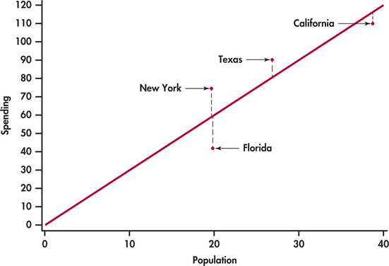
California spends $5.73 million less on education than the least-squares regression line predicts. On the scatterplot, the residual for California is shown as a dashed vertical line between the actual spending and the least-squares line.
Apply Your Knowledge
Question 2.50
2.50 Residual for Texas
Refer to Example 2.16 (page 89). Texas spent $90.5 million on education and has a population of 26.8 million people.
- Find the predicted education spending for Texas.
- Find the residual for Texas.
- Which state, California or Texas, has a greater deviation from the regression line?
There is a residual for each data point. Finding the residuals with a calculator is a bit unpleasant, because you must first find the predicted response for every x. Statistical software gives you the residuals all at once.
Because the residuals show how far the data fall from our regression line, examining the residuals helps us assess how well the line describes the data. Although residuals can be calculated from any model fitted to data, the residuals from the least-squares line have a special property: the mean of the least-squares residuals is always zero.
Apply Your Knowledge
Question 2.51
2.51 Sum the education spending residuals
The residuals in the EDSPEND data file have been rounded to two places after the decimal. Find the sum of these residuals. Is the sum exactly zero? If not, explain why.
2.51
The residuals sum to -0.44. This is due to rounding error.
edspend
As usual, when we perform statistical calculations, we prefer to display the results graphically. We can do this for the residuals.
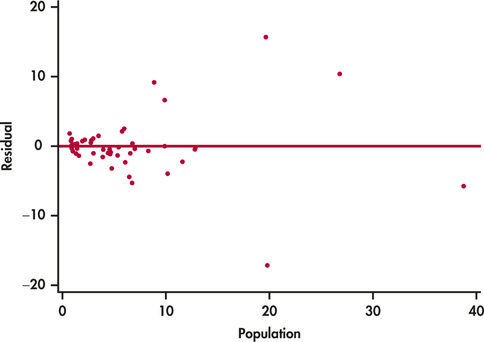
Residual Plots
A residual plot is a scatterplot of the regression residuals against the explanatory variable. Residual plots help us assess the fit of a regression line.
EXAMPLE 2.17 Residual Plot for Education Spending
edspend
CASE 2.1 Figure 2.14 gives the residual plot for the education spending data. The horizontal line at zero in the plot helps orient us.
Apply Your Knowledge
Question 2.52
2.52 Identify the four states
In Figure 2.13, four states are identified by name: California, Texas, Florida, and New York. The dashed lines in the plot represent the residuals.
- Sketch a version of Figure 2.14 or generate your own plot using the EDSPEND data file. Write in the names of the states California, Texas, Florida, and New York on your plot.
- Explain how you were able to identify these four points on your sketch.
edspend
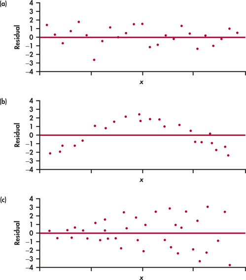
If the regression line captures the overall relationship between x and y, the residuals should have no systematic pattern. The residual plot will look something like the pattern in Figure 2.15(a). That plot shows a scatter of points about the fitted line, with no unusual individual observations or systematic change as x increases. Here are some things to look for when you examine a residual plot:
- A curved pattern, which shows that the relationship is not linear. Figure 2.15(b) is a simplified example. A straight line is not a good summary for such data.
- Increasing or decreasing spread about the line as x increases. Figure 2.15(c) is a simplified example. Prediction of y will be less accurate for larger x in that example.
- Individual points with large residuals, which are outliers in the vertical (y) direction because they lie far from the line that describes the overall pattern.
- Individual points that are extreme in the x direction, like California in Figures 2.13 and 2.14. Such points may or may not have large residuals, but they can be very important. We address such points next.
The distribution of the residuals

When we compute the residuals, we are creating a new quantitative variable for our data set. Each case has a value for this variable. It is natural to ask about the distribution of this variable. We already know that the mean is zero. We can use the methods we learned in Chapter 1 to examine other characteristics of the distribution. We will see in Chapter 10 that a question of interest with respect to residuals is whether or not they are approximately Normal. Recall that we used Normal quantile plots to address this issue.
EXAMPLE 2.18 Are the Residuals Approximately Normal?
edspend
CASE 2.1 Figure 2.16 gives the Normal quantile plot for the residuals in our education spending example. The distribution of the residuals is not Normal. Most of the points are close to a line in the center of the plot, but there appear to be five outliers—one with a negative residual and four with positive residuals.
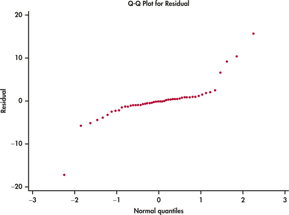
Take a look at the plot of the data with the least-squares line in Figure 2.2 (page 67). Note that you can see the same four points in this plot. If we eliminated these states from our data set, the remaining residuals would be approximately Normal. On the other hand, there is nothing wrong with the data for these four states. A complete analysis of the data should include a statement that they are somewhat extreme relative to the distribution of the other states.
Influential observations
In the scatterplot of spending on education versus population in Figure 2.12 (page 87) California, Texas, Florida, and New York have somewhat higher values for both variables than the other 46 states. This could be of concern if these cases distort the least-squares regression line. A case that has a big effect on a numerical summary is called influential.
influential
EXAMPLE 2.19 Is California Influential?
edspend
CASE 2.1 To answer this question, we compare the regression lines with and without California. The result is in Figure 2.17. The two lines are very close, so we conclude that California is not influential with respect to the least-squares slope and intercept.
Let's think about a situation in which California would be influential on the least-squares regression line. California's spending on education is $110.1 million. This case is close to both least-squares regression lines in Figure 2.17. Suppose California's spending was much less than $110.1 million. Would this case then become influential?
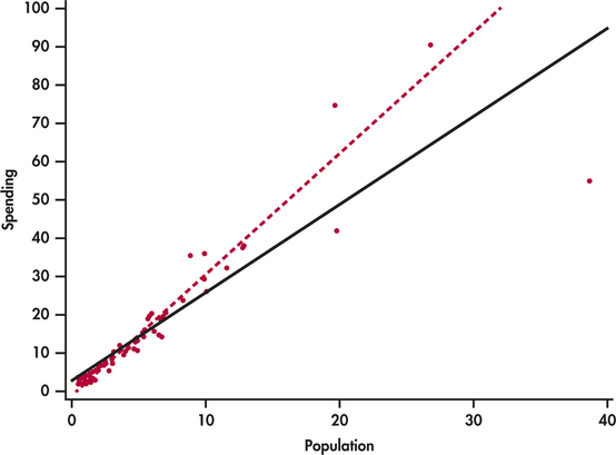
EXAMPLE 2.20 Suppose California Spent Half as Much?
edspend
CASE 2.1 What would happen if California spent about half of what was actually spent, say, $55 million. Figure 2.18 shows the two regression lines, with and without California. Here we see that the regression line changes substantially when California is removed. Therefore, in this setting we would conclude that California is very influential.
Outliers and Influential Cases in Regression
An outlier is an observation that lies outside the overall pattern of the other observations. Points that are outliers in the y direction of a scatterplot have large regression residuals, but other outliers need not have large residuals.
A case is influential for a statistical calculation if removing it would markedly change the result of the calculation. Points that are extreme in the x direction of a scatterplot are often influential for the least-squares regression line.
Apply Your Knowledge
Question 2.53
CASE 2.12.53 The influence of Texas
Make a plot similar to Figure 2.16 giving regression lines with and without Texas. Summarize what this plot describes.
2.53
The lines are very similar, with and without Texas. Texas is not an influential observation.
edspend
California, Texas, Florida, and New York are somewhat unusual and might be considered outliers. However, these cases are not influential with respect to the least-squares regression line.
Influential cases may have small residuals because they pull the regression line toward themselves. That is, you can't always rely on residuals to point out influential observations. Influential observations can change the interpretation of data. For a linear regression, we compute a slope, an intercept, and a correlation. An individual observation can be influential for one of more of these quantities.
EXAMPLE 2.21 Effects on the Correlation
CASE 2.1 The correlation between the spending on education and population for the 50 states is r=0.98. If we drop California, it decreases to 0.97. We conclude that California is not influential on the correlation.
The best way to grasp the important idea of influence is to use an interactive animation that allows you to move points on a scatterplot and observe how correlation and regression respond. The Correlation and Regression applet on the text website allows you to do this. Exercises 2.73 and 2.74 later in the chapter guide the use of this applet.