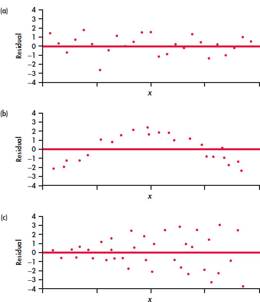
FIGURE 2.15 Idealized patterns in plots of least-squares residuals. Plot (a) indicates that the regression line fits the data well. The data in plot (b) have a curved pattern, so a straight line fits poorly. The response variable y in plot (c) has more spread for larger values of the explanatory variable x, so prediction will be less accurate when x is large.