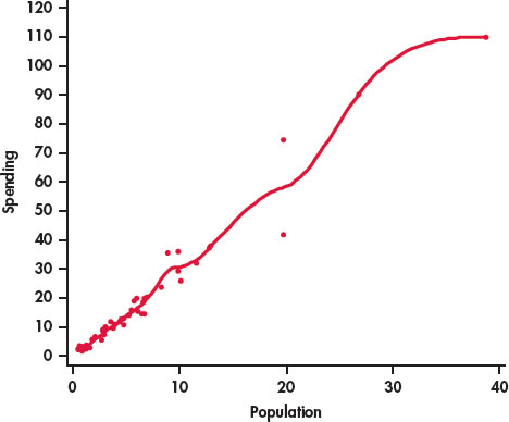
FIGURE 2.3
Scatterplot of spending on education (in billions of dollars) versus population (in millions) with a smooth curve,
Example 2.5
. This smooth curve fits the data too well and does not provide a good summary of the relationship.