EXAMPLE 2.6 Education Spending and Population with Logarithms

Figure 2.5 is a scatterplot of the log of education spending versus the log of education for the 50 states in the United States. The line on the plot fits the data well, and we conclude that the relationship is linear in the transformed variables.
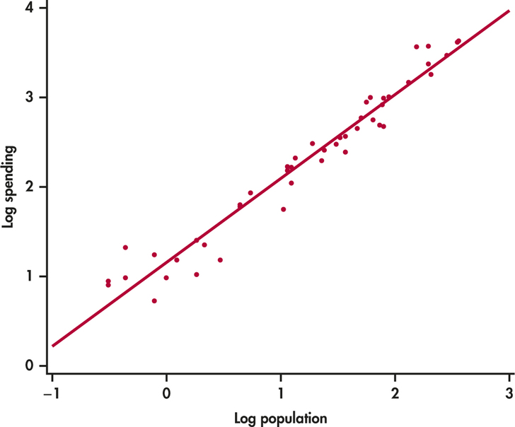
Figure 2.5: FIGURE 2.5 Scatterplot of log spending on education versus log population with a fitted straight line, Example 2.6.
Notice how the data are more evenly spread throughout the range of the possible values. The three or four high values no longer appear to be extreme. We now see them as the high end of a distribution.