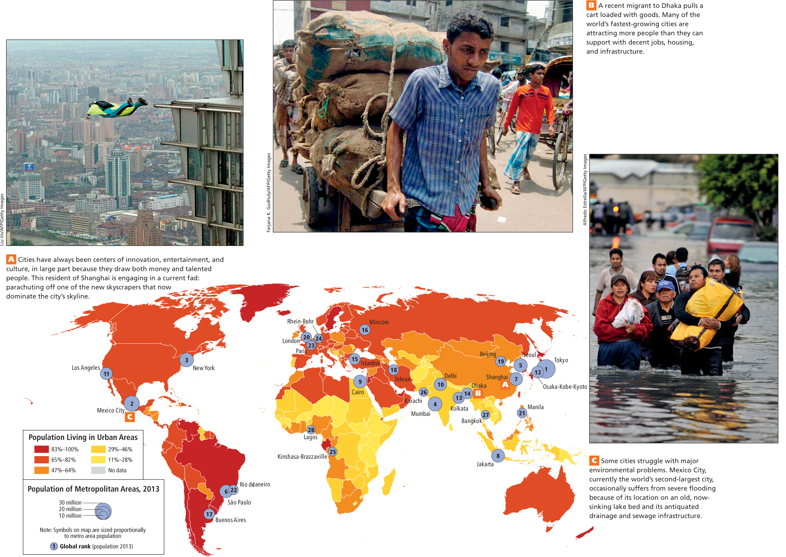
Figure 1.24: FIGURE 1.24 PHOTO ESSAY: UrbanizationIn the map, the color of the country indicates the percentage of the population living in urban areas. The blue circles represent the populations of the world’s largest urban areas in 2013.
[Sources consulted: 2011World Population Data Sheet, Population Reference Bureau, at http://www.prb.org/pdf11/2011population- data- sheet_eng.pdf and World Gazetteer, at http://world- gazetteer.com/wg.php?x=&men=gcis&lng=en&des=wg&srt=npan&col=abcdefghinoq&msz=1500&pt=a&va=&srt=pnan ]