Tutorials on Reading Visuals

Introduction
1 of 12

Chapter 3. test

true
true
Tutorials on Reading Visuals
Reading Visuals: Alignment
false

Reading Visuals: Alignment

Author

Cheryl E. Ball, Wayne State University, and Kristin L. Arola, Michigan Technological University

Activity Objective:

In this tutorial, you will explore the various uses of the principle of alignment.

Click the forward and backward arrows to navigate through the slides. You may also click the above outline button to skip to certain slides.

© 2018 Macmillan Learning

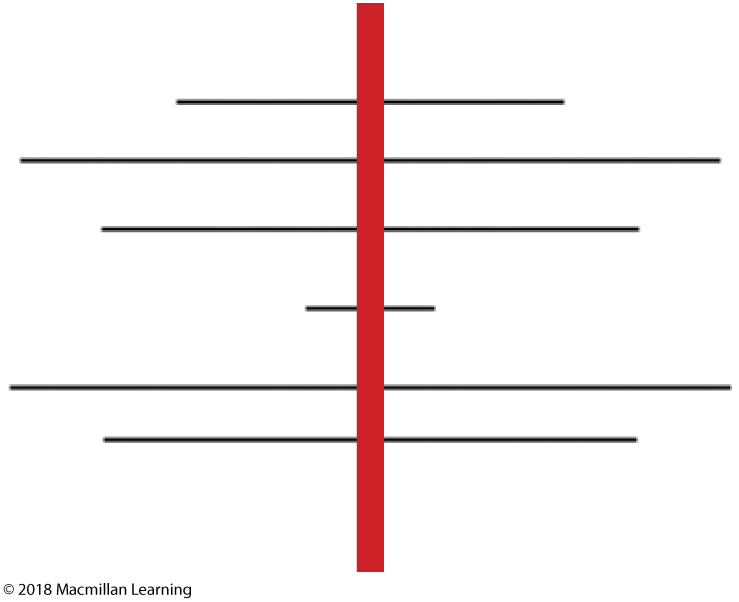
Thin horizontal lines of various lengths are drawn across a red vertical line in the center.

Alignment means, literally, how things line up. A composition that uses alignment to best effect controls how our eyes move across a text. Even if we’re working with a text that is all words, every piece should be deliberately placed. A centered alignment—an easy and popular choice—causes our eyes to move around the space with less determination, as we move from the end of one line and search for the beginning of the next.

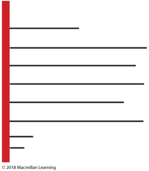
Thin horizontal lines of various lengths are left-aligned from a red vertical line.

A strong left alignment gives us something to follow visually—even elements that contrast in size can demonstrate coherence through a single alignment. This particular example mimics the look of written text, but also consider the strength of an alignment between different kinds of elements, including text and images, on a single page or screen.

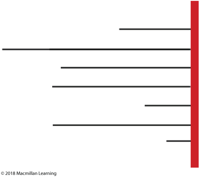
Thin horizontal lines of various lengths are right-aligned from a red vertical line.

A strong right alignment creates a hard edge that connects disparate elements. It can be useful to group things in a clear, interesting way.

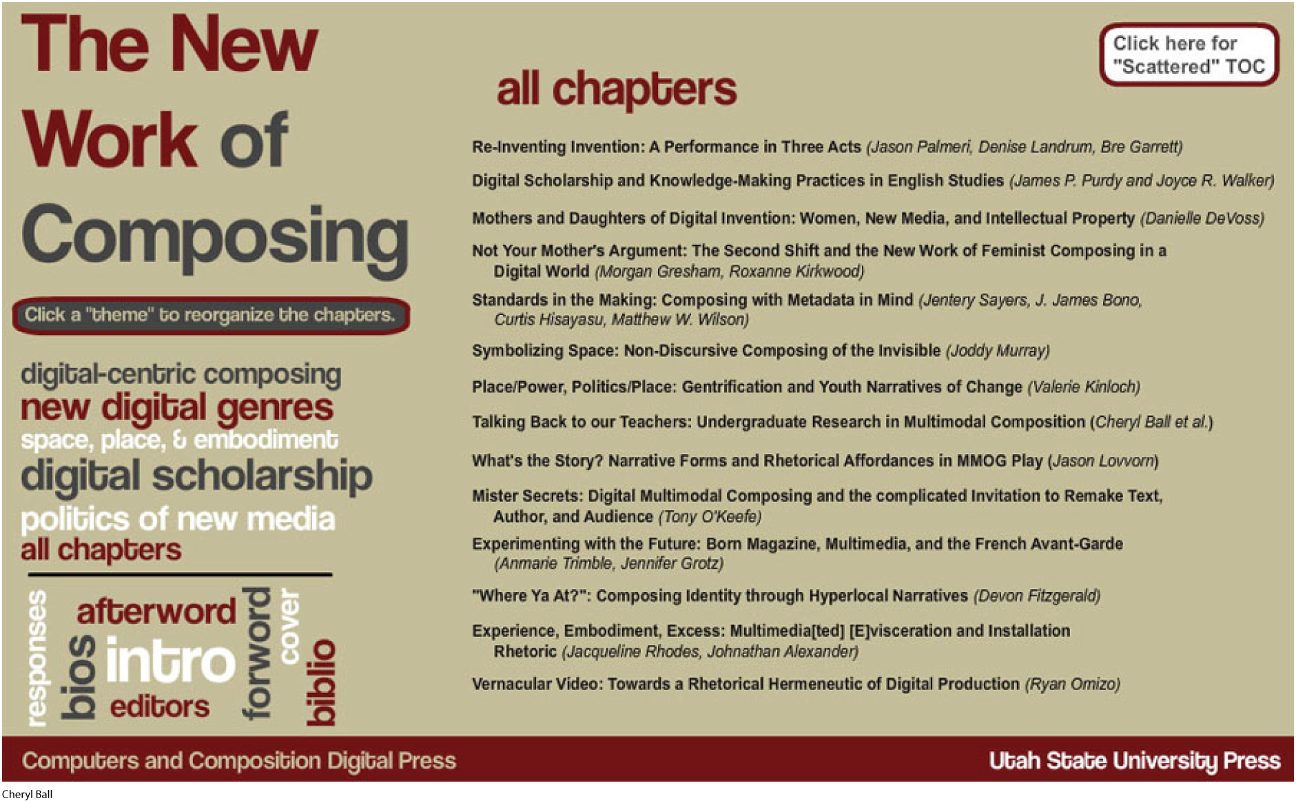
A screenshot shows a list of themes and chapters.

A table of contents (TOC) is grouped information from a larger text. It needs to present itself clearly, in a way that allows readers to quickly see a text’s overall organization and contents. A strong alignment can help readers scan the text quickly. In this example from a digital book meant to be read online, there are a lot of navigation elements on the screen and a strong left alignment for all groups of elements.

A screenshot shows a list of themes and chapters.

Although other items such as the “intro,” “forword” [sic], and “bios” (at the bottom-left) are bigger in size and different in color, their unusual rotation indicates that these elements are much less important than the chapter titles in understanding at a glance what the book is about. This “frontmatter” group of elements is still left-aligned, but the nontraditional rotation encourages readers to view the list of chapters instead.

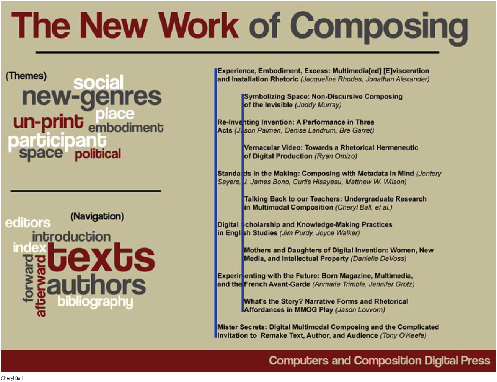
A screenshot shows a page titled The New Work of Composing.

In this early version of the design, two sets of left alignments are used for the chapter listings. The intent was visual diversity, but this design was soon nixed because the editors thought it was misleading. Consider how the problem of clarity was fixed through consideration of alignment.

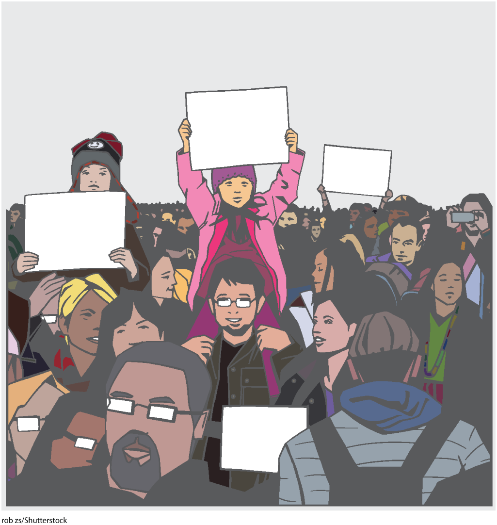
An illustration shows a crowd. A few children are sitting on their fathers' shoulders holding signboards in their hands. A girl holding a sign is the focus of the illustration.

Work through the following questions to use the concept of alignment to analyze this illustration. Then submit your responses.

An illustration shows a crowd. A few children are sitting on their fathers' shoulders holding signboards in their hands. A girl holding a sign is the focus of the illustration.

Use the space below to answer the following questions.

Where is your eye first drawn when you look at this illustration? Why do you think that is?
Your response has been provisionally accepted and will be graded by your instructor.
An illustration shows a crowd. A few children are sitting on their fathers' shoulders holding signboards in their hands. A girl holding a sign is the focus of the illustration.

Use the space below to answer the following questions.

List some of the elements that are aligned (or, perhaps, intentionally misaligned) in this illustration.
Your response has been provisionally accepted and will be graded by your instructor.
An illustration shows a crowd. A few children are sitting on their fathers' shoulders holding signboards in their hands. A girl holding a sign is the focus of the illustration.

Use the space below to answer the following questions.

Do you think this illustration has a clear message? How does the alignment of the image’s elements emphasize the message, if there is one?
Your response has been provisionally accepted and will be graded by your instructor.
An illustration shows a crowd. A few children are sitting on their fathers' shoulders holding signboards in their hands. A girl holding a sign is the focus of the illustration.

Use the space below to answer the following questions.

Would the message change if the elements were aligned differently? What if the protesters were arranged shoulder to shoulder—or in profile?
Your response has been provisionally accepted and will be graded by your instructor.

Congratulations! You have completed this activity.

Total Score: out of (%)

You have received a provisional score for your essay answers, which have been submitted to your instructor.


Slide 1 of 12 is showing. Introduction