Chapter 3. test
Introduction
Reading Visuals: Color
© 2018 Macmillan Learning
Color: Define
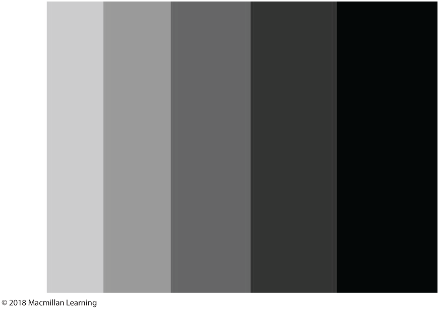
Color: Define
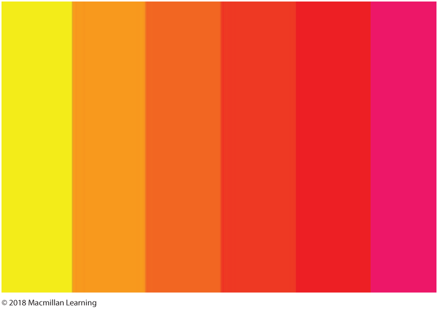
Warm colors such as reds and oranges command more attention than cooler colors like blues and greens. Warm colors are usually read as more emotionally intense—think fire, sun, and summer—and are used to elicit emotional reactions in audiences.
Color: Define
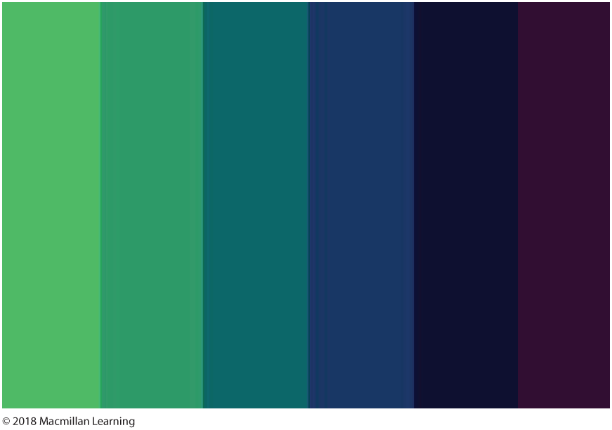
We tend to associate cool colors like blues and greens with water, leaves, cool temperatures, and the sky. Cool colors are usually read as calming and are used to create less emphasis than warm colors in a visual composition.
Color: Analyze
Analyzing a text for color means noticing not only what colors are being used, but to what effect. Do the colors create a certain mood or feeling? Do they work to emphasize a particular element? Or do they work to highlight certain elements on the page in relation to each other? Watch the first part of this Creative Commons video. Notice the colors being used and then think about how they help you understand the message of the video.
Color: Analyze
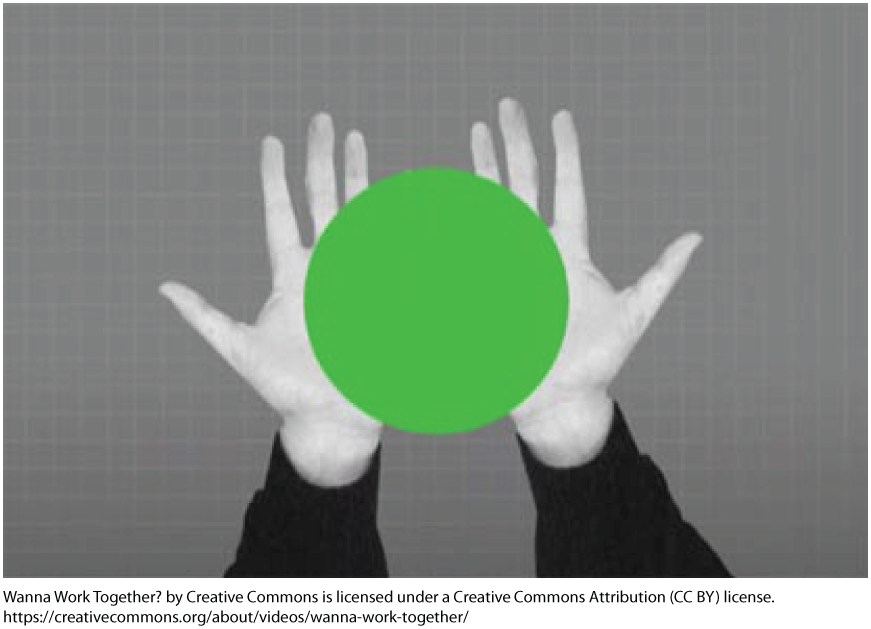
When the green ball is first introduced, it not only adds visual interest to an otherwise drab color palette, but also provides a focal point. The bright color draws our attention and encourages us to follow the green throughout the subsequent frames.
Color: Analyze
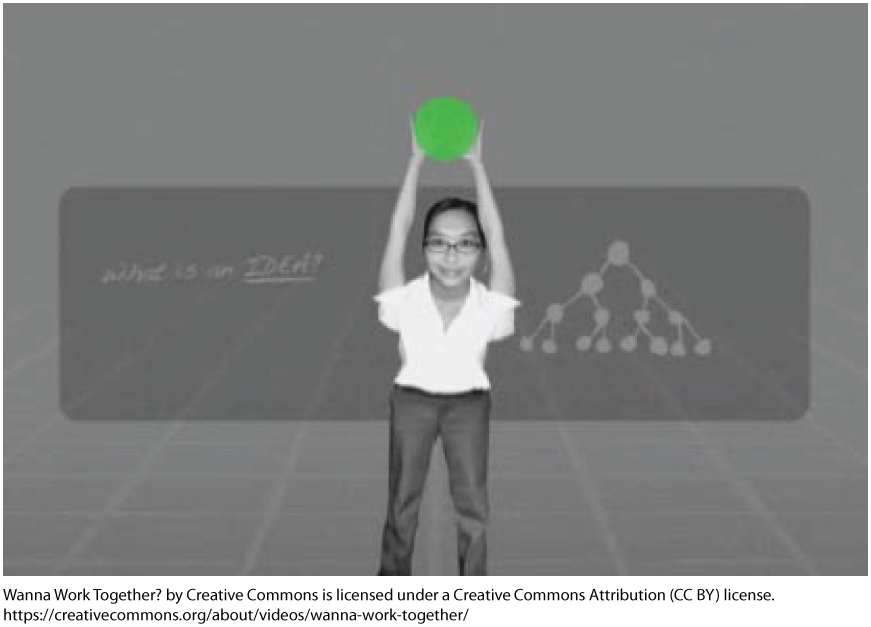
Let's take a closer look at how color works to draw and direct our attention by examining three frames from the video. They come one after the other in the short span of three seconds. In the first shot, our eyes are drawn to the green circle above the teacher’s head. Because our attention is drawn to the circle, we are likely to read the words “What is an IDEA?” written on the chalkboard. The color draws our eye to the teacher and to the written words. As we watch the circle move above the teacher’s head, we hear the narrator say, “Take the teacher, who shapes young minds with work and wisdom from around the globe.”
Color: Analyze
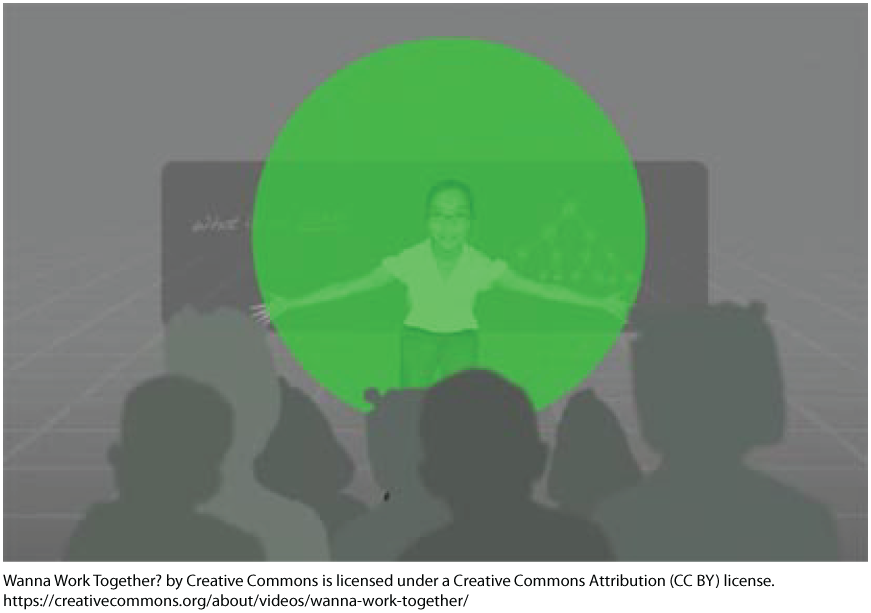
At this moment, the green circle becomes much larger and gives a quick impression of a globe. It also comes to represent the ideas the teacher shares with her students. The narrator then says, “. . . and the artist, who builds beauty out of bits and pieces she finds online.” Notice how when the word “artist” is said, the green circle multiplies.
Color: Analyze

In this third screenshot the green circles draw us to the teacher’s students; we are to assume they signify the creators of the bits and pieces of online content that the artist is remixing. In this quick span of time, the color green draws our eye from the teacher, to the world of ideas, to the students and artists themselves.
Color: Analyze


The use of one color throughout the piece effectively signals the flow of information and the way that students and artists receive and remix it.
Color: Respond
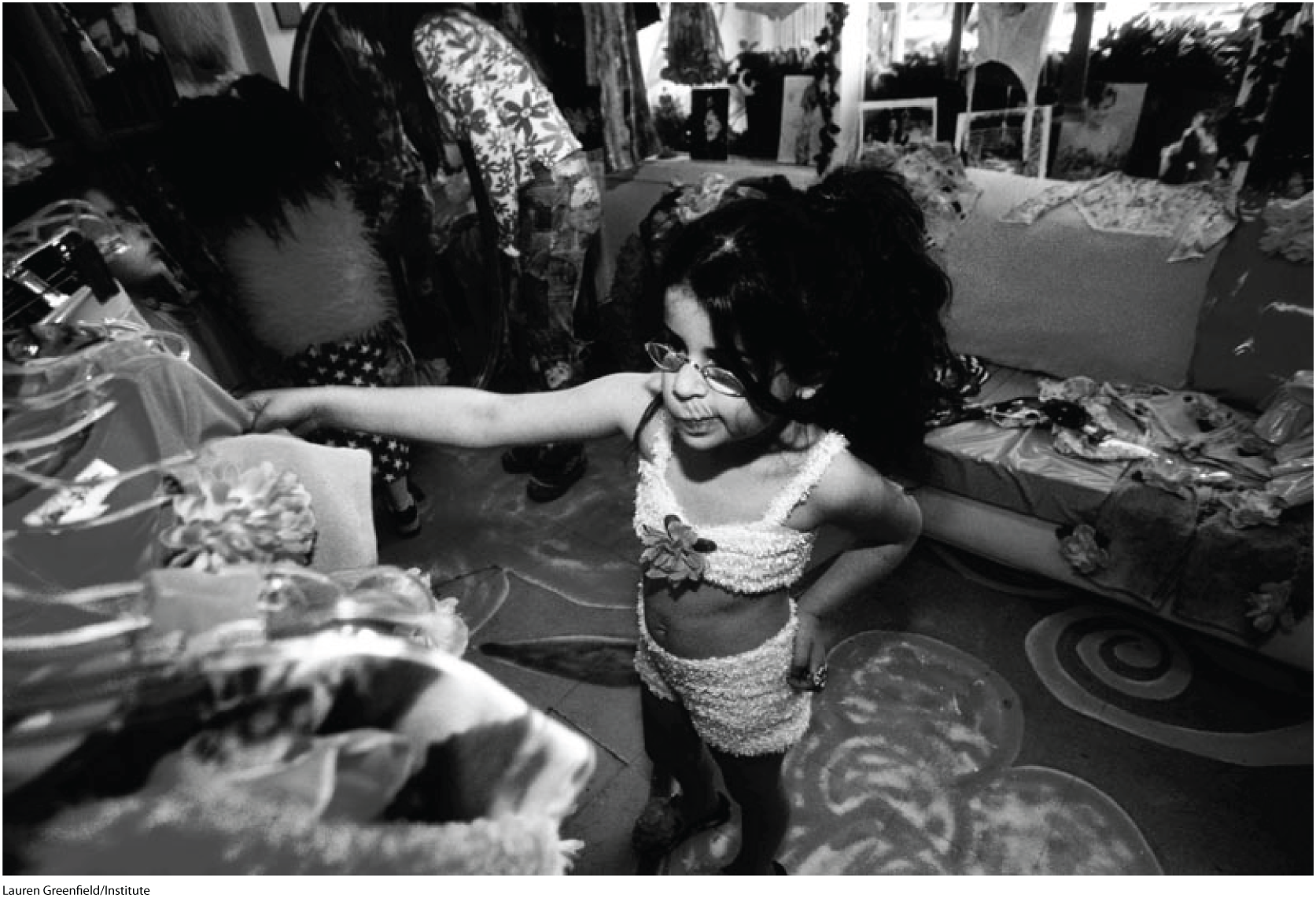
Work through the following questions to think about how color works in a visual text.
Color: Respond

Use the space below to answer the following questions.
Color: Respond
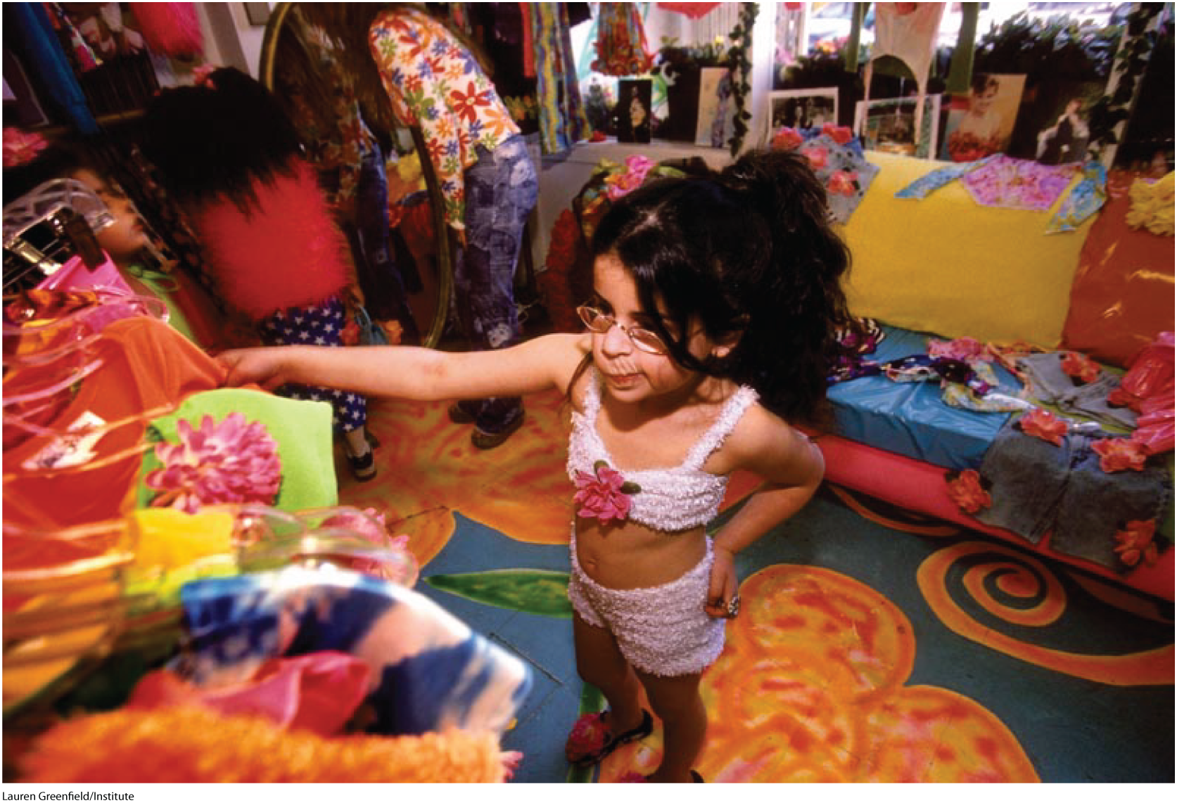
Use the space below to answer the following questions.
Color: Respond
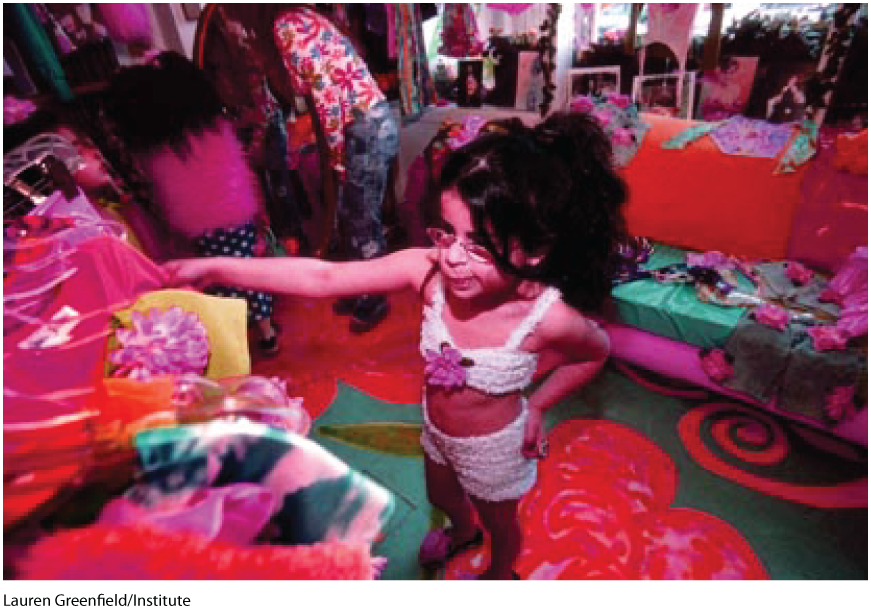
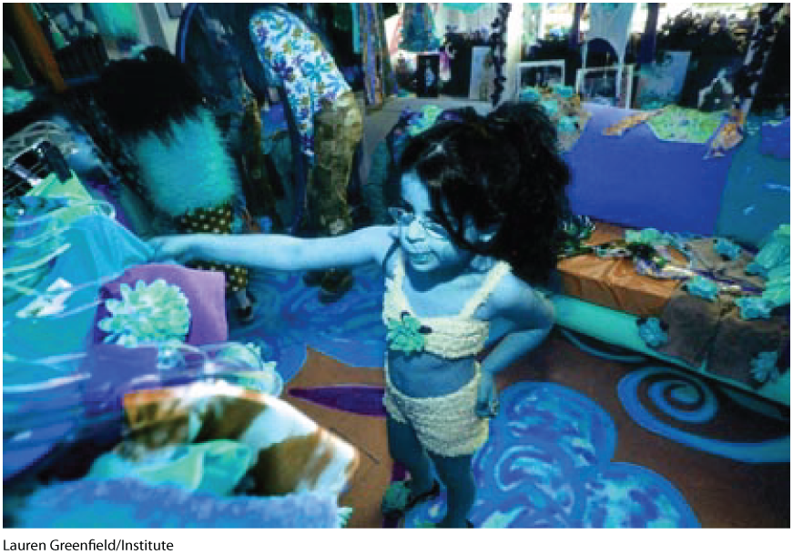
Use the space below to answer the following questions.