Chapter 3. test
Introduction
Reading Visuals: Proximity
© 2018 Macmillan Learning
Proximity: Define
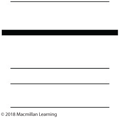
Proximity can apply to any kind of visual element in a text, including words and images. The wide spaces between the lines in this example signal that these are unrelated elements and should be read separately. Proximity can also apply to audio elements in a text, such as voiceovers, sound effects, and lyrics.
Proximity: Define
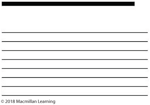
A larger line of type at the top (with space around it) and smaller lines below it suggest that the larger line is to be read as a separate entity, while the lines below it are meant to be read together—this is the conventional way to present a header and body text.
Proximity: Define
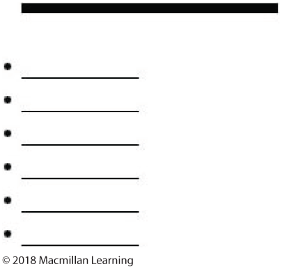
We recognize this as a bulleted list—a header at the top with separate items below it.
Proximity: Define
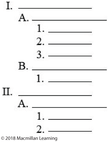
This is a conventional outline form—text is grouped together with clear hierarchies of separate items.
Proximity: Define
Credit: Jeff Kuure
The sound of the snowblower close to the description of snowblowing helps us “see” what’s going on in the text even though the radio essay has no visual elements.
Proximity: Define
Credit: Cheryl Ball
For a class video, Cheryl simulated the explosion of a CD, like in the old Mission: Impossible TV series. Changing the proximity of the filmed footage—by deleting the part where she breaks the CD into pieces and juxtaposes the remaining footage segments—makes it seem as if the CD has exploded.
Proximity: Define
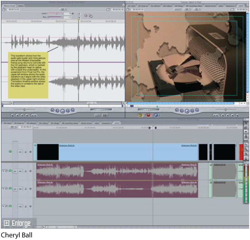
Cheryl had to approximate the added visual effect of the explosion light-burst with the edited video when she was composing this project in iMovie to ensure the combined elements were timed to occur simultaneously.
Proximity: Analyze
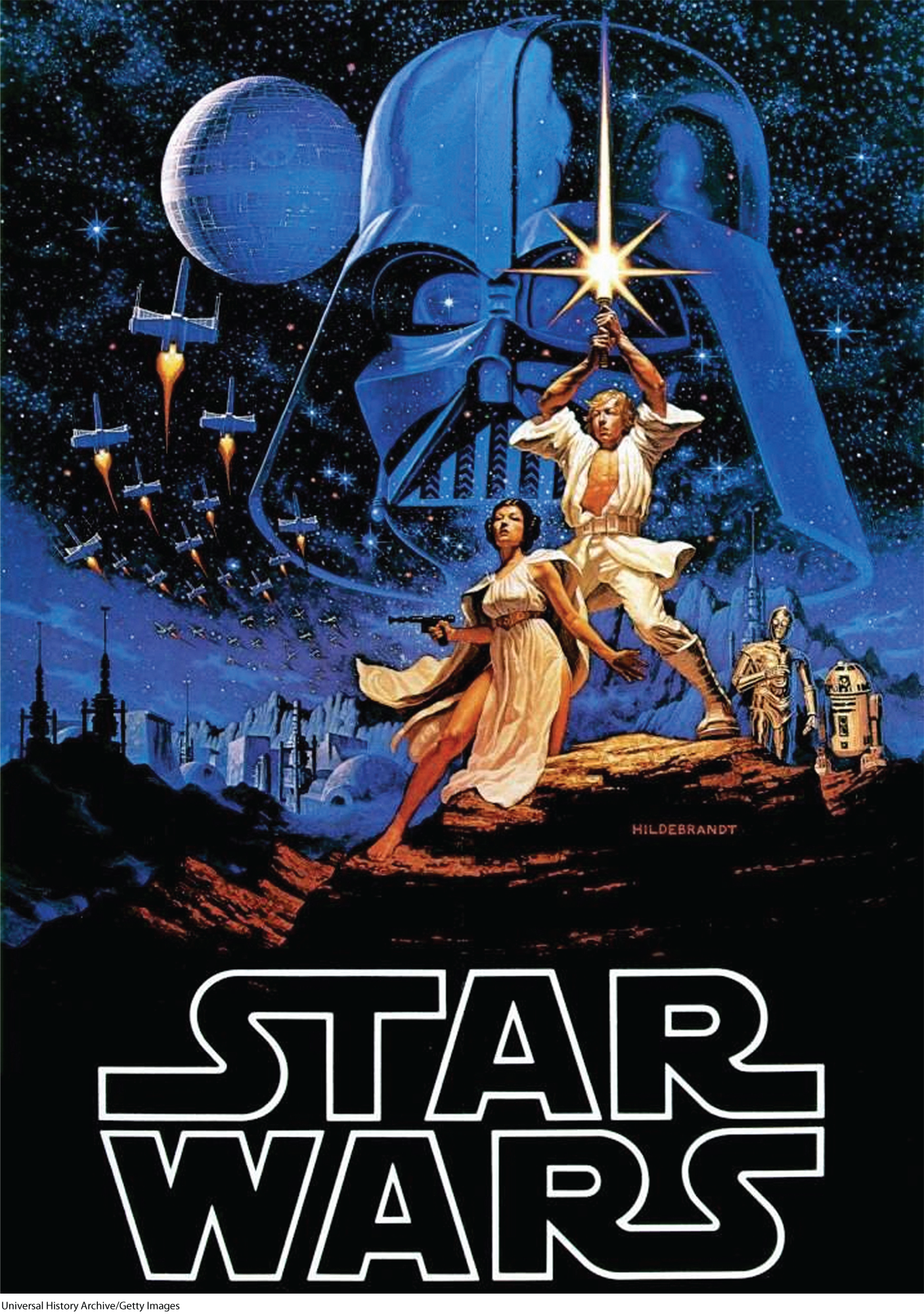
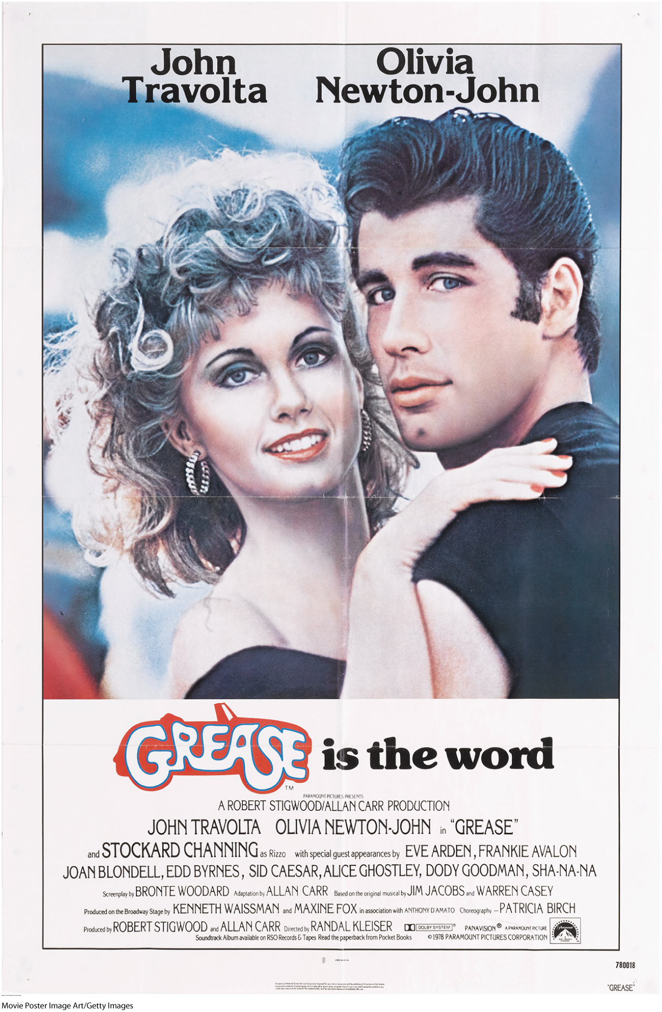
Using proximity to analyze a text means thinking about how elements are grouped together, where they are placed on the page or screen in relation to one another, and how placement suggests purpose. Take a look at these movie posters. One is for the first installment of the Star Wars film series, produced in 1977, and the other is for Grease, a musical from 1978. Notice how the elements (images of characters, titles and subtitles, cast names, production credits) are grouped differently in each poster.
Proximity: Analyze


Movie posters such as these are designed to sell movie tickets to viewers; they have to present several pieces of information in an interesting, visual, and coherent way. Notice that the Star Wars poster depicts a vast landscape and an entire cast of characters (though no information about the actors/actresses or production studio). The main characters are grouped together in the center of the poster. In contrast, in the poster for Grease, the two leads (Olivia Newton-John and John Travolta) completely dominate the composition. Perhaps their celebrity alone was enough to sell tickets?
Proximity: Analyze

You can tell that the titles and characters are related because they appear close to each other; they are grouped by proximity of space. On the Star Wars poster, the villains are shaded in a twilight blue, and the heroes appear in a peachy-tan tone. Here we have groupings determined not just by physical proximity, but also by proximity of color.
Proximity: Analyze

In the poster for Grease, too, the title and two stars are the main focus. Notice that the names of the full cast and crew are placed far from the title and its tagline. The designer of the poster deemed this information less important than the title and its two stars.
Proximity: Analyze


By grouping elements in close proximity, the designer creates a relationship between the elements and gives the viewer a focal point. The Star Wars poster groups its ensemble of characters together at the center of the poster and uses a light, peachy color to link its heroes to the title of the film. The Grease poster also focuses the viewer’s attention on the two central characters, promising an entire world of baby blues, fire-engine reds, and sun-kissed tans.
Proximity: Respond
For this assignment, choose a movie poster or book cover that interests you. Make sure you have it in front of you to examine closely. Using the principles of proximity, think about the title, subtitle, author or director name, and images.
Use the space below to answer the following questions.
Proximity: Respond
Use the space below to answer the following questions.
Proximity: Respond
Use the space below to answer the following questions.