Presentation Slideware

Sitting through hours of slides from your Aunt Sonja’s vacation is boring. Sitting through a slide show that essentially repeats your speech outline can be positively unbearable.
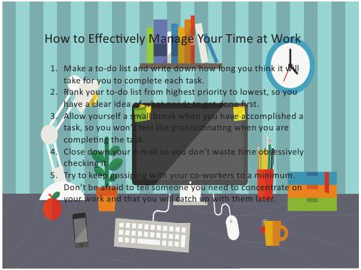
Presentation slideware (such as Microsoft PowerPoint, Apple Keynote, and Prezi), when used appropriately, allows you to have a one-
Too often speakers allow their slides to dominate their presentations, attempting to wow the audience with their technical proficiency rather than focusing on interesting points or well-
If you decide to use presentation software in your speech, here are some tips for developing effective slides:
- Become familiar with all of the features and options of your specific software before you begin to plug in your presentation information.
- Use as few slides as possible. More is not always better! In fact, research by cognitive scientist Carmen Simon suggests that audience members remember an average of four slides from a twenty-
slide, stand- alone, text- only PowerPoint presentation (“The ubiquitous PowerPoint,” 2013). - Ensure that each slide addresses only one topic or idea for simplicity and clarity.
- Use a minimal amount of text. Research indicates that restrained and very direct use of bullet points can positively affect audience recall of information (Vogel, Dickson, & Lehman, 1986), whereas irrelevant information on slides actually reduces learning (Bartsch & Coburn, 2003).
- Make sure the font is large enough for easy viewing (we suggest forty-
point type for titles and twenty- point type and above for all other text), and be sure to spell- check those visible words. - Use only design elements that truly enhance meaning. (No cheesy graphics, please.)
- Be prepared to give the same speech without slides in case of a technology glitch. Having backup handouts or transparencies is one idea, but in any case, make sure your presentation is effective even without your slides.
- Prepare and practice in advance! As we will discuss in the next section, you will need to give yourself enough time to organize, reorganize, edit, and feel comfortable moving between slides.