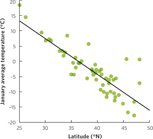
Figure A.2
(Text Figure from “Analyzing Ecology,” Chapter 5)
This scatter plot graph includes a line of best fit that helps us more easily see the relationship between latitude and mean January temperature for 56 cities in the United States.