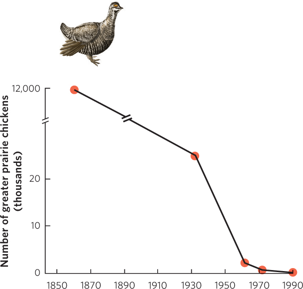
Figure A.7 (Text Figure 7.7). This line graph illustrates the decline in the population of prairie chickens over time in Illinois. Because there is such a large difference in population size between 1860 and 1930, the researchers inserted a break in the y axis, and a corresponding break in the line connecting the data points, to allow a compressed figure that spans a wide range of y-axis values.