Figure A.13
(Text Figure 23.5)
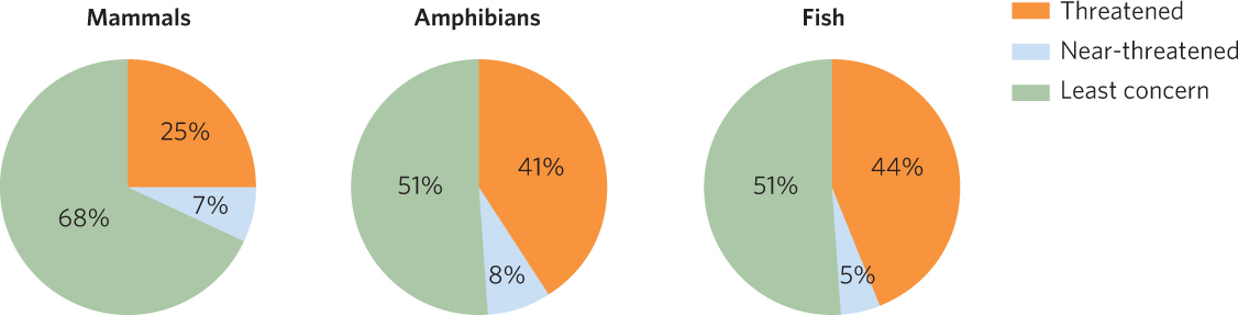
Pie charts illustrate the percentages that different groups compose. In this group of pie charts, we see the percentage of mammals, amphibians, and fish that fall into each of three conservation categories.