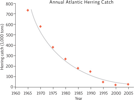
Drawing in a “trend line” that floats through the cloud of points is a more accurate estimation of the actual relationship seen between the two variables. We could draw a straight trend line for this data, but since it seems that the rate of decline lessens as times goes by, the curve seen here may better represent the relationship.