TYPES OF GRAPHS
A. LINE GRAPHS
In science, researchers often test the effect of one variable on another. Line graphs are used when the independent variable is represented by a numerical sequence (1, 2, 3 . . .) rather than discrete categories (red, yellow, blue . . .). The dependent variable is always a numerical sequence.
Steps to producing a line graph
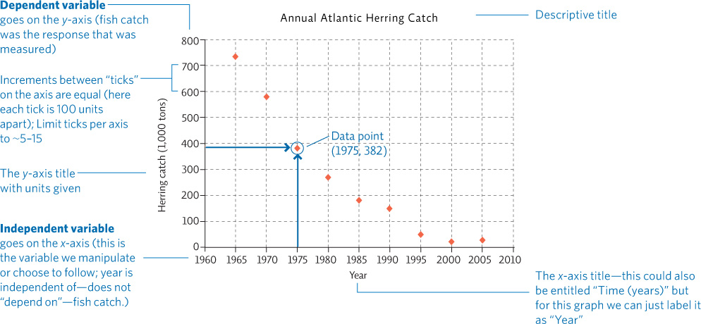
Determine the x-axis and the y-axis. The independent variable is usually shown on the x-axis (the horizontal axis). In a line graph, this variable is one that changes in a predictable, numerical sequence, such as the passing of time, increasing concentrations of a solution being tested, habitat distance from the seashore, etc. The data being collected (the response being observed) represent the dependent variable, which is shown on the y-axis (the vertical axis). The axes require a descriptive title that indicates exactly what each axis represents, along with units of measure, if needed.
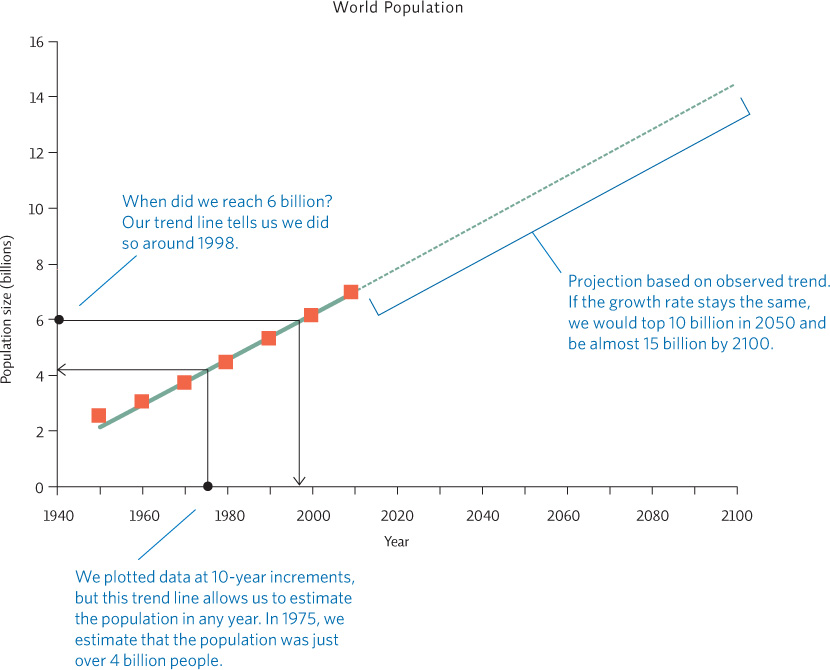
Page A-5Set up the axes. Set up each axis so that the largest data value for that variable is close to the end of the axis, leaving as much of the available space for your graph as possible. Aim for 5 to 15 “ticks” (the small dividing marks) on any given axis—don’t overload it with 50 tiny ticks or have so few that it is hard to place data points. It is essential to evenly space the ticks on a given axis, keeping the increments the same numerical size. On the sample graph, all the x-axis ticks are 10 years apart; all the y-axis ticks are 100 units apart. The increments will depend on your particular data; however, be sure they are presented in the same size for a given axis. Give the graph a descriptive title.
Plot the points. Plot each point by finding the x-value on the x-axis and moving up until you reach the y-value position across from the y-axis. If you are graphing more than one set of data, draw the data points as different shapes or colors and provide a legend to identify each data set.
Draw the line. Once data points are in place, you can draw your line, but don’t simply connect the dots unless they all line up exactly. Step back and visualize what kind of trend the data are showing and draw a line that approximates that trend. These trend lines can be mathematically determined but can also be fairly accurately estimated by simply drawing in a line that goes through the center of the data—about as many points will be above as below the line. You can draw a straight line or you may elect to draw a curve to accommodate shifts in the trend.
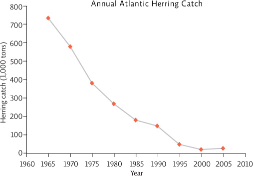 “Connecting the dots” like this implies that each data point is perfectly accurate and that this exactly represents the relationship between the two variables.
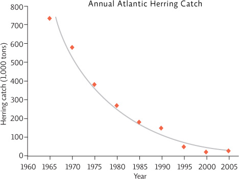 Drawing in a “trend line” that floats through the cloud of points is a more accurate estimation of the actual relationship seen between the two variables. We could draw a straight trend line for this data, but since it seems that the rate of decline lessens as times goes by, the curve seen here may better represent the relationship.
Interpreting the data
Once the graph is made, we can evaluate the data and draw conclusions. The first step is to simply describe the relationship seen—this is a statement of the results (observations). Here we see that between 1965 and 1980, herring catches dropped off dramatically and thereafter continued to drop, but more slowly. Now that we understand the relationship between the two variables, we can draw conclusions—make some inferences: What might have caused this relationship? What else may be true because this relationship exists? We could infer from these data that the herring population size also decreased in this time frame. If we know that the same number of fishers were fishing for herring the same number of days each year, the slower decline after 1980 might represent the fact that the fish are more difficult to catch because the population size is smaller. We might also conclude that it has not been as profitable to fish commercially for herring since 1980 as it was in the 1960s and 1970s. These last three statements are conclusions (inferences) based on the results of the study (observations); they are not observations themselves.
Interpolation and extrapolation (projections)
Plotting line graphs also allows us to estimate values of y or x within the range of our data set, values that we did not actually measure (interpolation). We can also create a projection of data points beyond our data set (extrapolation) by extending the line. This assumes the same trend will hold at higher or lower x-axis values, which may or may not be true; therefore, extrapolations are not likely to be as accurate as interpolations. Extrapolations, also called projections, are often shown as dashed lines.
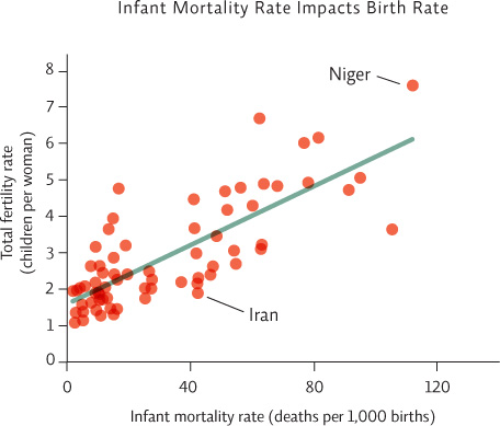
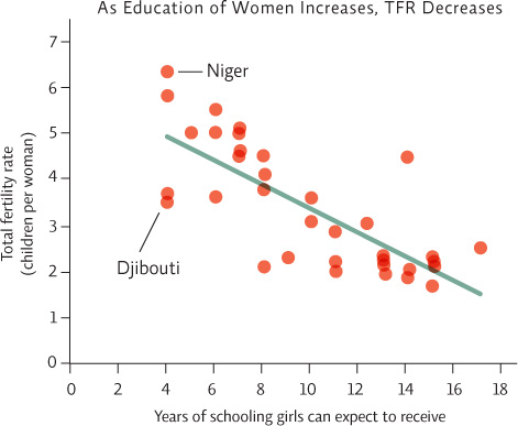
B. SCATTER PLOTS
Scatter plots (with or without a trend line) are used when any x-value could have multiple y-values. For instance, in the second graph shown here, data were collected from various countries. Girls in four of the countries surveyed receive, on average, 4 years of schooling; therefore, there are 4 data points over the x-axis value of 4. But each of those countries had different y-values (total fertility rate). Here it would make no sense to “connect the dots.” The resulting line would be impossible to follow.
It is more appropriate to construct a line that passes through the cloud of points and shows the “trend,” just as we did with the line graph. Data points can be entered into a computer graphing program to calculate a “best fit” line, but you can also estimate the path yourself. To pick the best fit line, draw a line (straight or curved) that passes centrally through the cloud of data points, with about as many points above as below the line—the occasional point far away from the others won’t impact the line significantly. When completed, your line may or may not be straight, but it should not connect the dots.
C. PIE CHARTS
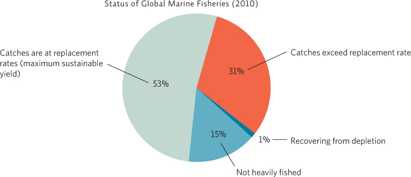
Pie charts are useful when the groups represented by the independent variable are all discrete categories (e.g. red, yellow, blue. . .) rather than a numerical sequence (e.g. 1,2,3. . .). In addition, the categories also represent all the subsets of a whole—all the category values add up to 100%. In other words, you have the entire pie! Data values and/or category titles can be shown either inside each “slice” or outside the pie. The data could also be shown as a bar graph (see Section D), but showing it as a pie chart instead allows one to more easily compare the size of each group to the other groups and to the whole.
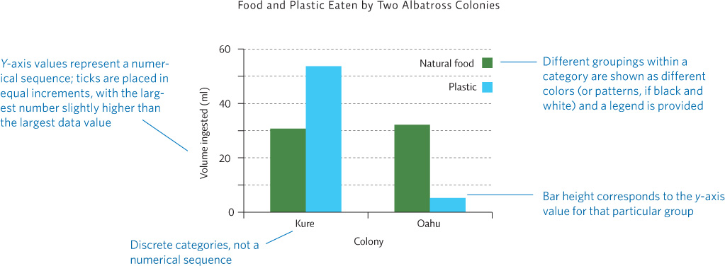
D. BAR GRAPHS
Bar graphs are appropriate in some cases. As with a pie chart, the key consideration is whether the independent variable (the variable you are manipulating in your experiment) is part of a numerical sequence (in which case, a line graph or scatter plot would be used) or represents discrete, separate groups. When you have discrete, separate groups, a bar graph can be used—it would make no sense to connect the data from one group to the next in a line. As with a line graph or scatter plot, the independent variable usually goes on the x-axis and the dependent variable is shown on the y-axis.
For example, researchers examined the stomach contents of birds from two different colonies. “Colony” is the independent variable because the researchers chose to see if where a bird lived would affect the type of food it ate. The volume of each food type ingested is the dependent variable—it is the data that the researcher set out to find and it may change according to colony location.
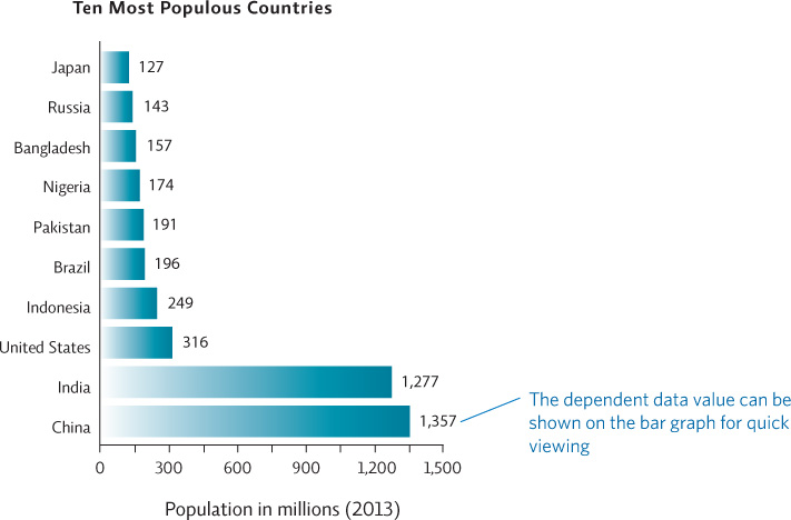
Sometimes it is easier to place the independent variable on the y-axis if the labels themselves are long. This prevents the need to place labels sideways, making them harder to read. The graph below, which shows the population size of the ten most populous countries, displays the independent variable (country) on the y-axis and the dependent variable (population size) on the x-axis.
E. AREA GRAPHS
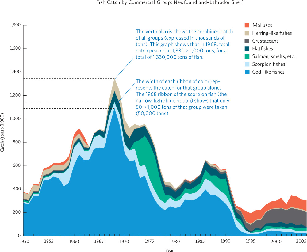
Another useful graph that allows us to view the relative proportion of all the groups being compared is an area graph. It is used when we have a line graph (the independent variable on the x-axis is a numerical sequence) showing multiple lines. Each data set (line) is part of a larger group—here we show total fish catch broken down by type of fish. Each line is graphed “on top” of the other, and the space between the lines is filled in with a different color. This is useful because at any given x-axis point (say, the year 1968) we can see what the total fish catch was as well as how much each type of fish contributed to the total catch. The width of the “ribbon” for each fish type at that point represents its y-axis value—in this case its catch in 1,000 tons. (The y-axis value opposite the ribbon represents the total for all groups.)