SCIENCE LITERACY WORKING WITH DATA
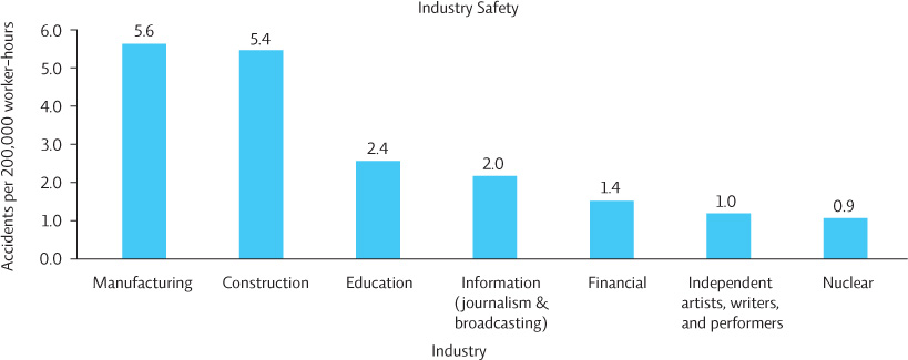
The following graph depicts the number of accidents that occur in a variety of U.S. industries.

Interpretation
1. What does the height of each bar represent?
Accident rate per 200,000 worker hours
2. Based on the graph, which two industries have the highest accident rates?
Manufacturing and construction
3. Based on the graph, which two industries have the lowest accident rates?
Independent artists, writers, and performers, and nuclear employees
Advance Your Thinking
4. To determine whether there is bias in this graph, answer the following questions:
Which industries are represented? Are they comparable?
Do the data for nuclear workers include accidents that occur as a result of mining, processing, and production?
Which of these industries do you think has the strictest OSHA (Occupational Safety and Health Administration) regulations? Might that account for differences in the number of accidents?
a. The industries are not similar. They range from manufacturing to acting. While this is an interesting comparison, it does not give you all the information you need to know to make an informed decision about nuclear safety. And it does indicate anything about the severity of the accidents — a useful thing to know.
b. It’s unclear, but probably not. These are probably data just from nuclear power plants.
c. The nuclear industry almost certainly does because of the high risk of dealing with nuclear material, which might account for differences. The attitude of employees may also contribute: people working in the nuclear industry know that it’s dangerous and may be more likely to follow rules, while people in other industries may not perceive their jobs as dangerous, and be more complacent about safety issues.
5. If you had access to safety data from all industries, which industries would you show in the graph to obtain a fair comparison to the nuclear industry?
A more equitable comparison might include other types of electricity generation, such as coal, wind, or hydropower.